People with the travel bug would adore a stay in this beautiful Irish castle set in the lush green countryside. By experiencing the wide world around us, we can gain inspiration for new designs. We’ve covered hotel websites before, but this one is a bit different in that it is a unique location and more of a destination than a place to lay your head.
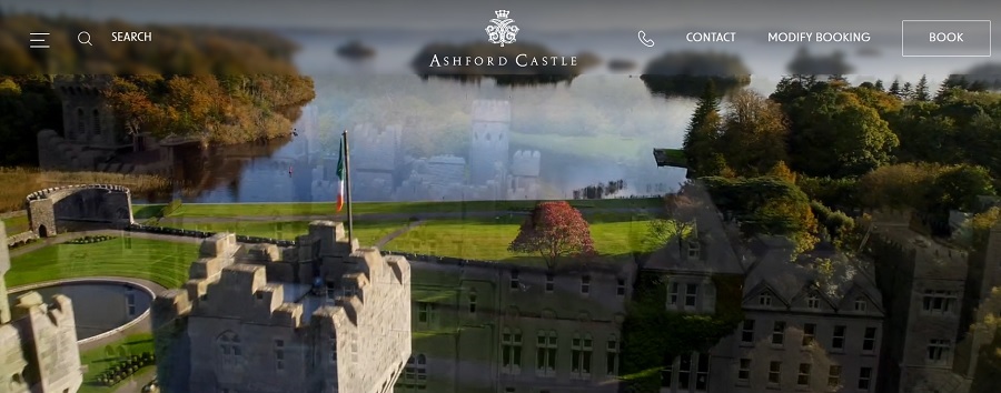
While there are numerous castle accommodations, Ashford Castle’s website stood out to us for its sleek design. The images of a castle that seems to have stepped out of the pages of a novel presented through a hero video at the top of the page draws site visitors in and makes them feel as though they’re transported to the past.
You might think castles are rare. However, researchers estimate there are around one million globally, with Germany being home to about 25,000. Some are larger than others, with many located in European countries.
Winner: Ashford Castle

https://ashfordcastle.com
Over the years, Ashford Castle has seen guests who are royalty, heads of state and celebrities. The estate features 83 rooms each with individual detail and luxurious furnishings. The estate features 83 rooms each with individual detail and luxurious furnishings. Get inspired by the Irish cuisine, using ingredients fresh from the castle gardens. Modern amenities include spa treatments.
The sleek video caught our attention as we looked through different castle hotel websites. The navigation was intuitive and the site wasn’t overcrowded with information. Ashford Castle dates to the 1200s. It started as a medieval fortress and is now a luxury retreat. We love the timeline on their About page that lets the user click errors and see an animation of the castle’s development throughout the ages.
By 1715, the Browne family created a French style estate with architectural details and double-headed eagles on the roof.
In 1852, Sir Benjamin lee Guinness bought the estate and added 26,000 acres and two extensions. He also developed roads and planted trees. The castle stayed in a trust for the Guinness family until 1939, when Noel Huggard purchased it and turned it into a luxury hotel.
In 1970, John Mulcahy bought, restored and doubled the size of Ashford Castle. He also added a golf course and further refined the property.
Today, it’s gone through numerous restorations and is owned by a hotel conglomerate. It’s home to the first School of Falconry and offers horseback riding, kayaking, fishing, wine tasting, golfing and cycling.
Why We Chose Ashford Castle as Our Winner
In addition to a history that spans hundreds of years, the website caught our attention because of its design excellence. It would be tempting for such an established place to stick with a traditional design and avoid updates for years on end. Instead, Ashford Castle’s website embraces interactive features such as the timeline mentioned above.
The landing page features a video with sweeping drone views of the castle and estate grounds. It instantly transports viewers to the hillsides of Ireland and makes you want to go there.
Navigational Hierarchy
Ashford Castle does a number of things right with the navigational structure of the site. Key details are included on the main page and available as users scroll through. However, they also have popular categories across the top of the home page. Click on the hamburger menu on the top left for an expanded version.

Interactive Elements
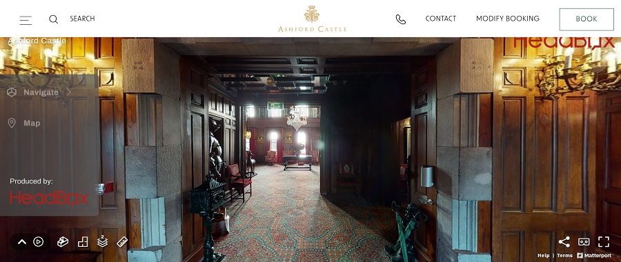
We already mentioned the hero video on the landing page, which draws site visitors in. There are other interactive elements, such as the timeline and a 360-degree, three-dimensional walkthrough of the interior of the castle. You can visit before you ever get there and make sure the location is right for your style.
Site Speed
The site loads at lightning speed, which keeps people there instead of forcing them to bounce away to another location. Research shows most people will only wait a few seconds for a site to appear before leaving.

Simple Booking Program
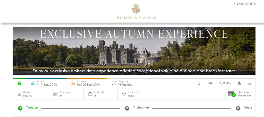
Some hotels have such complex booking procedures that it’s difficult to find the dates and prices you’re looking for. To create a better user experience, sticking with simple data selections and a list of rates works best. Ashford Castle’s booking system is intuitive and allows you to sort by dates and see what the rates are. Prices are in euros but you can adjust and filter by U.S., Canadian, Japanese, British, Polish and Thai currencies.
Trust Factors
In addition to an impeccable reputation for quality standards, Ashford Castle takes their website to another level by adding in trust factors. For those who may not be familiar with the location or coming from another country, adding details such as being able to adjust the booking online, send a message or phone the estate adds confidence that any issues can be resolved.
They also have a page listing every award and recognition they’ve received, such as the Conde Nast Traveler Readers’ Choice Award as one of the best resorts in Europe.
Social Media Integration
The site taps into the power of integrating with social media without overwhelming the user. The footer offers some additional details about press appearances, memberships and links to social platforms such as Facebook, Twitter, Instagram, YouTube and Pinterest.

Subscription Popup
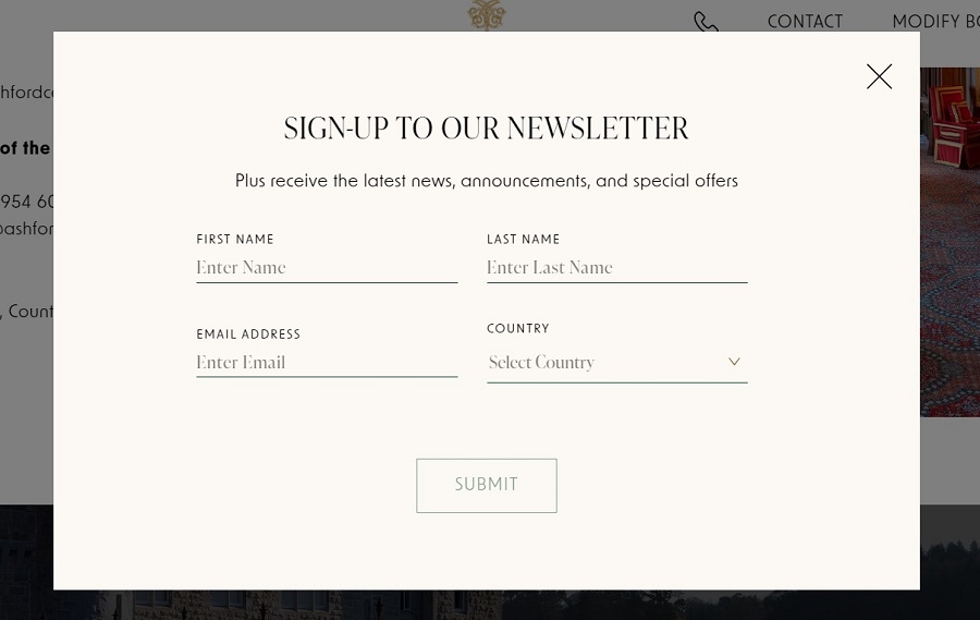
We don’t always care for popups. They can be intrusive, but Ashford Castle does the popup feature well. The box appears when you first land on the page. If you exit out of it, you won’t see it again on that visit. The form is short and to the point, too.
Gallery Section
It took a little digging to find the area, but the site also features a gallery page filled with photographs of the castle, grounds, visitors and special amenities. For visitors who prefer to browse in visuals rather than words, the gallery section is a nice addition.
What We Would Do Different
Overall, the site marks off a lot of checklist items Designerly looks for when giving a web design award. From the minute users arrive on the website, the design engages them, pulling them into another world. The booking system is simple to use and navigation is intuitive.
We’d like to see a little more interaction between social media and the website, such as adding features to share articles with a single click. The site is quite mobile friendly, which is a must in today’s mobile device for everything society. The gallery area could also be easier to find. The menu is rather large when expanded, so navigating to some sections requires more thought.
If you want to see how to create a highly functional and aesthetically pleasing booking site, Ashford Castles is an excellent example to study.


Leave a Comment