Bringing a bit of holly jolly to your customers for Christmas requires a website refresh, fun social media posts and an eye to choosing the right combination of colors. While red and green are traditional favorites, designers introduce new concepts each year that can get you and your clients in the holiday spirit. Finding the perfect Christmas color palettes is simple with these trendy options.
What Colors Are Hot in 2024?
To choose this year’s Christmas color palettes, you have to look at design trends across a number of industries. Interior design, fashion and beauty all come together to inspire web designers and graphic artists.
Southern Living points to pinks and berries as a fresh take on a traditional Christmas red this year in interior decor. We love the softer look of the deep cranberryish-pinks. It’s a look that goes along with the Barbie trends of the last few years.
Other palettes come from popular paint colors, such as Pantone’s color of the year–Peach Fuzz. Combine Christmas hues with a pop of something trendy. We even looked at what’s trending in nail designs to get some ideas for fresh color palettes that will give your small business a unique edge.
Try These Christmas Color Palettes
The palettes below will give you a base color and accents. However, feel free to mix, match and pick and choose. Using color palette generators can provide additional ideas you might not have considered yet.
Keep in mind that your company’s personality should still shine through. If your tone is typically young and vibrant, go for a Christmas color palette that illuminates the same attitude. Here are some options.
Cranberry & Pink

Brighter than burgundy or red, the combination of cranberry with a soft pink adds a feminine touch to a Christmas theme. Interior designers added these splashes of color to greenery up the stairs by tying wide bows on a staircase banister or around the back of chairs. If you want a third color, add a blush pink that pulls in some lavender tones to tie the two colors together.
Too much pink may seem a bit harsh, so you can also reserve the Christmas color palette above for accent colors during the holidays. Softer colors give a nod to popular Christmas movies, such as The Grinch, pulling on the vivid colors in the animated versions and the styles from the live action movies.
- Cranberry – #992f4f
- Soft Pink – #c77ea3
- Pale Pink – #f5dce8
Peach Fuzz & Green

Peach Fuzz was Pantone’s color of the year for 2024. What better way to wrap up the fourth quarter than by giving a nod to design trends? The soft peach goes really well with wintery greens. If you need a third color, stick with a buttery neutral as pictured above.
Peach probably isn’t the first color you think of when considering holiday designs. However, if you typically use softer colors in your design, it can work well to seem trendy while still pulling in more traditional elements.
- Peach Fuzz – #FFBE98
- Winter Green – #386e43
- Buttery Neutral – #f5f5dc
Wintery Mix

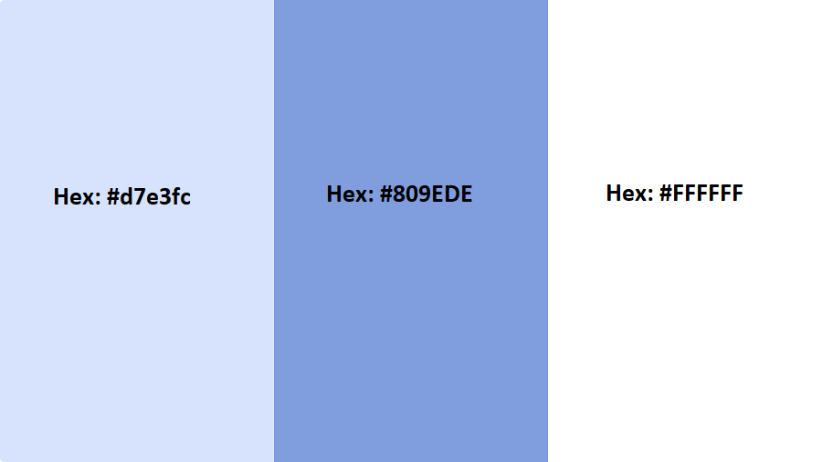
Blue isn’t a new color when it comes to finding your Christmas spirit. For many years, people combined blue and silver on their Christmas trees. However, focusing mainly on blues with a splash of white adds a modern edge that is popular in 2024.
Typically, people used a medium blue for Christmas decorations. The softer blues in this color palette are more winter-themed. They make one think of a holiday market or ice skating rink and bring a sense of nostalgia while also being more updated than a traditional Christmas blue.
- Icy Blue – #d7e3fc
- Winter Blue – #809EDE
- Snow White – #FFFFFF
Purple & Silver

Purple adds a touch of luxury to any web design and is often associated with royalty. Combining it with the light airyness of silver lends a festive touch that young and old can relate to. If you sell luxury goods or services, utilizing a color scheme like the one above can attract new customers during the holiday season. A neutral, such as black or white, can be utilized for body text.
If you can add photos with hints of silver, you’ll add the overall impact of the design. However, you can also nix the gray and use metallic elements instead. Some people prefer to use glittery gold with purple, which can also lend an elegant look to any design.
- Royal Purple – #6d3fa8
- Metallic Silver – #BCC6CC
- Black – #000000
Earthy Greens

Earthy greens were popular paint colors throughout 2024 and lend themselves well to a Christmas color palette, since most people already think of green. Instead of mixing green with golds, silvers, blues or reds, you can choose from various shades within the same color family and create a natural look on your site.
Earthy green Christmas color palettes are perfectly suited for foods and natural products. Earthy greens make people think of going out and finding the perfect Christmas tree to display. By mixing different tones, you have a unique palette that will stand out from competitors.
- Grape Leaves – #7F8659
- Spring Pond – #a7c2ab
- Almost Evergreen – #587156
Coastal Grays With Red

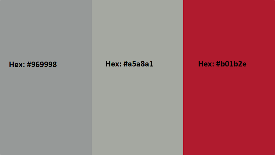
Coastal grays were popular in home decor in 2024. The key to grabbing this modern and monochromatic look for a Christmas website is to add a pop of vivid red to the mix. The grays will give your design a modern, fun edge. The red is a nod to traditional Christmas decor.
If you really want to ramp up the traditions of Christmas, you can also add in a Christmas green as an accent color.
- Coastal Gray – #969998
- Greige – #a5a8a1
- Christmas Red – #b01b2e
All White

Do you want your design to look like winter exploded on your page? You can tap into the power of winter colors by sticking with different pale hues and using a contrasting color for your text. If you choose to go with a stark white look, you’ll want to ensure even your photographs focus mainly on whites.
The look is quite stunning when it comes together and will likely make site visitors stop and notice. The effect is very subtle, so do keep in mind that those with visual impairments may not notice the variations. Always put anything crucial in a dark color so that the site is accessible to all, such as dark headings, body text and directional cues.
- True White – #FFFFFF
- Off White – #FAF9F6
- Pearl White – F8F6F0
Christmas Year Round
Choosing perfect Christmas color palettes to showcase your products and services can freshen up your designs and engage visitors. However, Christmas colors can also be used year-round if you fall in love with the design. Choose the hues you love and add a few neutral elements for a minimalistic look. Christmas might only come once a year but you can tap into the festive spirit every month.


Leave a Comment