One area we’ve not looked at as closely as of yet is the designs of websites specializing in web design and promotional services. As we end 2022 and head into a new year, we thought it was the perfect time to do a reset and see how well design agencies do with their own designs.
Anyone who’s been in business services understands how challenging it is to keep up with your work. The focus is always on the client, and it’s easy to lose sight of how your site design and promotional endeavors impact your brand image.
We spent some time looking at dozens upon dozens of different websites of agencies. Designerly staff casted a wide net and including advertising agencies, marketing firms and design specialists. We finally narrowed down the options to a handful of sites offering consulting and design services to small businesses.
It isn’t easy to narrow the results down and choose a single option. In any category, there are many excellent examples. However, the results often come down to a few small elements that make one site stand out over the others. It can even be a bright color palette that grabs the user’s eye if all other elements are the same.
Winner: Nimbletank

What makes a digital consulting website stand out from others? PR Newswire recently reported a 3.07% year of year growth rate for improved digital customer experience. As the world becomes more digital, people work remotely and order online, more and more companies see a need for not only a presence online but one that meets customers’ needs.
To meet the growing demand for digital consulting services, many new companies spring up almost constantly. From a design standpoint, not all are stellar. We can’t really compare their services or quality of their models without being their clients, but we can study how they attract people to their pages, what happens when the user arrives and how aesthetically pleasing everything is.
For various reasons, we chose Nimbletank as our Designerly award winner for December. We unpacked a lot of design features on this site that we think you’ll appreciate and can learn from.
What Is Nimbletank?

Located in London, United Kingdom, Nimbletank dubs itself as a strategic digital consultancy. Some of the services they offer their clients include analysis of the impact on customers and design based on data. Whether you need a website, an app for your business or some other digital solution, they’ll take all the facts at hand and come up with a plan.
Known for deep insights before you commit to the design. Anyone can throw up a website using a website builder. You can even find a free builder and toss up some pages. However, if you want to have maximum impact on your target audience, you need a little something more. Here are some of the services Nimbletank offers:
- Insight Gathering
- Focused Priorities List
- Opportunity Analysis
- Concepts Presented to Panel
- Value Modeling
Once the client and panel come up with a plan, experts will look at predictions throughout the process and suggest changes for the best outcome possible.
Why We Chose Nimbletank as a Digital Consultant Top Contender
Paul Vallois is Nimbletank’s manager. The company is on the smaller side, making their design even more impressive. With CX technology spending reaching $641 billion last year, any company that focuses on how well designs work for a target audience are on the right track. From a web design standpoint, we appreciate the clarity the company provides about their focus on CX and impact of different design and promotional options.
From the minute you land on Nimbletank’s home page, the site keeps you engaged and scrolling or clicking to learn more. Here are the reasons why we narrowed our selections down until Nimbletank was the clear winner.
Simplistic Design
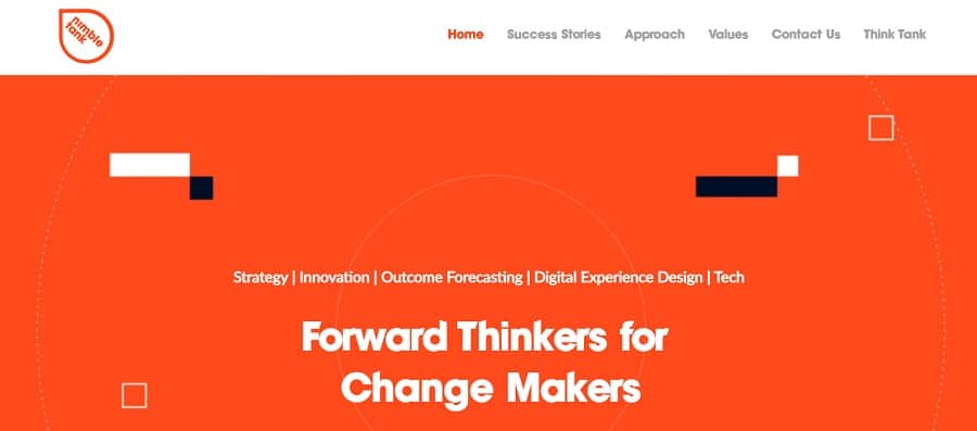
Although the website says a lot, it does so in an uncluttered and straightforward way. There isn’t anything to focus on other than the next phase of the buyer’s journey. The color palette uses orange, black and white. There are some shades of gray on the page we count in the black color family. Everything is laid out on a grid but some curves are added in for interest.
Animation
We love the fun and beautiful animation on the landing page. The text is inside a sort of bullseye that morphes and moves in and out, putting the user’s focus on the words. The use of orange to black is striking.
Limited Navigation Categories
It’s easy to let a website get bulky and take over the entire page. With Nimbletank, they focus on just five categories and the home button. It’s clear the next steps the user can take without any distractions to take them outside the path.
Mobile Responsiveness

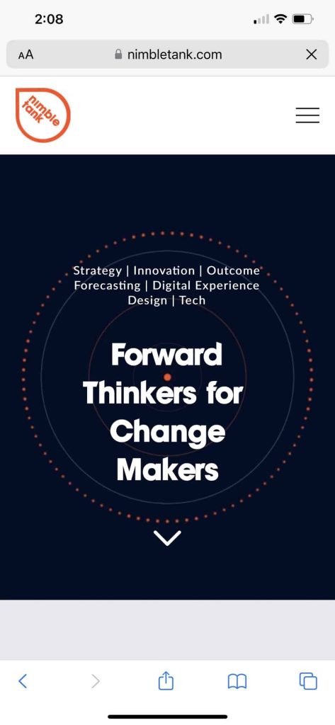
The mobile version of the site has animations, which is rare for smaller brands. We love the way it looks and matches the desktop version. The mobile responsiveness of the page is one of the things that put Nimbletank in the lead for this coveted award. Without a strong mobile presence, your site may miss potential customers who visit the internet only on mobile devices.
What We Would Do Different
We adore the design, the animations, the bright pop of orange and the simplicity of the site. One thing we would change is some of the wording. It isn’t immediately clear what Nimbletank does as a business if you aren’t aware of their work. It would serve them well to work on their headlines and taglines a bit. Even the success stories don’t always point to specific services they offer.
Tweaking some of the language is a thing almost every website can do to improve conversions. With so much to love about this site, it’s really a pretty basic fix. They’ve likely focused on messaging for clients and missed a few key components on their site because they haven’t had the same amount of time to invest. We recommend a wording audit and a few phrasing changes and this site will really shine.


Leave a Comment