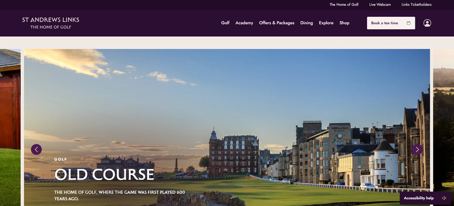


What better way to start a new year than by looking at an industry we still need to cover in our awards areas? Golfing is a highly popular sport, with enthusiasts visiting courses around the globe. We started by looking at some of the top golfing greens in the world and narrowing our choices to those with well-designed websites. Our final choice for the Designerly Award for web design is St. Andrews Links.
Why Golf Is Big Business
Golf is big business. According to the National Golf Foundation, about one-third of U.S. citizens over five have played golf. The industry brought an estimated $34.9 billion in revenue in 2025. Whether you run a supportive business, such as working as a golf coach, producing tees or owning a golf course, studying what makes St. Andrews Links’ site stand out will help you tweak yours. Other industries can also learn from studying excellent design.
About St. Andrew’s Links

St. Andrews Links is in the town of St. Andrews, Fife, Scotland. The history dates back to the early 15th century, with the Old Course still available today. The location features eight courses players can utilize.
Why We Chose St. Andrew’s Links as our Designerly Award Winner
Here at Designerly, we take website design seriously. Some of the standards we write about frequently are the same ones we use when determining which sites we consider the best of the best. Some of the criteria we looked at included:
- Mobile responsiveness
- Speed
- Aesthetics
- Typography
- Images
- Color Palette
- Animations
- Interactivity
- Calls to action (CTAs)
- Footer
- Content
Since 77% of users own smartphones, we put extra emphasis on mobile responsiveness. Website owners have had plenty of time to update their sites and ensure mobile experiences are as good as those on other sites.
1. Navigation
The hallmark of excellent navigation is keeping it minimalistic and to the point. Particularly on mobile devices, users need to be able to select options quickly and find the most pertinent information.
St. Andrews Links offers six categories in their primary menu, including Golf, Academy, Offers and Packages, Dining, Explore and Shop. Each category is succinct. The user knows exactly what they’ll find under each section. The mobile version collapses into a hamburger menu.Click the menu icon to access each area. Click the menu icon to access each area.
2. Aesthetics
Since St. Andrews Links has a regal background, the deep purple is an excellent choice, as it evokes images of princes and castles. The neutral border and background showcase the pictures and keep things balanced.
Some of the text is in color, particularly in the footer, in deep purple. It pops and adds to the overall luxurious effect.
3. Mobile Responsiveness
The site works just as well on a smartphone as on a desktop. The images are scaled for a smaller screen, the text is legible, and everything shifts so it makes sense to swipe and tap.
The site also loaded quickly, including the larger hero images. Since people expect sites to load quickly, we consider this when determining the winner of our design award.
4. Typography
St. Andrews Links uses Flowing and Arial fonts. While both are sans-serif fonts, looking a modern edge set against a vintage backdrop, Flowing offers some additional style that works well for headings and subheadings.
Flowing sits almost on the edge of a serif font, with slightly wider strokes at the edges of letters. Notice the capital “H” and how the top points are marginally wider than the stem.
5. Images
The site uses bold, vivid images to showcase the location’s beauty. You can see their courses, buildings and surrounding countryside. The use of several of these images in the hero header slider pulls the user into the location and makes them want to learn more about visiting. Since the goal of a business website is to attract customers, adding large, bold images works well.
6. Calls to Action
The “Book a Tee Time” CTA button is at the top of each page, driving users to take action. However, there are other CTAs sprinkled throughout, depending upon your reasons for visiting St. Andrews. Various offers, packages and training lead the user through a strong sales funnel meant to capture leads and convert them.
7. Footer
The foot on this website is art in itself. The background is deep purple, with gold-accented text. They add some logos to showcase their partners, such as Rolex, TORO, Golf Channel and Callaway. The first part of the footer prompts the user to sign up for the newsletter or follow them on social media. Under the initial section is a secondary navigation portion of the site. Finally, a thin black band offers links to privacy and cookie policies, along with other compliance statements.
What We Would Do Different
No matter how excellent a site is designed, there is always room for improvement. You shouldn’t design your site and forget it. The best sites frequently update based on user feedback to ensure the best possible experience. We would like to see St. Andrews Links add more content. While there is a lot of information available about visiting, the site is lacking some personality and the strong brand voice that comes from a well-planned blog. More than news, we’d love to see tips from instructors at their golf academy, stories from users, and tips for getting the most out of a visit to the area.
Overall, the site is an excellent one for anyone in the golf industry. Those in travel and events may also find the design a helpful study in how to create something that engages users. Congrats to St. Andrews Links on securing a Designerly Award. We’ll be interested to see what it looks like in a few years and how it morphs with technology and industry changes.
Leave a Comment