

A font combination can amplify a project. Fonts are often the first thing viewers see when they look at a journal, article, website, or other project. Designers should choose the best font combinations that make the text stand out but are also readable and professional.
Best Font Combinations

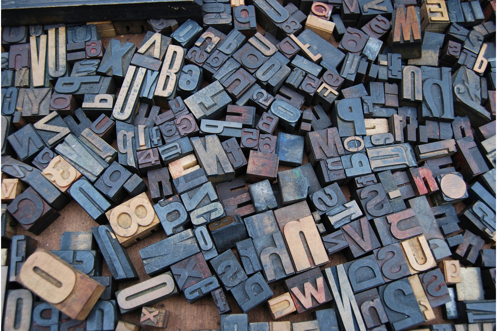
Typography, or configuring typefaces into the correct mixes, is an essential practice. There is a plethora of font combinations. A good rule is to have a font for the heading and a different one for the text. Usually, one to three fonts work well with a singular one. Below are a few of the best font combinations.
- Lato and Abril Fatface/Grand Hotel/Arvo/Playfair Display
Lato is a great text font. It is clean, clear, and readable. Its structure is also simple and light, bringing a neutral and friendly tone to the project. Several heading fonts work well with Lato. Abril Fatface is bold and elegant, grabbing the attention of the viewer. Grand Hotel is sleek and looks handwritten. Arvo is sturdy and appears geometric, inspiring confidence. Playfair Display is also elegant but with a high contrast. Its striking appearance makes a sophisticated heading.
- Work Sans and Fugaz One
Work Sans is a clean and easy-to-read text font. It pairs well with Fugaz One, which has a geometric and italic style that brings energy to the project. Work Sans Bold and Work Sans Regular are from the Work Sans font family and work well as a duo. They provide a necessary contrast, but also make a project look succinct thanks to their similarity.
- Space Mono and Plus Jakarta Sans/DotGothic16
Space Mono works as both a heading and a text font. It is a heading font for Plus Jakarta Sans because of its retro technological feel. A good retro look has variations of sans serif with different angles and curves to maintain the vibe. The font has a monospace structure with a clean, readable, and technical foundation. Due to its clarity and readability, it can also serve as a good text font for DotGothic16.
Plus Jakarta Sans is a good text font for Space Mono because it is readable, creating a friendly and professional atmosphere. DotGothic16 is a nice heading font for Space Mono. It takes the retro vibe to another level with pixel art.
- Raleway and Merriweather/Roboto Condensed
Raleway is a versatile heading font. It features sleek strokes and a neo-grotesque design. Its interesting makeup makes headlines pop. Merriweather is a complementary text font due to its classical, condensed letterforms. It provides a comfortable reading experience, especially for online projects. Roboto Condensed has a fine weight that pairs well with Raleway’s heavier heading font.
- Inter and Krub/Syne/Spline Sans/Supreme
Inter works as a heading font for Krub and is a text font for the rest. It has clean, contemporary lines that make it stand out as a heading. However, its streamlined design and crisp, legible text also make it an ideal text font. Krub creates contrast with Inter because of its distinct looped letterforms, sparking visual interest. It also has balance and clarity for an easy read.
Syne is bold and ever-expanding. It adds character to a heading when paired with Inter’s text font. Spline Sans and Supreme are both suitable heading fonts for Inter because of their clarity, readability, and professionalism.
- Oswald and Source Serif 4/Montserrat Light and Cooper Hewitt
Oswald is a solid heading font with bold, condensed letters that grab viewers’ attention. Source Serif 4 is refined and readable, creating a strong visual image when paired with Oswald. Montserrat Light and Cooper Hewitt work as a duo with Oswald, functioning as subheading and text fonts. They are both highly functional and readable.
- Mulish and Arima Madurai/Philosopher
Mulish is a minimalist font with a polished, easy appearance. It is beneficial as a solid text font. Arima Madurai makes a good heading font because of its flowing curves that inspire warmth and creativity. Philosopher is elegant and modern, grabbing the viewer’s attention as a heading. It is also versatile and highly legible.
- Nunito and Lora/PT Sans
Nunito is a rounded font that sparks warmth, friendliness, and invitation. Its unique edges make it a heading font. Lora and Nunito are a good combination because of Lora’s structure and readability, inspiring elegance and sophistication. PT Sans offers a structured design with a polished, neutral style that complements Nunito.
- Cinzel and Fauna One/Quattrocento
Cinzel is an elegant, Roman-inspired font. Its decorative, grandeur capital letters make it a staple heading font. Fauna One is soft and more condensed than Cinzel. It also has natural letterforms, making the text readable while contrasting its heading font. Quattrocento has delicate strokes and curves. It is a more traditional pairing, sporting similar lengths and widths to Cinzel.
How to Choose a Font Combination
Font combinations are simple to choose once designers know what to look for. Fonts with different weights and heights are ideal because they demonstrate a clear visual hierarchy and guide readers down the page. There should be a contrast between fonts. Letter spacing and line height also matter. Ensure they create a visually balanced, readable design.
Finding fonts in the same family creates a cohesive feel while also visibly contrasting each other. Choose different weights such as light, regular, or bold. Also, pick styles like italic or condensed. As long as there is a visual difference, it makes a good combination.
Check fonts on different types of screens with varying backgrounds to make sure they remain readable and visually pleasing. If designers choose a decorative style, ensure it is still legible. Headings should be more impactful than the regular text. Designers must limit themselves to two to three fonts per project. Too many fonts make projects look cluttered and unprofessional. Additionally, consider the project’s context. What fonts are appropriate?
Importance of Choosing the Best Font Combinations
Choosing the best font combination ensures a designer’s project is attention-grabbing and legible. Each font must match the tone and style of the piece while also meshing well together. Noticeably poor font combinations can deter readers from continuing to view a project. If they cannot read a font, then they will probably click away. Designers also want to remain professional. Selecting a font combination that showcases this while also having a unique flair is ideal for projects.
Good Font Duos
Fonts are among the first attributes of a project people notice. They should be readable, attention-grabbing, and match the piece’s tone. The best font combinations achieve those things while also blending well together. Choose from the list above or create one using the provided information. Happy designing!
Leave a Comment