

What is it that makes a fabulous design? It’s about aesthetics, but also more. It’s about good layout and then some. Many factors contribute to what engages readers and keeps them coming back. One of the best ways to learn excellent design is to study other designs, which is the reason we choose a design award winner each month for our Designerly award. This month’s winner is Cayman Turtle Centre on Grand Cayman in the Cayman Islands.
How We Choose the Winner: Methodology
We try to feature winners from all over the world, because design is a universal language and the best sites come from various sources. Narrowing down the options to the best designed sites is a daunting task. There are millions of websites. We start by looking at a category, such as nonprofit sites. To give you an idea, there are over 10 million nonprofits globally.
You can see why we have to narrow the options down further. We then look at types of nonprofits and choose a niche, which takes a bit of digging, too. One thing we consider is if we’ve covered a similar category before. Finally, we hone in on something like saving sea turtles. We then wound up nixing the nonprofit category because Cayman Turtle Centre is a government-owned commercial enterprise. However, they are still doing good work to educate people and help sea turtles.
We then compare the site to others in a similar category and rank them on aesthetics, readability, speed, navigation, quality of content and numerous other factors. The winner stood out from the rest for multiple reasons. Each element gets a score between one and five points, with five being excellent.
Winner: Cayman Turtle Centre

Source: https://www.turtle.ky
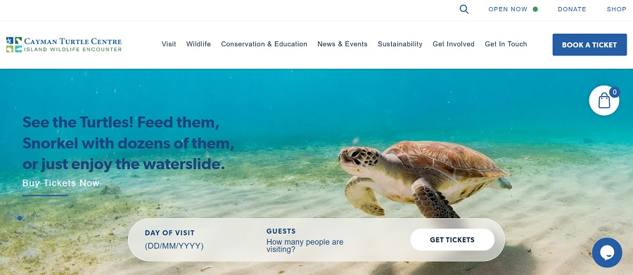
Cayman Turtle Centre is the largest land-based sea turtle attraction in the world. People can swim with turtles in a lagoon, hold a turtle and learn why they’re endangered. Visitors can see turtles in all their life stages as they learn about conservation efforts, such as repopulating wild sea turtles.
The center is located in Grand Cayman. The facility is in the West Bay district, about eight miles from George Town – the capital. They also serve for recovery of green sea turtles, helping them and returning them to the sea when possible.
Why We Chose the Cayman Turtle Centre as Our Winner
Although a staff member has been to the centre and was impressed with the level of education and efforts to repopulate green sea turtles, we looked at the site through a design lens, ranking each category separately. It’s an added bonus that they do good work for conservation there. We found the site stood out from competitors in the following areas:
Page Speed
The site loads at a lightning speed, taking well under a second to appear. The mobile experience was similar, pushing the score to five full points for page loading times. Having a fast-loading page prevents visitors from getting aggravated and bouncing away from your site.
Color Palette
A site’s style is probably one of the most difficult aspects of ranking. We have to be cautious not to allow subjectivity into the mix. For the Cayman Turtle Centre, using blues and greens makes perfect sense with the ocean theme. However, what we really loved about this site was the ample white space to keep it from being too busy.
Navigation
The navigation is listed across the top of the page for easy access and limited to seven categories. Since the most common reason for people visiting the site is to plan a visit, they have a call to action (CTA) button embedded in the navigation bar. They also offer a spot on top of the hero image to book tickets.
Clear Purpose
Once you land on the page, there is little doubt what they are about – everything turtles. You’ll find a lot of “learn more” CTAs and information revealed as you scroll or hover over elements. When you understand your unique value proposition (UVP) for your business, it’s much easier to work elements into your website design.
Your UVP can make you stand out in your industry and drive more visitors than you otherwise would. The Cayman Turtle Centre’s website does an excellent job of presenting their UVP and events that will draw visitors.
Images
Bright, vivid images of sea turtles rotate on the hero slide, grabbing the reader and pulling them into the world of sea turtles. The site also uses a nice balance between text and photos so the ones they did use stand out and serve a purpose. While visual elements are appealing to your users, you can overdo it with too many images. Take a step back from your computer screen when designing and consider whether there is enough negative space for balance. The best images should be set apart so the user can focus on them.
Typography
The site’s logo uses a serif font with thick and thin strokes to create visual interest. Alongside the serif font, they use a sans serif for headings and body text. By combining the two, the designer creates a visual hierarchy that makes it clear what details are most crucial.
Content
This site stands out for content, containing enough information to keep readers interested for days. In addition to efforts, they offer events, general educational info about turtles and news about the organization.
What We Would Do Different
The Cayman Turtle Centre website hits all the high notes in design. One thing we would probably change is to move the booking CTA off the hero image. It detracts from seeing the full image on a smaller screen and is distracting. However, you can learn a lot by studying this award winner and applying many of the same principles to your designs.


Leave a Comment