

In This Article
When choosing the best button colors for your website, there are a few aspects to making the right decision. Colors matter because they affect us in many different ways. Various shades can have an emotional impact on the viewer. Learn about how colors can make a difference for the best button colors for websites. Additionally, there is a list of colors to choose from if you feel overwhelmed with color choices.
How Colors Make a Difference
Color can be a major contribution to your conversion rate. Evidence shows 93% of shoppers use color as one of their primary reasons for purchasing a product. However, when choosing the best button colors for your website, you must keep looking for new ways to grab attention. After all, many other website owners know to tap into color psychology. How can you be different while still using best practices?
Grab users’ attention by testing a color scheme and seeing how your audience responds. Avoid missing an opportunity to connect and convert. Your business should treat color buttons as part of your strategy for increasing conversions.
Why Do Colors Make Such a Difference?
Colors can inspire a variety of emotions and reactions. They can also have different meanings to other cultures. It’s always a good idea to find out what works best for your business and its brand.
Although, if you’re having a hard time finding the right colors, here are some suggestions.
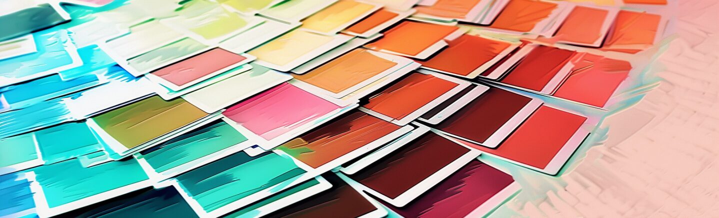
10 Best Button Colors for Websites
Blue Hues

Hex #4681f4

Hex #5783db

Hex #55c2da
These shades are bright but also complementary to many other colors. Blue is one of the best button colors for websites because it makes them easy to find. Both men and women like the color blue, making it attractive and comfortable.
These colors also suggest feelings of trust, loyalty, and calmness. Blue is also seen as a color of stability and people commonly associate it with security, reliability, and logic. Blue goes well with grays or contrasting hues, such as orange and yellow.
You’ve likely noticed blue used for banking logos and websites. People tend to trust institutions with traditional colors and practices. They tend to use deeper shades, such as royal or navy. Use Hex #4169e1 for royal blue. Use Hex #000080 for navy blue.
If you want a hipper, more modern vibe for your site, turn to shades such as electric blue or aqua. A soft sky blue works well for artistic endeavors and kids’ topics.
Green Hues

Hex #5dbea3

Hex #33b249

Hex #5adbb5
These shades of green may be the perfect choices of colors for your website. The colors introduce feelings of peace and calmness. Green is often associated with motivation, money, restoration, and the environment.
For example, if you own an organic coffee company, adding green inspires the user to think about nature and realize your product is superior. A green call to action (CTA) button can also instill a feeling of calm and remove worries about whether the buyer can trust your company.
Consider the purpose of your branding. Do you want to hint at natural materials? Using earthier greens makes more sense. You could even pull in some darker hues, such as a forest green with Hex #228B22. Try Hex #7da27e for an earthy green.
Purple Hues

Hex #a881af

Hex #80669d
Purple suggests feelings of power, quality, and truth. It’s also a soothing color, and people rarely use it for their websites. So, if you do decide to use these shades, you’re more likely to stand out.
Some people see deep, luxurious purples as regal and elegant. Try Hex #301934 for a dark purple and Hex #430541 for an eggplant hue.
Another reason to use purple tones is it encourages people to slow down and think. Deep thinkers may wonder why you chose purple over another shade. Others will have a sense of the uniqueness of the design. If you aim to inspire these feelings, the purple shades above are the best button colors for your website.
Pink

Hex #dd7973
Pink is an excellent color for buttons, and people generally see it as romantic and feminine. If your audience targets younger women, this shade is perfect for coming across as a woman-focused brand.
Pink promotes feelings of warmth, nurturing, love, and tranquility. This shade can also reinforce your message of love and warmth if that is what you use for your branding.
As with most colors, there are many different hues from which to choose. A baby pink of #f4c2c2 might work perfectly for a parenting website where you offer childcare tips for the early years. A pale pastel pink of #ffe5ec works well for wedding sites or portrait portfolios. A vibrant hot pink like #FF69B4 is well suited for an e-commerce store selling women’s swimwear or any type of summer product.
The tone of pink you choose will set the voice of the brand. Vibrant hues may bring more fun and youthfulness to the design. Pale hues create reassurance and are perfect for a wedding website design or florist.
Yellow

Hex #ffbd03
Yellow is youthful and exciting. It is often associated with the warmth of the sun and will grab your audience’s attention. Yellow works best as a background color with dark text for contrast or as an accent color to grab user attention, making it the perfect option for a button color.
If many of the elements on your page are darker, a pop of yellow draws attention to the CTA. You could also go to a lime color such as #DBE80C or an orange-yellow like #FFBA0D. Consider your brand’s color palette and choose colors that mesh well. You can also stand back from the design and see if it achieves your goals.
Colors in the yellow family also promote feelings of creativity and friendliness. If you choose to go with a sunny hue, your customers are more likely to buy, especially if they feel happy.
Red

Hex #ED0800
If you’ve visited many sites, you’ve likely noticed the popularity of red as a CTA button. Red is an exciting color that evokes passion. It grabs attention and pulls people toward it. Most of the deeper red hues pull the user in and make them want to take action.
The shade above is a very bright pop of scarlet. You could also use something like #A10500 for a brick-red, #610300 for a deep maroon or #E10600 for a true red. Red can tend more toward orange, blue or purple. Select according to the emotional message you’re trying to exude.
Try different shades and conduct split testing to see what your users respond best to. One audience might prefer a deep brick-red, while another might like a stop sign hue. Subtle variations can make a huge impact on your conversion rates.
Neutrals
Don’t overlook the power of sticking with a tried and true button color such as black or white. Many sites now outline the button in one of these colors but leave the center transparent to grab interest and set it apart from the rest of the design.
The beauty of a neutral button color is that you can shift the images or background around and not have to redo your CTA. Adding in transparent elements gives your site a modern edge and a touch of elegance. You can create an outlined button with text and transparent background for an almost seamless design.
Now that you have an idea of some of the shades you might use for a button and why, don’t feel limited by the options we’ve given here. You can try out any shade imaginable until you hit on the perfect one to stand out against your design and drive visitors to convert into leads. Here are some things you should focus on when creating your design.
1. Make Sure the Color Stands Out
The buttons on your website should be so evident that it is hard to miss. Colors can be vibrant, but make sure the color contrasts and stands out against the page’s background. You want to avoid using a color that blends in with the rest of your website.
For instance, if you have a lot of blue on your site, go with yellow buttons. If you have black or white, a red color will stand out. It’s always best to ensure you choose a bright color to capture visitor attention.
2. Use Consistency
A button needs to have the same color consistency throughout your website. If you have a green call-to-action button, make certain your hyperlinks, and anything else that’s clickable, has the same color. Of course, consistency enables the user to see the color more clearly. Consider the various patterns that direct users to intrinsically understand what to do next.
The power of suggestion exists to show the user they can click on the button. You’ll want to avoid using different colors for several reasons. For one thing, it won’t be appealing to the eye. Plus, it may confuse your visitors on where to go next.
Those visiting your site might not understand why they prefer it to a competitor’s, but they will instinctively understand the effort you put into getting colors, words and layout just right for their user experience.
3. Consider Size & Placement
Your button’s size can make a difference in how well it converts. If you make it too small, people might not notice it. Make it too large and they may feel you only care about selling something. Color alone doesn’t give them enough information to make an informed decision. Consumers in the 2020s are quite savvy.
An eye for design helps determine what the correct balance is. Allow for enough white space around the button and the text while still grabbing attention. Test the look on both larger and smaller screens. Will the user be able to easily tap the button with a finger on a mobile device? Is the area easily clickable with a mouse on desktop screens?
You should also think about where you’re placing the button on the screen. Above the fold might be preferable for an item people are likely to buy without knowing all the details. However, a higher-ticket product or things that are more complex may require a bit of text and detail before offering a CTA.
4. Keep Testing
It may be tempting for you to choose a color and leave it be. Rather than opt for a color and hope for the best, test it out. Businesses often use A/B testing to see which colors convert at the highest rate.
Amnesty took a look at Alexa’s top shopping websites and studied CTA buttons. They found around 20% were the color red, 19% green, 18% blue and 17% orange. Red won out as the most popular color as in similar studies in the past. People just gravitate to the shade. The results may not always apply to all situations. Nevertheless, you can use your testing to see which color scheme captures the best results.
Once you’re able to collect enough data, use the best color for your site. Then you can choose another color to compare and test it all over again.
Another way of testing is to ask your audience. Take a screenshot of your website and post it on social media. Create a survey in your post and ask users to vote on the best color for your site.
Which Colors Will You Choose? The Best Button Colors for Websites
Sometimes the effects of color may surprise you. There are many color choices to choose from, but only you can use your insights to make the best decisions. Which color will you decide to use for your website today?


Leave a Comment