
Every part of your website works together to create a brand identity. Even the fonts should match the overall tone and personality of your business. Finding the best fonts for websites is no easy task. You have to consider the mood, the hierarchy of the typography on your page and how readable it will be on different screen sizes.
According to Internet Live Stats, there are about 200,000 active websites, although the number changes frequently. You’re competing with social media and other sites for attention. If you want to stand out, you must pay attention to your design’s every little detail, including your font hierarchy.
Even if you just search for the term “free fonts,” Google returns about 19 billion results. There is a wide supply from which you can choose the best fonts for websites. They fall into certain family types, such as serif, sans-serif, script and decorative. For reading purposes, serif or sans-serif are your best options. Go for a traditional style such as Times New Roman or Verdana. For headlines and logos, you can choose something a bit more unique.
Figuring out what is the best font for a website starts with understanding the fonts available. There are four basic types of fonts.
Serif
Serif fonts have the little accents on the tails and stems of letters. Serifs can be a simple line or a curved end. They have a classical look, giving them a formal edge. Examples of best serif fonts for a website include:
- Garamond
- Caslon
- Ogg
- Plantin
- Romana
These are just a handful of some of the fonts with a serif design. Make sure whatever font you choose works in different browsers. Some designers choose a Google font because they work in the popular Chrome platform and are free for personal and commercial use.
Sans Serif
If you want a font with a modern edge, sans serif lacks the extra flourishes of a serif typeface. This choice works well for headings and logos. Although some use it for body text, be cautious as it can become difficult to read on smaller screens. Examples of popular sans serif fonts include:
- Open Sans
- Istok Web
- Montserrat
- Proxima Nova
- Lota
- Avenir
When seeking out sans serif for body text, look for a style that isn’t too thin. If there are thinner points in the stems, they can almost disappear as you scale the type down to a smaller size.
Script
If you want a handwritten look, script fonts are an excellent choice. They give a formal event type look with cursive letters, swirls and connected pieces. Some scripts have more flourishes than others. Some popular script fonts used on websites are:
- Alex Brush
- Windsong
- Lobster
- Yellowtail
- Dancing Script
Scripts work best for headings and logos. They become unreadable in smaller sizes, especially on mobile devices, so stick with a serif or sans serif for body text.
Decorative
If you want to give your site a truly unique look, turn to decorative fonts. While there are many options available for download, you could also have someone create or refine a font with specific elements matching your business’ personality. Here are a few decorative fonts you might enjoy:
- Henny Penny
- Cinzel Decorative
- Carter Layered
- Cherie Bomb
- Runy Tunes
If you search for decorative fonts, you’ll find thousands of choices. Narrow your search as much as possible by adding keywords tied to your industry. With a little effort, you’ll find the best headline font available.
Combining Types
Most websites turn to more than a single typeface to meet their needs. Even if you stick to a sole type, you’ll use different elements, such as bold or larger and smaller sizes. Mixing more than one type of font works well. As a rule of thumb, stick with no more than two styles, although some designers get away with three and pull it together. Beginners should go with two.
A serif and sans serif combination tells users you are a company with history and traditions, but you also understand modern technology and consumer needs. One common use is a sans serif heading and serif-based body text. You can alternately flip the two and use the sans serif for content.
Script and decorative fonts should be reserved for logos and headlines. Using them in body text makes the information difficult to read and may frustrate your users. When using script or decorative, stick with one or the other. Try not to combine the two together unless they truly look outstanding, and the ligatures, tales, flourishes, weights and other elements match symmetrically.
Studying Sites You Love
Perhaps there are a few sites you enjoy, and you’d love to utilize elements of their style. One technique is to right-click on the page and inspect the design components. You can search for “font” and figure out what they are using for the headings and paragraphs. Once you know the fonts used, you can either use those same ones or search for similar choices.
Figure out which fonts pair best together, and you can make minor adjustments or find choices highly similar to the ones you’ve chosen.
Pay attention to the logos on those sites as well. Do they use a decorative or script font in their design? Perhaps the look is hand-drawn, and you can’t find it anywhere else. The inability to locate the look is the signal of a custom font. You may not be in a position to afford to hire someone to create a custom option for you, but you might be able to find a ready-made font with a similar look.
Add Flourishes
Another idea for beautiful website typography is using a single font but putting flourishes on your headings or logos. You simply use the same font but add a swash in your image editor to give it a more customized look. You can use something like Photoshop or Canva.com to add some interest to your design.
Which Font Is Most Pleasing to the Eye?
To find the best fonts for websites, start by knowing what you’re looking for, understanding the personality of your brand and figuring out your target audience. We’ve come up with gorgeous styles you’re sure to appreciate.
Jump to: Playfair Display | Arial | Helvetica | Georgia | Proxima Nova | Quiche Flare | Futura | Raleway | Ostrich Sans | Arabella Pro | Merriweather | Monospace | Open Sans | Tahoma | Arno Pro | Fira Sans | Avenir | Cera Pro
1. Playfair Display

Playfair Display is a Google font and is considered a transitional design. It was created in the image of late 18th century fonts with slender hairlines. Google suggests using it for larger displays and pairing with Georgia for a body font.
Unpigeon uses Playfair Display in the heading and body copy. Because there is limited text on the page, this works really well for this site. It might be a bit much if you tried to use it for an article or paragraphs of content. However, it works nicely for headings, subheadings and short descriptions.
2. Arial

When looking for best fonts for websites, don’t overlook tried-and-true sans-serif fonts such as Arial. It might seem boring to use at first glance, but one of the reasons Arial is so popular has to do with its versatility and ease of reading. The font translates well on both personal computers and mobile devices. It doesn’t distract from other elements on the page, because it is such a well-known and trusted font.
The Huffington Post uses Arial for most of its headlines and some of its body text. The design gives the modern magazine a more traditional look that states it is a serious news organization and readers should pay attention. Note the different weights of Arial used on the site.
3. Helvetica

Helvetica is a popular sans-serif font used by giants such as Facebook and BuzzFeed. It works well with digital, so you’ll come across it or fonts similar to it quite often. It pairs with Georgia, Open Sans and Museo Sans. It’s free, which is always a plus when you have to pay for every image, theme and aspect of your website.
4. Georgia

If you’re looking for the best fonts for websites that are safe and translate well across any type of device, Georgia is a strong contender in the serif category. The letters in Georgia are comparable to those in Verdana in that they appear bolder because they are stronger and larger than some other styles. One thing to be aware of is that Georgia is a very strong font, so if you pair it with one that is slender and tall, you can create an unbalanced look. If you use Georgia for your header, try to match with a stronger body font such as Verdana or Arial Bold.
The Wall Street Journal uses Georgia for both its headlines and body. It uses a Georgia family in its code. However, the body looks a bit unbalanced. For the purposes of web design, it might be better to use something slightly stronger or move to a sans-serif. Ultimately, the choice is yours, but you don’t want the reader to see that the body text is minuscule and assume it is unimportant compared to the headline.
5. Proxima Nova

Proxima Nova is a more modern-looking font but still has a newsy feel. It has a variety of weights, so you can make it bolder or lighter, depending upon your needs. It pairs well with Helvetica and Tahoma. This font has a wide footprint with letters such as “O” and “X” taking up a lot of space, even in lower case.
BuzzFeed uses the font families Proxima Nova as well as Helvetica and Arial. The result is a site with strong headlines and readable sans-serif copy. The pairing translates well on mobile devices. Finding the best fonts for websites requires a bit of trial and error before you hit on the right combination.
6. Quiche Flare

Quiche Flare is one of the newer styles available. It is a flared serif font and has foxtail ball terminals, geometric proportions and swash capitals. You can choose from different weight italics and special characters. The font isn’t well suited for body text but is perfect for an H1 heading or logos. It has a sort of traditional look to it and works particularly well for industries such as weddings and floral.
7. Futura
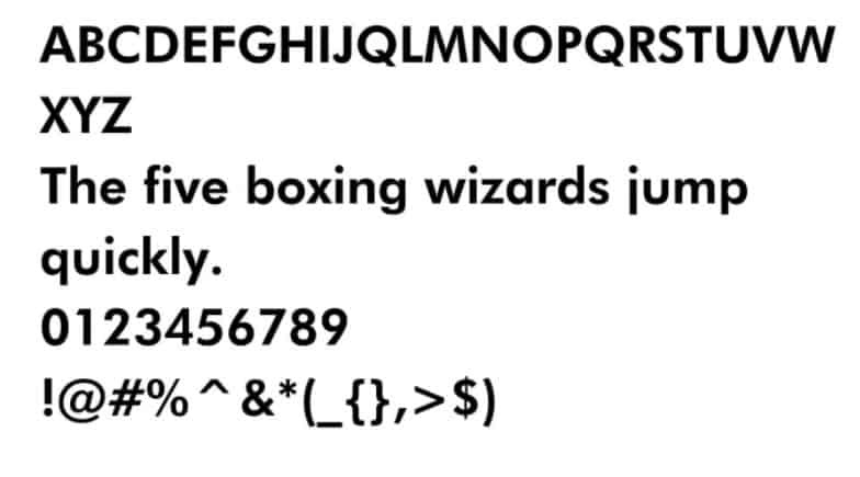
Futura follows the original ideals behind the Bauhaus movement. This particular font was changed from a metal type to what we have today. It is quite traditional, yet it has some modern touches such as curves and asymmetrical features for some of the letters. It works best as a display but also can drop to small sizes for captions or short blocks of text.
Draw With Music uses Futura. Notice the simple lines and the use of Future in headlines to set the tone for the site. There is plenty of white space used around the big letters, drawing attention to the headlines.
8. Raleway

Raleway is a sans-serif typeface with some interesting features, such as crisscrossing lines on the “W” and some other unexpected ligatures. The font was designed by Matt McInerney but was later expanded into a nine-weight family, and also now has a sister group called Raleway Dots.
9. Ostrich Sans

Ostrich Sans is a modern-looking sans-serif with a tall footprint. One reason it makes the list of best fonts for websites is its versatility. It comes in a variety of weights and styles. If you use bold, you’ll gain an inline look that is reminiscent of a diner sign, but if you use heavy, you’ll get blocky, solid letters.
10. Arabella Pro
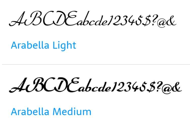
If you’re looking for something a bit more like a script for a logo or other featured text, Arabella Pro has a distinct calligraphy look to it. Note the extended serifs and swoops and swirls that give the font a handwritten look. The original style was designed in 1936, but today is digitized for OpenType. It pairs well with sans-serif fonts such as Futura.
11. Merriweather

Merriweather has a clean look that works well for financial institutions or businesses where client trust is a must. The Google font was originally created as a text face for onscreen reading. The x-height is tall but the letterforms condense. It is considered a serif font, but there are also open forms. If you don’t care for the serifs, Merriweather Sans offers a similar style without them.
Hannington Tame uses Merriweather font throughout its design. It is particularly noticeable in the headers but works well for the subheading descriptions as well. It works with other elements of the site to gain user trust.
12. Monospace

Monospace is actually a family of fonts with a fixed pitch. The letters and characters all take up the same amount of space on the y-axis. Google’s Monospace fonts include Fira Code, Roboto Mono, PT Mono and Nova Mono, among others. The letters are straight, and some have serifs while others don’t. There are some soft curves for letters such as “S,” and PT mono features soft angles for the lowercase “L” and “T.”
Wikipedia uses Monospace as one of its main fonts. It also uses sans-serif and Linux Libertine to complement it. The site is an online encyclopedia of knowledge, so the font works well as it screams educational.
13. Open Sans

If you’re looking for a humanist sans-serif font, Open Sans is a strong option used by thousands of websites. It comes in a variety of weights, including italic, light italic, open sans italic and semibold italic. The lack of serifs gives this style a modern edge.
PopCash utilizes Open Sans on its website alongside Lucida Grande and Courier New. Because it presents a new way for merchants to collect payments and support popular modern software such as PayPal and Wire, it makes sense to use a more modern look.
14. Tahoma

Tahoma is a sans-serif typeface from Microsoft. You’ll find two TrueType fonts in the font family and can choose regular or bold. You can scale the font to any size needed, so it’s perfect for responsive websites. It translates particularly well in smaller type, so it works for body content. It’s in the top 10 of the best fonts for websites and is used hundreds of thousands of times.
15. Arno Pro
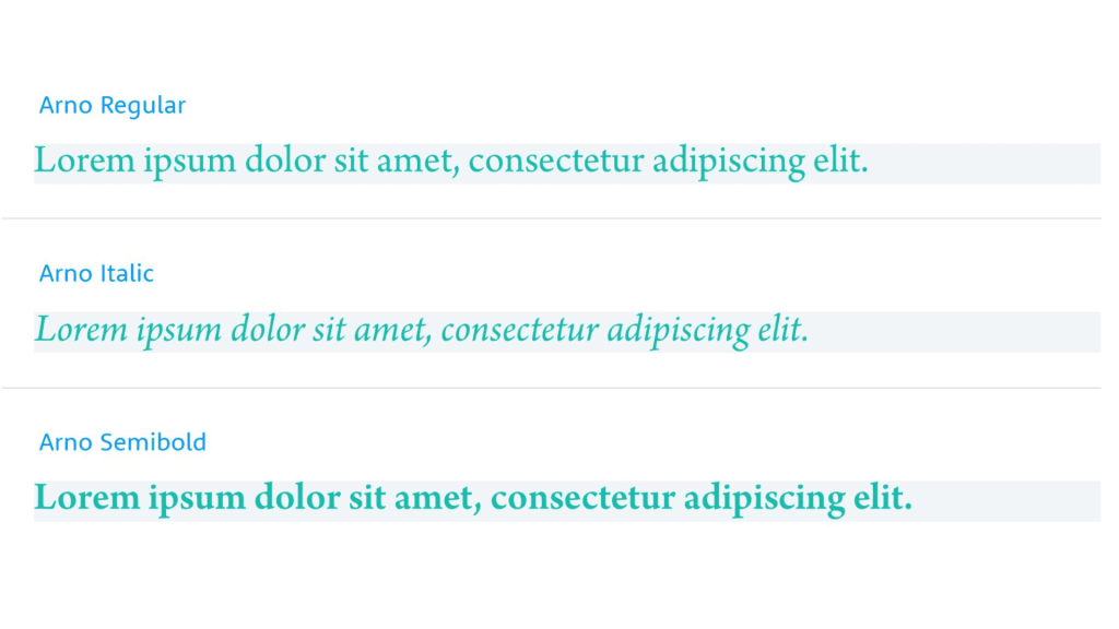
Arno Pro is an Adobe font designed by Robert Slimbach. There are 32 styles within the family, and other options such as bold italic and semibold. It comes with 2,849 glyphs and supports languages such as Vietnamese, Central/Eastern Europe, Western Europe, Baltic, Turkish, Romanian, Cyrillic and Greek. Arno Pro isn’t used as commonly as some other styles, but is a nice sans-serif font perfect for body text or headers.
The Pleated Poppy utilizes Arno Pro to give the blog a fresh, youthful look. It pairs the font with Helvetica Neue and Century Gothic. The font works particularly well for blogs and is readable across different devices.
16. Fira Sans

Fira Sans is another option for some of the best fonts for websites. It was created by famous type designer Erik Spiekermann and is meant to work with a wide range of sizes and in different image qualities. The family has three widths, each with italic available, and even comes with a monospaced variant.
17. Avenir

Avenir is a geometric sans-serif font designed by the same man who created Frutiger and Univers — Adrian Frutiger. He wanted a linear sans in a 20th-century style. The design has gradual weight changes to help with the needs of text applications. The book weight is better used for the body while the lightweight is better used for subheadings.




Leave a Comment