Designerly’s staff loves pets, so it was natural we decided to look at pet treat companies for this month’s award. We gathered ideas for cat and go favorite treats, narrowed the options to those that used quality ingredients and then popped over to the company websites to see which ones measured up, with our winner being Bocce’s Bakery.
Some of the criteria we used included whether the site was mobile friendly, how easy it was to order from their e-commerce store and the overall aesthetic appeal of the site. When choosing a winner for the Designerly Award, we factor in every good design element we can think of and narrow the options down until there is a clear choice that stands out as stellar in most areas.
To get to a single site, we have to choose a category for the month. For June, we chose to look at pet product websites.The American Pet Products Association released their annual State of the Industry Strategic Insights report for 2024. The U.S. pet industry is worth an estimated $147 billion, with projected growth to $250 billion by 2030. Of that amount, pet owners spent $64.4 billion on food and treats.
Walk into any retailer selling pet products and you’ll find some major brands with sleek product packaging and advertising. Bocce’s Bakery offers simpler packaging and appears in many boutique pet supply stores and online.
Winner: Bocce’s Bakery

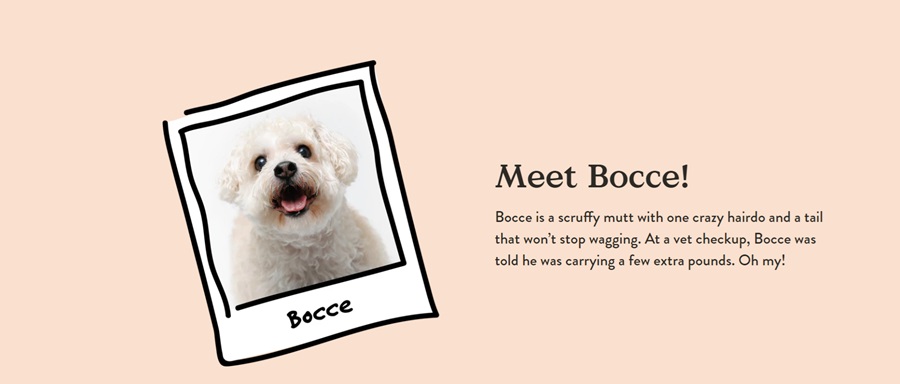
Andrea Tover started Bocce’s Bakery in her New York City kitchen to create all-natural, healthier treats for her dog. The company is named after her dog, Bocce. The company later expanded to cat treats and was bought out by Antelope in 2021.
Why We Chose Bocce’s Bakery as the Winner

We scoured various pet treat websites. While big players often have sleek, well-designed sites, they lacked the personality we found at Bocce’s Bakery. The color palette is unusual for a dog treat website, which is one of the many things that kept drawing us back to this one.
Everything about the design just works. Here are the various elements we appreciated the most and why Bocce’s Bakery ultimately won as our web design award for June.
Color Palette
The color palette features a pale peach as the primary hue with some neutral colors. This makes the product packaging pop. Many of the products have pastel package colors so they show up well against the light background. The black text also contrasts nicely with the theme.
Font
The logo is a word mark, using a sans serif font. The choice gives the site a modern look that should appeal to Gen Zers as they enter the workforce, get their first pet and find ways to care for their critters.
While it is a modern font, it is also easy to read on a variety of devices and equally appeals to older generations.
Story
A powerful story draws users into the website and keeps them. Bocce’s Bakery has a fabulous story about a woman whose dog was slightly overweight, so she went looking for natural treat options. Rather than give up when none were readily available, she created her own, and then sold them to other people.
Thus, Bocce’s Bakery was named after her dog and grew into the company it is today.

Cute Icons
A minimalistic design such as the one at Bocce’s Bakery calls for simple icons. The designers could have chosen outlines, but instead did mini sketches of dogs, cats and action emblems. The effect is fun and homey, matching the brand’s personality perfectly.
Navigation
The website navigation is simple and intuitive. The nav bar appears at the top of each page, with seven options.
- Shop All
- New
- Bundles
- Our Brands
- Subscription Box
- About Us
- Sign In
Under several of the options are subcategories so the user can drill down to the exact thing they are seeking. The icons under each menu category add to the overall aesthetic of the site and are one of the things that put this one ahead of others in the same category.
Unique Bundles
One thing Bocce’s Bakery does extremely well is put themselves in the shoes of their average buyer. With purchase habits in mind, they came up with a few bundles people are likely to enjoy made up of a variety of products.
They also offer a subscription box so people can share unique offerings with their furry friends and never be bored. Inside each box is a soft treat, crunchy biscuits, dental bars and poo bags. The boxes run $35 per month. Add on a supplement for $15.
Intuitive Shopping Cart
The other thing this site does really well is the shopping cart. It’s easy to use, quick add items and you can create an account and go back to your cart later. The process is intuitive and easy, reducing shopping cart abandonment rates.
The site and cart offer a strong visual hierarchy design to keep the buyer moving through the sales funnel.
Mobile Responsiveness
Before choosing a site as a winner, we always check out it from mobile to see how it functions. The site loads fast and is functional. It looks similar to the desktop version but is still readable.
We felt the mobile product pages were preferable to the desktop ones with the spacing working much better and the “Buy with ShopPay” standing out against the white background as it stretched all the way across the smartphone screen we used to access the site–an iPhone 12 Max Pro.
Buying quickly with ShopPay is convenient for mobile shoppers, making the process as simple as possible so they don’t bounce away.
What We Would Do Different
The site’s design stands out from the competition and is visually appealing. One thing we would change is to expand the product descriptions a bit more. While there is enough information to make a decision, the content is short and could use a bit more detail.
The list of ingredients is a nice touch, but one has to scroll a bit to get to it and the info could get lost if the user thinks the description is over. We like the addition of “other products your pet will love,” as they offer an opportunity for an add-on sale.


Leave a Comment