

Designerly staff chooses a website to feature each month to help our readers learn about the design elements we hold dear. Why does one website stand out over another? We dig into the details and teach you how to apply the best practices to your own sites, so you can draw customers and keep them coming back for more. We decided it was time to look to the medical field for a site and chose the Cleveland Clinic.
How We Chose the Winner: Methodology
Medical is a wide category, so we began by narrowing down the pool of options. Rather than a doctor’s office or some type of service, we decided to look at hospitals. You would expect major facilities to have beautiful websites, but we found many of them to be cluttered and difficult to navigate. They might offer multiple specialties but if the brand didn’t have a cohesive concept, the site was confusing at best.
At first, we cast a wide net when looking for a website to feature–paying attention to global offerings. As we narrowed the geographic scope, we realized many of the best hospitals in the world are in the United States, so we decided to study the American hospital industry and select a winner from there. There are 6,093 hospitals in the U.S., made up of community, government and private facilities.
We started with the recognizability factor. If we mentioned the place, was it likely people had heard of it? While there are many fine rural hospitals, for this particular award, we chose to look at larger cities. In the future, we might go back and cast a net over small, more rural ones.
We then narrowed the list further by assigning a point system for the following elements:
Key Features
| Page Speed | Color Palette |
| Navigation | Clear Purpose |
| Contact Information | Unique Value Proposition (UVP) |
| Images | Typography |
| Mobile Responsiveness | Content |
Each element was given a scale of one to five points, with five being the highest. If the page loaded in under three seconds, it received three stars, if under two seconds, four stars and under one second, five stars. The UVP was something new we looked at. Did the website make it clear why the brand stood out from the competition? This received one point. Everything else was also rated on a scale of one to five.
Website Award Winner: Cleveland Clinic
Cleveland Clinic opened in 1921, making it over 100 years old. Many medical firsts have happened at the hoQspital. Today, the clinic features 65,000 caregivers at over 200 locations. It serves around six million patients annually. In 1950, the Cleveland Clinic started the first dialysis program in the United States. By 1958, they began to haQve cardiac breakthroughs in angiography. Today, the hospital is a leader in cardiac surgeries.
Why We Chose the Cleveland Clinic as Our Winner
Although the organization’s history and ground-breaking medical discoveries is impressive, we looked specifically at its website design when considering it as our Designerly Award winner. We found it exemplary in the following areas:
Page Speed
The website loads in under a second, making it one of the fastest hospital websites we visited. The speeds are so fast that you barely have time to register you’re on the site before you see it. A fast-loading site is crucial when people are looking for care. They may have a diagnosis and need a specialist or a family member who is critically sick. By eliminating wait time for the site to load, the designer took one concern off the person’s mind.
Color Palette
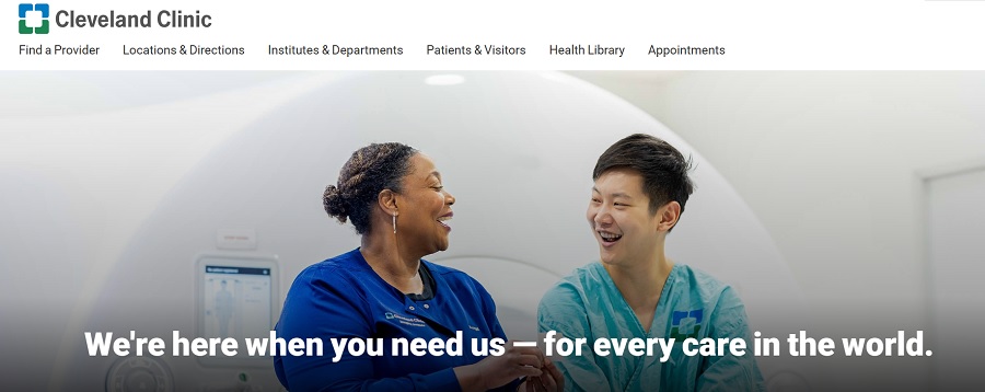
The colors you choose for your design matter. Studies show 78% of consumers recognize a company from its colors. The majority of people like blue and find it a trustworthy color. Cleveland Clinic uses a minimalistic design with white space and a logo with blue and green. The calls to action (CTAs) are blue and some of the most crucial text, like the toll-free telephone number.
Navigation
The website narrows down the options to six navigation tabs.
- Find a Provider
- Locations & Directions
- Institutes & Departments
- Patients & Visitors
- Health Library
- Appointments
When you click on a tab, you’ll find additional options like Parking, Lodging & Travel or Billing & Insurance in a grid-style layout. Under each option are additional links, keeping everything organized in a navigational hierarchy that takes site visitors where they need to go.
Clear Purpose
One of the questions we asked when narrowing the options was whether the website had a clear purpose. Many hospitals seem to lose their footing here. They might add a little news and such but the purpose of the site isn’t clear.
We gave Cleveland Clinic a good score in this area because of their easy-to-find CTAs and appointment links. The categories also show the purpose for each part of the hospital really well.
Contact Information
Knowing how to contact a hospital is crucial to figuring out appointments, where your loved one’s room is, or where to park. We like that a toll-free number is right at the top of the website and is clickable for those on mobile devices. The organization also places a small tab at the top that reads, “Need help?” You can find answers to frequently asked questions and local numbers. If you still need another option, it also has a link to a phone directory and how to contact staff by email.
UVP
A unique value proposition makes a company stand out from the competition. Cleveland Clinic includes one right in the hero header. It reads, “We’re here when you need us–for every care in the world.” This shows they are respected around the globe and treat multiple issues.
Images
The photographs on the website are of doctors, patients and staff, showing the company culture at the hospital. People are talking, laughing, smiling and showing empathy. By using big, beautiful images of a mix of situations, it draws site visitors in and makes them feel they are in the right place to get the help they need.
Typography
The san serif font gives the design a modern edge. There is a hierarchy to the typography as well, with headings being bolder and bigger than body text. It’s a reminder to choose a font that’s readable on different screen sizes.
Mobile Responsiveness
Most people access the internet at least some of the time via their mobile devices. It’s crucial any website you design is friendly to smaller screens. The Cleveland Clinic website offers the same experience for mobile as desktop and is just as if not more functional.
Content
The site has a blog that offers tips and advice. Some of the article titles include:
- How Stress Can Make You Sick
- The Teen Mental Health Crisis: How to Help Your Child
- How to Finally Stop Doomscrolling
By embracing current topics, the hospital draws in people concerned about these issues and turns them from readers into customers when they have a need for medical services.
What We Would Do Different
There isn’t much we’d change about Cleveland Clinic’s site. It is easy to navigate, user-friendly and visually pleasing. We might add changing header images to welcome people from all backgrounds to the site, but that is a minor limitation that will likely change with time anyway. If you want to study a well-designed hospital website, Cleveland Clinic is an excellent place to start.


Leave a Comment