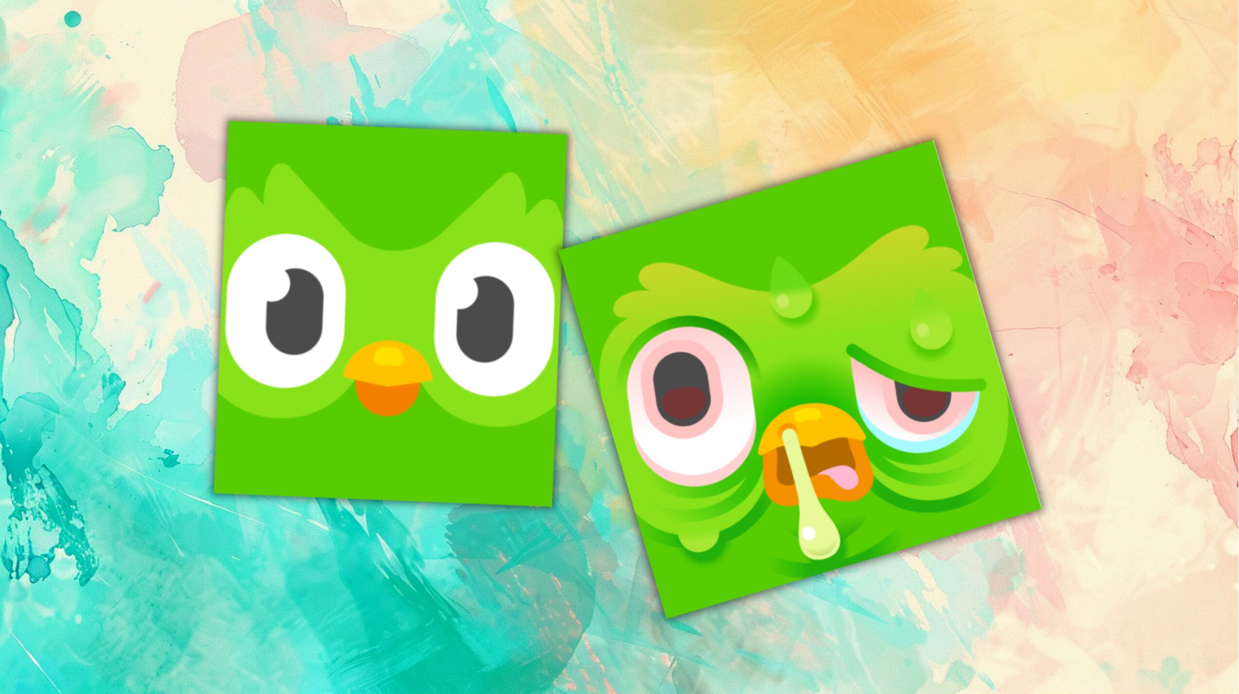


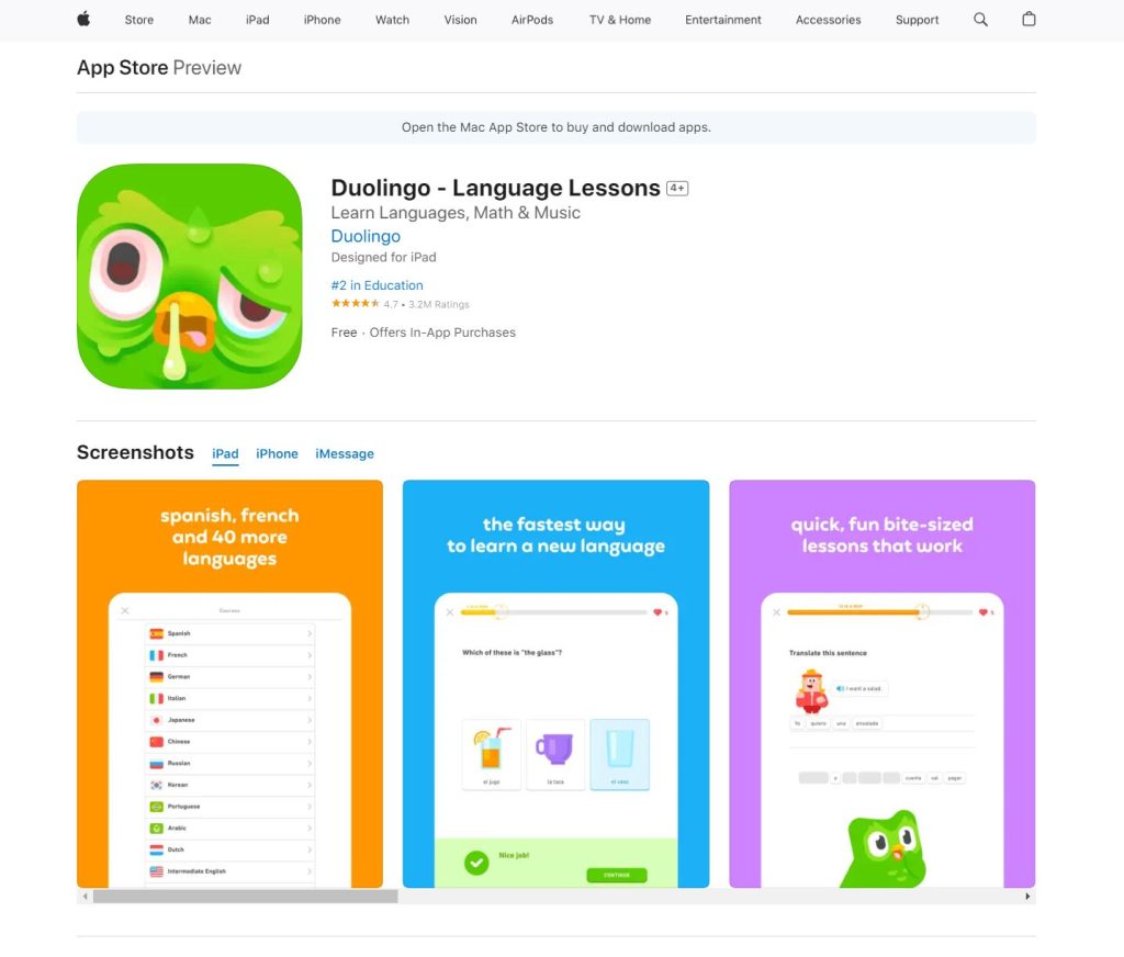
The Duolingo app icon went from chipper to sickly at the tail end of August. Duo the Owl, the app’s famous mascot, seems to be suffering. His usually bright eyes are red-rimmed, sweat is dripping down his feathers, and snot is hanging from his beak. What happened to him? More importantly, how can users return him to normal?
Why Does the Duolingo App Icon Look Sick?
Duo looks sick in the new Duolingo app icon update because too few users are staying on top of their lessons. The company cheekily stated he is “quite literally sick of reminding everyone to do their lessons,” adding that his symptoms aren’t contagious as long as users keep their streaks going. The red-rimmed eyes, snot-covered beak, and triple eyebags are effectively a guilt trip.
Since the brand normally sticks to a flat-design icon, this change was immediately noticeable. The subtle gradients, dramatic shading, and strategic highlights made Duo seem impossibly ill. Of course, the Duolingo icon isn’t sick — the green owl didn’t come down with something after handing out one too many reminders. In reality, this change was a marketing tactic.
The Marketing Strategy Behind the Duolingo App Icon
Duolingo has changed Duo’s look several times. The first change occurred in October 2023, when an app update made Duo appear to be melting. A spokesperson for the company said it was to encourage people to open the app by piquing their curiosity.
A similar change happened in April 2024 when Duo suddenly looked shriveled. The company explained that the Duolingo app icon update happened because Duo was “quite literally exhausted” from participating in recent marketing campaigns, mirroring the language they used to describe the August 2024 change.

The marketing campaigns in question involved a four-hour musical on ice — an April Fool’s joke — and a Brazilian butt lift. The so-called Duolingo on Ice jokes, “the tears of the innocent will please the owl,” leaning into Duo’s unique online reputation. The latter saw Dr. Miami, a plastic surgeon, and reality TV star, give Duo a BBL to remind users there are “no buts” about completing lessons.
The recent Duolingo app icon change followed a similar pattern. Most users who noticed it fell into two categories — they either posted about it on social media to figure out what happened or opened the app to see if their actions had any effect. The brand was radio silent initially, letting consumers generate talk and engagement.
User-generated content generally outperforms branded posts and advertising. In fact, 82% of Instagram users are more willing to purchase from brands that post it. When Duolingo gets people to post questions about the app and give tips on changing the icon, they essentially get free press.
How Duolingo’s Marketing Strategies Have Paid Off
Unlike other brands, Duolingo knows how to stay on top of trends. Initially, it went viral for being crass and overly relatable. Seeing how well the shock factor helped generate engagement, it continued. The company leaned into Duo’s growing reputation as a comically menacing and absurdly quirky character.
Most of Duolingo’s marketing campaigns rely on the novelty effect, which refers to the short-term metrics boost brands receive for introducing something. It works because the ventral tegmental area — a structure in the brain — activates when people interact with something new. This reward system regulates dopamine release and addiction, subtly incentivizing engagement.
Duolingo spends a lot of money on marketing. The operating expenses for its sales and marketing department reached about $75.8 million in 2023, up from $14.9 million in 2019. These figures represent an impressive 405% increase in five years. So, are Duolingo’s investments paying off?
In February 2023, the brand announced its 2022 earnings in a shareholder letter. It revealed its revenue had reached $369.5 million, up 47% year-over-year. It also grew its paid subscribers by 44% from the prior quarter, totaling 4.2 million users. In the same span, its total monthly active user base grew to 60.7 million, a 43% increase in the same span.
To date, the company has acquired 80% of its users organically. The main growth factor was a novel risk analysis tool its data science department developed. It classifies users as active, at-risk, inactive, or reactivated. If users open the app, they transition from inactive or at-risk to reactivated — revealing the true reason for the Duolingo icon being sick.
4 Ways to Make the Duolingo App Icon Normal Again
Although the Duolingo icon’s sick state will only last a limited time, many users are eager to return it to normal. There are several ways they can do this:
1. Wait for the App to Update Again
People can either wait for the icon to update or revert their app to a previous version. It can be time-consuming, so it isn’t ideal. Also, rolling back an update may re-introduce bugs or security weaknesses. However, this method might be necessary for new users.
2. Join the App’s Streak Society
Users who are a part of the Streak Society — as in those who have a 30-day streak — can scroll to the rewards section to find a new app icon. The strategy behind incentivizing users to use the app to change an ugly icon is brilliant. While the flame-eyed Duo isn’t as sweet or calm-looking as the normal icon, it’s not grotesquely sick.
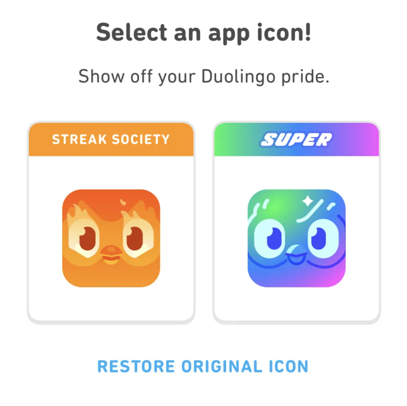
3. Subscribe to a Subscription Tier
Super Duolingo and Duolingo Max subscribers probably didn’t even realize the Duolingo app icon had changed. They get alternative icons as part of their membership. Since they’re already engaged and paying, the brand doesn’t alter visuals to draw them in.
4. Change the App Icon Manually
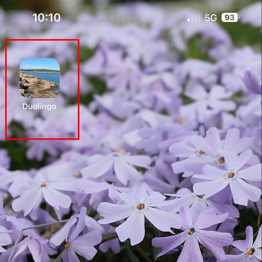
Individuals can manually change their app’s icon. On iOS, the shortcuts app — available on iOS 14 and later — allows people to change the appearance of apps on the home screen. Android users have many more personalization capabilities. People can either make a custom icon or replace sickly Duo with an image of regular Duo.
How to Change the Duolingo App Icon Manually on iPhone
There are more options for people still wondering how to get old Duolingo back. Those who don’t have a subscription or who aren’t members of the Streak Society can still change the Duolingo icon on iPhones.
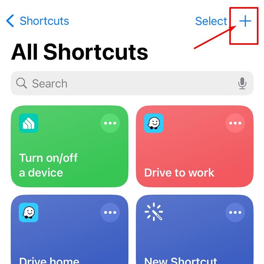
The Shortcuts App
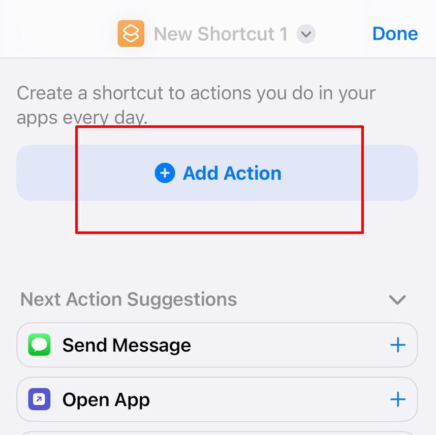
Shortcuts is a pre-installed app that can, among other things, change app icons on iOS. Once users open it, they need to hit the plus sign in the top-right corner.
To change your Duolingo app icon with Shortcuts, follow the steps below. If you want to change the icon back to Duo’s previously-healthy state, be sure to download an image of the original app icon to your photos before proceeding.
1. Launch the Shortcuts app and tap the “+” button.
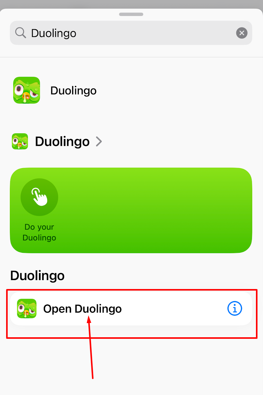
2. Tap “Add Action,” then use the search bar to find “Duolingo.”
3. Tap “Open Duolingo.”
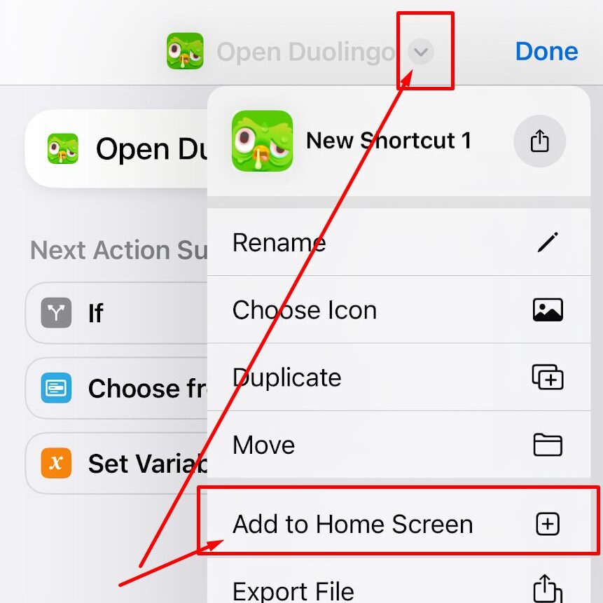
4. Tap the downward facing arrow at the top of the screen and select “Add to Home Screen.”
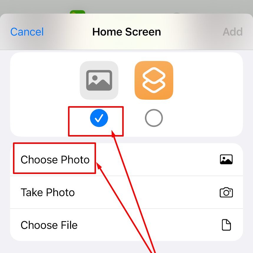
5. Tap the placeholder image icon on the left and select either “Choose Photo,” “Take Photo,” or “Choose File.” On this screen, you can also rename the shortcut “Duolingo” for easy finding.
6. Find and select your replacement image, and tap “Add.” You should now see the shortcut, along with your chosen image, on your home screen.
Icon and Theme Packs
Icon packs are another way to change the Duolingo icon on iPhone. While some cost money, many are free. Users can find dozens on the App Store. They technically work the same as shortcuts since Apple doesn’t allow customization. However, having hundreds of pre-generated, icon-sized images speeds up the process significantly if you’re hoping to change all or many of your icons.
How to Change the Duolingo App Icon Manually on Android
Learning how to get old Duolingo back on Android is much easier than trying the same thing on iPhone because of the Android system’s built-in personalization tools.
Wallpaper and Style
The Wallpaper and Style feature — available on Samsung phones — is the simplest way to change the Duolingo app icon on Android. Simply tap and hold on the home screen, select “Themes,” and tap “Icons.” Alternatively, you can use the color palette feature to match your icons to their wallpaper. Notably, these actions change every app, not just Duolingo.
Third-Party Launchers
The launcher most Android phones have doesn’t support icon packs or themes. Fortunately, dozens of third-party launchers on the Google Play Store let people change the Duolingo icon on Android. For example, Nova Launcher, one of the most popular options, lets users personalize their entire home screen. Everything from color to shape is customizable.
The Shortcut Maker App
Shortcut Maker is basically Shortcuts for Android. It is incredibly helpful for those still wondering where to change app icons. Simply tap “Apps,” pick Duolingo, and edit the icon. You can use gallery images, emojis, text, or system icons. The “Style” tab allows you to change the icon’s shape. Tapping “Create Shortcut” completes the process.
Why the Duolingo App Icon Will Keep Looking Different
When Duo looks different, the brand wants to increase engagement. To date, the Duolingo icon’s sickness marks the third app icon change along these lines. Since not everyone remembers the October 2023 or April 2024 updates — the novelty fades quickly — the brand will likely continue making similar changes.
So far, Duo has melted, shriveled, and become sick. The trend seems to follow a pun or saying, indicating Duo will “quite literally” embody one. Consumers may see it become tired, flattened, crazy, choking, or frozen the next time the brand decides it wants people to talk about it. Marketers and small business owners should take a page from this lesson.

Leave a Comment