


It’s time for our monthly Designerly award again. Each month, we choose a business category. We then look across a huge number of potential websites. Finally, we start narrowing the niche and choices until we uncover what we think is one of the best designs and sites in that category. This month, we chose Epoch Labs.
Decisions are fully independent. We have no connection to the sites chosen or advertising from the brand. These are the sites we think our readers can learn from and apply knowledge to their designs for similar companies.
Surprisingly, we haven’t yet covered the research industry. We kept coming back to the idea of labs and experiments. There aren’t as many businesses in this category as in some others, such as retail, so our choices were narrowed fairly quickly.
At the same time, we had to do a fair amount of research to ensure we understood the industry and what the website needs for businesses in this category.
The pharmaceutical industry researches medications, creates processes and distributes medicine. Each company can have its own specializations. In general, they serve a wide audience, answering to stakeholders, providing supplies to doctors and hospitals and informing the public. Pharma revenues are $1.48 trillion per year globally.
We looked at big names in the industry, such as Merck, Eli Lilly, Pfizer and Bristol-Myers Squibb. After a lot of consideration, we chose a lesser-known company out of India because of their relatable design. We do want to add that in no way do we endorse any one pharmaceutical company over another. Our choosing the website does not indicate how well they produce medications or operate. Our focus is on the website design solely, which we felt was stellar.
Winner: Epoch Labs
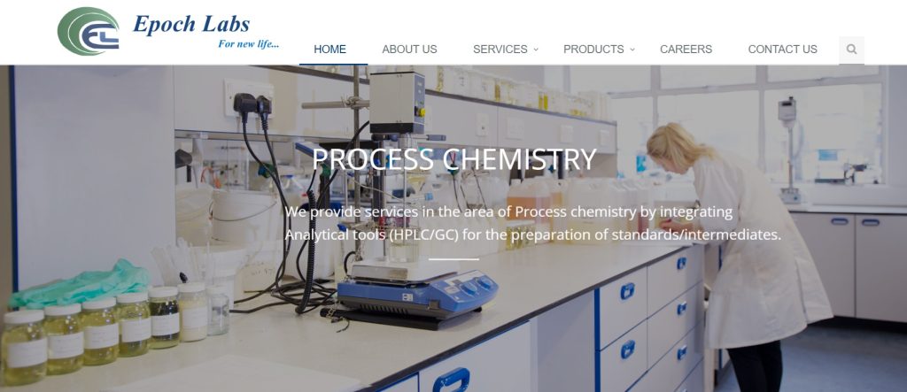
Epoch Labs has a cohesive design that makes it easy to find what you’re looking for. The company is based in India but the site is relatable to people from various locations. The strong hero image at the top of the page pulls the user in. Other elements are kept to neutral colors, so you’ll see pops of green and blue to lend an element of calm presence and trustworthiness.
We chose Epoch Labs because of all the elements coming together nicely and creating a vibe. They are located in Hyderabad, India. Their goal is to help other organizations improve their research and development programs. You might see a company such as this working alongside some of the bigger names in the pharmaceutical industry.
Why We Chose Epoch Labs as May’s Winner
As always, we looked at a number of factors before choosing Epoch Labs as our winner for this month’s Designerly award. It’s never an easy decision. There are thousands of worthy sites. It often comes down to how the site looks on mobile or other small features that bring the entire design together.
Designers should focus on those small details when creating a look. The more cohesive your site is with the brand image and pulling consistent elements together, the more likely it might win an award.
Hero Image
The first thing we noticed about Epoch Labs’ design was the hero image at the top of the page. It is the epitome of a relevant image telling the story. The current image showcases a researcher in a lab intent on her work. The image does rotate to some other generic chemistry-type visuals, but keeps coming back to the scientist. Choosing the right photos for your site can make or break your design. The colors must mesh with the rest of the page and the images should be unique and applicable.
Color Scheme
We enjoy the neutral color scheme with pops of blue and green. The shades lend trust to the company where someone might not know much about them. Even the hero shot has bluesin the equipment and the drawer pulls.
The brand logo is a navy blue with a mid-range green. By focusing on blue and green, the designer pulls the entire tone of the site toward the brand image and the logo. Accents and CTAs are in the same deep blue.
Easy-to-Understand Content
We glanced at the content on the site. The descriptions and details are easy to understand. Pharma research is a pretty niche field, but we could understand the gist of what the company does and who they serve by reading over their about page and their services.
Epoch Labs’ navigation is straightforward and easy to comprehend. The top of the page has six tabs with short labels:
- Home
- About Us
- Services
- Products
- Careers
- Contact Us
Under “Services” and “Products,” there is a drop down menu with additional selections. The logo is clickable to go back to the home page, which is a basic feature that makes navigation more intuitive. Many users know to click on the logo to go home. Since logos typically rest at the top of the page, it’s a great cookie crumb to leave for users. Navigation gets repeated in the footer along with links to their latest blog posts.
Calls to Action
We love the way the CTAs on the hero images are transparent. They don’t distract from the message of the photo but are still recognizable as clickable elements. Other CTAs on the page repeat the navy blue with a pop of white text. They contrast sharply with the white background.
Icons
We’ve noticed more companies adding icons to indicate categories on their sites. It’s a nice touch when done well that pulls users to the information they’re seeking. The science beaker icon next to each category is interactive. As the user scrolls over it, it turns from gray to navy blue, indicating you can click on the words and go to that website area.
Mobile Responsiveness
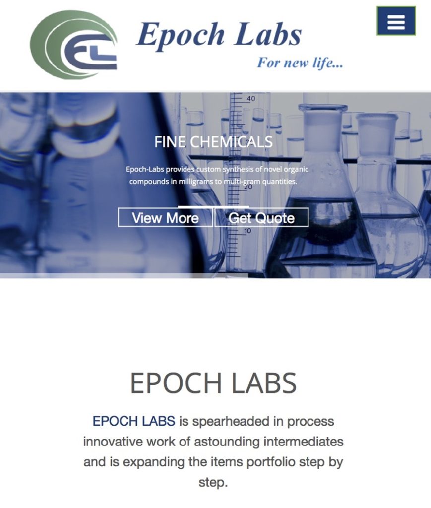
If possible, we like the mobile version of this design even more. Not only does it size perfectly, but it shrinks to a single column, making everything easily accessible to smartphone users. Smaller screens present challenges for designers but they’ve worked everything in and kept it easy to move around the site and find what you need.
What We Would Do Different
The design for Epoch Labs is impressive. It is simple but works. We usually can talk about mobile responsiveness as an area for improvement, but their design works well. The only thing we might do is expand a bit on the About information. Because they aren’t as well known as other brands yet, it would benefit them to share some of their history and the experts behind their research.
They could easily profile some of their scientists on the blog without giving away trade secrets on the exact work being done. Overall, the design is nicely laid out and one people from any industry can learn from.
Small business owners, designers and other professionals can incorporate some of the color scheme and navigation principles to create a solid design that draws users in and keeps them on the pages.


Leave a Comment