You’ve more than likely seen examples of flat UI out in the wild, but it’s possible you didn’t know it by name at the time. The flat user interface concept has been around for a while, but it enjoyed renewed popularity among mainstream consumers when Apple, Google, and Microsoft released iOS 7, Google Now, and Windows 8, respectively.
So what is flat UI? It’s got a distinctive look that gives it visual appeal. But what are the practical reasons for why the design took off, and what are the advantages to the user?
Flat UI: Design Principles
The underlying design principles behind flat UI are fairly straightforward and typically:
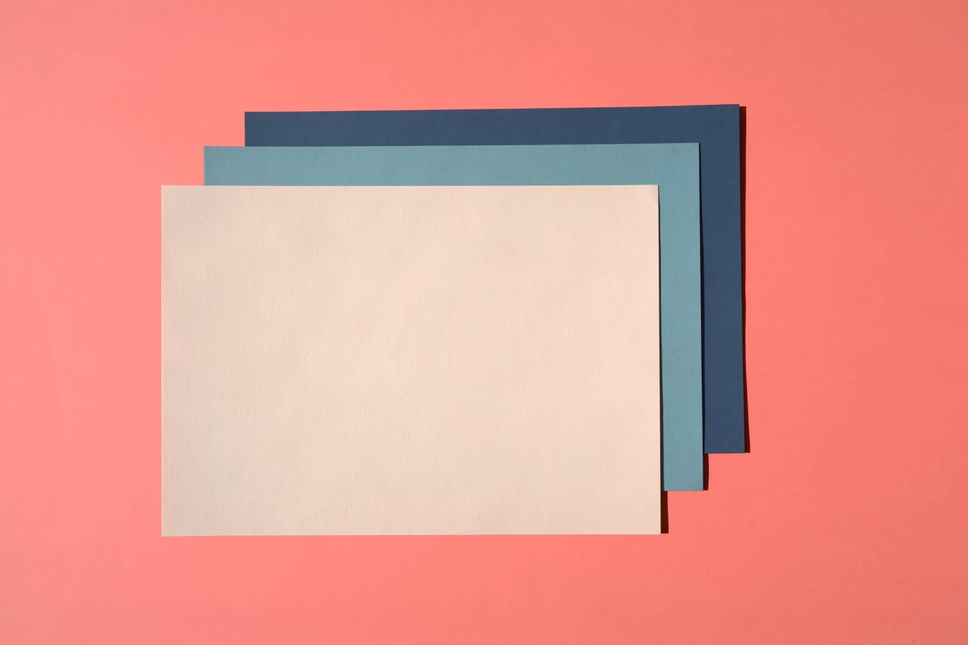
- Feature simple, two-dimensional shapes.
- Use bold, bright colors to create contrast between elements.
- Lack unnecessary ornamentation.
- Don’t use much texture but may employ transparency to suggest layers of material.
It’s most frequently compared to previously popular design schools of thought like skeuomorphism. Skeuomorphism is where digital objects are deliberately modeled after their real-world counterparts, such as a note-taking app resembling real paper or a camera icon looking like a vintage Leica.
On the other hand, flat UI uses simple elements that dynamically change size, shape, or placement depending on how they’re interacted with. It’s more fluid and less reliant on behaving like real objects than skeuomorphism.
Flat UI: Origins
The design language known as flat UI began as one component of responsive web design. A responsive design is one that adapts as necessary – like changing size or layout – depending on the user’s device or operating system. The same webpage shouldn’t operate the same way on a smartphone as it does on a notebook computer, for example.
Flat UI is a good fit for responsive design because of its simplified shapes and lack of ornamentation. Good responsive design must load fast and look uncluttered, and employing its design elements is a great way to ensure that level of performance.
Advantages and Disadvantages
There are upsides and downsides to using the design language – especially if one is a purist about it. We’ll talk in a moment about some latter-day alterations and evolutions of flat UI. For now, let’s look at the major disadvantages and advantages of a “conventional” flat user interface.
Disadvantages
- Problematic interaction: For some users, the lack of depth in flat UI makes it difficult to discern how to interact with page elements or detect where the edges of buttons and other elements actually are. Long-familiar visual cues, like blue or underlined links, are not always a part of flat UI.
- Design cohesion: Flat UI uses primarily bright colors. Some designers find it difficult to match and coordinate these bolder hues. It could be a challenge for unseasoned designers to get the hang of it.
- Typography challenges: Another concern among designers is choosing the right typefaces. Flat design tends to make overly narrow typography look strange and unreadable.
None of these challenges is insurmountable, but they do show how flat UI has raised the bar in the visual design world. Flat UI is appealing and functional, but it’s a challenge to get right.
Advantages
- Performance: As mentioned, one of flat UI’s chief advantages is that it supports responsive designs and fast loading times. Users will bounce away from your site less frequently.
- Visually appealing: Although flat UI designs hit the mainstream around 2011 and 2012, the look is still considered pretty trend-setting. Many web designers and users favor flat UI, and it’s still a great way to stand out.
- Future-proof design: Nothing’s really future-proof in the tech world, but flat UI design is likely to be relevant for some time, and there’s nothing inherent about it that’s likely to look old-fashioned too quickly.
Some designers think designing for flat UI is too stifling when it comes to creativity. Others welcome the challenge that limitations bring.
Where Does Flat UI Design Go From Here?
To answer some of the shortcomings listed above, many graphic designers and engineers working on operating systems and apps are moving past flat UI to what they call “flat design 2.0.”
Flat design 2.0 seeks a more practical balance between simplified, flattened visuals and the tasteful use of “conventional” elements like depth, skeuomorphism, shadows, gradients, and color variations. Although Apple and Google played a major role in introducing the masses to flat UI, their more recent designs have sought this kind of balance in a more obvious way. There’s a healthy amount of shadow and blurring effects going on, which helps orient the user and point them to the most important touchable or clickable elements of the user interface.
Getting the most out of flat UI design and crafting the best product, ultimately, means remembering the end user. You’re not designing for yourself or other designers – you’re designing for people who actually need to use products like apps and websites.


Leave a Comment