


A site with a hero section adds interest to any design. When users land on your page, you have seconds to grab their attention and keep them there. A hero header gives you an opportunity to add animation or beautiful images, share a headline that pulls them in or utilize calls to action (CTAs) to move them through the sales funnel.
Yet, not all hero sections are the same. If your landing page fails to capture your site visitors, you probably need to make some adjustments. From revamping an old site to creating a brand new one, we’ve gathered up the ways you can make your hero images stand out and serve a function along with a few examples.
1. Know Your Unique Value Proposition (UVP)
Your UVP is the value you bring to consumers that no one else in your industry does or can do as well. Understanding what your UVP is allows you to focus on a hero section that showcases the advantages of doing business with your brand.
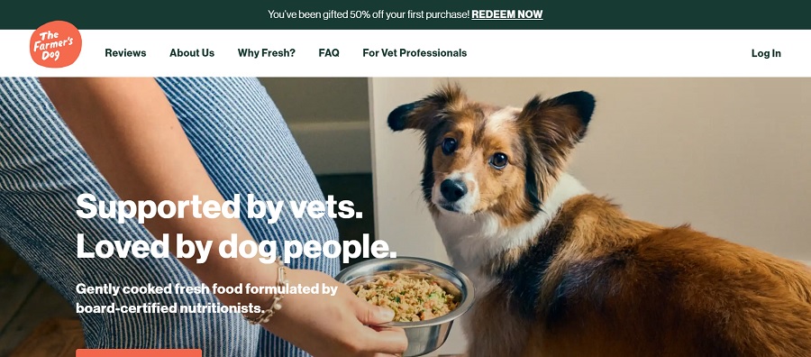
Source: https://www.thefarmersdog.com
The Farmer’s Dog is about bringing healthier food to dogs with the help of board-certified nutritionists. By using a hero image of a cute dog with one floppy ear and a bowl of the food, they showcase their UVP of providing nutritious and delicious food to pets. The tagline also reiterates the point.
2. Use the Right Color Palette
There is an entire psychology behind color choices. Finding the right shades that fall in line with your brand style is challenging. Hiring a professional photographer to create such shots is ideal. However, smaller businesses may not have the funds to pay for a photo shoot.
If you have to rely on stock images, there are a few things you can do to ensure your hero section meets your needs. Use AI to change the color of clothing, the food bowl or even the background of an image. You could also add a filter on top to take the photo from full-color to a hue in your design. Another option is to make your text overlay or your CTA button the same color as the rest of your design.
3. Make Your CTA Bright
It’s crucial that your CTA button pops and drives users to take action. Start by considering what color the hero image is and what contrasts sharply with it. Even if the shade isn’t an exact match to your color palette, it is best to go with something that stands out. Another idea is to create a transparent CTA with white or black text that stands out against the background hues.
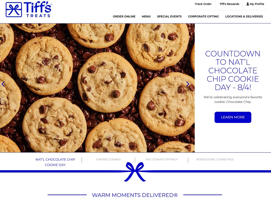
Source: https://www.cookiedelivery.com
Tiff’s Treats in Atlanta, Georgia offers same-day cookie delivery. The look of the ooey-gooey chocolate chip cookies is so realistic that it makes your mouth water. But, the gorgeous pop of blue on the CTA button is what really draws the eye. Site visitors can click on it to learn more about getting cookies delivered in the area.
4. Add Animation for Interest
If you want to stand out from others in your industry, adding some animation creates a unique hero header that draws site visitors to hang around. You can do things like drop in text, pulse the button or animate the illustration or parts of it.
Another idea is to do fade-ins and fade-outs upon scroll and create microinteractions on hover or tap. Researchers found 69% of survey respondents felt microinteractions enhance their overall experience on a website.
5. Know Your Brand
It might be tempting to copy the styles of large corporations or even the small business examples you see here. Keep in mind that these examples are shared for inspiration. You should always stay true to your voice as a company. Stick with images that reflect who you are. Adding a personal touch is preferable to the slickest photo you can find. People will forgive slight imperfections in images. They won’t forgive lack of authenticity.

Source: https://viewpointbooks.com
Viewpoint Books uses their hero section to showcase the fun nature of their business. They embrace offering storytime, book clubs and other fun events and the images in their hero slider showcase this culture.
6. Consider Placement
Where you place your image matters. Only you can determine if your logo should go above the hero section. You’ll want to be sure visitors can access your navigation either through a bar above or below the header or via a hamburger menu laid over top of the photo.
Keep in mind where your audience typically encounters menu items and other features on your page. It’s better to stick with the tried and true than to stray outside normal boundaries and frustrate users.
Test Your Hero Section
It’s crucial you test your hero section frequently. Add a new image and conduct a split test to see if visitors respond best to the old hero shot or the new one. Try different color CTA buttons, different title placement and even adding filters and overlays in a variety of colors. The more testing you do, the more of a feel you’ll get for what your customers prefer.
You can also send out surveys to your frequent buyers and ask them what they love or hate about the top section of your home page. Is there any information they access frequently that isn’t at their fingertips? What would they like to see added or removed? A survey will give you a lot of details an impersonal A/B test might miss.
You Need a Stellar Hero Header
Your hero section is more than aesthetics. An excellent design pulls the user in and keeps them moving through your site. It involves an image, text, CTAs and an overall feel that matches your brand image. When you create a clear message with visuals and conversion strategies, your website works for you to convert browsers into buyers.


Leave a Comment