


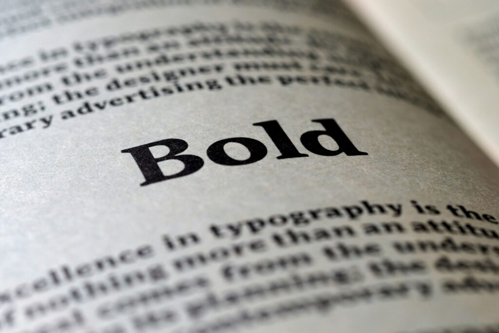
Typography is more than a way to make a visual seem nice. People’s feelings about a brand can change based on the font selections before they even read a word. When designers put the correct things together, a layout can look polished and confident. Yet when they couple the wrong things together, it could look less credible. Good typography does not shout for attention — it just works, guiding the eye and making the whole design better without most people even knowing why.
What Is Font Pairing (and Why It’s Crucial for Your Brand)?
Font pairing is the process of choosing two or more types that work well together in the same design. It is both imaginative and planned. When done right, it makes the visual hierarchy apparent and offers a brand a unified, planned image instead of one that appears like it was thrown together.
Strong combinations lead the eye without pushing it. Headlines are easy to read, subheadings help them, and body content is easy to scan. That structure is important, especially online, where readers can tell in seconds if the information is trustworthy. Studies even reveal that the way text is laid out affects how easy it is to read and how well it works for users. When content is hard to read, individuals are much more likely to leave a page.
There is also a measurable effect on the business. Companies that keep their branding and design the same across all platforms often see sales go up by 10% to 20%, and typography is a modest but important part of that consistency. A brand looks more trustworthy and established when the fonts look like they belong together and have a purpose.
7 Core Principles That Teach You How to Pair Fonts Like a Pro
It is uncommon for great font combinations to happen by chance. A few basic rules assist designers to keep contrast, hierarchy and cohesiveness in check without making the layout too busy.
1. Establish Strong Visual Hierarchy
To make a good font pair, designers need to know what each typeface does. The main typeface, which is commonly used for headlines, should grab people’s attention and set the mood. The secondary typeface, which is mostly used for body text, should put comfort and readability ahead of personality.
Designers can use a tertiary option sparingly for captions, pull quotes or little accents, but it should never compete with the primary two. When a creative knows what each typeface is for, their design looks planned and organized instead of messy.
2. Create Harmony Through Contrast
One of the best criteria for combining fonts is that opposites frequently function best together. A serif and a sans-serif together make a big visual difference right away, but they still feel balanced. An analysis from 2024 that looked at 22,897 font use instances revealed that the best combinations usually have great contrast in three ways:
- Serif vs. sans-serif
- Basic vs. ornamental
- Light vs. bold
That difference makes designs feel alive without making them look sloppy. Combining different types of text, like a serif header with a clean sans-serif body, usually makes things look more interesting and clear.
Type classification is not the only thing that contrast performs. Designers can also make it look seamless by changing its weight, size and design. A bold headline adjacent to standard body text makes it clear that the text is important. Bigger type makes something stand out, whereas smaller type backs it up. Even small changes, like switching from italic to roman, can add variety without changing the font at all. The goal is not to clash, but to make each part stand out enough that it can breathe.
3. Match the Mood and Message
Fonts have an emotional effect on people, even if they do not realize it. For example, serifs are common in publishing and finance because they show tradition, authority and trust. Sans-serif fonts are popular with tech and lifestyle firms because they look modern, clean and direct. Script typefaces may make things look elegant or creative, but if a creative applies them in the incorrect way, they can also look too fancy.
The most important thing is to line everything up. A fun handwritten typeface can work well for a brand for kids, but it would make a law firm look less credible. When a type choice supports a brand’s message instead of going against it, the whole design seems more real.
4. Limit Font Palette
When it comes to font combinations, it is usually best to keep things to a limit. If a creator only uses two or three typefaces, their design will look more professional and less cluttered. If they have too many fonts fighting for attention, the message may be lost, and the layouts may not seem right.
If there is a need for additional variety, try utilizing different weights or styles within the same family before adding something new. A compact font palette nearly always looks better than one that is too complicated.
5. Draw from the Same Superfamily
Look for a superfamily for a safe, professional way to do things. A typeface superfamily has different weights and styles, and occasionally even both serif and sans-serif variants that were made to operate together from the start.
Because they have a similar size and structure, combos feel like they belong together. Designers can make things stand out by using bold and light weights or serif and sans-serif versions within the same family. They do not have to worry about the two styles clashing. It is a subtle method, but it always works to get clean, professional results.
6. Consider Historical Context
Fonts have a history behind them. Typefaces from the same time period frequently have the same proportions, structure and design philosophy, which can make them feel like they go together organically. For instance, using two mid-century modern fonts together might give a nostalgic look without being out of place.
On the other hand, putting something very modern next to a really elaborate Victorian script could make things feel tense in a way that is unplanned. When thinking about where a typeface came from, the pairs made together tend to feel more solid and consistent in style.
7. Test for Readability and Accessibility
A font pairing may look fantastic on a laptop, but that does not mean it will work on all devices. Make sure the typography is still readable across multiple devices, screen sizes and backdrops by testing it on all of them. Small changes to contrast, spacing and weight can make a big difference in how clear something is.
Accessibility is important, too. About one in four adults is handicapped, which means that the way something is designed can make it easier or harder for someone to read. Not only are clean letterforms, enough color contrast and font sizes smart design standards, they are also necessary for making experiences that everyone can enjoy.
Common Font Pairing Mistakes to Avoid

Even seasoned designers sometimes mess up with fonts. It’s just as vital to know what not to do as it is to understand the rules.
Mistake #1: Pairing Fonts That Are Too Similar (The “Conflict” Problem)
Using two fonts that are too similar can make things a little tense. For instance, using identical sans serifs together can make a design look a little “off,” like something was changed by mistake. The design does nott make things stand out — it makes things confusing. If people have to squint to see the difference, the pairing is not working.
Mistake #2: Overusing Decorative or Script Fonts (The “Readability” Problem)
Fonts with decorative or script styles have a lot of character, but they can become too much too quickly. They work best as accents, such as in headlines, logos, or brief phrases, not in long paragraphs of body material. When a layout has too many stylistic fonts, it can be hard to read, and the design can start to look unprofessional. A little flair goes a long way.
Mistake #3: Ignoring Legibility in Body Copy (The “Functionality” Problem)
No matter how nice a font looks, it does not work if it is hard to read. When it comes to body text, clarity should always come before style. If the weights are too thin, the spacing is too tight, or the contrast is too low, it can be hard on the eyes, especially on screens. Typography is meant to communicate, and communication fails when readability is not a priority.
Font Pairing Examples for Different Brands
Seeing principles in action makes them easier to apply. Here are a few example pairings and why they work in different brand contexts:
- Montserrat and Lato for the modern tech startup: Montserrat’s framework is clean and forward-thinking, which is perfect for firms that focus on technology. Lato adds to it with a neutral tone that is easy to read and works well for extended pieces without being boring.
- Playfair Display and Raleway for the elegant lifestyle brand: Playfair Display’s high-contrast serif forms add contrast and sophistication. The light, breezy sans-serif style of Raleway makes the whole thing feel polished without being too heavy or outdated.
- Poppins and Open Sans for the friendly small business: Poppins gives the text a little personality with its rounder shapes, while Open Sans makes the body text easy to read and friendly. When used together, they give off a warm, welcoming vibe that works well for brands that care about their communities.
Where to Find High-Quality Fonts
Now that you know how to pair typefaces, the next thing you need to do is find them. There are a number of trustworthy places that offer free and premium fonts from professional foundries.
Google Fonts is a great place to start for free, easy-to-find fonts. Its library has hundreds of web-optimized families with different weights and styles, so it is easy to try out various combinations. If you currently use Creative Cloud, Adobe Fonts has a subscription service that gives you access to a curated collection of high-quality typefaces.
Many of these typefaces come in large families or superfamilies. MyFonts and other marketplaces that sell premium, standalone items connect you with independent foundries and more unique type designs. No matter where the typefaces originate from, make sure to read the licensing conditions to make sure they match how you plan to use them.
Learning How to Pair Fonts and Design With More Intention
There are no strict guidelines for great font pairing — it is all about creating choices that are well thought out and deliberate. When designers put hierarchy, contrast, readability and brand alignment first, typography starts to seem easy. A few small changes can make a design look very professional. Take the time to test, improve and simplify, and the font pairings will do their job — assist the message without taking the spotlight.


Leave a Comment