


Purple websites can be luxurious yet light, creative yet serious, and bold yet subtle. Graphic and UX designers know that color is more than decoration. It’s part of the visual dialogue. Every site visitor is part of that communication. The color purple expresses both calm confidence in its dark shades and an energy of originality in its bright shades. Designers who prefer purple websites can combine the warmth of emotion with mindful moderation in color choices.
Why Purple Works in Web Design
Designers use various research and visual cues to understand how color should be utilized to impact users. A recent academic literature review on the topic shows that website aesthetics, including the shades of a website’s dominant features, affect first impressions within 50 milliseconds of a user viewing the site.
In practice, purple combines warm and cool tones. Associated with energy yet calm, it has an anchoring effect on users. When used sparingly for impactful elements like hero banners, section backgrounds and call-to-action buttons, it balances the overall design.
Color Psychology in Purple Websites
In design theory, purple conveys creativity, ambition and subtlety. Deep purple conveys sophistication and authority, while lavender conveys a sense of calm and intimacy. Purple is also a good choice for portfolios and for creative endeavors, tech companies or lifestyle brands that want to communicate a memorable yet advanced visual identity.
Purple Website Examples for Inspiration
The following are recent examples of professional websites or galleries that use the color purple well, whether heavily or sparingly, and may serve as sources of inspiration for designers.

1. Duncan Trussell
The tone of this independent creator website features lavender-colored sections with violet accents. It’s a great example of how to use purple to support your personal brand content without being overpowering on a portfolio or personality site.
The bold, purple background adds a whimsical touch that makes the user pay attention to the purpose of the page and lends authority. To ground the scrolling experience, purple is used, with the lavender sections breaking up text. The color changes lend readers’ eyes rest when they are confronted with large blocks of text. Content areas, separated by color changes, do not need thick black borders or unnecessary graphics.
Lighter, rather than saturated, shades of purple avoid visual noise and communicate creativity and originality, while the color palette reinforces the site’s reflective, conversational tone and shows how purple can complement personal branding without overwhelming a portfolio or a creator-led website.
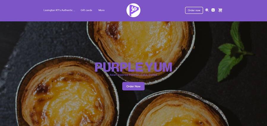
2. Purple Yum
Purple Yum Bakery might just splash purple across their pages as a nod to their name. However, they instead choose bold, beautiful images of their baked goods and use purple as a backdrop. A band in the header grabs attention in a medium but vivid purple. This hue gets repeated in the call to action (CTA) button.
A medium-saturation purple is used for the header band to establish brand identity, and for buttons and other subtle interface elements throughout the pages to provide consistency and navigational aid, without overpowering the products’ images.
Purple here provides contrast with the lighter background and the cooler food-related photography, making calls to action (CTAs), such as buttons or links, more visible. This shows a small business using purple to develop brand association and hierarchy on the page, while keeping the product as the primary focus.
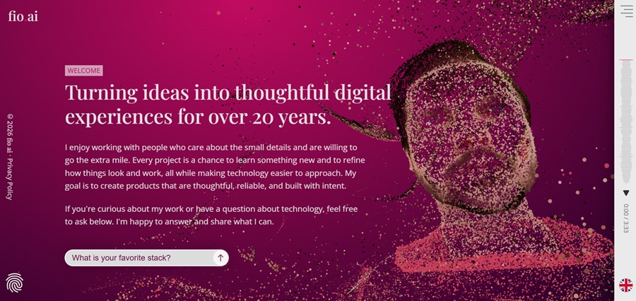
3. Fio.ai
Fio.ai is a design agency using a deep red-purple. The vivid hue is not one seen often in web design, so sets them apart as innovative and unique. The animated graphics on the welcome page begin to fill in the negative space, still allowing some of the purple to peek through and set the tone for boldness.
The animated graphics superimposed on the purple background are translucent, allowing motion without obscuring the color layer. The contrasting shapes and objects, which have moved from their original places, suggest continuity between the layers of purple. Negative space is present in the design, allowing the color to breathe and feel open.
The unusual purple with movement reinforces the color’s association with the perception of innovation. The overall palette fits this forward-looking nature, while ensuring legibility and balance. This is an example of how saturated colors like purples work through controlled composition and spacing.
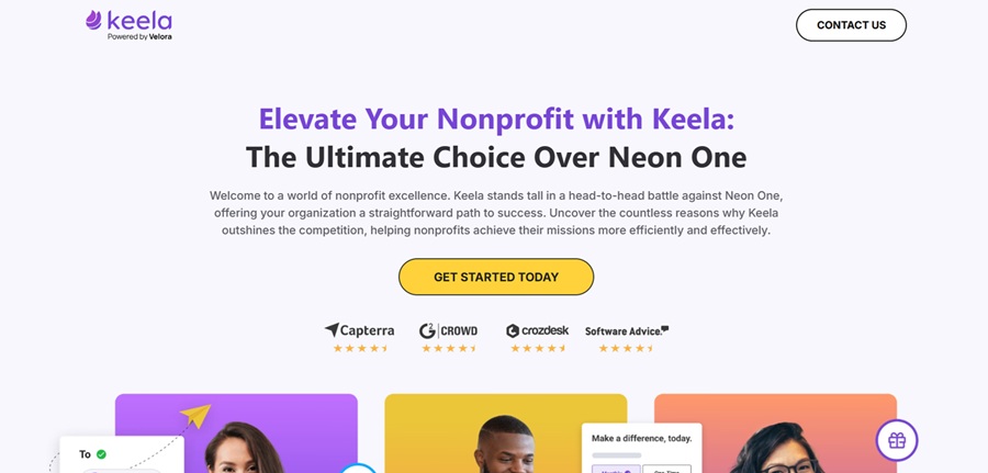
4. Keela
Keela’s comparison landing page uses purple not as an accent but as a design framework to guide the user. In the opening hero, violet gradients confidently demarcate primary content from supplementary content. Instead, purple is used to break apart the information-heavy design, employed in headers, call to action buttons, iconography and comparison highlights to guide the reader.
The color purple is used throughout, especially when scrolled down the page, to indicate hierarchy. Features, benefits, and conversion points are a deeper shade of purple against the neutral white and gray. Visitors can naturally think about multiple side-by-side comparisons without becoming overwhelmed, thanks to color.
Keela uses purple to communicate professionalism and calm authority. It avoids playful or whimsical purples, preferring cooler violets to maintain a grounded, professional demeanor. The restrained type system and generous whitespace are supported by the color system, which shows how purple can support trust and usability on a content-heavy service page with a clear brand presence.
Best Practices for Designing With Purple
Purple works best when it shifts from a statement of intent to a system, as too little makes the color feel incidental, and too much makes it feel melodramatic. Designers who use purple effectively tend to use the color in hierarchical or interaction-based ways rather than across all surfaces.
Purple can be eye-friendly when used with neutrals such as white or light gray, indicating importance without being distracting. Many successful purple websites use dark violet for navigation menus, title text or CTA buttons, and lighter shades for section breaks or highlighting. This provides clarity, while the color itself does some branding work.
The color is rarely used on its own, and the success of designs with purple often depends on how the colors around it are used. Purple is often paired with analogous colors, such as blue or a muted red, or with gray, to make them less tiring to the eye. Advanced approaches to analogous color schemes can create depth or harmony without sacrificing contrast.
Contrast is also important, as purple can be appropriate for buttons or other elements when its color contrast ratio is sufficient. Designers should first test for legibility and accessibility to ensure that the use of purple is appropriate.
For example, in the examples above, purple is not used simply as decoration but to guide, separate, and reinforce content. This is particularly useful on highly information-dense pages, comparisons or choices that users must evaluate at a glance.
Purple occupies a crucial emotional space within UX. It communicates creativity without the volatility of red and seriousness without the coldness of blue. When applied intentionally, it can support the three qualities designers aim to balance when building modern websites — trust, focus and memorability.
Purposeful Purple Websites
Purple websites remain effective. Although an unconventional choice, restrained use of purple can distinguish a website while remaining discreet rather than garish. Its sensibility may be modern or timeless, tranquil or assertive, depending on execution.
If used to organize a product, lend it a sense of place, or convey hierarchy, purple is useful. The examples of purple websites across industries will help inspire your design. Use them as a starting point to incorporate purple into your color system and make your design shine.


Leave a Comment