
In This Article
A letterhead includes your name, contact information and logo — if you have one. For businesses, it should match the color palette and image of your company, adding a bit of personality to all correspondence you send. For designers, it’s an opportunity to show off your talents. Looking at letterhead examples shows the similarities in layout across different industries.
Show your personality through the typography and logo design, but don’t neglect usability for aesthetics. It’s important you include contact information and your name or brand at the top of the letterhead, even if the design looks better without this information.
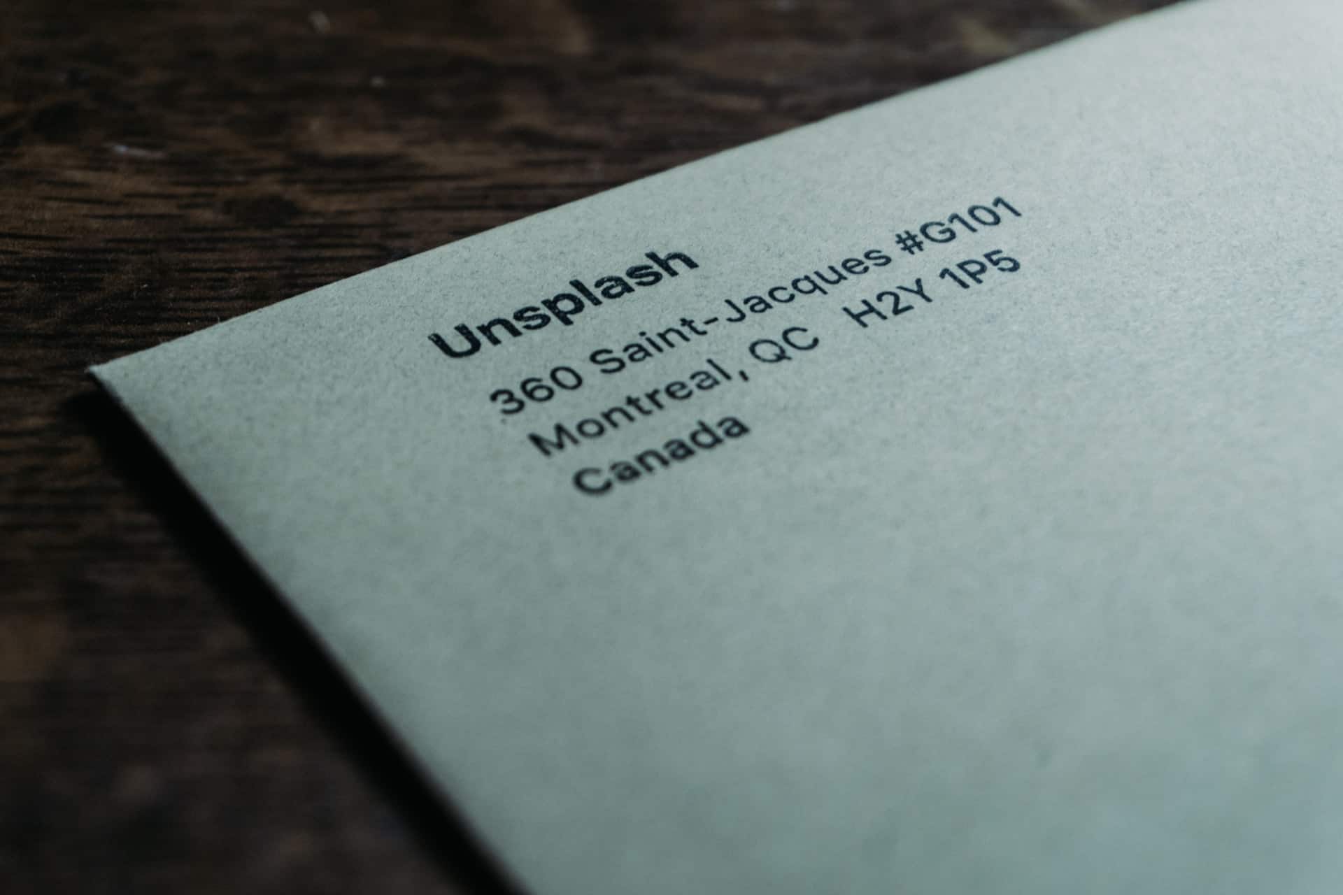
If you’re writing a formal note, business letters have some basic tenets in common, such as the salutation and closing. In the letterhead examples below, you’ll notice they all have similar elements, like the sender’s address.
1. Casual Tone

There are occasions for a casual letterhead, such as if you’re sending a note or your business is more personal by nature, such as a consultant or tutor. In the example above, there is a wide border strip in the header, and the company or personal name appears directly under the graphic. The contact information is at the bottom of the page.
2. Original Placement

Although many letterhead examples are traditional, the law firm example has a unique layout. The designer suggests it is perfect for a law firm. However, it would also work well for a design agency or consultant. A single monogram letter or small logo appears at the top of the page, making the layout more conversational, and contact information gets pushed to the bottom right side of the page.
3. Beautiful Typography

When studying letterhead examples, pay careful attention to the typography used and how it aligns with the brand’s design guidelines. In the case above, the use of a font with serifs ties nicely into the script of the logo while remaining readable. The same style repeats at the right, where the doctors’ names appear, and again at the bottom of the page with the contact info.
4. Utilizing Icons
![]()
Most letterhead examples feature information at the top of the page, even if only the logo. In the case above, the company’s logo and contact information appear at the bottom of the page. However, arrow icons point the way to the important information the user might need. It provides some direction while thinking outside the box. Directional cues reach readers on a subconscious level, directing them toward vital info.
5. Contrasting Colors

Your letterhead is an opportunity for you to make a statement, and using contrasting colors draws the eye and makes a bold impression. Using colors in the same family, such as the dark and light blues above, provides some consistency while still offering a striking visual. The eye naturally tracks toward the juxtaposition of dark and light.
6. Modern Layout

Most letterhead examples stick to a grid layout, where everything is aligned on horizontal or vertical lines. However, if you’d like to create a more modern-looking letterhead, use a design that doesn’t stick to a traditional pattern. In the example above, the layout includes standard information, but part of the header encompasses the salutation, which appears in size <H1> typography.
7. Geometric Patterns

Geometric patterns speak of strength and boldness. This type of design might work well as a letterhead design for a construction company or a financial firm. Although those two industries are very different, they are ones where customers want to know they are confident in their work. In the example above, the pattern appears in the upper right and lower left corner. You can also place one across the top and bottom or down the side of the design.
8. Colorful Backgrounds

Most letterheads appear on white or cream paper, so when you add a background color, your letterhead stands out as creative and unique. In the example above, the addition of a vertical stripe of coral draws the eye to the information on that portion of the page. All the details about the designer appear in the coral section. The user can either choose to read the letter portion on the plain background first or move to the contact info.
9. Framed Border

Out of all these letterhead examples, the one above offers a framed look that creates clean, minimalistic lines. The overall look of a framed header and footer is professional and works well for almost every type of business or service industry professional.
10. Photo Background

In recent years, the higher definition of digital screens has spurred a revolution in the use of beautiful photography and hero images. One idea for your next letterhead design is taking that concept and applying it to your header and footer to embrace the letter’s body in pictures. In the example above, note how the background appears between other elements of the page and repeats in the header and footer.
11. Black Backgrounds

A black background creates a striking contrast to the design of your letter. Writing the body in white on black paper isn’t very effective and can be harsh on the reader’s eyes. If you instead add a black header background and place your logo and white text on top, you have a statement that is masculine and shows the user you are dominant in your field.
12. Asymmetrical Layout

An asymmetrical layout adds a lot of interest to your correspondence without taking up much space. Note how the colored lines appear at the edges of the letter in the example above. The fact that the text is symmetrical brings it into relief and highlights that the words on the page are the most important aspect of the design.
13. Directional Cues

For a more traditional letterhead design, offer directional cues toward the important information in the letter. In the image above, note how the company name appears in the header within a wide arrow. The arrow points to the body of the text. At the bottom of the page, the business’s contact information appears and the arrow element repeats in a horizontal line.
14. Creative Icons
![]()
As more people get online, certain common icons become instantly recognizable. There is no reason you can’t use them in your letterhead design in the place of words to save space and communicate with images. In the example above, the designer used a conversation bubble. This indicates the ways to communicate with them and then used a phone icon rather than the word.
15. Custom Shapes

If your business has a shape identifiable as belonging to you, such as from your logo or the type of work you do, creating a custom shape for your letterhead design draws attention to what your company does. Add the custom shape to the header, footer or any of the edges of your design.
16. Simple Shapes

Sometimes the simplest designs are the most striking. No article on letterhead examples would be complete without looking at utilizing simple shapes to create a professional but approachable look.
17. Location Information

If your business offers multiple locations, you can list them across the top header and placing your contact info down the left side of the page. Note in the example above how there is an image of architecture, which reflects what the company does, and then the logo and contact info appears in a layer over the background photo.
18. Columns

Dividing your page into two or three columns creates a streamlined look. Each type of information has its own slot. For example, you might place contact info to the left and an image to the right. You could put everything on the right and the letter body on the left. There are many different ways of using a column layout and creating a unique letterhead design.
Represent Your Business Personality
Out of all the letterhead examples above, there is likely one or two that speak to you and reflect your brand’s personality. If not, start with a simple design and add elements that make sense for you.


Leave a Comment