


In This Article
Color does more than polish a real estate design for a website. In real estate design‚ the right palette communicates trust. It drives visitors to listings and cultivates a sense of belonging for the brokerage․
For small real estate companies‚ visitors can quickly decide if a site has enough credibility to search listings‚ request a valuation or contact an agent․ The color scheme gives a feel for the market and audience․
Why Color Matters in Real Estate Design
Real estate websites offer buyers emotional and financial commitments to homes they can only imagine, and sellers worry about the fate of their biggest investment. Investors value credibility. Everything on the site has an impact. But, the hues you choose can earn trust and signal professionalism.
Use traditional colors rather than trendy ones. A palette of strong blues‚ greens and neutrals can help make a site feel more established. High contrast helps people read listing details‚ forms and calls to action․
7 Color Schemes that Build Trust and Engagement
Although there are particular colors that evoke trust, you can combine them with a variety of hues or add accents to take your real estate design to the next level. Here are some top combinations and examples of real estate websites with stellar online presence.
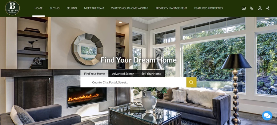
1․ Lake Blue‚ White and Gold
A palette of blues and golds elicit trustworthiness. This scheme is best for waterfront properties, vacation properties and lifestyle brokerages.
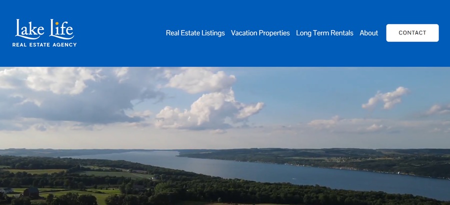
Lake Life Real Estate Agency‚ a local‚ boutique brokerage based in Skaneateles‚ New York‚ specializes in real estate and vacation homes․
Blue‚ white and gold lake colors connect the brand with blue representing water‚ calm and open sky․ White keeps the site neat and easy to read‚ while gold adds warmth so that it does not feel cold․
Use blue for any headers‚ navigation and footers․ Use white for listing cards and content sections․ Save gold for buttons‚ icons or featured property labels․
2․ Black‚ Gold and White
An elegant color palette is best for luxury homes‚ boutique brokerages‚ urban properties and high-end relocation markets
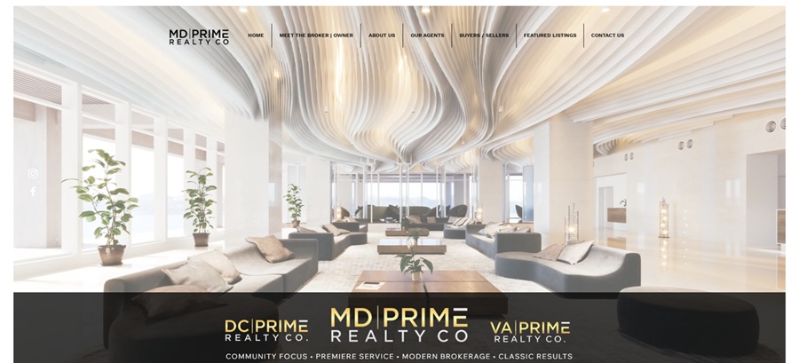
MD Prime Realty Co․ is a local‚ boutique brokerage that serves the D․C․‚ Maryland and Virginia markets․ Black‚ gold and white are used on the real estate website․ Black provides contrast‚ gold adds elegance and sophistication‚ and white is used to keep text readable․ It can be particularly useful if each color has a specific purpose․
Use black for hero sections‚ headers and footers and luxury landing pages․ For listing grids‚ use a white or light background to make photos and details more scannable․ Use gold to highlight calls to action‚ dividers‚ logos and hover over transitions․
3․ Black‚ White and Soft Botanical Gray
Consider monochromatic looks for boutique agencies, community brokerages and relationship-driven brands.
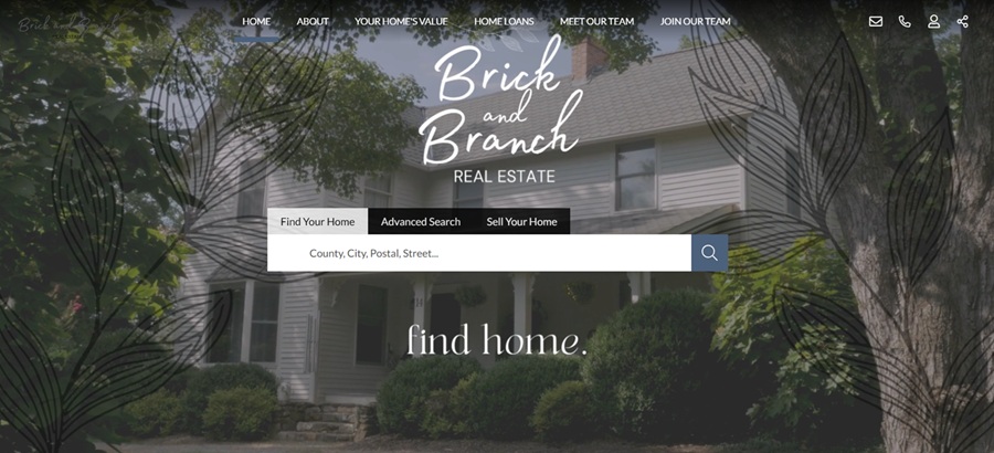
Brick and Branch Real Estate describes itself as a locally owned and operated boutique-style brokerage serving metro Atlanta․
Black‚ white and soft gray create a classic‚ clean base for any brokerage‚ without feeling cold․ A branch pattern or organic logo mark softens the professional aspects of the palette‚ signaling that the brokerage builds with structure‚ but is also aware and considers․
Use black for the logo and navigation‚ white for listings and the main content‚ and gray as an accent color for backgrounds‚ borders‚ filters and testimonials․
4․ Blue‚ Gray and White
Working in some blue signals trust and is many people’s favorite color. Buyer education‚ relocation services‚ first-time homebuyers and trust-centered brokerages

Blue Door Associates states that the company is an independent brokerage founded in 2020‚ aimed at offering a boutique experience․ Blue remains one of the most dependable colors in real estate design․ It communicates stability․ Gray adds balance․ White accounts for a modern‚ minimalist design that is easier to read․
The palette works for buyer guides‚ seller guides‚ relocation pages and contact forms․ Use blue for navigation‚ buttons and section headings․ Supporting boxes and secondary backgrounds should use gray․
5․ Teal‚ Red and White
This brighter color palette is best for agent-matching tools‚ energetic local brands‚ family markets and high-traffic websites․
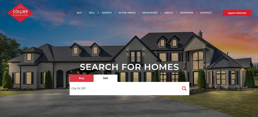
Collier & Associates describes itself as a locally owned real estate brokerage serving Northwest Arkansas with integrity‚ innovation and a client-first approach․ Teal‚ red and white can make a real estate website feel active and fresh․ Teal is a professional color‚ but softer than navy․ Red is a color of energy and white balances the overall design and prevents excess․
Red should only be used sparingly for high-value calls to action: “Find an Agent,” “Get a Home Valuation” or “Start Your Search.” Teal should be the main color used for headings‚ badges and background blocks․
6․ Deep Green and White
A dark green color palette is best for land specialists‚ acreage marketplaces‚ suburban communities‚ rural homes and place-based brokerages
According to Branch Real Estate Group Inc․‚ its tools are backed by local experts who live‚ work and thrive in and around San Antonio and Boerne․ The group states on its website’s about page that it helps families establish roots through real estate․
The deep green and white palette supports its place-based real estate brand․ Green translates to growth‚ land‚ trees and rootedness․ In suburban or acreage-heavy areas‚ it can be more authentic than yet another blue corporate template․
The deep green should include headers‚ footers‚ search modules and the market reports‚ while white can be found in property listings‚ blogs and forms․
7․ Purple‚ Gold and Grau
Purple and gold is best for residential brokerages, commercial firms, established local agencies and mixed-service real estate sites.
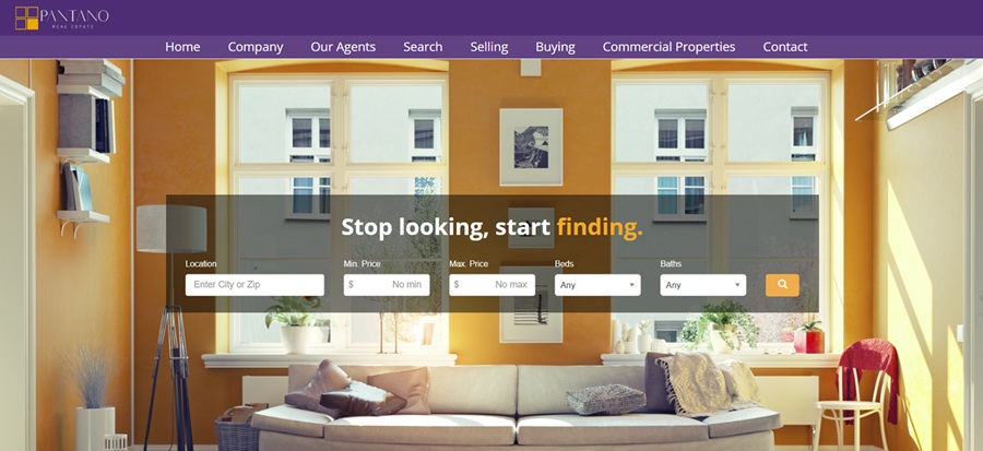
Per their about page‚ PANTANO Real Estate considers itself a boutique brokerage that focuses on residential and commercial real estate within Greater Wilmington and New Castle County․ They also consider themselves to be locally owned and independent․
Purple pairs well with gold and light gray․ Purple adds a bold and luxurious touch‚ building trust with the audience․ Gold softens the effect․ Gray provides clear‚ accessible property information․
This palette is applicable to brokerages with multiple target audiences․ Use purple in the header‚ footer and section titles․ Gold should be used very sparingly for search buttons‚ contact buttons and active navigation states․
How to Choose a Real Estate Color Scheme That Works
Typically‚ the strongest colors will depend on the position of the brand․ For example‚ a luxury brokerage may need black‚ white and gold‚ while a waterfront agency may need blue‚ white and gold․ A rural or suburban authority may want green and white․ A brokerage focusing on education may want blue‚ gray and white․
Designers should check buttons‚ text on hero images‚ card listings and forms‚ and how the color looks next to colors used elsewhere on the website before finalizing colors․
Although color is never the only criterion of great real estate design‚ colors can influence mood․ For example‚ the right color palette might give visitors cues that a brokerage is local‚ luxe‚ practical‚ vibrant‚ traditional or intimate․
Color can help small real estate firms compete with larger organisations by helping their website feel both focused and human and become an easy place to trust․ Choose colors that link to your market‚ complement the photography and guide action․ With coherent use of color‚ content and layout‚ the website becomes more than just a digital brochure. It becomes a portal to your client’s next home.


Leave a Comment