

When it comes to getting a Halloween fright, scary websites can be an experience unlike any other. While some may offer spooky content or frightening visuals, they also use the psychology of fear through immersive design. By exploring some of the darker corners of the web, designers can get a feel for what makes a website truly disturbing and compelling.
1. Amnesia
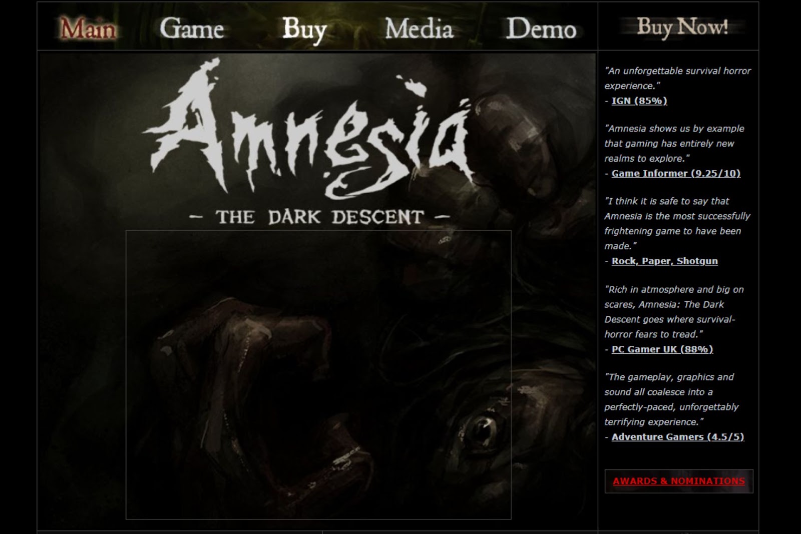
Source: https://www.amnesiagame.com/#main
Amnesia: The Dark Descent plunges users into one of the most infamous horror games. It is dark and moody, and landing on the homepage alone gives an unsettling feeling. The website feels disturbing, like stepping into a shadowy corner of the internet. It is one that would make users unsure if they should explore further. Yet, that is the appeal here — it sets the stage for psychological horror before starting the game.
The design relies on simplicity to get under users’ skin. It is mostly dark gray tones with just enough light to make someone feel on edge. There is little to distract from, meaning every small interaction can feel eerie. The stripped-back design also feels claustrophobic, adding to the unease that defines Amnesia.
2. The Darkest Blog
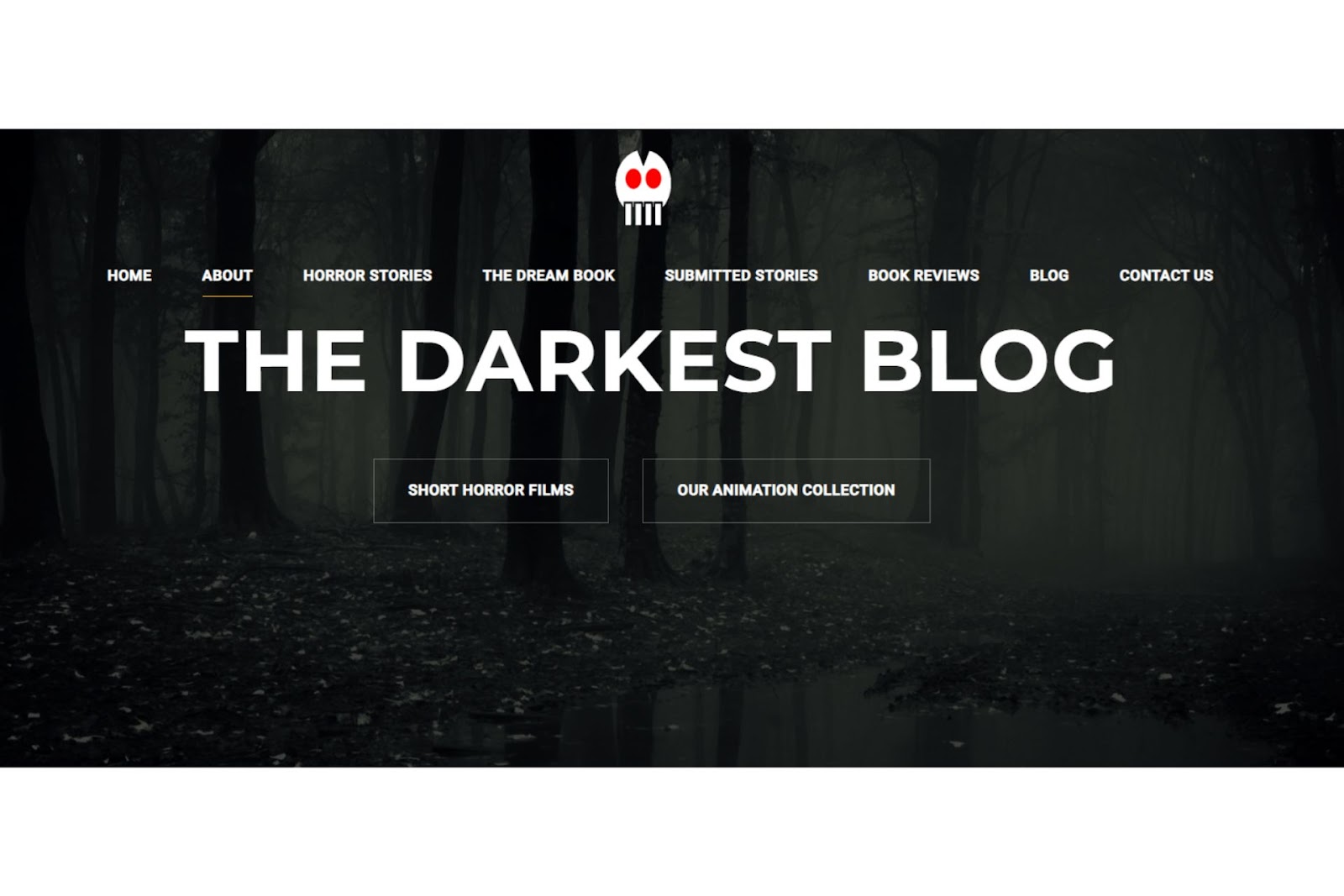
Source: https://thedarkestblog.com/
The Darkest Blog takes a different approach to horror, pulling visitors in with its chilling mix of eerie stories and visuals. Unlike some horror sites that rely on shock value, The Darkest Blog focuses on slow-burn fear, drawing audiences in with each chilling post. The site’s layout mirrors the content, immersing users to make them feel like they are about to hear a haunting tale.
While the design is minimal, it allows each story and image to stand out. The website uses a muted color palette of mostly blacks and grays to create a scary atmosphere. Yet, it also uses sparse pops of white or red to make it feel all that more jarring.
3. FrightFind

Source: https://frightfind.com
FrightFind is a go-to source for uncovering real-life haunted and spooky attractions nationwide. This site caters to true horror fans by helping them locate haunted houses, real ghost sightings and creepy attractions. From listing well-known haunted hotels to underground ghost tours, FrightFind offers a hair-raising yet intriguing look at the paranormal. Browsing through it alone gives users a handful of spooky adventures.
From the text and imagery, audiences get just enough detail to make each page feel submersible without being overwhelming. The fonts are clean but bold and glowy green to make each of the listed hauntings feel real.
The site also carries a dark theme with visuals that would give someone goosebumps. Simultaneously, the site keeps the visual elements simple but feels well-placed to create a trail of breadcrumbs that may lead someone into the unknown.
4. Hashima Island
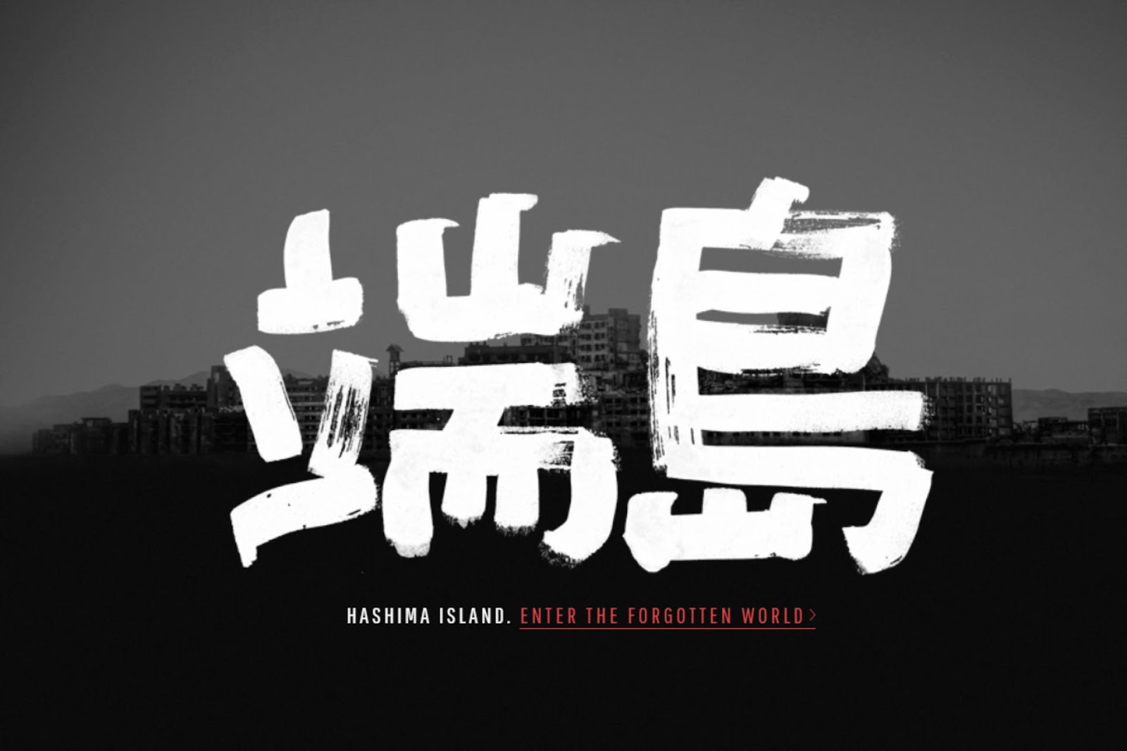
Source: https://www.hashima-island.co.uk/
Hashima Island’s website invites visitors to virtually explore a location known as “Ghost Island” — an abandoned coal mining island off the coast of Japan. The site may be a historical archive, but it is also an interactive experience. It lets users navigate through the haunting remnants of a once-bustling community. The fact that it is a real part of history combined with storytelling gives visitors a sense of isolation, which makes this website as captivating as it is disturbing.
The Hashima Island website gives off spooky vibes. The color theme sticks to blacks, whites and grays, representing the desolate structures and rocky sea surrounding the island. Full-screen images and background music also create an engrossing experience once the user tours the island via the website. The site resembles the ghost town itself, making it feel haunting in every empty corner.
5. Silent Hill 2
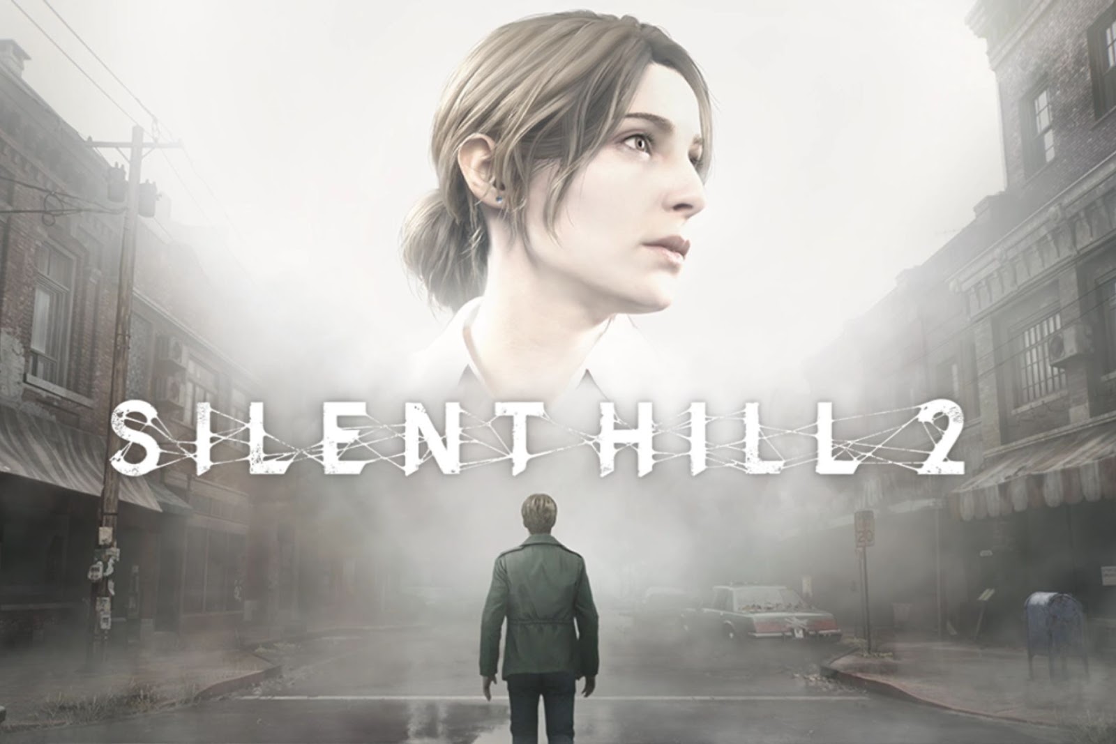
Source: https://www.konami.com/games/silenthill/2r/us/en/
Silent Hill 2 site brings fans back to one of horror gaming’s most iconic towns, but this time with a modern edge. Konami and Bloober Team reintroduced the haunting story of James Sunderland and his search through Silent Hill on its site, which feels dark, all-consuming and nostalgic. With its high-definition graphics, foggy aesthetic and subtle horror elements, the site perfectly complements the remake’s atmosphere.
It perfectly captures Silent Hill with its chilling fog and shadowy streets. The visuals are more realistic than ever, enhancing details with dynamic lighting and intricate details. The layout also feels intimate, making users feel like they are with James, experiencing the town’s disconcerting silence.
6. Housecreep

Source: https://www.housecreep.com/
Housecreep is a one-of-a-kind website that explores the dark histories of homes, from crime scenes and paranormal activity to notorious former occupants. This digital archive of haunted and crime-linked properties is like a treasure trove for anyone curious about the hidden pasts of everyday places. Housecreep feels slightly like sleuthing but adds mystery and unease that keeps users returning for more.
The design is straightforward yet creepy. The layout uses a mix of darker tones to give it a shadowy aesthetic. Additionally, the website’s navigation takes the spooky factor to the next level by encouraging users to explore places by location, property type, and events.
7. Real Ghost Stories Online
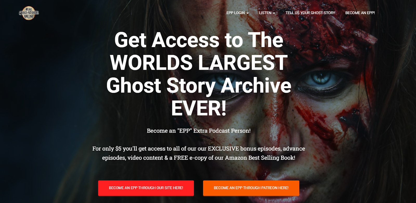
Source: https://www.realghoststoriesonline.com/
Real Ghost Stories Online is a podcast where people share their paranormal experiences. The site allows users to submit ghost stories, letting individuals from all over recount their encounters with the supernatural. The website is a collection of captivating and scary stories, creating an online community where everyone can document their stories.
The website is spooky but still offers an approachable nature to its content. It lends itself to mystery with pops of reds and darker colors. Although the website itself is supposed to make users feel unsettled, it still gives some breathing room to let users browse and listen to different ghost stories.
8. Zombie Pumpkins
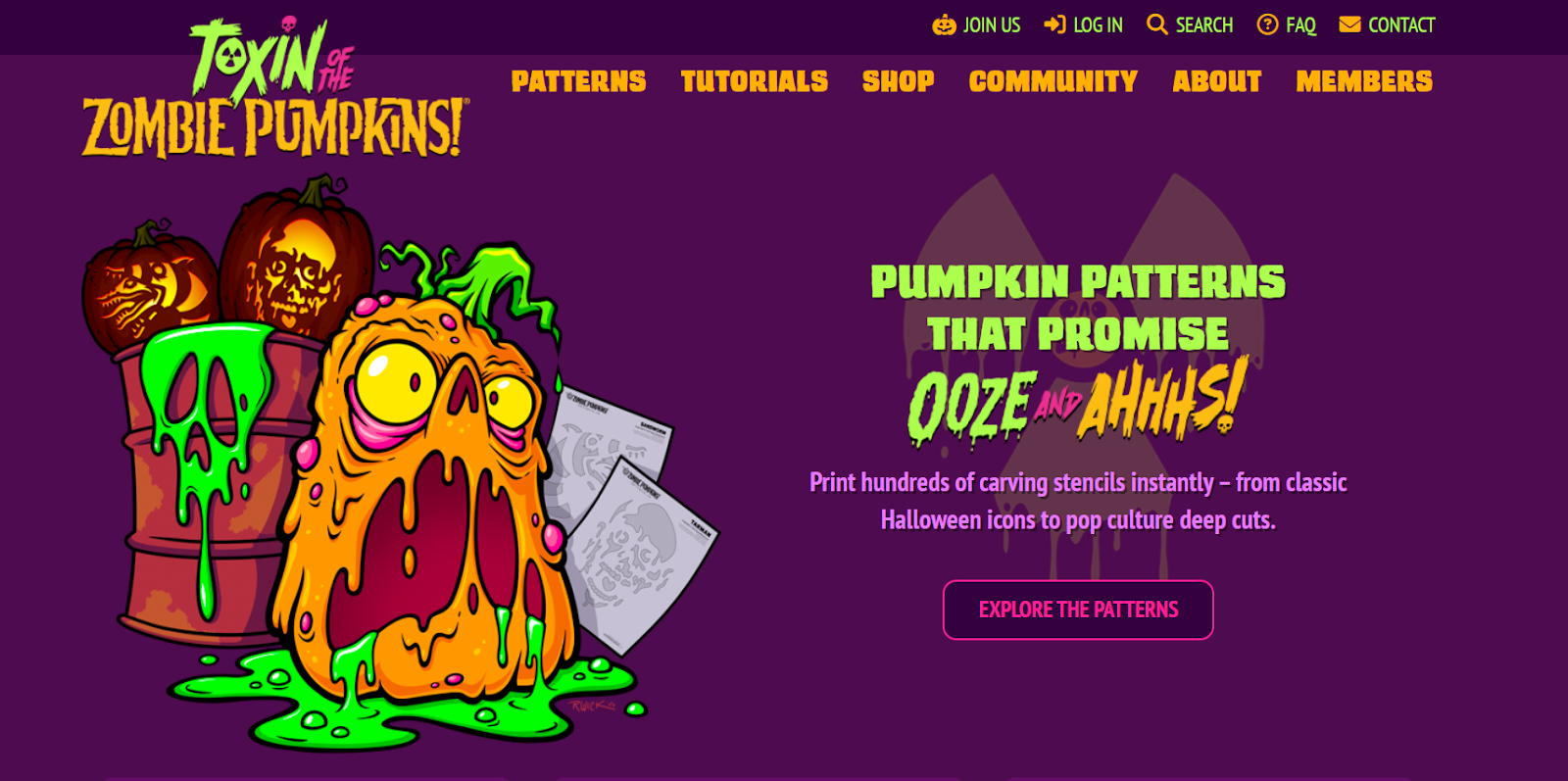
Source: https://www.zombiepumpkins.com/
Zombie Pumpkins is a Halloween-themed website specializing in intricate, creative pumpkin carvings. It offers everything from classic spooky designs to intricate characters that push the limits of pumpkin artistry.
Zombie Pumpkins’ design strikes the perfect balance between spooky fun and accessibility. The homepage welcomes visitors with animated pumpkins resembling zombies and other Halloween-themed visuals, creating a festive atmosphere.
Dark purple backgrounds paired with pops of orange and green create the perfect mix it is trying to portray — scary-looking zombie pumpkins. The bold colors are part of what makes this website attractive — they all come together in a nicely even format. Without this strategy, nearly 40% of visitors tend to click away, so a good design layout is essential to enhancing content and keeping a significant portion of users.
9. Creepypasta
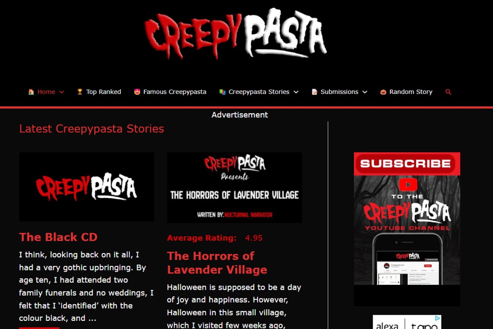
Source: https://www.creepypasta.com/
Creepypasta is a popular online hub for horror enthusiasts who enjoy short, spine-chilling stories. These stories often feature tales of unnerving encounters, supernatural beings and psychological horror. It is a go-to destination for anyone looking to be genuinely spooked.
As soon as users enter the site, they will easily find categories like “Top Ranked,” “Submissions,” and “Famous Creepypasta.” The typography is clean and readable, with a hint of unsettling flair. The site uses black, red and white to symbolize fear. The bold headers and background capture the eerie feeling even further without detracting from readability.
10. Spooked Podcast

Source: https://spookedpodcast.org/
The Spooked podcast is a storytelling series that dives into real-life ghost stories. Each episode features actual encounters with ghostly apparitions and unexplained events narrated by those who experienced them.
Its website design sets the tone for the show’s content. Above the fold is a hero image of a Ouija planchette and Roman numerals to support a creepy atmosphere. The design is clean yet moody, supporting the podcast’s content and allowing the stories to take center stage. With a black background and hints of light brown and white, it gives off a sense of suspense and the supernatural.
Diving Into the World of Scary Websites
Scary websites bring peoples’ fascination with horror to life in unexpected ways. Each site masterfully uses design to play on fear or mystery to encourage users to stay and explore. They also remind us that sometimes, the scariest part of exploring the unknown is finding out how much it resonates with our fears, pushing curiosity further. With a well-crafted creepy website, designers can easily turn an online space into a chilling, interactive platform that may be too close for comfort.


Leave a Comment