

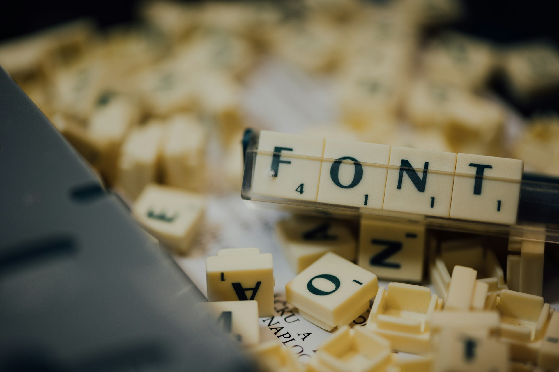
For most people working in digital marketing, typography is often viewed as a secondary or aesthetic choice. Many people view it as a finishing touch when the main bulk of the “real” work has already been done. Yet, at a time when digital saturation is at an all-time high, especially with automation that can roll out content en masse, the architecture of your text is your most potent silent communicator. Sometimes, typography is more than how a message is relayed— it is the message itself. Studying iconic fonts can remind us of these principles.
The history of typography is very interesting, but beyond its engaging nature, it unveils many valuable lessons— lessons about power, rebellion and technological breakthroughs. By examining seven specific letterforms that fundamentally altered human communication, we can better understand how to wield design as a strategic tool for growth in today’s hyper-competitive market.
1. The Trajan “T” and The Origins of Serif
This journey begins at the base of Trajan’s Column in Rome. The chiseled stone inscriptions found there unveiled the “Roman Square Capital,” which would form the foundational DNA for every uppercase letter we use today.
The Trajan “T” introduced the world to the serif, the small stylistic strokes at the ends of letter stems. Originally, these were likely a by-product of stone carvers cleaning up their chisel marks, but they soon became a symbol of stability.
Serifs conjure feelings of heritage and reliability. If your brand operates in a high-trust sector like finance or legal services, leaning into these classical proportions communicates an established presence, even for a startup.
2. How The Gutenberg “B” Represents The Democratization of Knowledge
Johannes Gutenberg’s B in his famous 42-line Bible functioned completely differently. This was the birth of movable type. Before this, books were hand-copied by monks, making them luxury items for the elite.
Gutenberg’s initial typeface, Textura, mimicked the blackletter handwriting of the era. While difficult to read by modern standards, it allowed for the first mass production of information.
The business lesson here is that innovation often starts by mimicking the familiar before finding its own voice. When adopting new technology, such as AI-generated assets, ensure your brand remains recognizable to your core audience while you bridge the gap to the future.
3. The Jenson “e” and The Humanist Revolution
As the Renaissance took hold in Italy, Nicholas Jenson looked back at Roman inscriptions and combined them with the humanist handwriting of the time to create Roman Type.
As the Renaissance was taking place in Italy, Nicholas Jenson studied Roman inscriptions and decided to combine them with the humanist handwriting of the time. This was where Roma Type was conceived.
The lowercase “e” in Jenson’s typeface was revolutionary because of its slanted crossbar and open counters. It prioritized the comfort of the human eye over the calligrapher’s stylistic preferences. This was one of the first times readability became a primary design objective.
This teaches us that design is a service to the user. In 2026, usability has officially overtaken ornamentation as the leading design principle for SMBs. If your website’s typography is aesthetically pleasing but unreadable on a mobile device, you might be failing your consumer.
4. The Baskerville “Q”: The Bridge to Modern Branding
By the mid-18th century, John Baskerville wanted to push the limits of printing. He developed a smoother paper and a darker ink to allow for higher contrast between thick and thin strokes.
The Baskerville “Q,” with its elegant tail, represents a shift toward Transitional typography. It felt more refined than its predecessors. This era proved that subtle improvements in packaging could completely change the perception of quality.
This is a reminder that details matter. Small refinements in your brand’s visual identity can move your brand from generic to premium in the eyes of a consumer,
5. The Helvetica “a”: The Era of Globalism
In the post-WWII era, global trade and commerce needed a natural, cohesive way to communicate. Enter Helvetica. Its “a” is well-balanced, aiming to be invisible rather than overstated. Helvetica became the default font of the modern corporation, used by everyone from NASA to Nestle.
Consistency and trust go hand in hand in the world of marketing. By the late 2010s, this led to more bland designs, where every tech startup looked identical. In 2026, the trend is shifting back. While consistency is vital, personality-driven typography is now required to stand out.
6. The “A” of 2026: Variable Fonts and “Mutant Heritage”
Today, the most important letter in your arsenal is the Variable Font. Unlike static files of the past, a single variable font file can adjust its weight, width and slant in real time based on the user’s environment or device.
There is currently a trend called “Mutant Heritage,” where classic letterforms are re-engineered. Designers are taking old-school serifs and midcentury grotesques and giving them a sleeker and more tech feel. This is often driven by big data analytics and AI-infused workflows that help marketers predict which typographic weights resonate most with specific demographics.
In 2026, business owners should embrace the kinetic. Words no longer stay still on the screen. Animated headlines make your brand feel alive.
Actionable Tips for SMB Owners and Marketers
By understanding some of typography’s deep history, designers can apply many lessons to their own work.
1. Prioritize Mobile Readability: Recent research highlights that consumers will leave a mobile site if the text is too small or lacks enough contrast. Use a minimum of 16pt for body text and ensure your line height is at least 1.5x the font size.
2. Use a Two-Font System: Don’t overcomplicate your brand. Choose one “personality” font for headings, like a modern serif, and one “professional” sans-serif for body text. A serif font like Merriweather pairs well with any sans-serif one.
3. Audit Your Hand-Drawn Touch: A major 2026 trend is a move away from frictionless branding. Brands are choosing to show the human hand through slightly imperfect typography and more organic textures. This signals authenticity in an era of AI-saturated content.
4. Implement Kinetic Typography: If you are running social media ads, even a subtle pop or slide on your text can increase engagement significantly.
The Future of Your Brand’s Voice
History can always be a powerful force. It teaches us what doesn’t work, what does work and what works exceptionally well. By taking the time to understand the “why” and “how” behind something that works, designers build an understanding of the foundational values that make things pleasing to the eye and how to channel these values into their own work. And just as importantly, learning about history will always be engaging.

Leave a Comment