

Serif fonts have the little extra ticks that set a font apart and can give it a more classic look. Think of fonts with decorative strokes but that are still easily readable by the human eye and you’ll have an idea of what a serif font looks like. You may have used one recently at work, in a document or some other printed matter. Figuring out what are the most popular serif fonts requires a bit of detective work.
Serif fonts are often found in magazines, newspapers and books. However, they also appear on websites, on invitations and on posters. Anywhere you can use a sans serif, you can probably use a serif. They simply provide two competing looks with a similar purpose. Most popular serif fonts are easily recognizable.
What Fonts Are Hot Right Now?
There are four main types of fonts you can utilize as a designer, which you likely already know about. They include:
- Serif
- Sans serif
- Script
- Decorative
The popular fonts at any given time can include ones used by the most people as well as new creations that hit all the right design notes. To come up with a list of most popular serif fonts, we paid attention to the ones popping up over and over in search engine results.
We then compared them to traditional most popular serif fonts and also applied good design skill basics to the equation. Here’s what we came up with for our favorites. You’ll likely find a few familiar ones as well as some unique options.
1. Times New Roman
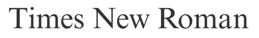
Times New Roman (TNR) was created for the Times of London newspaper in 1929 by typographer Stanley Morison. It was created for easy readability for print publications. However, as computers began to gain popularity and eventually take over the publishing industry, TNR kept its popularity. It is still used frequently today.
The font is narrower than some other serif fonts, even in bold typeface and will fit more text per line than other fonts. Higher education often requires students to complete reports in the font so as to avoid students using wider fonts simply to hit a word count without doing all the work.
TNR is one of the most popular serif fonts because it is utilized so frequently by people in design, business, education and publishing.
2. Ogg

Ogg is a serif font with a touch of calligraphy in the accents and letter shapes. Note how the lowercase “G” almost makes a figure eight. The font factory describes Ogg as a calligraphic serif typeface. Lucas Sharp designed it in 2013. Sharp has said his inspiration came from hand lettering by Oscar Ogg in the 1900s.
Although you won’t see Ogg as frequently in body text, we chose it for this most popular serif fonts list because it appears frequently in logos and headers. It works well to add a touch of whimsy without overwhelming the design. It’s still easily readable and works as well on the title of a wedding invitation as on a movie poster.
3. Georgia
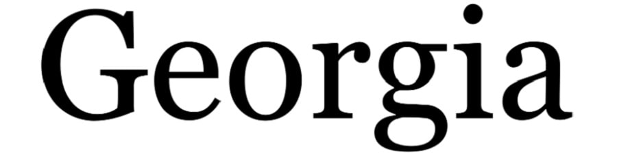
Isn’t Georgia a gorgeous and versatile font? You can use it as easily for body text as you can for a headline. It’s easy to read, even on smaller screens and offers many variations to best match your design requirements.
For history buffs, Matthew Carter designed Georgia in 1993, making this one a vintage beauty. The font was originally created for Microsoft and found its inspiration in the Scotch Roman designers of the 1800s.
The font has thin strokes and ball terminals. It appears in books both online and offline and works well in printed material, even though created for digital use.
4. Baskerville

There are numerous variations of Baskerville font, but our favorite is the Baskerville Display PT by Adobe in regular typeface. Out of the most popular serif fonts we’ve chosen, Baskerville is arguably our favorite for its cozy mystery look and beautiful thin accents on letters.
For example, look at the “B” and how the stroke thins toward the bottom left. John Baskerville first designed the look in the 1750s in England. The look was modernized by various font designers, but still keeps the shifted axis and rounded letters. You’ll find contrast between thick and thin strokes, giving the serifs a sharp or tempered look, depending on the letter.
Baskerville works well both for headlines and as a body text. It’s readable in print and on digital devices.
5. EB Garamond

Garamond is a popular font used by publishers, artists and marketers. It has a nice, clean serif style that’s easy to read in large or small print. It is a community project that gives a look to mid-16th century humanist typefaces such as the one originally created by Claude Garamont.
The font comes in regular, italic, medium 500, semibold, bold and extrabold. The versatile font works well for almost any medium and various size projects. The letters are spaced evenly so it looks as good blown up for a billboard as shrunk down for a mobile device.
Garamond has a lower x-height than some fonts, so using it too small can cause blurring. However, it has to be around 10 points or under before one notices the shift.
6. Georgia
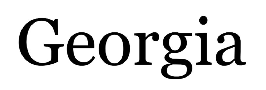
Georgia is a digital Microsoft font with strong serifs and variations between thick and thin strokes. Lowercase letters, such as the “g,” are rounded and almost take on a script look.
Matthew Carter designed the serif type in 1993. It is meant to still be readable on smaller screens and takes its inspiration from Scotch Roman designs. It has some similarities to typefaces from the turn of the 19th century. For example, ball terminals and vertical axis mark the features of the font. At the same time, it is a rather bold font and going to bold rather than regular makes it more difficult to read in small print.
We recommend using Georgia for headings and shifting to something like Garamond or Times New Roman for smaller, body text.
7. Merriweather
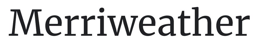
If you’re looking for a beautiful serif font to use on invitations or for a more formal look, Merriweather is an excellent choice. It was originally created as a text face, so it is easy to read on all types of screens. The font’s larger x-height makes it stand out from other text around it. It also have the lightest diagonal slant.
If you want to combine a serif and sans serif font, you can tap into Merriweather Sans for more options. The font pairs well with any sans serif.
Merriweather can be used for headings or body text. It comes in a lighter weight option than the regular pictured above for body text. it also comes in bold, black, boldblack and italics for each weight.
8. Larken

If you’re looking for a bolder font to use for headings or on posters and large-print advertising, Larken features bold, heavy strokes and sharp lines. The font has the appearance of stenciling.
Ellen Luff designed the Larken family of fonts, made up of 14 different styles. One of the weights, think, features bold, thin, tall lines that add angled serifs to the edges of letters. It creates a modern, elegant look attractive for almost any event.
The font also comes in extra bold, regular and italics for each weight.
9. FF Ernestine

If you’re looking for a slab serif font, FF Ernestine is an Adobe font with nice serifs and swoops for parts of the font.
Nina Stossinger and Hrant Papazian are the type designers for FF Ernestine. The designers were on the hunt for a versatile monolinear typeface that would feel warm but serious at the same time. They also wanted a new font with a feminine edge but not too girly.
The font works well for headings and larger text. While it is still readable at smaller sizes, it seems a bit too much for body text due to the heavier lines and tall x-height.
More Serif Fonts
There are thousands of additional serif fonts. Although the most popular ones appear frequently online and offline, the one that works best for your project may be more obscure. We’ve listed a couple that aren’t quite as common, but we’ve also tried to cover some of the tried and true fonts that appear over and over.
The more you know about fonts and their unique features, the easier it is to pick one that works best for your project. The most popular serif fonts aren’t always what you need, but they are a good starting point for any design brainstorming.


Leave a Comment