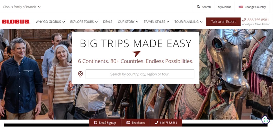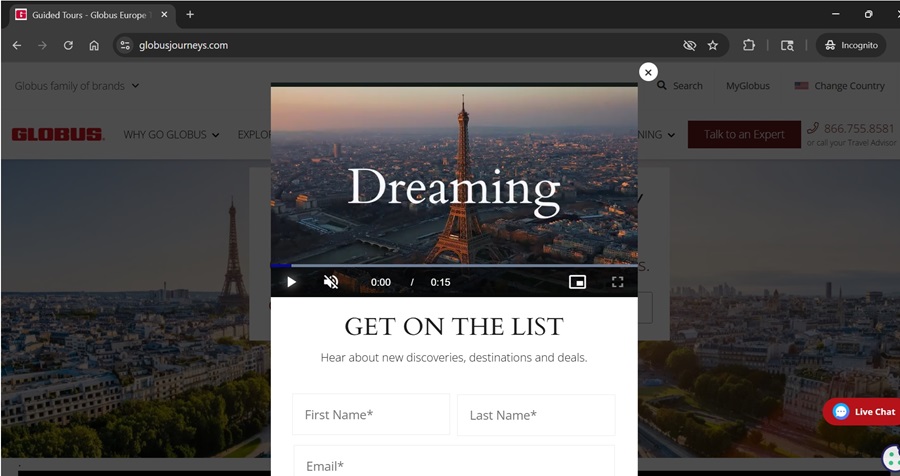
Good website design has a purpose beyond aesthetics. It builds trust, sets expectations for users and guides them through an experience that matches the brand it represents. For these reasons, Globus won the Designerly Award in Outstanding Travel Website Design for November.
When reviewing websites for a Designerly award, our staff assesses how the design shapes the user experience. We factor in hierarchy, functional navigation, accessibility and communication clarity. We want to know how it all supports a company’s goals. Globus’s website does all that and more.
The brand is near and dear to one of our staff members’ hearts. In 2019, they took a Globus tour to Italy, visiting Venice, Pisa, Florence, Assisi and Rome. What strikes us most upon revisiting the website today is how well the web design expresses those values. Just as the tour guides whisk travelers through Italy, the website helps visitors imagine themselves walking the streets of Rome or sipping wine in the countryside.
Why Globus Journeys Won a Designerly Website Design Award
Globus earned a design award by using architecture to tell stories and put the customer at the center of the journey. It creates a sense of place, explaining the history and art behind the must-see sites, similar to how Globus tour guides highlight the Duomo in Florence and the basilicas in Assisi. The site’s speed reflects the balance of structure and freedom guests experience on their journey, taking them from inspiration to a plan without overwhelming them. And it reduces friction at every turn, with delightful navigation, an intuitive information hierarchy, and seamless booking flows, much like our staffer’s approach to travel to Italy in 2019.

In 1928, between the two world wars, a family rowed a boat across Lake Lugano, sharing the beauty of the world with others. The company is Swiss-owned and has expanded from its original Swiss excursions to include global destinations in over 75 countries. They are now headquartered in Colorado.
How the Travel Website Design Stands Out
One of the most apparent signs of good website design is when the experience matches what the brand promises. Globus achieves this by showcasing destinations on the landing page with bold imagery and clear pathways to search by trip styles and regions. The design does not overwhelm the user with choices. Instead, it invites them to move from interest to inspiration to planning.
Photographs are separated by negative space, allowing you to take in what each destination offers. A Globus tour of Italy stops for moments, allowing the guide to wait while the group looks up at the soaring lines of the Duomo, or waits for night to fall in St. Mark’s Square. This site allows photos to take center stage similarly, with built-in pauses.
Navigation reinforces the overall sense of order. While many travel websites bury key headlines in menus, Globus lays out its categories clearly. By combining destinations, travel styles, promotions and other resources, the site felt more like an itinerary than a store. This approach continues throughout the site as users progress to deeper levels, making it easier to plan a complex event, such as an international trip.
The typography is designed for readability. Headlines, subheads and body text are grouped together. Weight and spacing are consistent between them. The pages are easy to scan with a laptop or mobile device. The color palette is part of the branding, with white and charcoal. Signature red accents for the calls to action make sure they stand out from all the other content.
Addition Reasons Globus Earned This Designerly Award
Having firsthand experience with a Globus tour, it was refreshing to see that the website matches the in-person customer experience. The Italy trip required very little thought, allowing travelers to take in the sights of the destination without distractions.
You can see the strength of the website’s design and structure on each page. Tour pages start with one of the destination’s best images. The scrolling layout breaks it up into chunks, allowing users to easily skim and scan the site for the correct section, whether that’s itineraries, hotels, interactive maps, or dates. It does an outstanding job with its itinerary layout. Rather than overwhelm you with a wall of text, you tap to open or close each day of the tour. Pages are designed to carry that same sense of sequence from one level of trip information to the next.
A Website That Reflects the True Experience
One of our most cherished values at Designerly is that the brand’s visual identity is reflected in its digital products. The globus.com website effectively conveys the company’s travel philosophy, rather than just a collection of travel packages. Visitors don’t just see beautiful scenes. They see how Globus plans, paces and supports the journey. That consistency builds trust, especially for tourists making a meaningful international trip.
Each city on the itinerary has a different vibe, and that is showcased on the website. Venice should feel fluid and floating. Florence should feel crystalline and reverent. Pisa should feel fanciful and ancient. Assisi should be contemplative, and Rome should be monumental. Every day is balanced, and every transition is smooth. The same balance holds on the website, reminding travelers that Globus has done the heavy lifting so you can enjoy the ride.
How the Site Compared to Competitors
We examined other major travel sites with beautiful, usable, and deeply intentional design, but the Globus site is the only one where we found all three elements balanced. This avoids visual clutter and presents its destinations in a way that feels aspirational without being overwhelming, signaling the way forward while minimizing ambiguity and indecision. Most crucially, it weaves emotional narratives into the experience without showy displays or panache.

The mobile version of the site performed as well as the desktop version. Since the majority of today’s website traffic comes from mobile devices, this is a crucial aspect we look at for all our award nominees.
Good travel design prepares us to go out into the world. Globus does this by accurately and gently informing and by building digital environments that empower us without overwhelming us. As a result, it is a site that reflects decades of experience and respects the user’s needs.
The Heart Behind the Design
The best travel sites do more than show customers where they can go and what tours they can take. They spell out the company’s brand and turn it into a rapport-building, excitement-generating website. The Globus site represents that model. Its design is personal and focused. It is reminiscent of our 2019 tour of Italy. The company’s website developers clearly understand what a travel website can be and how design shapes our exploration of the world.


Leave a Comment