

Color harmony sits at the core of effective visual communication. When colors work together, designs feel intentional, balanced, and emotionally resonant. Strong color harmony supports brand recognition, improves user experience, and influences decision-making across digital and physical touchpoints.
Below are practical ideas for achieving color harmony in modern design projects, from branding and marketing to digital interfaces and print materials.
- Align Color Harmony With Brand Consistency
Color harmony plays a direct role in how audiences evaluate and accept brands. Notably, color is decisive in early product judgment, shaping approval or rejection for more than half of buyers. This makes consistent and intentional color use a strategic business decision rather than a purely visual one.
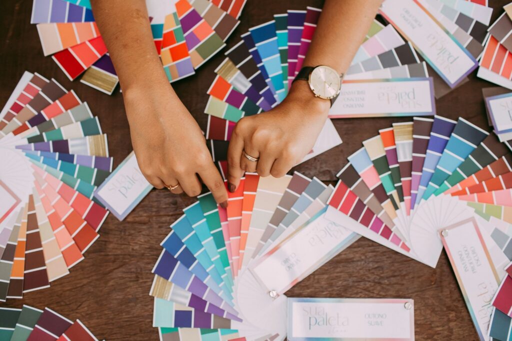
Brand guidelines help maintain this consistency by defining how colors work together across platforms, ensuring the same emotional signals appear on websites, social media, packaging, and marketing materials. When harmonious color systems remain stable across touchpoints, brands appear more credible, recognizable, and reliable.
Effective guidelines clearly document primary and secondary colors, acceptable variations in tone and shade, and usage rules for different contexts. This structure allows teams to scale design efforts while preserving color harmony and reinforcing brand trust over time.
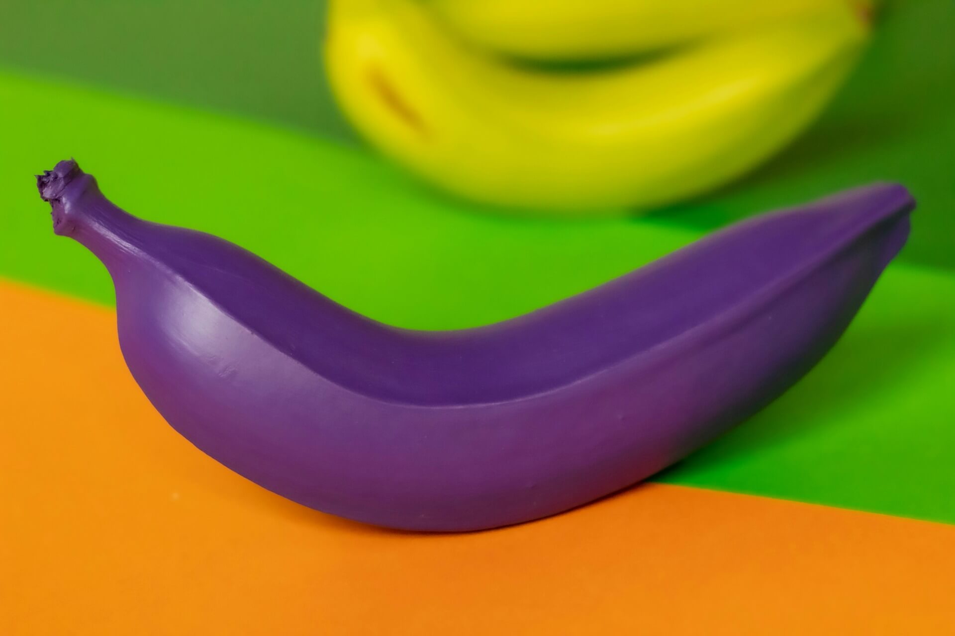
- Ground Every Palette in Color Theory Fundamentals
Color harmony begins with a working understanding of color theory. The traditional color wheel organizes hues into primary, secondary, and tertiary groups, making it easier to identify relationships among hues. Harmonious combinations often come from established structures:
- Analogous schemes use neighboring hues for smooth, cohesive visuals
- Complementary schemes pair opposite hues to create contrast and energy
- Triadic schemes rely on evenly spaced hues for balance and vibrancy
These relationships guide visual balance and hierarchy by defining how the eye moves across a composition. Closely related hues create smooth transitions that feel cohesive, while opposing hues introduce contrast that directs attention and establishes emphasis.
Structured color relationships help designers control focal points, reduce visual tension, and maintain consistency across layouts. Designers who anchor creative decisions in these principles create palettes that feel deliberate rather than arbitrary, strengthening overall color harmony.
- Choose a Dominant Color That Reflects Purpose

Strong color harmony begins with one dominant hue that carries the impression and primary message. This color establishes how a brand feels at first glance, shaping emotional response, perceived reliability, and overall tone. When the dominant color aligns with brand personality and audience expectations, it creates immediate clarity and strengthens recognition across touchpoints.
In financial and technology branding, blue often serves this role because it signals trust, reliability, and competence. By anchoring the palette around a clear emotional signal like this, supporting colors reinforce rather than dilute the message, resulting in more cohesive and effective color harmony across layouts.
Once the dominant color is defined, secondary and accent colors support rather than compete with it, preserving visual balance and hierarchy.
- Factor Accessibility Into Color Harmony Decisions
Modern color harmony extends beyond aesthetics into usability and inclusion. Harmonious palettes that consider accessibility ensure that designs communicate clearly to diverse audiences, including those with visual impairments.
High-contrast combinations improve readability and make key information more visible, while careful color selection supports navigation and comprehension across digital and print formats. By integrating accessibility into color decisions, business owners and marketers reach broader audiences, strengthen trust, and create designs that perform reliably for everyone.
- Use Proportion to Control Visual Balance
Color harmony depends as much on proportion as on hue selection. Even well‑matched colors lose effectiveness when used in equal amounts. A commonly recommended guideline suggests allocating about 60% to the dominant color, 30% to a secondary color, and 10% to accent colors, a standard approach taught in design principles to help achieve balanced compositions.
By controlling how much each color appears, designs maintain rhythm, hierarchy, and emphasis while preserving overall color harmony. This distribution ensures that the dominant hue establishes the visual foundation, the secondary hue enriches the palette with supporting interest, and the accent hue draws attention to key elements.
Applying these proportions guides the eye naturally through a layout and supports clearer communication. Consistent use of thoughtful color proportions strengthens both visual clarity and user experience.
- Leverage Nature as a Proven Model for Harmony

Nature offers some of the most reliable examples of color harmony. Landscapes, seasons, and natural materials demonstrate balanced palettes refined over time, with hues that naturally complement one another and create a sense of calm and cohesion.
Designers can study these combinations to create visuals that feel intuitive, grounded, and emotionally resonant. Common approaches include drawing from:
- Earth tones paired with soft neutrals
- Sky blues balanced by warm highlights
- Greens layered with muted browns and creams
- Ocean-inspired gradients from deep navy to sandy beige
- Autumnal mixes of rust, ochre, and moss green
- Floral combinations of soft pastels with bright, contrasting blooms
These palettes feel instinctively balanced because they mimic environments humans experience daily, tapping into an innate sense of order and comfort. Nature-inspired color systems work effectively across industries — from wellness and hospitality to technology and lifestyle — providing designs that are warm, familiar, and visually stable.
- Use Data to Validate Color Choices
Color harmony benefits from data-informed decisions. Marketing and user experience research shows that consistent and harmonious color systems improve usability, guide attention, and reduce cognitive load, making designs easier to navigate and understand.
Designers and marketers can validate palettes by testing them through methods such as A/B testing, heatmaps, and engagement analytics. These tools reveal how specific color combinations influence user behavior, attention, and perception, helping teams identify which relationships perform best for their audiences. Using real-world performance data ensures color choices are not just aesthetically pleasing but also strategically effective.
- Test Color Harmony Across Real-World Applications
Color harmony evolves when tested in context. Screens, lighting conditions, materials, and print processes all influence how colors interact and appear to users. Colors that feel balanced on a calibrated monitor can shift under different lighting, display technologies, or production methods.
Testing palettes across multiple devices, viewing conditions, and formats helps identify contrast issues, tonal imbalance, and unintended emphasis before launch. This approach ensures color harmony remains consistent and effective in real-world use rather than only in design tools. Effective testing includes:
- Viewing palettes on multiple screen types
- Evaluating print proofs under different lighting
- Reviewing accessibility contrast tools
Together, these checks reduce the risk of miscommunication and visual fatigue. They also help teams deliver designs that perform reliably across platforms, audiences, and production environments.
- Balance Trends With Timeless Color Relationships
Color trends influence contemporary design, yet long-term harmony relies on enduring relationships between hues.
While specific colors gain popularity each year, their effectiveness depends on how well they interact with foundational, complementary, or analogous colors in a palette. Trend colors can refresh visuals and attract attention, but relying on them as structural elements can disrupt harmony and shorten a design’s longevity.
Design teams benefit from using trending colors as accents or highlights rather than primary components. This approach allows designs to feel current and culturally relevant while maintaining balance and consistency.
By combining timeless color relationships with subtle trend elements, designers create palettes that are both visually appealing and adaptable over time, ensuring brand identity and messaging remain clear across changing aesthetics.
- Consider Cultural Context in Global Designs
Color harmony carries cultural meaning. Colors evoke different associations across regions, influencing how designs are perceived and received by diverse audiences.
For example, white can signal purity and cleanliness in some cultures, but mourning in others. Red often conveys celebration and luck in parts of Asia, yet communicates caution or urgency in many Western contexts.
Designers working with global audiences strengthen harmony by aligning palettes with cultural expectations and sensitivities. This approach ensures that colors support the intended message, resonate emotionally, and avoid unintended misinterpretation across markets.
Color Harmony as a Strategic Advantage
Color harmony extends beyond visual appeal into strategy, psychology, and performance. For SMB owners, designers, and marketers, harmonious color systems support brand clarity, user engagement, and long-term scalability.
By grounding decisions in color theory, accessibility standards, cultural awareness, and data-driven insights, teams create designs that resonate across platforms and audiences. As design continues to evolve alongside technology and user expectations, color harmony remains a foundational skill that rewards thoughtful planning and continuous refinement.

Leave a Comment