

In This Article
Left-hand user experience (UX) highlights how inclusive design shapes a better mobile experience by considering how different users naturally interact with interfaces. Inclusive design improves usability and helps users complete tasks faster, which directly enhances overall satisfaction.
Left-handed accessibility is important because many mobile layouts still favor right-handed use, which creates avoidable barriers for a significant portion of users. Overlooked usability gaps often lead to frustration and higher bounce rates, which can reduce conversions and weaken brand loyalty.
Why Left-Hand UX Matters for Mobile Users
Approximately 10.6% of the world’s population is left-handed, which makes it a significant user segment that businesses cannot afford to overlook. Despite this, most mobile interfaces still default to right-handed interactions, with key buttons and navigation elements positioned for right-thumb ease. This imbalance introduces subtle friction that disrupts usability and slows task completion.
These small frustrations add up, leading to lower engagement and missed conversion opportunities. Brands that fail to address left-handed usability risk losing users to competitors that offer smoother, more inclusive experiences. Repositioning key actions can remove these barriers and improve overall usability. Inclusive mobile UX strategies help businesses reach a wider audience while strengthening customer satisfaction and retention.
Understanding Thumb Zones and Reachability
Natural thumb movement affects how users interact with mobile interfaces, with comfort zones determining which areas feel easy or difficult to reach. Around 49% of people operate touch screens using their thumbs alone, which makes a thumb-friendly design essential for smooth navigation and task completion. Left-handed and right-handed users have mirrored reach patterns, so elements placed for one group often fall into awkward or hard-to-reach zones for the other.
Poor placement of buttons and menus forces users to stretch or adjust their grip, creating friction that slows interactions. This added effort increases the likelihood of errors and eventual drop-offs, especially when users try to complete time-sensitive tasks. Repeated friction can condition users to avoid certain features or abandon the app entirely. Thoughtful placement within natural thumb zones helps create a more intuitive and seamless mobile experience for all users.

Common UX Mistakes That Disadvantage Left-Handed Users
Many common design patterns still overlook left-hand UX, creating unnecessary barriers for a large segment of mobile users. Navigation menus placed on the right side often fall outside a left-handed user’s natural thumb zone. Key action buttons positioned too far from comfortable reach force users to stretch or adjust their grip, which disrupts flow and increases effort.
Swipe gestures that favor right-handed use further limit usability, especially when interactions rely on one-directional movement. Overcrowded layouts add to the problem by reducing clarity and making one-handed navigation more difficult. These issues often go unnoticed during design but become obvious during real-world use. Addressing them early helps create a smoother, more inclusive mobile experience.
Placing primary navigation within easy reach on both sides improves usability by accommodating different hand preferences and natural thumb movements. Incorporating accessibility at the initial stages of design ensures equity and fosters broader user acceptance, which strengthens overall user experience from the start. Bottom navigation bars offer a practical alternative to top-heavy menus by keeping key actions within comfortable reach for one-handed use.
Allowing customizable navigation placement gives users more control over how they interact with an interface, which enhances flexibility and satisfaction. Adaptive UI patterns, like mirrored layouts and gesture alternatives, further improve accessibility by adjusting to user behavior and needs. These design choices reduce friction and make interactions feel more intuitive across different usage scenarios. Consistent accessibility improvements can lead to higher engagement and stronger user retention.
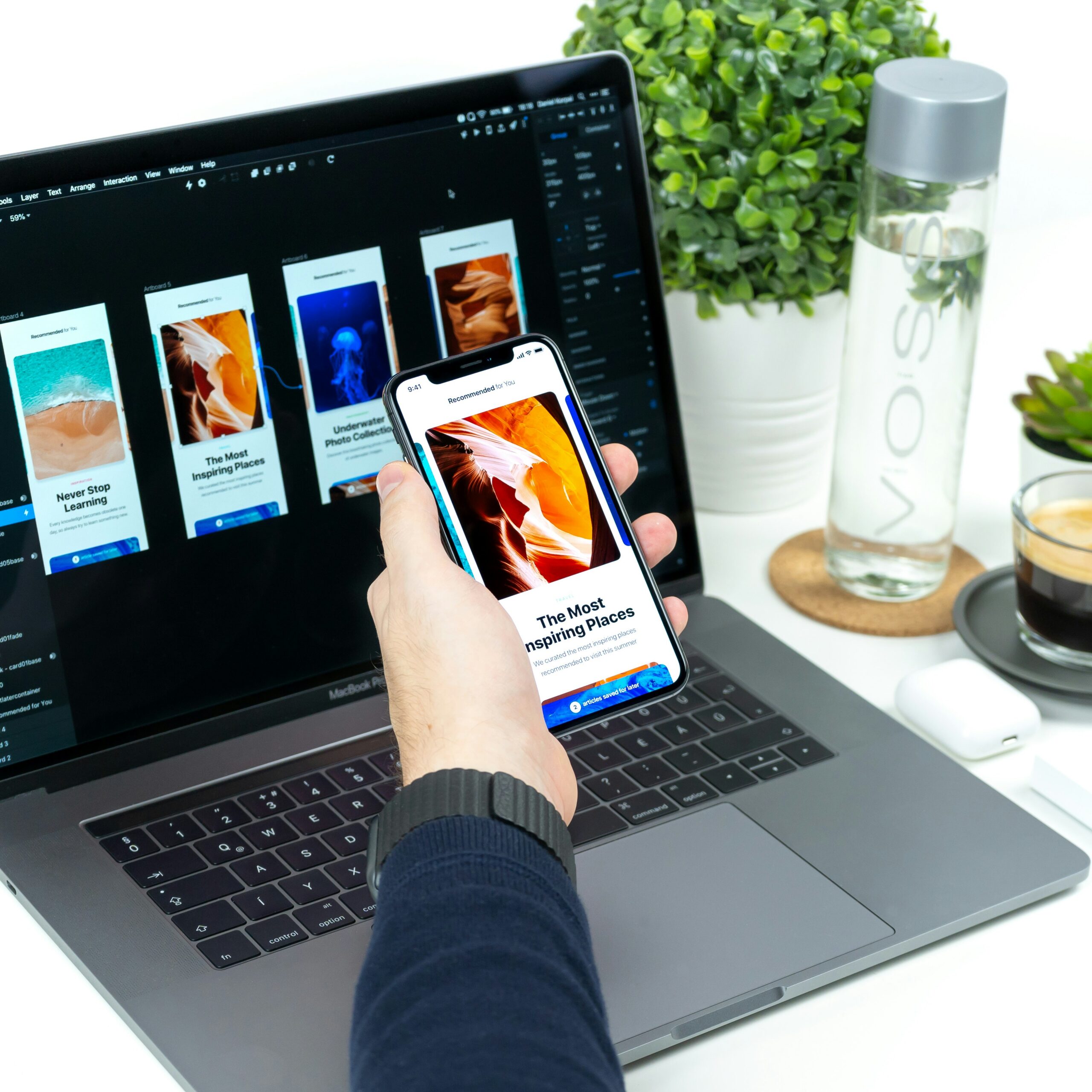
Optimizing Touch Targets and Button Placement
Positioning key calls to action within the left thumb’s natural zone improves accessibility and allows users to complete actions without adjusting their grip. Buttons should remain large enough for easy tapping, with 10 millimeters by 10 millimeters recognized as the ideal minimum size based on the average fingertip. Avoiding edge-only interactions prevents key features from becoming difficult to reach, especially during one-handed use.
Balanced layouts distribute interactive elements across both sides of the screen, which makes the interface comfortable for either hand. This approach reduces input errors and creates a more consistent user experience. Thoughtful spacing between elements also prevents accidental taps, which improves accuracy during fast interactions. Consistent placement patterns help users build familiarity and make navigation feel more intuitive over time.
Accessibility and Inclusivity as a Competitive Advantage
Inclusive UX strengthens brand perception by showing a clear commitment to usability and user-first design. This approach builds trust and positions the brand as thoughtful and forward-thinking in a competitive market. Around 80% of customers who feel unsatisfied with a site will bounce to a competitor, which highlights the direct risk of ignoring usability gaps.
Improved accessibility leads to smoother interactions, which increases customer satisfaction and encourages repeat engagement over time. Higher satisfaction often translates into stronger loyalty, as users gravitate toward experiences that feel intuitive and inclusive. Aligning with broader accessibility standards and best practices also supports compliance efforts while reinforcing long-term credibility and brand value.
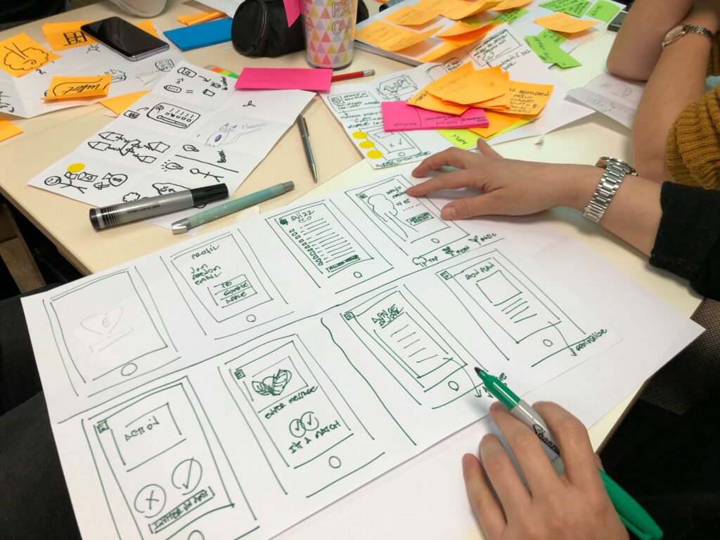
Testing UX With Left-Handed Users
Usability testing with diverse participants ensures mobile experiences reflect real-world behavior rather than assumptions, which leads to more reliable design decisions. Gathering feedback from left-handed users through interviews and task-based testing reveals friction points that often go unnoticed in standard workflows. Opposite-handed UX testing, where teams complete core workflows using the non-dominant hand, uncovers hidden usability gaps that conventional testing might miss.
Heatmaps, touch tracking and session replay help identify where users struggle or abandon tasks. These insights highlight specific pain points tied to reachability and layout design. Continuous iteration based on real-world behavior allows teams to refine interfaces and deliver a more inclusive and intuitive user experience over time.
Practical Tips for Small Businesses and Designers
Designing for left-hand UX does not require a complete overhaul, but it does demand thoughtful adjustments that improve usability for a wider audience. Small businesses and designers can start with simple, high-impact changes that make mobile interactions more accessible and intuitive.
- Start with thumb-friendly layouts: Play key actions and navigation within easy reach on both sides of the screen to support one-handed use.
- Audit current interfaces: Review existing designs to identify elements that favor right-handed interactions and create friction for left-handed users.
- Prioritize key CTAs: Position primary buttons in accessible zones to reduce effort and improve conversion rates.
- Use adaptable navigation patterns: Implement bottom navigation bars or floating elements that can shift based on user preference.
- Test with real users: Include left-handed participants in usability testing to uncover overlooked pain points.
- Try opposite-handed testing: Complete core tasks using the non-dominant hand to reveal hidden usability issues.
- Leverage analytics tools: Use heatmaps and session recordings to track where users struggle or drop off.
Designing Mobile Experiences That Work for Every Hand
Designing for left-hand UX ensures mobile experiences remain accessible and effective for a broader audience. Inclusive mobile UX drives better performance by reducing friction and improving conversion rates. Businesses that adopt user-centered, flexible design strategies position themselves to deliver stronger results while meeting user expectations.


Leave a Comment