


Canva is filled with big, shiny tools and features, but sometimes the most useful ones are tucked away in the little side drawers. TypeCraft is one of those tools. It lets you bend, stretch and reshape text so your words feel like part of the design instead of something you dropped on top at the last minute.
It’s a great effect for social media graphics, posters, headers, product feature promotions, event flyers, quotable images and presentation titles. The key to success is knowing when to go a little wild and when to hold back enough to still be understood.
Why Custom Text Effects Matter
Images draw the eye, but text often carries the most information. A pretty picture can’t compensate for a headline that feels needlessly boring or gets lost in the design. The right text effect can set the mood of your graphic, create movement and give viewers a clear point of interest.
That’s important on visual social media, where people scroll fast and decide faster. According to Pew Research Center, one in two U.S. adults say they use Instagram, making it one of the most widely used social media platforms in the country — 50% of U.S. adults use Instagram. In a cluttered social feed, your graphic is fighting for attention and the headline must be strong.
TypeCraft is useful because it lets you start with plain text and still get creative. You can curve a word to wrap around a shape, stretch it to fill a narrow space or distort it slightly to match the feel of the design. When used sparingly, it can elevate a basic-looking Canva design into something more polished.
What Is Canva TypeCraft?
TypeCraft is a Canva app that allows you to bend, twist, warp or reshape letters, not just change the font, size or color of the text.
To find it, open a design in Canva, go to Apps and search for TypeCraft. Once opened, enter your text, choose a font and modify the shape. Canva describes it as a way to “bend, warp, twist” and create unique text for designs.
TypeCraft is not a full-featured typography app, though. Think of it more as a lettering assistant. TypeCraft works best for decorative headlines and short words. It is not a good choice for body text, longer paragraphs or text with strict accessibility requirements.
How to Use TypeCraft in Canva
You can create a new design from scratch or start with a Canva design you’ve already begun. TypeCraft works better when the rest of the design has a clear direction. Use it on a retro sale graphic, a birthday invitation, a book promotion, a cafe poster or a blog header.

Go to Apps and launch TypeCraft so you get a text box. Type in a single word or short phrase. Pick a font that goes with the attitude of your design. Chunky sans serif typefaces work well. Cursive and script fonts need more care because they can lose readability when stretched.
After that, play with the shape. For example, use a curve for badges, a wave for playful graphics or a stretch for posters. Keep the first version simple. A little distortion can look clever. Too much turns into alphabet spaghetti.
Once you have the shape you want, resize or recolor it to fit your layout. If the word becomes hard to read when made smaller, reduce the effect or change the font.
Best Ways to Use TypeCraft
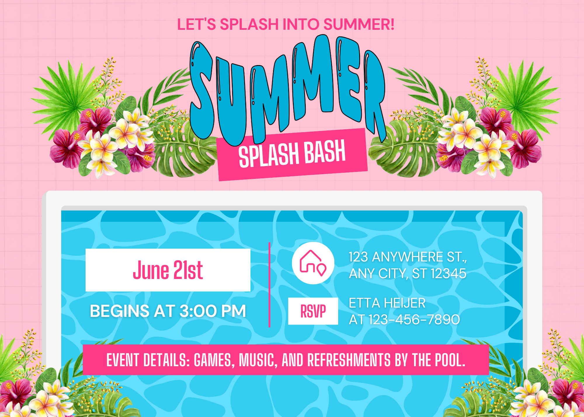
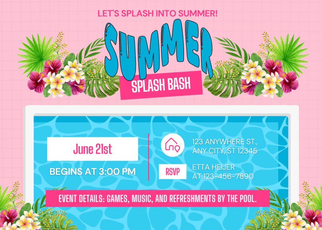
TypeCraft works best when the effect complements the graphic. For example, a curved headline can wrap around a coffee cup in a cafe graphic. Wavy words add a little whimsy to a summer sale email, while stretched headlines add drama to a poster or magazine cover. For this invite, we wanted the word to look like a wave to go with the summer, poolside and water theming.

You can also use TypeCraft to create simple logo-style marks for mockups. A small business owner might use it for a campaign graphic, event badge or branded social post. It gives the design a more customized feel without requiring hand-lettering.
However, the primary purpose of typography is to help people read. Designerly lists accessible fonts and explains why readability matters for websites, documents and digital designs. A warped headline can act as a hook, but it should not make people squint.
Use TypeCraft sparingly and pair it with a more standard style for body text. If the main word has a lot of action, keep the background quieter. If the background has photographs, textures or illustrations, leave space around the text.
Ideas to Try in TypeCraft
Consider setting a single word as the main focus of the design. Curve the word “fresh” over a cupcake to promote a bakery. For a music concert, put the band name across the top of the poster. For a book promotion, use a sticker-style badge to signal the genre.
You could also make “summer” look like a wave, “holiday” curve around an ornament or “sale” feel like a thick, bold badge. TypeCraft works especially well when its form suggests its function.
Another simple trick is to put TypeCraft text behind a cutout image. Make the text slightly transparent or place it so only part of the word peeks out behind the subject. That adds interest without making the project feel like an all-afternoon design puzzle.
Common Errors
TypeCraft loses its effectiveness with longer phrases. The more words you distort, the harder the phrase becomes to read and fit within the design. Stick with one to five words when possible.
Avoid using too many effects. A warped word, busy font, shadow, gradient and patterned background may overwhelm the viewer. Choose one main effect to carry the moment.
Ensure good contrast. Use dark text on a light background or light text on a dark background. If you are using a photograph, consider adding a solid shape behind the text or blurring part of the photo so the words stay visible.
Make sure you know what the final graphic will look like at its intended size. A headline that looks great in your editor’s browser may look jagged on a phone. Zoom out before downloading to ensure the design still works small.
Make Text in Canva More Custom
The TypeCraft app is a handy Canva tool for quick graphics. It helps you shape words around a project’s mood and give basic templates a stronger sense of purpose. Use it for headlines, badges, posters and social posts where the words need a little personality. Don’t make the type sit quietly on the page, but keep the supporting text simple so the design still works.

Leave a Comment