What are the Advantages of Z-Pattern Design?

Posted on May 11, 2022 | Updated on October 10, 2022
If you’ve been designing websites and documents for any length of time, you’ve likely heard of Z-pattern design, H-pattern and several other types. The idea behind a design that forms a Z shape is that people read from top left, across, down and over again. The pattern applies best to readers whose language starts left and reads right.
Around 80% of potential customers who feel unsatisfied with your site will bounce to a competitor. What if you could change that and increase your conversions? The layout you choose has a huge impact on user experience (UX). Z-pattern is a great option for sites wanting to shift readers to a call to action (CTA) at the bottom of the page or speed up the UX.
Consumers tend to already read in a zig-zag, skipping over elements they don’t see as important and skimming text. Your goal is to adjust your Z so you hit all the high points. You may need to do some split testing and move elements around until you find the perfect fit.
When Would You Use a Z-Pattern Design Instead of F-Pattern?
The F-pattern works well to help people absorb details about a topic. So, if you have an informational page for the consideration stage, you might choose an F-pattern. On the other hand, if you want to move the user to an action, such as a CTA button at the bottom of the page, a Z-pattern works much better to move them there quickly.
A Z-pattern is best for minimalistic sites and little content. Here are some tips to create amazing Z-pattern designs.
1. Put Important Elements First
Your most important content on the page should be placed at the top and across. Ideally, you’ll keep the number one thing on the far left and elements lose importance as the reader travels to the right of the header. People tend to put more focus on the first few things they read and the last few things on the page.

Brainbox AI uses a Z-pattern design with the logo starting in the upper left corner and the pattern ending on a video the site invites users to “Watch.” Note how the center of the site is fairly open with just a headline and a background image. It’s very easy for users to scroll quickly to the CTA.
2. Skew Your Z
Keep in mind that your Z-pattern design doesn’t necessarily have to be a perfectly straight line. In fact, some assymetrical elements can create a more pleasing design for users. It’s okay to skew an image a little outside the line or add an element that doesn’t perfectly fit inside the layout.
3. Build Toward the CTA
The diagonal portion of your Z-pattern design helps build toward the CTA button. You can use the space to add details that might urge the reader on. The Z doesn’t have to be text. You can plop a video in the center, add images or even use an arrow that points toward your CTA button in the bottom right corner.
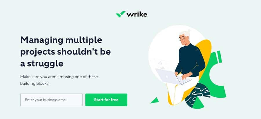
Wrike uses a Z-pattern design to move the user toward the CTA at the bottom of the page that reads, “Start for Free.”
Note how an image sits to the far right, shortening the angles of the Z-pattern design. The information on the diagonal is just an aside. The user can skim over the text and still get the gist of what they’re signing up for from the headline and the CTA button.
4. Place Less Important Details on the Diagonal
Because readers skim as they scroll down a page, save the diagonal portion of the Z-pattern design for less important information or supporting details, such as relevant images or facts. Those who want to slow down and absorb more data can. However, those who want to get right to the point can simply glance over the info.
5. Choose the Right CTA Placement
The bottom horizontal line for your Z-pattern design should contain the CTA. Know the objective of your page, so you can make the CTA button the absolute best it can be. You must decide which placement works best for your customer base.
You might choose to place it in the center of the page or even to the left. Use heat maps to figure out viewing patterns on your site. Try split testing and see which placement works best for conversions with your target audience.
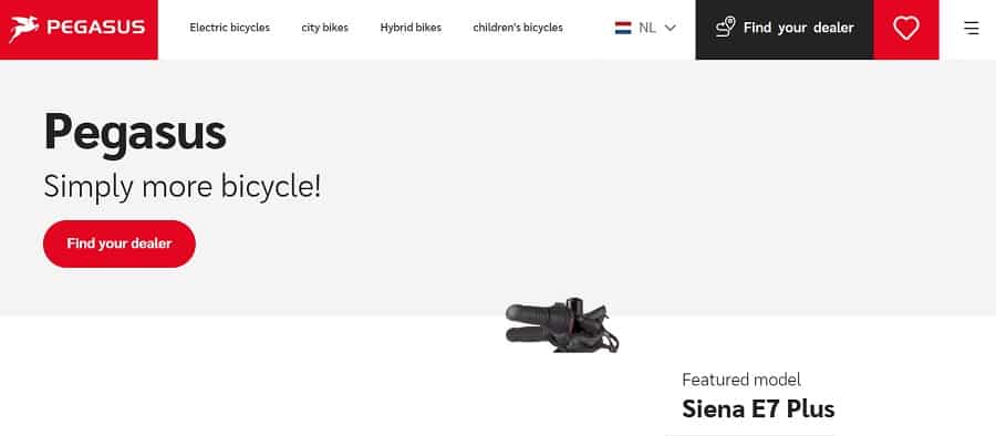
Pegasus Bicycles is based in the Netherlands but they have customers from all over the globe. Note how they place their CTA button in the lower left corner. The bright red contrasts sharply with the light background and draws the user to click on it. Q
6. Control Eye Movement
Get some feedback from others on your layout. What are the things they hone in on first? Do you need to move anything around to better grab attention for particular elements on the page? What should you cut? If something isn’t read, do you really need it on the page or can it go?
Understanding how different patterns such as the Z-pattern design work gives you control over how a user moves down your page.
Should You Use a Z-Pattern Landing Page?
The pages listed above work because they understand what elements are most important to their audience. You see the finished product, which looks fairly simple. However, many hours of research and trial and error go into creating a Z-pattern design that works for a brand’s audience. Test, try new placement and persist until you find the right layout for your site.