
Most of the world is familiar with the piece of fruit with a bite out of one side. Today, Apple is a household brand. The Apple logo is as easily recognizable to most people as the spelling of their own name. However, the journey from 1976 to 2024 was a lengthy one, made up of good design choices and some questionable ones.
Studying a famous logo design can help you learn how to create something recognizable to the target audience and that has some meaning to the business owner.
Before Apple Began
The concept for the company started when Jobs was just 16-years-old and met Wozniak, who was working on a blue box that made free long distance phone calls. The two sold the boxes for $150 each and managed to move around 200 of them. The two Steves, as many refer to the men, both stated over the years that without the blue boxes, Apple Computer Co. would have never been born.
In 1972, both men dropped out of college and designed a video terminal. They were fascinated with technology and computers and trying different inventions to see what improved daily living. From there, the men joined a group called the Homebrew Computer Club, where they learned to use microcomputers, such as the Altair 8800 and IMSAI 8080.
Wozniak began tinkering with a microprocessor to include with his video terminal circuit for a complete, easy-to-use home computer system. Wozniak had the concept of how to build the computer, but the cost of CPUs was out of his budget. Then, in 1976, MOS Technology offered a $20 chip. Wozniak began building his computer and never looked back.
The Original Apple Logo
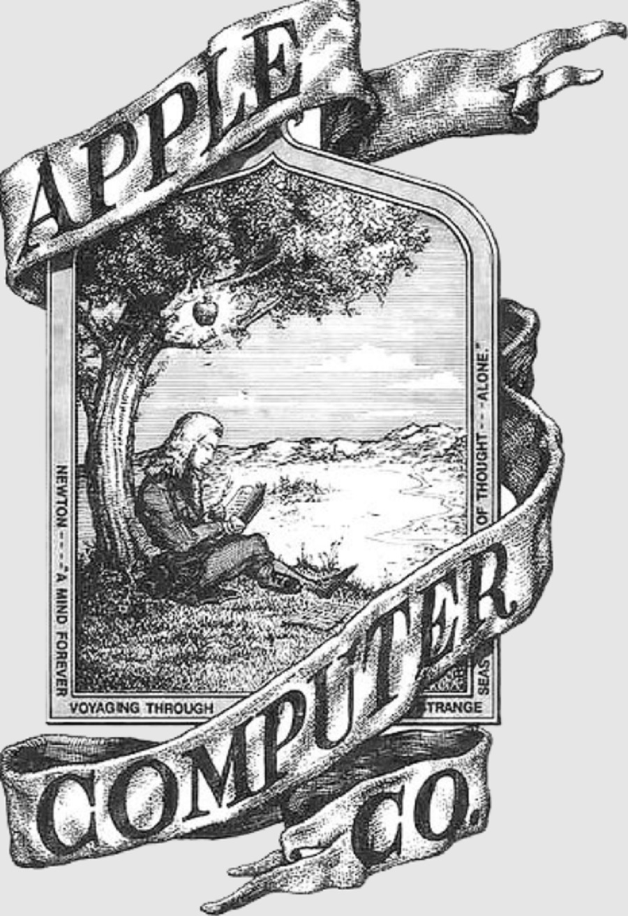
Once the Steves had a working computer they felt they could sell, it was time to incorporate their company and come up with a logo. You might think the apple symbol is what they’ve always had. However, at the company’s start, they first had a more complex graphical logo.
Source: https://en.wikipedia.org/wiki/File:Apple_first_logo.png
The first logo is framed with an old-fashioned looking image and Sir Isaac Newton sitting under the apple tree. One might wonder what gravity has to do with computers, but likely the two men were just recognizing scientists who discovered great things.
The men have stated the illustration was meant to convent “knowledge and discovery.” The first design was complex and old fashioned and was destined to be replaced fairly quickly as computer technology changed and advanced.
Source: https://en.wikipedia.org/wiki/File:Apple_Computer_Logo_rainbow.svg
When Did the Rainbow Apple Logo Appear?
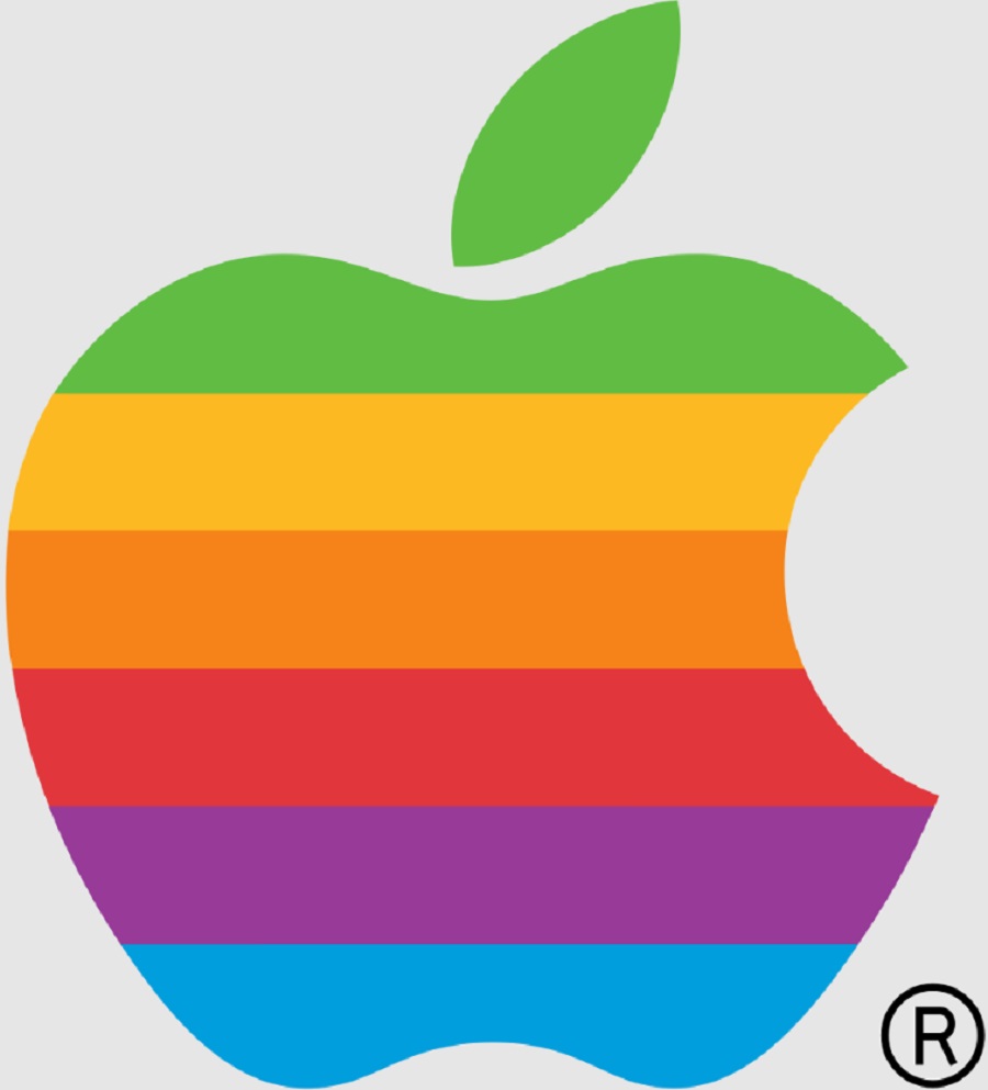
By 1977, the company replaced the original logo with a rainbow apple with a bite out of one side. People have theorized why there is a bite out of the fruit for years.
The rainbow logo creator, Rob Janoff, stated the bite was meant to distinguish the graphic from a cherry to ensure people knew the company name. The bite is a small portion of the image, showing scale and that it is the size of an apple. The founding trio may have also felt it showed the fun side of their company and how much they loved what they were doing.
Embracing Minimalism in the 90s
The company changed quite a bit between 1976 and 1998. Minor tweaks to the logo included adding the word “apple” and taking it away. Steve Jobs left the company in 1985 but returned by 1997, taking the brand on a meteoric rise to its current $383 billion in annual sales.
Source: https://commons.wikimedia.org/wiki/File:Apple_logo_black.svg
By 1998, people were embracing a minimalistic look. The busy rainbow look of the previous logo didn’t match the sleek styling of the Apple computer system. Today’s logo looks very similar to the one from 1998. It has gone over a couple of variations, colors and changes from 1998 to 2024. It has retained the monochrome look of the original 1998 version.
Jobs wanted to completely change the way people saw Apple computers after leaving the company, watching it flounder and returning. At one point, he experimented with a light blue logo but it was short-lived, giving way to solid black. His goal was to make Apple appear as a luxury brand. He also wanted something everyone could recognize no matter their geographic location or culture.
A Move to Glass
Throughout the early 2000s, designers varied the look of the logo, depending on where they were marketing the brand. Chrome, black and white versions appeared. Some were shiny, such as the one used with macOS X in 2001. They also added a glass-looking surface to the logo to make it look more futuristic. The aesthetic matched the design of iMacs and other products at the time.
Current Flat Design
The simplicity of the flat design from 1998 is Apple’s ability to change its color and make other minor tweaks that keep the symbol recognizable. The more people see the logo, the more brand awareness increases for the company.
What Font Does the Apple Logo Use?
Apple states on their website that they use Myriad Set, which is a modified variation of Myriad Pro. They use the same font in multiple places, including marketing materials and on products. If the logo is just the apple, you won’t see the font, but occasionally text appears alongside the emblem and it is consistent with other places where the name appears.
Why The Logo Works Today
The Apple logo’s recognizability is a testament to how well it works to represent the brand. The simple design used over and over withstands various design trends. People who bought an Apple computer in 1978 still recognize the company today.
Future Changes in the Apple Logo Design
Can we expect any future changes in Apple’s logo design? More than likely the apple with the bite out of it will remain the same. However, Apple releases new products every year. As technology changes and style preferences emerge, the company will likely make tweaks to their logo to keep up.
We expect to see changes such as more reflection rather than a flat design, three-dimensional impact and varied color options. It will be interesting to see where this iconic brand takes its design next.


Leave a Comment