

When you think of popular logos, you probably consider brands such as Coca-Cola, McDonald’s, FedEx and American Airlines. Brands that are household names also tend to have emblems immediately recognizable to the average consumer.
Most famous logos have a story behind them about how the company came to be, overcame all odds or grabbed public attention. With a huge assortment of potential logos from which to choose, our job became selecting ten or so.
Rather than only go by what is the most popular logos, we also considered which ones had the most impact on people. Why do they stick with us and is it something designers can repeat in their own work? With that in mind, here are the top eight.
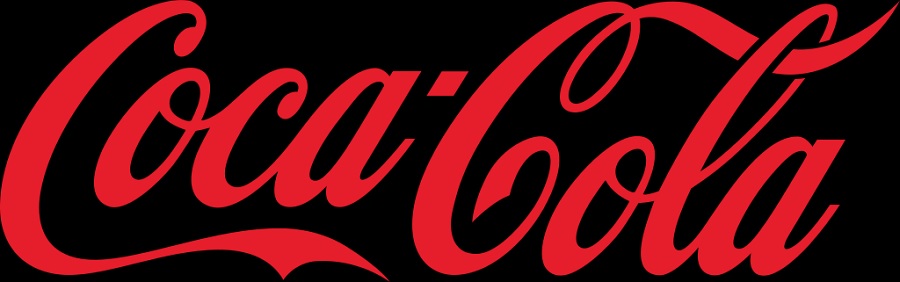
1. Coca-Cola
Source: https://commons.wikimedia.org/wiki/File:Coca-Cola_logo.svg
Perhaps it is the history of cola or the way the logo has only slightly changed from 1886 to today, but Coca-Cola is arguably the most recognizable logo in the world. The beverage is popular in the United States, but makes its way around the world in various concoctions.
In 2015, the brand united the different drinks under a brand font and style. The logo was black until 1934 when the iconic red took shape. The logo has a script, handwritten appeal that makes the beverage seem like something special, although it’s an everyday staple in some people’s diets.
Coca-Cola proves a wordmark logo, given a bit of personality, can make a huge impact.
2. Apple

Source: https://en.wikipedia.org/wiki/Apple_Inc.#/media/File:Apple_logo_black.svg
Apple’s global sales are over $383 billion per year, making it one of the largest companies in the world. The Apple logo is a simple image that is immediately recognized by billions of people around the globe.
A simple black logo with a single bite out of it has been utilized since the mid-80s. Minor changes happen from time to time but sticking with the same symbol has helped the company with brand familiarity.
Apple proves your logo can be simple without words and still become a household name.
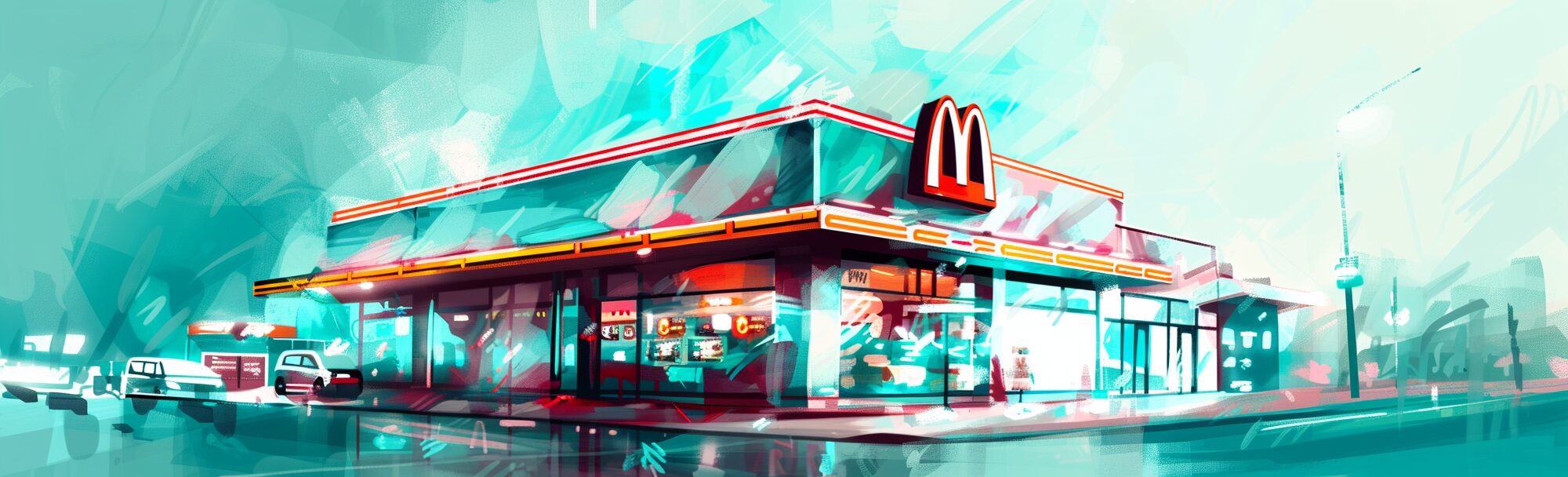
3. McDonald’s

Source: https://corporate.mcdonalds.com/corpmcd/our-stories/media-assets-library/media-article/golden_arches_logo.html
McDonald’s was founded by Dick and Mac McDonald in the 1940s. They set up a system for speedy service and cheap hamburgers. It wasn’t until they started to franchise that it grew into the powerhouse it is today.
Although best known for the golden arches, McDonald’s also has several word mark logos for various uses. The yellow M logo is the perfect example of tapping into the power of a color to set a tone for your brand.
Yellow makes people think of sunshine and happy times–and mustard. Kids all over recognize the power of the golden arches and ask to stop and get a Happy Meal. You can repeat their logo success by choosing colors that tap into customers’ emotions.
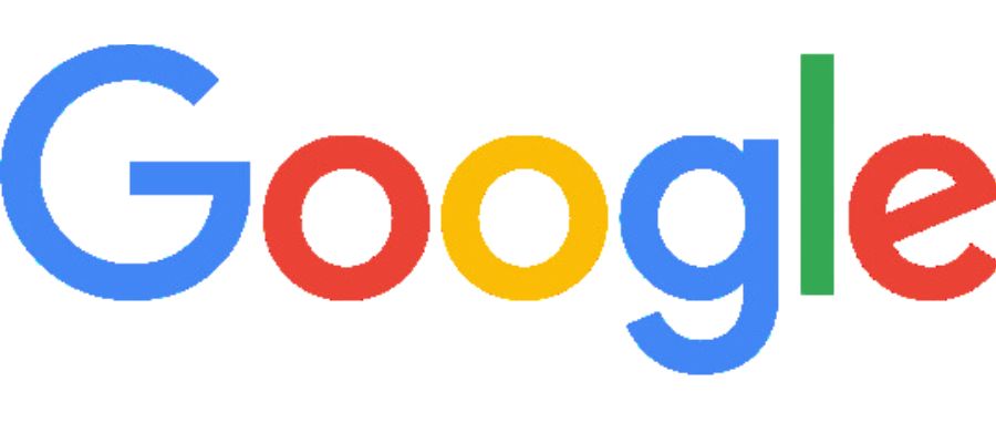
4. Google
Source: https://google.com
Google features a simple, almost preschool-looking logo with bright colors and a sans-serif, thick-lined font. The typography has a modern look and the large open areas of the letters create a friendly feeling.
However, by keeping their logo simple, Google gives themselves room to change things up frequently while still keeping their logo relevant. They’ve been known to add some images around the letters to commemorate historical events or just for fun.
You can create a simple wordmark logo and then add to it for holidays and special events. The key is to keep the design recognizable throughout any additions.
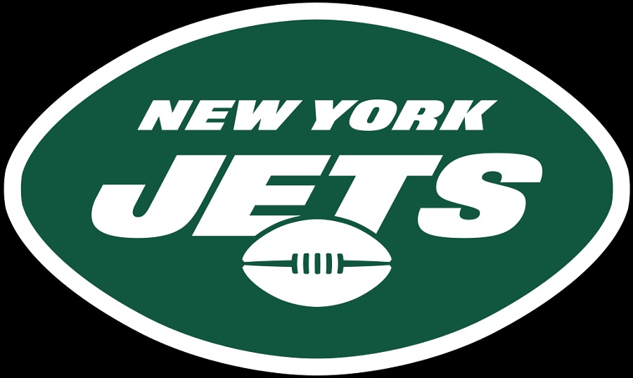
5. New York Jets
Source: https://www.newyorkjets.com
What story about popular logos would be complete without a look at the best NFL logos of all time? We felt the New York Jets was an interesting one for designers to study because it adds some motion through slanted letters and is an elongated oval.
Note how the letters for the words “New York Jets” all slant every-so-slightly to the right, creating a sense of movement. One immediately thinks the team must run fast down the field.
How can you add subtle movement to send a message for your logo designs? Think of brands such as FedEx, where the letters almost seem in motion.
6. Subway
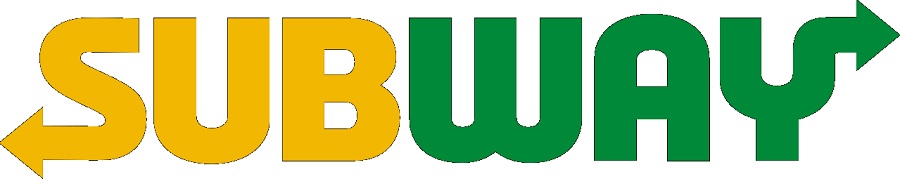
Source: https://commons.wikimedia.org/wiki/File:Subway_2016_logo.svg
Another logo worth studying is Subway’s. The original logo was a wordmark with arrows on either end. The arrows represent the coming and going of customers and fast service.
In their early days, they were quite health-conscious and many athletes ate there, giving it the green and yellow hues. The brand underwent redesigns in 1982 with larger arrows and in 2016, losing the submarine icon. Throughout, the name and arrows remained, keeping the logo recognizable.
7. Amazon
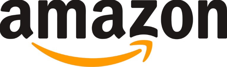
Source: https://amazon.com
Amazon has an interesting logo that people either love, hate or make fun of. Once you see the male body part in the arrow, you can’t unsee it. While the intent was likely to show they have speedy service with the movement and angles of the arrow and to show they sell from A to Z, the result is less than ideal.
Amazon’s logo is one of the most popular logos in the world but is a good reminder to not only check and recheck everything but to get several pairs of eyeballs on every design to ensure you aren’t inadvertently sending the wrong message.
8. PlayStation
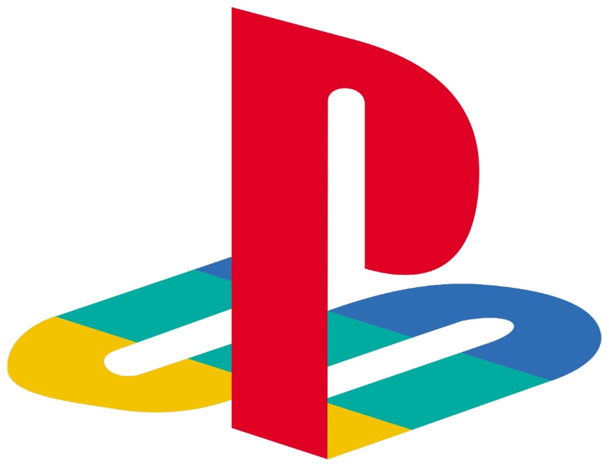
Source: https://en.wikipedia.org/wiki/File:Playstation_logo_colour.svg
Sony Playstation has an interesting logo that gives users a 3D effect. The original intent with the red, green, blue and yellow was to appeal to all audiences. The original rendering presented an optical illusion with additional depth of perception between the S and P. This was quite interesting in the gaming industry at the time–1994. The logo now appears in black and white in most instances but the design itself remains intact.
Logos can send a message. What do you want your logo to say?
More Popular Logos
We can’t possibly cover all the popular logos from every brand out there. We’ve gone with names nearly anyone would recognize and explained why the logos work well and how you can repeat their efforts. You can also learn from other well-known brands, such as clothing brands, sports teams, music groups and movie studies. Anything you see often can be another case study for your design work.


Leave a Comment