


In This Article
Whether working on a blog or business hub, everyone needs an attractive and user-friendly website. There are of course many factors that go into creating a great website, like color choices, imagery and reliable written content. Perhaps most important is a professional and readable font to accompany all that you have to say.
Google owns a large collection of unique and stylistic fonts to use for any website curation software, like WordPress. Personalizing your brand or your unique spin on storytelling is vital to capturing your audience. Find 22 of the best Google fonts below and revitalize the look of your website.
The Power of a Persuasive Font
Capturing attention and increasing dwell time is crucial to building an audience or generating leads, but there is much more than goes into a good font than flash. Consider style, user experience and professionalism.
Style curates a unique voice for your website. Written content helps explain the mission and thoughts of the creator, but stylistic typography can enhance the experience. Think about matching the tone of the words with the typeface. For example, a website for a children’s party magician will probably lean towards a whimsical and engaging font instead of a generic, blocky one.
The brand message is conveyed in a variety of ways, from the smiles of people in their site photos to the typography on the website. All of this contributes to the user’s experience and information gleaned on the site.
Secondly, readability makes your website people-focused. Google’s algorithm values people over auto-generated content, so it places authoritative and clear content at the top of the search results. Often we can get swept up in the fun of finding stylistic fonts and may choose one that is hardly legible.
Think about the color of your background and what colors will appear the best. Color theory points out certain color schemes that are best for legibility, like black text on a white background. Additionally, fonts should always be optimized for use on all browsers and devices. A lot of internet traffic comes from mobile users, so make sure not to leave them out of the party.
Finally, maintaining a professional glow is important even for personal blogs. If the font is strange or discordant with the message, then potential audiences might click away. Some typefaces are in secret codes or symbols, and though they might be funny for an April Fool’s prank, they may ultimately be frustrating for the reader.
Prioritizing the experience of the reader is the most important step in crafting the perfect font for your website.
5 Font Umbrellas
Experienced developers may already know the ins and outs of generic typesettings, but most people tend to just stick with Arial, Helvetica and Times New Roman. Exploring the genres of fonts can help guide web developers decide the perfect style and professional air for their website.
1. Serif
Many people find serif fonts easier to read as the line strokes at the end of letters accentuate their details. Readers can scan through faster this way. Even better, serif fonts exude professionalism and call back to the typesettings of newspapers and magazines. Trustworthy and authoritative, serif fonts are the classic genre.
2. Sans Serif
Sans serif includes fonts that do not have line strokes at the ends of letters. As a more modern addition to the font library, sans serif evokes a sense of casual familiarity.
3. Display
Consider display for any attention-grabbing headers, titles and notices. Big and bold, display fonts are heavy lifters in the flashy department.
4. Handwriting
Handwriting mimics the touch of a human’s flick of the wrist, from scratched-out quick notes to swooping, romantic cursive. Their strong personalities and appeal to our human nature are perfect for a more stylistic approach.
5. Monospace
Monospace rounds out the top pics with its clean and simple design. Developers will quickly recognize monospace as it is a preferred font family for close-reading code.
The Best Google Fonts: Top Serif Choices
The fonts under these umbrellas are expansive, but what are some of the best Google fonts for a website? There is no one correct answer. Every blogger and business owner has a unique style and message to shout out to the world, and their font will help portray that message.
1. Lora
Lora is a serif font that exudes a professional, yet elegant aura. Soft, rounded edges and balanced strokes create an engaging user experience. Created with readability in mind, websites looking for a smooth and professional vibe can look no further.

2. Playfair Display
Inspired by quills of the 18th century and transformed by modern ink printing, Playfair Display stands out as one of the best Google fonts. This traditional serif is simple and has flourishes in all of the right places. Its professional, historic appearance makes it a good eye-catching choice for headings and subheadings.

3. Nanum Myeongjo
Reminiscent of a calligraphy quill running out of ink, Nanum Myeongjo stands out among other serif fonts. It was purpose-built for the digital world, so it will look great on web browsers. That being said, you should be careful about using it on text-heavy pages since the tiny embellishments get lost in smaller sizes.

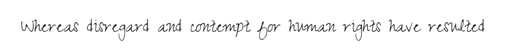
4. Zeyada
Zeyada is unlike any other handwritten typeface because it combines elements from traditional script and cursive. That, and it’s heavily inspired by the handwriting of an actual person. This font may be hard to follow in a text-heavy setting, but it would look great as a heading, accessory or descriptive snippet.
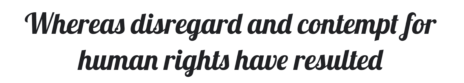
5. Lobster
Lobster is not as pointed as the claws of its animal namesake. Instead, lobster font is a swooping swirl of cursive beauty. Thick strokes down the body of the letter are accompanied by thin linking lines for an elegant, yet eye-catching view. Again, lobster’s thickness makes for more of a header on a page, but its elegance can be used for everything from flower shops to morning routines.
6. Dancing Script
Reminiscent of a twirling ballerina, dancing script features delicate cursive swirls in an energetic movement. Cursive evokes a strong mood of delicate, feminine energy and is sure to help further this brand message. However, be wary of using too much cursive as it can be difficult to read for many younger viewers. Try using this stylistic font as only an accent piece and not as a body paragraph.

7. Glass Antiqua
Glass Antiqua is a revival of a typeface from the early 1900s that takes inspiration from cursive calligraphy. Naturally, it looks like someone mashed together retro and Victorian aesthetics. Its swirling loops and surprising curves are unique, fun and informal. It’s one of the best Google fonts for brands who want to seem personable or fit a niche theme.

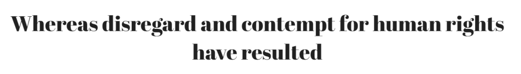
8. Abril Fatface
As the name suggests, Abril Fatface is very high-contrast and curvy. It’s inspired by headlines on posters from the 19th century, which is plain to see in the excessive flourishes. This serif font is best used in headings and subheadings to catch attention while people skim.
The Best Google Fonts: Top Sans-Serif Choices
Don’t be afraid to experiment and ask coworkers and friends about their experiences as they read through your website. Finding the unique setting for you is a journey.
1. Lato
Originally designed for corporate settings, Lato is supposed to be a blend of practicality and stylistic expression. This sans-serif font looks great whether you use it as a header or in body text. While it isn’t particularly eye-catching, it makes for an easy read.

2. Rowdies
The Rowdies font is all about storytelling. Inspired by classic Indian action films, it focuses on bold and artistic elements to make small details like diamond dots and chunky embellishments stand out. For a unique, eye-catching look for your homepage, consider using this font.

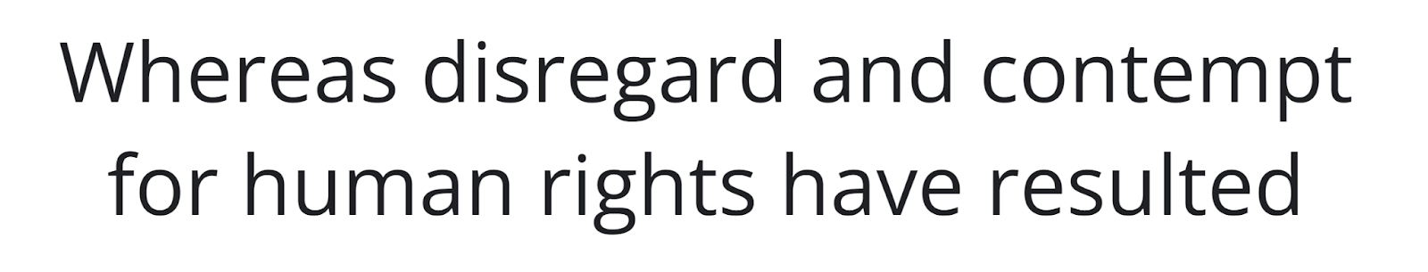
3. Open Sans
Open Sans is a sans-serif font that stresses neutrality and user experience across multiple devices. For an inviting and professional look for your homepage, consider the modern strokes of Open Sans.
4. Poppins
Poppins is another sans-serif font that emphasizes neutrality over form. Each letter is round and spacious, which makes for an especially easy read. If you have a lot of dense text on your website, consider using this to make the words visually flow.

5. Pixelify Sans
Brands in the tech sector can rejoice at the arrival of Pixelify Sans. This font is perfect for all things geeky, considering it is directly inspired by traditional computer graphics and videogame fonts. This is one of the best Google fonts you can use if you’re involved in a tech-centered field.
6. Montserrat
Montserrat is a beautiful and thin font inspired by classic beauty. The famous posters of Buenos Aires featured the rounded sans serif strokes of this font. Modern and casual, bloggers often find Montserrat to be perfect for travel journals or weekly updates.
7. Bebas Neue
Bebas Neue is big, bold and brash–and perfect for an attention-grabbing headline. Thick lines beef up the letters, preparing the reader for important information. While this font may be a bit tiring for body paragraphs, try pairing its power with thinner fonts like the above Montserrat.

8. Raleway
Raleway’s combination of form and function makes it one of the more elegant sans-serif fonts. Although it appears very geometric at first glance, it has plenty of playful stylistic twists. Most of the letters have some sort of special touch. Brands looking to appear authoritative yet approachable should consider using it.

9. Anton
If you were told to imagine a breaking news headline, Anton is probably the closest thing to your imagination you get it. It’s a revision of a traditional sans-serif font, purpose-built for the digital world. As a result, it looks particularly good on web browsers and mobile devices.
10. Fira Sans
The main reason Fira Sans exists is to integrate with the character set from the Mozilla Firefox OS. However, it was also built with legibility in mind. Although the robotic structure screams tech blog, the subtle flourishes on many lowercase letters evoke a strong sense of authority and classic professionalism.
11. DM Sans
This geometric sans-serif font is about as plain as you can get. Although it isn’t particularly eye-catching, it’s particularly easy on the eyes. Since the designers of DM Sans intended for it to be small, it’s one of the best Google fonts for brands who have text-heavy body paragraphs.
12. Indie Flower
As the name suggests, indie flower is carefree and fun, featuring a handwritten vibe. The slight discrepancies in sizing and shape of the letters add to the true human feeling of reading in Indie Flower. For brands looking to create that familiar bond with their readers or searching for a casual young audience, this bubbly font can do the trick.

13. Titan One
Where most bold fonts go for big and brass, Titan One goes for an informal, curvy look. It’s meant to be cheerful, inviting and disarming, which makes it ideal for any title or header. On your homepage, it would make a good font for buttons.

14. Space Mono
The final pick for the best Google fonts is space mono. Inspired by headlines of the 1960s, this font has a typewriter, a mid-century modern feel to it. Like Lora, this vibe evokes professionalism and class. However, its blocky and rigid shapes are fresh and modern, warding off stuffiness. Creative, innovative brands can utilize space mono to strengthen their personality.

Optimizing for Your Website
Remember to not go overboard when experimenting with font styles. Fonts have weights, and websites like WordPress can become laggy when attempting to load heavily weighted options. Additionally, stick to no more than 3 fonts as it can slow down your website significantly. A slow website frustrates users and could drive them away.
Ensure that you are using up-to-date fonts that will seamlessly integrate with updated website curation software. Old and new versions could also slow down load times.
Finally, have fun and explore your brand’s personality. There are fonts for every mood, feeling and vibe. Bubbly or serious, goofy or somber, the font can express a variety of ideals to a reader in the blink of an eye. These best Google fonts exemplify the library of choices that populate the digital landscape. Explore how you can revamp your website with a new font today.


Leave a Comment