


In This Article
A mark of good website design is when the searcher can answer every question without reaching out via the contact page. Breadcrumb design, or secondary forms of navigation, can assist with deepening user experience (UX).
This means you set up your navigation bars intuitively. It also implies an effort to produce high-quality marketing content, giving other pages a chance to answer subsequent questions the searcher may have.
How Do Breadcrumbs Benefit a Website?
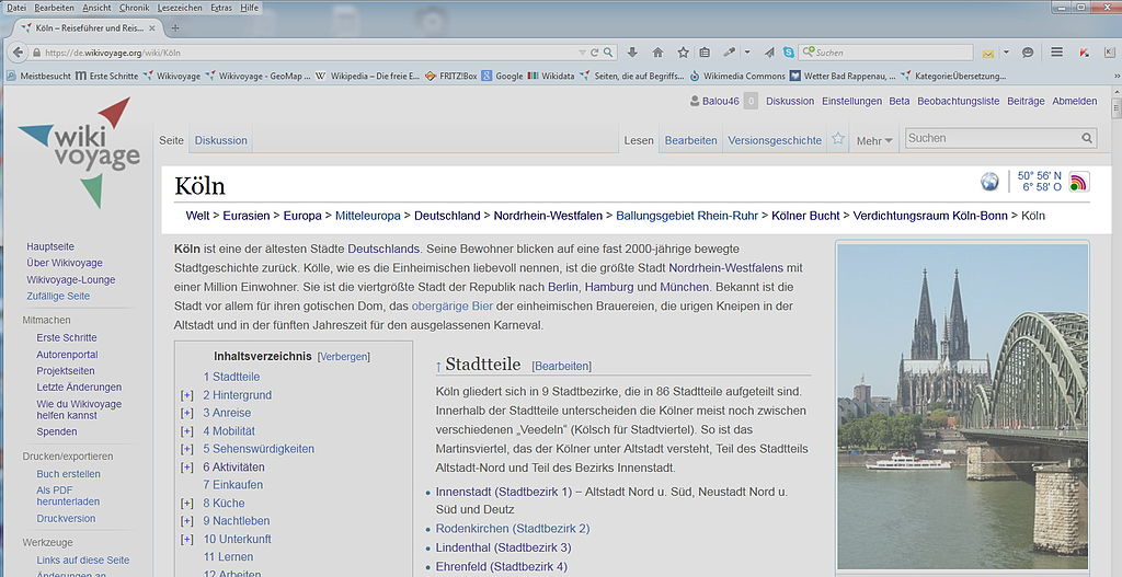
Breadcrumb navigation is a text path that shows a page’s navigation path or link tree. It explains to users the strategic categorization of a website, describing how they can associate topics on your website. It also provides website users with navigational independence and reduces frustration when trying to find info.
Everyone has had an experience before of trying to find answers on their own before defaulting to the usually easy-to-find customer support contact page. The goal of breadcrumbs is to make visitors feel like they can intuitively navigate without reaching out for assistance. It is a balance of content moderation and strategic UI design.
Breadcrumbs provide search engines with even more clear insights into your site’s structure. This helps with SEO performance, allowing you to perform better. Unlocking the secrets behind optimized breadcrumb design will create more promising customer relationships and decrease bounce rates. There are several ways to consider experimenting with categorization and best breadcrumb practices.
[sc name=”newsletter”][/sc]
1. Choose an Appropriate Breadcrumb Structure
Not all breadcrumb structures are created equal. A university website will need a different setup compared to a clothing store. The visitors to these two sites have distinct search intents, and breadcrumbs should reflect typical visitor behaviors. To comprehend which structure will suit your customers best, analyze the various formats:
- Attribute-based: Structures like this are ideal for storefronts since they can demonstrate the tags each type of product falls under. For example, you could set up your attribute-based structure like this — Home > Product umbrella > Size > Material > Color.
- History-based: This outlines the search history of the specific user. If a user started at the About Us page and immediately went to Get a Free Quote, that’s how their breadcrumbs would appear. Every path would be unique, and it helps to have this if your site has a lot of information.
- Hierarchy or location-based: Replicating your breadcrumb structure to reflect your main navigation bar would make it hierarchical. This is one of the most straightforward ways to create a practical breadcrumb trail, as it reinforces cohesion.
2. Affirm Your Need for Breadcrumbs
Not every website needs breadcrumbs in the first place — they shouldn’t be used to replace main navigation. If your website is single-layered, like a portfolio, breadcrumbs may only clutter up priceless whitespace. There shouldn’t be too many navigation options where they appear redundant to fill up real estate. Instead, prioritize a clean web design to provide a calming user experience.
3. Show Your Work
Regardless of which breadcrumb tree you choose, you should never skip a step in the hierarchy. Always have the homepage as the starting point, and end with the current page. However, there are a few ways to optimize this simple rule.
First, never make the current page a link. Hyperlinking the current page in the breadcrumb structure will only confuse visitors, causing them to question if clicking on the current page link in the breadcrumb will lead to a different page. When it ultimately leads them to the same place they were, the link is useless — and links should always lead elsewhere or provide a new experience.
It will prevent confusion if the current page isn’t hyperlinked at all. The visual difference will create a firm distinction in a visitor’s mind, such as underlines or traditional blue text.
4. Simplify Website Structure
Your website may have hundreds of pages leading to countless resources for helpful information. However, a polyhierarchal structure does not improve breadcrumbs. The navigation becomes muddled if a page has a few parent categories, and the breadcrumbs only show one or both.
Visitors may lose their grip on traversing your site because navigation is overcomplicated. Simplify categories to ensure there aren’t too many ways to access single pages. The breadcrumbs should reflect the main navigation bar so visitors can cross-reference them if need be.
5. Know Your Audience
Just like any other aspect of website design, it’s vital to know your audience’s behaviors and demographics before assuming referencing a top website’s design will work for you. There are plenty of aspects of breadcrumb design that analyzing your audience could unravel, alongside industry expertise. Some examples include:
- Age: If you run an eyeglasses website or primarily have older audiences, it may not benefit users to have small, thin text for breadcrumbs. Consider usability, so their experience is comfortable.
- Surfing platform: How will your breadcrumbs look on a phone versus a computer? If you streamline design for PC, but the text wraps for multiple lines on a phone, it may be time to reconsider visual appeal if more of your customers use cellphones for browsing.
- Search habits: If most people are coming to your site to send a contact request — and most scroll to the footer to find contact information — you could try placing breadcrumbs beneath the content instead of above.
6. Make Designs True to Your Brand
Just because there aren’t graphics associated with breadcrumb navigation doesn’t mean there can’t be compelling ways to create visual appeal. Instead of a simple text path with arrows between pages, you could try colons, slashes, or dots. You may even choose to add a graphic element by putting boxes around the page names or make it interactive with dropdown menus.
7. Size and Format Appropriately
Depending on your audience, it’s a general rule to make breadcrumb navigation small yet present. It shouldn’t be hidden away, but it should be unassuming and not detract from the user’s main search priorities.
The navigation bar should always be the go-to for primary navigation, not the breadcrumbs — they are there to act as a supplement and should be formatted appropriately. The length of the breadcrumb trail shouldn’t be excessive and should appear any time the user needs it, such as scrolling back to the top of the page.
8. Experiment
Never forget to experiment with breadcrumb design. You may discover over time, audience behaviors change, or Google changes the algorithm to prefer a new adjustment to breadcrumb navigation.
There are static elements, such as the structure, which could remain constant, but it’s crucial to recognize it’s like any other part of website design — it’s fluid and will need updating in time. How could sideways navigation change the experience? Try changing font size or vertical mapping instead of horizontal.
Breadcrumbs help guide users through the maze of the internet. With so much to explore, creating avenues to reorient website visitors is essential. It’s not necessarily necessary to develop as many navigational options as possible, just useful ones.
They allow people to discover their answers and increase the time they stay on your site. Superior breadcrumb navigation can be the user interface (UI) facet that sets your website apart from competitors, as it can reveal the breadth of information your business can offer.
[sc name=”newsletter” ][/sc]

Leave a Comment