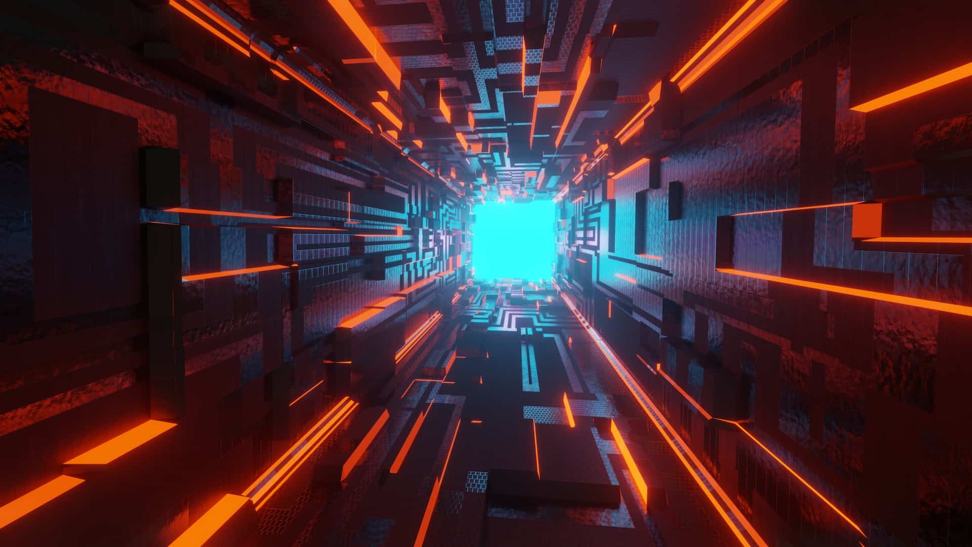

Futuristic fonts are perfect for cutting edge designs, paranormal, science fiction and technology type projects. They have a bold, hard edge that makes them stand out. They work particularly well with other trendy designs as well as minimalistic ones.
If you’ve tried sans serif and it just isn’t what you need, look to some futuristic fonts as a possible option. You may hit on a look that hasn’t been designed to death and pique the interest of Star Trek and Star Wars fans.
How Do I Make My Font Look Futuristic?
If you punch in the search term “futuristic fonts,” you’ll get 15.3 million results on Google alone. Some will be repeated, but the number of sites offering options shows how popular fonts with a futuristic look are.
In addition to the fonts that take on a sci-fi appeal, you can also turn nearly any sans serif into a futuristic typeface.
- Choose a sans serif font to make your own futuristic typography.
- Italicize the letters so they slant to the right.
- Round any sharp edges.
- Lengthen the vertical axis – futuristic typeface is tall.
If you prefer something out of the box, we’ve done the work for you and found the best futuristic fonts around. Check out these favorites and see if one might work for you.
1. Orbitron
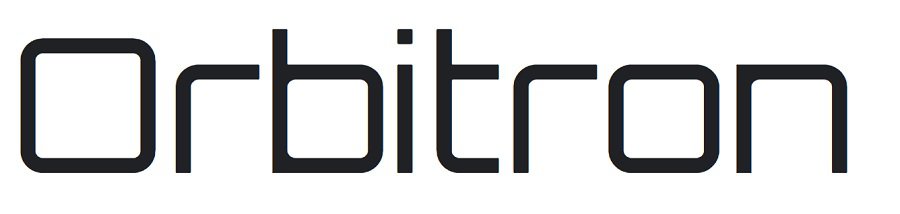
Google fonts are free to download, and Orbitron serves nicely as a solid futuristic typeface for your projects. Note the lack of serifs and missing elements on some of the letters. While still highly recognizable, the lowercase “T” cross bar only appears on the right of the letter and is missing from the left.
Futuristic fonts are often tall and narrow, but this particular font is a bit wide and squatty, giving it the perfect appearance for a headline or logo.
Google classifies Orbitron as a geometric sans-serif font. It is available as an Open Font license, meaning you can use it for all your non-digital and digital products and projects, including commercial. The font comes in various weights and with alternative glyphs to really customize your look.
2. Forgotten Futurist
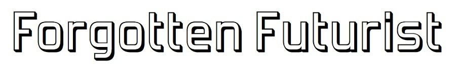
Futuristic fonts often take on a shadow effect and have a dimensional look. Adobe’s Forgotten Futurist has sharper edges than some futuristic fonts, but it still works for a Star Wars type look on a taller ligature.
Each character is outlined with a black shadow but you could use any colors for the inside and the outline to give the futuristic typeface a truly unique look. You probably remember the evolution of Star Wars movie title fonts.
Start with a basic regular type and then add in details until you get the look you want from Forgotten Futurist.
3. Pricedown
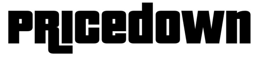
Pricedown features bold strokes and ligatures on some of the letters. Parts of the fond are square and others are rounded, giving it a unique look you don’t see in many other futuristic fonts. It is well suited for a poster or as a title.
The font was created by designer Raymond Larabie. Originally released in 2000, the font has been expanded over the years. You can turn off tails or leave them on. Leave it on some letters and remove ligatures on others.
4. The Solstice
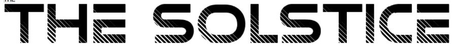
We adore the accents on this futuristic typeface. The Solstice has smooth lines and bold strokes. However, where it looks futuristic is in the lines that touch on some of the edges of the letters. It gives the entire look a sort of video game effect.
Who knows? Maybe we’re all in a video game and the little blips you sometimes see or deja vu is just the game glitching out. It’s a font that makes all kinds of futuristic and sci fi possibilities seem possible.
5. Halo 3
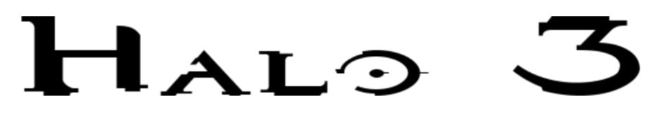
Halo 3 is a science fiction video game set in a future world. The Halo 3 font gives a nod to the cover of the game and hints of a future coming soon. The look of certain letters, such as the “O” are quite distinctive.
Because some characters are harder to read, it’s probably best to use the font only for accents or as part of a headline, for example. It isn’t readable in large blocks of text.
6. Origin Tech
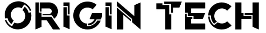
Origin Tech gives a nod to network circuitry, making one think of robots, information technology and flying cars. Out of the futuristic typefaces listed, this one might be the most distinctive. It doesn’t look like any other fonts out there.
Unfortunately, it is only for personal use for free, so if you want to use it for a commercial purpose, you’ll need to pay a licensing fee. However, if you’re looking for something unique, it might be worth the investment.
7. Space Age

Space Age font puts one in mind of Space Mountain at Walt Disney World in Orlando. It gives a nod to a ride at Epcot with an extremely similar typeface. The sweeping lines and connected letters give the font a futuristic bent. The single dot under an open triangle for the letter “A” is unique but the viewer still can read the text.
Because it is a decorative geometric font, it’s best to use it for headlines and steer away from it for reading text. It pairs well with almost any sans serif font.
Finding More Futuristic Fonts
We’ve shared a number of places to find ready-made futuristic fonts. You can use a sans serif and slant it for a forward-looking effect. You can also hand draw your own font and give it your own personality. The key to this look is geometric angles, rounded edges and tons of creativity.


Leave a Comment