

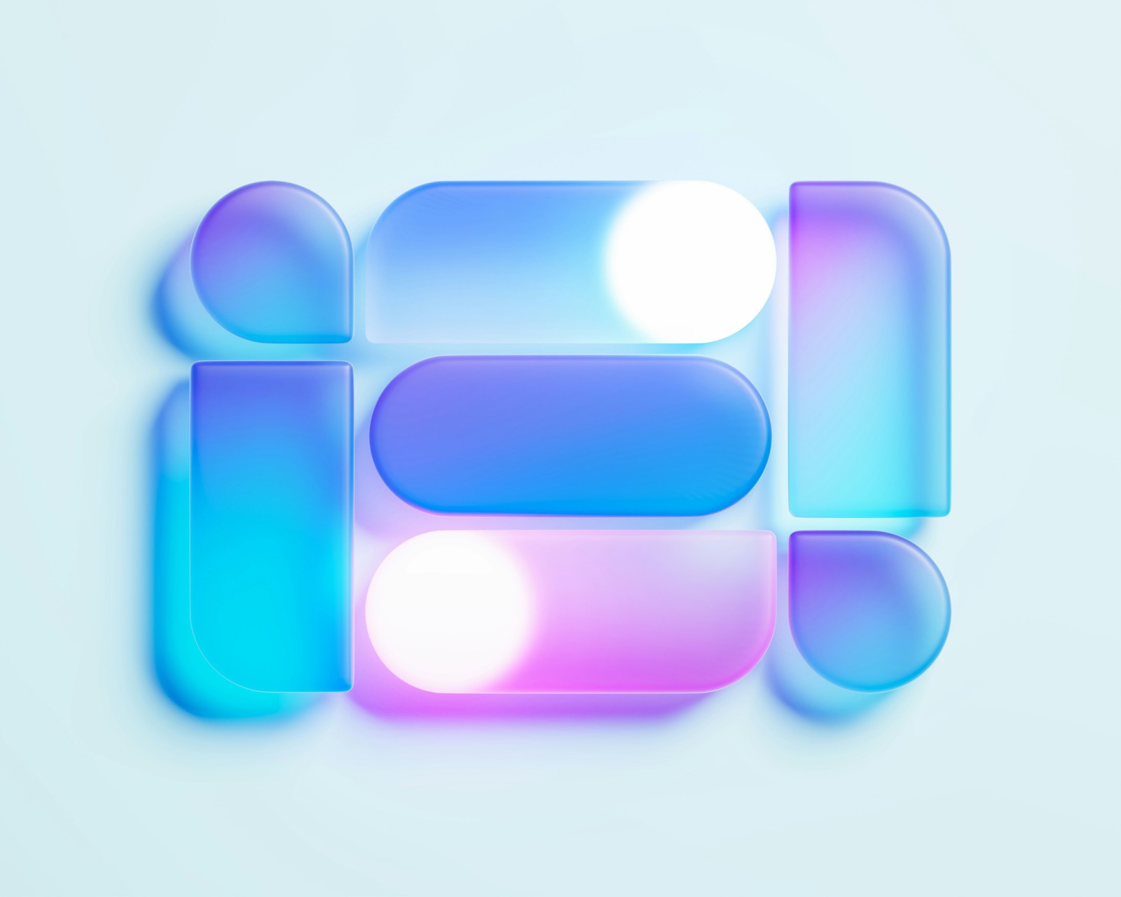

As digital experiences become more visually driven, designers are exploring new ways to create user interfaces (UI) that balance aesthetics with usability. Since its rise in popularity, glassmorphism UI has evolved from a visual trend into a more intentional design approach. With its frosted glass effects and translucent surfaces, the style remains relevant in 2026 for creating digital experiences with depth and clarity.
What Is Glassmorphism UI?
This glass-like design style creates the appearance of translucent surfaces within digital interfaces. Using a combination of visual techniques, it creates depth and separation between interface elements. Common characteristics include:
- Transparency: Semi-transparent backgrounds allow users to see content behind a surface.
- Background blur: Blurred visuals create a frosted-glass effect while helping foreground elements stand out.
- Layered layouts: Multiple overlapping surfaces establish a sense of depth and dimension.
- Soft borders and shadows: Subtle outlines and shadows help define floating elements.
- Vibrant backgrounds: Color gradients and imagery behind glass panels enhance the visual effect.
The appeal of glassmorphism comes from its ability to make interfaces feel lightweight, modern and dynamic. Instead of relying solely on solid blocks and traditional containers, designers can create a more spatial experience where different layers interact visually.
Why Glassmorphism UI Remains Relevant in 2026
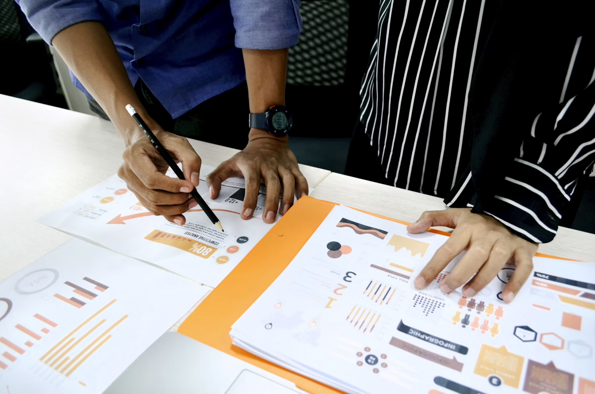
With the internet gaining 639,769 new websites every 24 hours as of June 2026, businesses face increasing pressure to create digital experiences that are both visually distinctive and easy to navigate. While functionality remains the priority, thoughtful interface design can help brands make a stronger first impression and improve user interaction with their products.
Amid evolving web design trends, glassmorphism continues to offer a way to create modern, layered interfaces that enhance the user experience in several ways.
Introduces Depth in Minimalist Interfaces
Modern interfaces often prioritize simplicity, reducing unnecessary elements to create cleaner user experiences. However, excessive simplicity can make digital products feel visually flat or repetitive.
Glassmorphism provides a way to introduce depth while maintaining clean aesthetics. Transparent layers can help distinguish navigation panels, notifications, cards and interactive elements while maintaining a streamlined appearance.
For example, a dashboard can use glass-like panels to separate different information categories while keeping the overall interface cohesive. Subtle layering guides attention naturally through a clear hierarchy.
Supports More Immersive Digital Experiences
As digital experiences become increasingly interactive, interfaces need to communicate a stronger sense of space and engagement. Glassmorphism aligns well with experiences that benefit from layered environments, including immersive applications, interactive platforms and advanced digital interfaces.
The style can help create interfaces that feel more fluid by making elements appear as though they exist within the same unified environment. In 2026, this approach remains valuable for brands and products that want to create a more engaging experience while maintaining a modern visual identity.
Creates Premium Digital Experiences
Visual design plays an important role in shaping how users perceive a brand. When designers apply it correctly, glassmorphism can communicate a distinct sense of innovation, sophistication and technological advancement.
Industries such as technology, finance, luxury and creative services can use glass-inspired interfaces to establish a polished digital presence effectively. The combination of transparency, lighting effects and carefully selected colors can make a product feel more refined and distinctive. However, the effect works best when it supports the brand’s identity as a complementary design element.
How to Use Glassmorphism UI Effectively in 2026
Glassmorphism offers designers a range of visual possibilities, from creating floating elements to adding depth between interface layers. However, the strongest results come from making deliberate choices about where and how to introduce these effects.
Use Glass Effects for Important Elements
Glass surfaces work well for components that need emphasis, such as:
- Navigation menus
- Notifications
- Floating action panels
- Highlighted information cards
Using the effect selectively helps important elements stand out while maintaining interface balance. Designers should also consider the surrounding space and interaction needs when applying glassmorphism to clickable elements. Leaving enough white space around buttons and text can help draw attention while improving usability.
Testing these elements across different screen sizes ensures users can interact with them easily, whether tapping on a mobile device or clicking with a mouse on a desktop.
Maintain Strong Contrast
Transparency is one of the defining characteristics of glassmorphism, allowing designers to achieve a light, layered appearance through translucent surfaces. However, this effect must maintain strong readability.
Designers should carefully test backgrounds, text colors and opacity levels to ensure content remains easy to read, adding subtle solid fills or stronger borders where needed to ensure sufficient contrast.
Combine Visual Effects With Strong Typography
Typography remains one of the most important aspects of interface design. A visually attractive glass panel improves the experience only when users can easily read the information inside it. Clear font choices, spacing, and hierarchy should work alongside glass effects to create a balanced design.
For instance, a finance dashboard using glassmorphism may feature translucent cards to display account summaries or investment updates. However, clear typography is essential to ensure users can quickly distinguish key figures, labels and calls to action within each panel.
Using different font sizes, weights, and spacing can create a clear hierarchy, allowing important information to stand out while maintaining the sleek visual appeal of the glass effect. This combination helps the interface feel polished without making users work harder to understand the content.
Consider the Content and Context
Glassmorphism works best when it complements an interface’s purpose through intentional, functional design. Designers should consider whether transparency and layered elements help users understand information, navigate a product or focus on key actions.
For example, the effect may work well for dashboards, creative platforms or immersive experiences where visual depth supports the overall interaction. However, interfaces that prioritize quick information scanning may benefit from simpler treatments.
Prioritize User Experience Over Aesthetics
Visual design alone is no longer enough to keep users engaged. Modern digital experiences increasingly combine attractive interfaces with intelligent features that adapt to individual user needs.
Research has found that websites incorporating AI-driven personalization have experienced a 25% increase in user engagement metrics, including time spent on-site and interaction rates. Tailored content and recommendations are often the key drivers to encourage users to explore further.
Glassmorphism can complement this approach by providing a clean, layered interface that helps personalized content stand out while maintaining visual balance. Whether highlighting recommended products, customized dashboards or context-aware notifications, the design style can support AI-powered interfaces by improving visual hierarchy while maintaining a cohesive and contemporary appearance.
Making Glassmorphism Work for Modern UI Design
Glassmorphism UI continues to earn its place in modern interface design by offering a distinctive way to structure digital experiences. Its success depends on how well designers adapt the style to fit the purpose of each project. When used with creativity and restraint, glassmorphism can add sophistication and depth to interfaces without sacrificing functionality.
Leave a Comment