
Your font choice sets the mood for your design. Double line fonts and multiline ones add something distinctive to your project. However, they work best in certain locations unless you want the bulky double lines to overwhelm the rest of the page.
We looked at some of the typical reasons you might utilize a double line font and found headlines, logos, posters and other large scale projects were the likeliest ones. While you might use multiline typography in subheadings, they are almost never used in body text or directional cues.
As you look for a double line font for your project, keep in mind how many people need fonts that adapt to smaller screens. In the last decade, mobile internet access has grown about 70%, and 82% of users say they go online via their smartphones. Double line fonts might be harder to read the smaller they get. Pay attention to the thickness of lines and how they look at various points.
What Are Double Line Fonts?
A double line font has a copy of the lines, creating a three-dimensional effect. Some graffiti fonts showcase double lines. However, the double line fonts of today may be tall and thin or thick and bold. They cover a whole host of attitudes and looks. Some fonts even have more than two lines, creating a sort of three-dimensional effect.
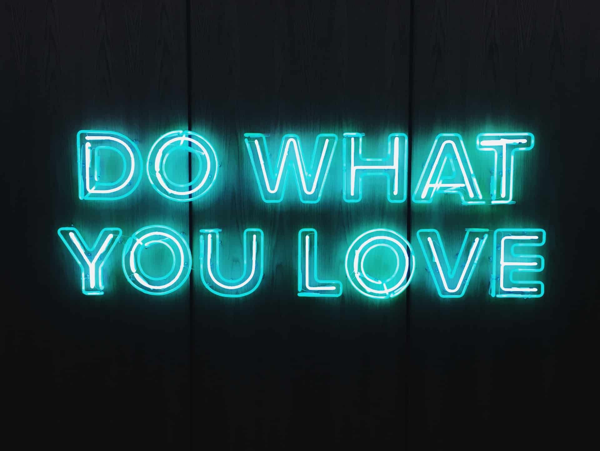
Where should you use double line fonts? Anywhere you need to make a statement is an excellent location for this class of font. Use them in headers, logos and accents on your page. Consider the personality of each font. Some are regal looking, while others are quite casual or futuristic looking.
We spent some time sorting through the available double line fonts and multiline ones, too. Since we have designers with different styles and creating for various industries, we tried to mix up the ones we chose to cover a wide range of needs. Here are our favorites:
1. Wander Brave
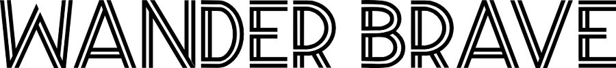
Offering a sort of theater marquee look, Wander Brave features stacked, medium-weight lines. The sans serif font doesn’t add a lot of extra embellishments, making it perfect for headlines on websites and posters.
The double line font would work perfectly for anyone designing for events or businesses in the entertainment industry. We particularly appreciate the way letters such as “A,” “N” and “W” have straight crisp lines. Yet, “B,” “D” and “R” have swoops and curves that create excellent contrast with the harsher letters.
2. Amithen
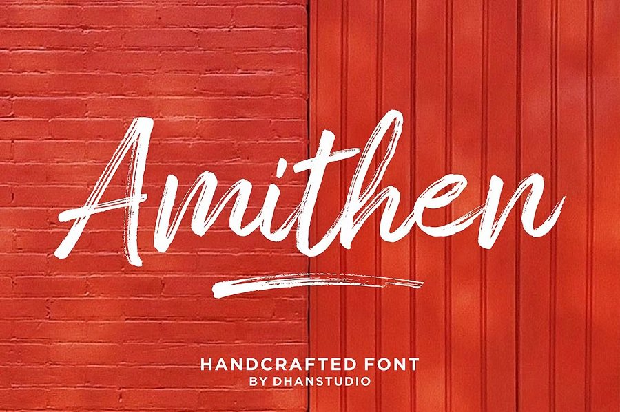
Amithen font has a couple of things going on. First, it is a double line font. However, it also has brush strokes, giving it a hand-painted appeal. The lines come together and create some sections that are solid and other sections with multiple lines. The strokes of the font are quite wide overall.
Amithen would look great on a wedding or birthday invitation. It also would work well for any small business with unique products or handmade items. It does have an artistic look, so it would be a nice addition to the heading of a portfolio for a photographer, designer or artist.
The font is on Envato Elements. You will need a subscription to download and use it. However, you’ll also gain access to multiple other double line fonts. We mention several Envato Elements fonts in this article and throughout our site. The selection is almost endless. Just pay attention to licensing requirements, depending upon how you plan to use the font.
3. Paralines
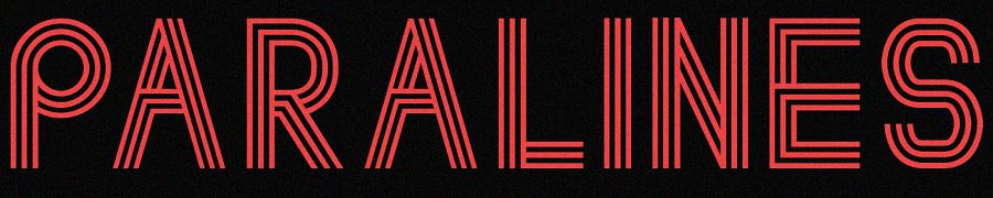
Designer Lewis Latham offers a free font over on Behance of multiple lines called Paralines. The font actually takes on three lines, giving the type a futuristic feel. The font works well for high tech blogs, cutting edge products and science fiction authors and shows.
We can see this font as the title for a fanfiction site, for example. Although our focus is on double line fonts, this multiple line font was too good not to share. Consider using some letters from this font and others from a basic double line font such as Neon for a striking heading.
4. Neon
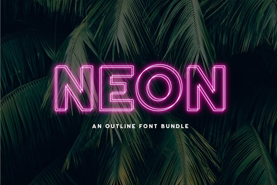
Neon has a definite island vibe. The three-dimension double line font would work well for a store sign in front of a restaurant or bar. It would also work well on a website. Although the sample image uses a neon pink, you could also go with a black or white color scheme and completely change the look.
Bright, vivid colors will create a fun, youthful tone. On the other hand, switching to neutrals makes the font appear more elegant and upscale.
5. Double Line Font
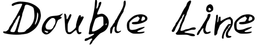
Double Line Font is a free font that has a handwritten, juvenile look. It would work well for a casual event invitation, daycare flyer or blog. We also though the font would look good for a mystery writer’s website or true crime blog.
We think it has the look of a serial killer’s handwriting, but that can be useful depending upon your audience and what they expect from your brand.
6. Radon
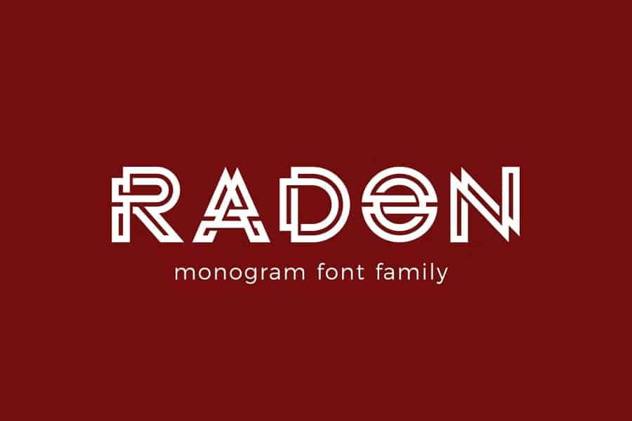
Radon font is in the monogram family. It’s another font from Envato, so you will need to take out a membership or at least a free trial. Keep in mind you can only use the font if you created the design while a member. So, if you take out a membership and save the font for a future date, you’d need to reup the membership before using it in a new design.
Envato Elements lays out their licensing agreement. It’s a bit detailed, but the gist is that you can use what you download when you’re paying. If it’s on a website, for example, you can continue using it, but you can’t change it or use it elsewhere.
This font would look good for a logo, wordmark or on a banking or news website.
7. Paperclip
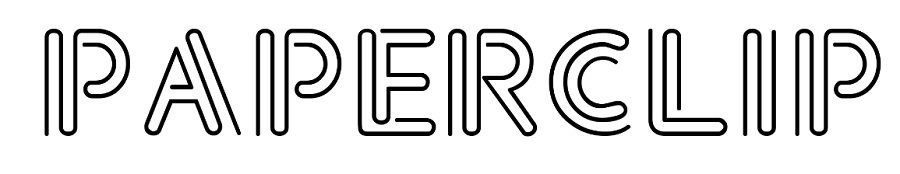
Paperclip puts one in mind of a fancy paperclip. It would work well for a virtual assistant logo, small business supply company or even in the education sector. Any B2B business might have use of this typeface in some of their promotional materials. It is a bit complex, so you would want to stick to headlines and logos.
Most double line fonts would not work well as body text. However, using them sparingly can set a fun, unique tone to your designs.
8. Little Lord Fontleroy NF

Little Lord Fontleroy NF is a cross between a script and a double line font. The design would look perfect on a wedding invitation or for a wedding planner’s site. You could also use it for historical novels, formal titles and traditional blogs. If you’re going for a more regal tone, then Little Lord Fontelroy NF may be the perfect selection for your needs.
9. Loadtz
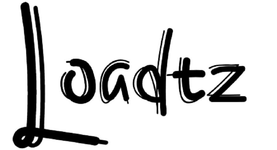
Loadtz font has a formal graffiti look that would work well for a party invitation, book cover or header on some websites. The font might become unreadable at very small sizes, so it’s best to stick with headings for this typeface.
10. Core Circus
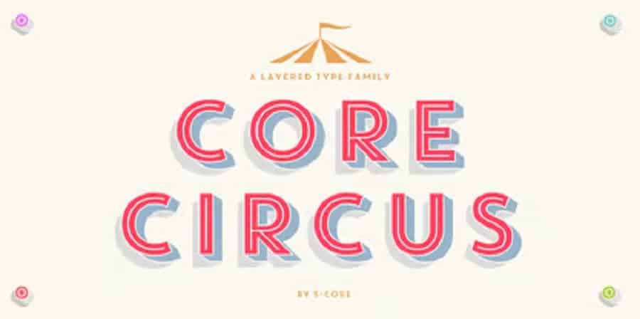
Core Circus is a fun font that works well for preschools, educational material and businesses that serve kids and teens. Hyun-Seung Lee, Dae-Hoon Hahm and Minjoo Ham created the font family via S-Core with 20 different styles in the package.
11. Peach Sundress

Peach Sundress is as light as a Sunday ice cream social. Look at the pretty ligatures and double lines mixed with single lines in this script-based font. We think this font would be fun to create store signage or on posters. It’s described as a rounded, upright script font. It works best in larger sizes.
12. Kundalini

The Kundalini font is a calligraphy font with swirls, swoops and multiple lines to create a distinct look unlike any other font available. If you’re an artist or other creative type looking to add some interest to your headlines and advertisements, check out this one for an artsy look.
13. Industrial Gothic
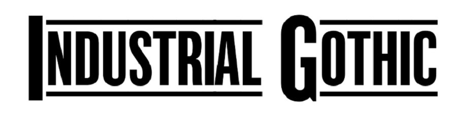
Industrial Gothic font is an unusual double line font. The inside of the letters are filled in, making them have a stenciled appearance. However, the lines come into play over and under the letters in any word. There are different style options depending upon how formal or informal you want them to appear.
14. Killa
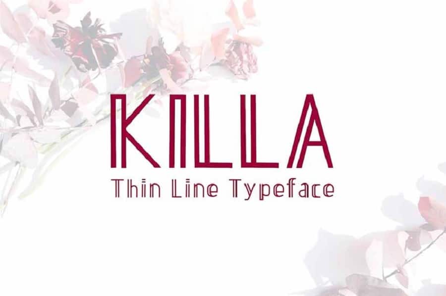
We love this unique double-lined font called Killa for it’s thinner letters and tall x-height. It has a modern elegance that makes one thing of New York City in the fall. This font would work particularly well in headings, on posters or for movie or book titles.
How to Choose Double Line Fonts
You should be able to cover basic needs with the double line fonts listed above. Try different ones and see what meshes best with your brand’s personality and overall style.

Leave a Comment