

Businesses can use icons on posters, websites, apps, business cards, social media posts, and billboards. If they are well-designed and easy to understand, they can attract customers to a website, increase an app’s user retention, or enhance brand recognition. With the right tools, even inexperienced designers can create icon sets in six steps.
How to Create Cohesive Icon Sets in 6 Steps
After determining the intended application and selecting a design tool, review applicable publishing rules, create a grid, and start designing. Usability testing is not mandatory, but it can help you refine your design before finalizing it.
1. Decide Which Type of Icon You Want
Where do you intend for your icon set to go? Whether you want branded user interface elements, a favicon for your website, or a custom icon for your app influences design rules and best practices. If you are creating an icon set for a business, it should have a high-resolution, visually appealing look, regardless of whether it is for a poster or a social media post.
Set branding and color guidelines if you are working for a client or with a specific industry in mind. If you are creating icon sets for people who want to customize their devices, you should create a broad range of general-purpose icons.
2. Select the Design Tool You Will Use
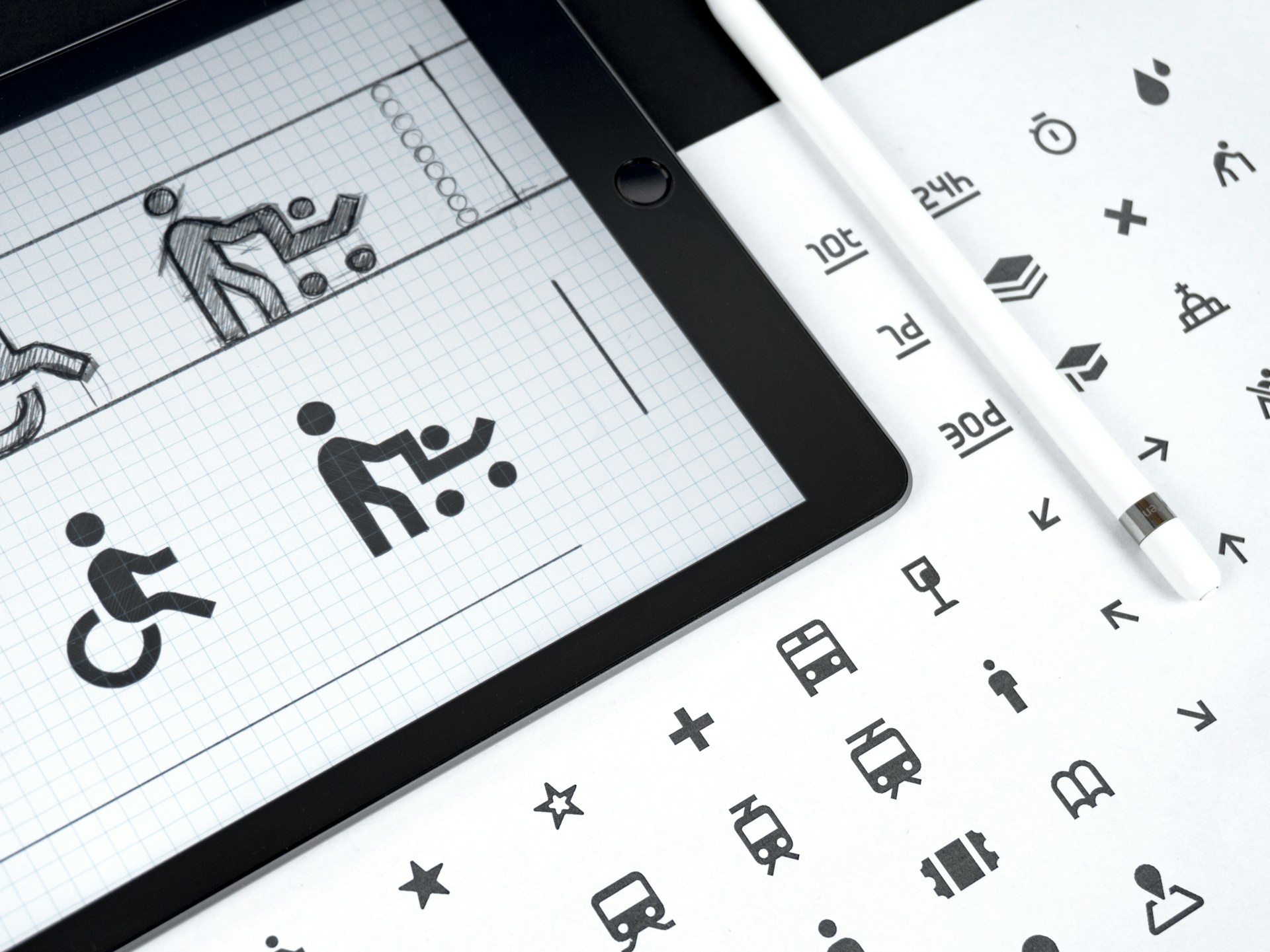
You can use Adobe Illustrator, Microsoft Paint, or a pen and paper to sketch out ideas. To ensure your pack is cohesive, create rules for thickness, colors, and design dimensions. Create a few different variations to explore potential themes. Small changes to line weight, color, and style can make a big difference. Even if the first draft is great, it is good to have options.
3. Review Size, Color, and Shape Rules
Whether the icon is destined for a browser tab or the Apple App Store, you must follow strict sizing guidelines. iOS apps must be 1024×1024 px and rounded squares, while tvOS apps must be 800×480 px and rounded rectangles. The system automatically scales the icon to produce the smaller variants that appear in notifications and settings.
Google’s favicon — a portmanteau of favorite and icon — is the small icon that displays in search results, browser tabs and bookmarks. You can only have one per site. Ours is the Designerly logo. Its size can range from 8×8 px to 48×48 px, so it must have a 1:1 aspect ratio.
4. Create a Grid to Ensure Consistency
Use a grid to ensure the icons are pixel-perfect. If you are using an eight-point grid layout, you can blow the design up to 16×16 or 32×32 to make designing easier. However, you do not want to make features too intricate because when you size them down, you will lose the finer details. Use micronegative space or layered colors to visually separate design elements.
5. Find Participants for Usability Testing
Show test groups the icon sets out of context — without text, labels, or other interface elements. If they can’t guess what you are trying to represent, sketch out new ideas. Then, show them the icons in the context of the full intended interface. They shouldn’t have trouble distinguishing between the designs. Track the rate of first-click selections.
6. Download and Import Your Icon Set
The download and import processes differ depending on the tools you use and the icon set’s intended destination. For example, to add a favicon to your website, you must create a folder in the root directory called “images,” where you will save the image. It can be a PNG, GIF, JPEG, SVG, or ICO file. Then, you must add a <link> element to the index.html file.
The Importance of Iterative Icon Design
Whether you’re a novice or master of design, you understand that the first draft is rarely the final draft. Icon sets may be visually simplistic compared to other graphic design projects, but testing and refining them is equally important. This way, you can identify flaws early and ensure your creation is user-centric.
Repeatedly prototyping based on usability tests and user feedback is wise. Aside from improving your design, you want to explore different themes and styles. Think of the approach like rebranding. While you want each new icon to be visually consistent, the differences should be immediately recognizable.
Take the Reddit icon, for example. When it was first created, it was an outline of an alien. It later became a white silhouette in an orange bubble. In 2023, the platform embraced a three-dimensional look with shading and highlights. If you were to redesign the logo, would you return to its linework roots or try something more abstract?
Consider These Iconography Design Tips
We recommend starting with a template, which helps keep icon sets visually cohesive. You can either use a pregenerated one or create your own. Each icon can share a background, border, or color palette. In addition to understanding what the icon is at a glance, you should be able to tell that each icon belongs in the pack.
A theme will help you make the set more cohesive. You can go for a flat, realistic, hand-drawn, three-dimensional, or cute look. Use the same shading style, line thickness, and colors to achieve your vision. Try to limit yourself to simple shading and three colors. If you get too complex or colorful, your design will muddle when scaled.
Consider accessibility when creating prototypes. Bright colors and distinctive shapes do not only affect aesthetic appeal. These design elements can affect usability and user retention. High-contrast colors and two-dimensional shapes are more accessible and scalable. Remember, icons need to remain readable whether they appear on posters or smart watches.
Examples of Icon Sets to Use for Inspiration
The first icon set uses minimalistic linework. The only source of color is a small dot in the same position. The designer sticks to the same pastel color palette. Details are emphasized through micronegative space. For instance, the roof of the house does not touch the walls.
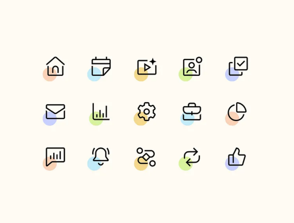
The second example offers a middle ground between minimalistic and stylized icon sets. You can clearly tell what each object is at first glance. While they could stand to lose a few details to prevent fuzziness at smaller scales, they are not overly intricate. The strategic use of color and flat shading makes it clear these designs belong together.
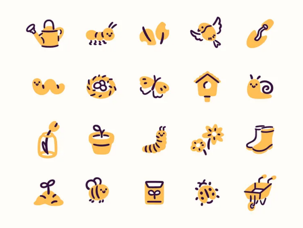
The theme for the third icon pack is nature. While the designer takes a more stylized, whimsical approach, their dual-tone creations are still grounded in realism. They may not be fit for a technology manufacturer or a health care portal, but they would be perfect for a garden center, landscaping business, or health food retailer.
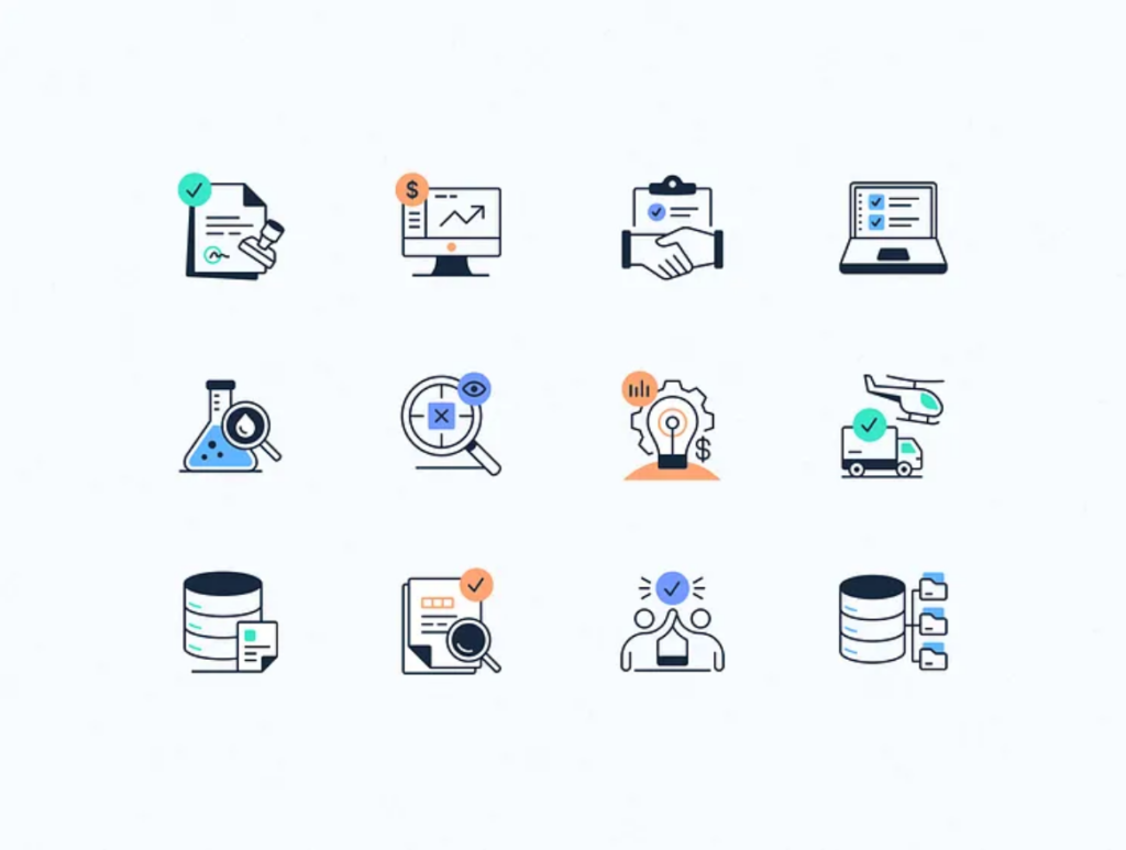
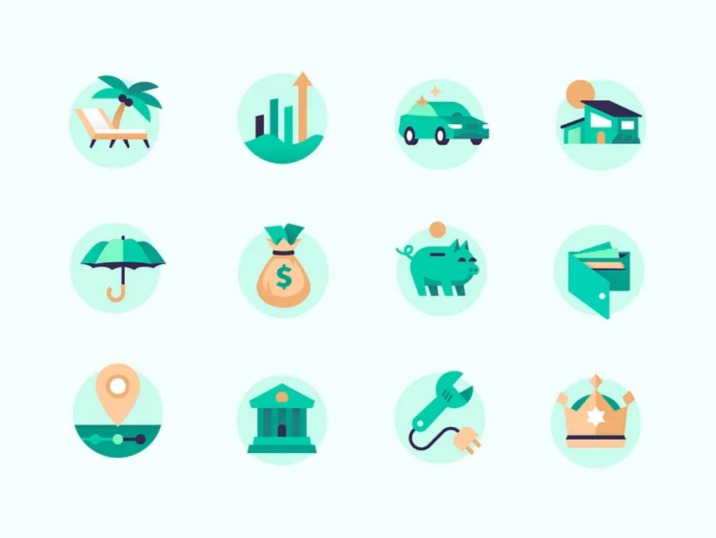
This icon set uses colors and flat shading to establish a theme. The designs are clearly recognizable. The piggy bank could represent a financial investment website or a habit tracking app, for example. You could use your brand’s colors to achieve a similar effect.
Icon Generator Tools That Streamline Design
Software like Adobe Illustrator is ideal for graphic design projects, but it’s an expensive commitment if you do not already have a subscription. Here are four free-to-use tools that you can use instead.
Canva
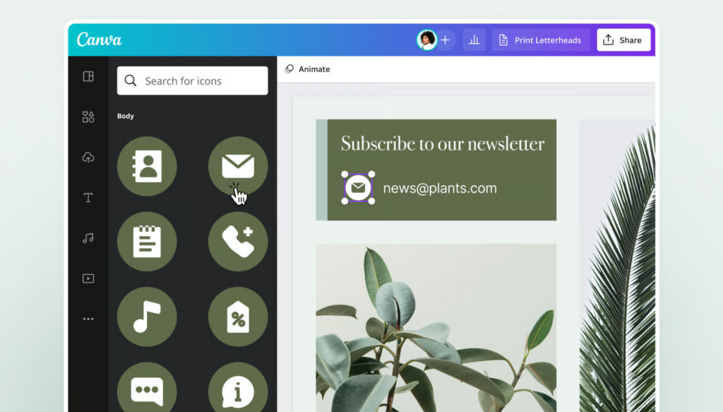
Online graphic design tool Canva is free to use. You simply pick a template, customize the design, and download your finished work. Create a pack by adding pages to your work-in-progress. Either duplicate the template you are working on, drag and drop a new template from Canva’s library, or start with a blank canvas.
Icon Composer
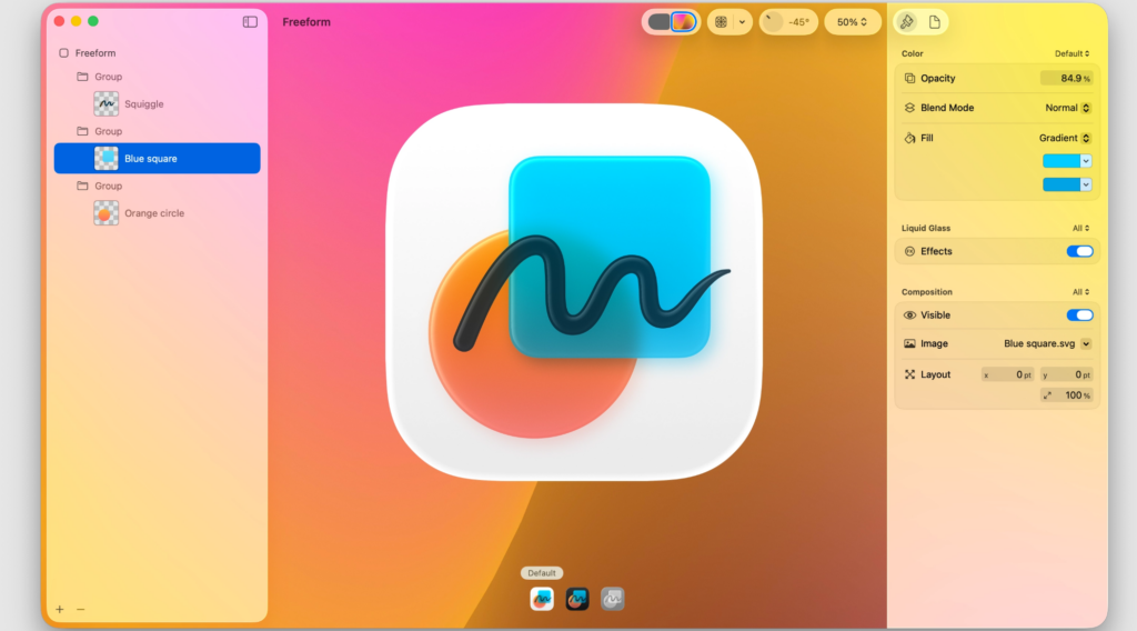
Apple’s Icon Composer is purpose-built for Apple devices. You can set the opacity, mode, blur, translucency, and more. It gives you full control over how app icons appear on default, dark, and mono rendering modes. The updated grid system makes designing across supported platforms easier and more consistent than before.
IconKitchen
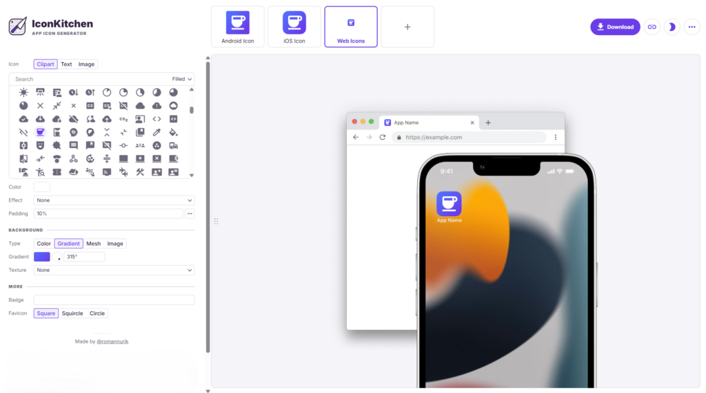
The web-based icon generator IconKitchen offers a large selection of pregenerated icons, streamlining prototyping. Alternatively, you can upload an image of your own creation. You can customize padding, color, gradient, mesh, texture, background, and more. Toggle between iOS, Android, and web browser views in light and dark mode to see how the app icon will look.
LOGO.com
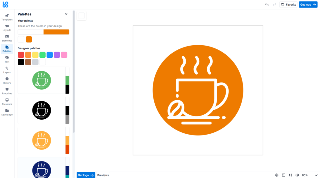
Online AI-powered icon creator LOGO.com has you choose a business name, industry, slogan, colors, and graphic. You can select from several pregenerated options or enter your own idea. If you aren’t satisfied with the options it gives you, you can create your own. You can make unlimited edits to the logo, font, and colors.
You Are All Set to Start Creating Icon Sets
Once you get your tools ready, the only thing left to do is to start creating prototypes. Explore various color palettes, styles, and themes before you finalize your drafts. Even if your client has specific requirements, you can find ways to get creative.

Leave a Comment