



In This Article
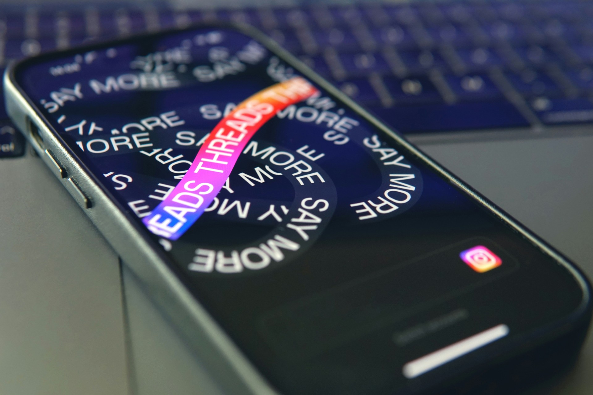
Web design continues to evolve as brands look for new ways to create memorable digital experiences beyond static layouts. As interactive interfaces become more common, movement plays an important role in guiding attention and structuring information flow. Kinetic typography offers designers a creative way to transform written content into a dynamic visual feature that strengthens storytelling and engagement.
What Is Kinetic Typography?
Kinetic typography refers to the use of animated text elements that move, transform or respond to user interactions within a digital interface. Unlike traditional typography, which stays fixed in place, it uses motion to highlight key messages, create visual rhythm and enhance the overall browsing experience. The movement can range from subtle transitions that improve readability to more expressive animations to capture attention and reinforce brand personality.
Common styles of kinetic typography include:
- Scrolling text animation: Text moves across the screen as users scroll or interact with the page, creating a continuous visual flow.
- Morphing typography: Letters change shape, size or form to create smooth transitions between different messages or visual states.
- Text reveal effects: Words or phrases appear gradually through techniques such as fading, sliding or masking effects.
- Interactive typography: Text responds to user actions, such as hovering, clicking or cursor movement, to create a more engaging experience.
- 3D and layered typography: Text uses depth, perspective or dimensional effects to create a more immersive visual presentation.
Why Is It Gaining Popularity in Modern Web Design?
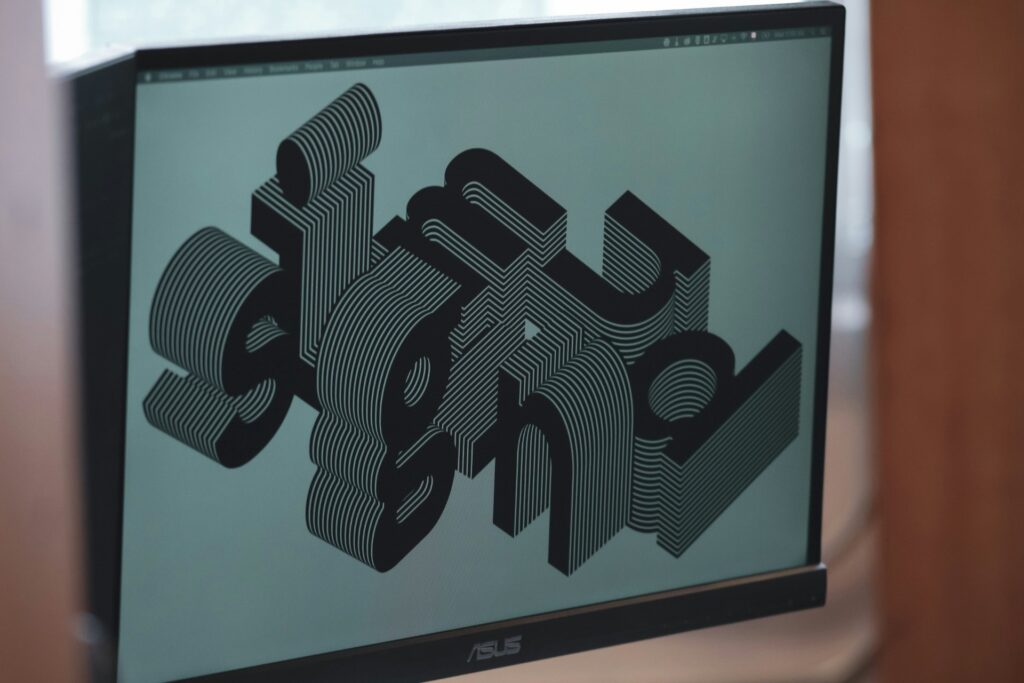
Research highlights that typography plays an essential role in visual communication by improving text presentation, strengthening the impact of messages and helping audiences form stronger connections with content. As websites continue to compete for user attention, designers are exploring ways to make typography more expressive and engaging, leading to the growing adoption of kinetic typography. By introducing movement into written elements, this approach enables text to become an interactive part of the design experience.
Beyond creating visual appeal, animated typography can improve how users process and engage with website content. Motion can help establish content hierarchy, highlight important messages and reinforce brand personality while creating a more memorable browsing experience. When creative teams balance it with usability, kinetic typography gives designers another way to communicate ideas more effectively. It also creates digital experiences that feel dynamic and purposeful.
Common Applications of Kinetic Typography on Websites
Kinetic typography works across different areas of a website to support communication goals and enhance the user journey. From homepage introductions to interactive brand experiences, moving text can help highlight important information while adding a distinctive visual identity.
- Hero sections: Animated headlines can create an immediate visual impact and introduce a brand’s message when visitors first land on a page.
- Brand storytelling: Motion can bring company values, mission statements or campaign messages to life through more engaging presentations.
- Calls-to-action: Subtle animations can draw attention to buttons, prompts or important next steps without overwhelming users.
- Product showcases: Moving text can emphasize product features, benefits or promotional messages in a more engaging format.
- Navigation elements: Interactive typography can enhance menus or website transitions while creating a smoother browsing experience.
How to Use Kinetic Typography Effectively in Web Design
While animated typography can add visual interest, its success depends on how well it supports the website’s overall purpose. Designers should approach motion as a functional design tool, ensuring each animation contributes to the user experience.
Match Motion With the Brand Identity
The style and speed of kinetic typography should reflect a brand’s tone and personality. A playful brand may benefit from energetic movements, while a professional website may require more refined and controlled animations.
- Define the emotional response the animation should create before selecting a movement style.
- Choose effects that complement the brand’s existing visual language.
- Maintain consistency across different pages and interactive elements.
Prioritize Readability and User Experience
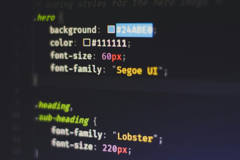
While kinetic typography can add visual interest, its effectiveness depends on how well users can understand and interact with the content. Typography should enhance communication and balance creative expression with clarity.
For example, distinctive typography can help a brand stand out without relying on complex visual elements. However, creative choices should always maintain legibility to ensure messages remain accessible and impactful.
- Keep animations smooth and avoid excessive movement that distracts from the text.
- Select fonts, sizes and spacing that maintain clarity throughout transitions.
- Allow enough time for users to read and process animated content.
- Test typography choices across different devices to ensure consistent readability.
Use Motion to Guide User Attention
Effective animation can direct visitors toward specific areas of a webpage and create a natural flow through the content. Designers can use movement strategically to highlight important information.
- Animate key messages rather than applying effects to every text element.
- Use timing and placement to create a clear visual pathway.
- Consider how users naturally scan and interact with the page.
Make Creative Typography Choices With Purpose
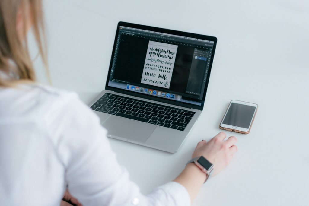
Research shows that sans-serif fonts, including popular typefaces such as Helvetica and Futura, rank among the most frequent typographic choices. Designers also often combine them with other fonts to create balanced visual pairings. These findings highlight the importance of selecting the right type of typography that supports both visual impact and effective communication.
- Select typefaces that reflect and serve the overall design direction.
- Combine fonts carefully to create contrast while maintaining visual harmony.
- Use animation effects that enhance the typography.
- Experiment with creative treatments while keeping text easy to understand.
Consider Accessibility Needs
Not all users experience motion in the same way, making accessibility an essential part of modern web design. Thoughtful implementation ensures kinetic typography remains inclusive for different audiences.
- Provide options to reduce motion where appropriate.
- Avoid rapid flashing or distracting visual effects.
- Ensure important information stays available without relying only on animation.
Optimize Performance Across Devices
Heavy animations can affect loading speeds and usability, especially for visitors accessing websites through mobile devices. Prioritizing technical performance when incorporating moving elements leads to a better user experience.
- Use lightweight animation techniques to reduce impact on page performance.
- Test motion effects across different screen sizes and browsers.
- Avoid complex effects that slow down navigation or interactions.
Key Considerations Before Adding Moving Fonts
Although kinetic typography can create more engaging websites, teams should consider the overall purpose of each element before introducing movement. Every animation should serve a clear communication goal and support the user journey.
A visually impressive animation, for instance, may lose its impact if it appears disconnected from the rest of the interface. Therefore, maintaining harmony between typography, layout, imagery and interactions is essential.
Long-term usability remains vital when adopting emerging design trends. While creative approaches can provide a modern appearance, timeless design choices that support clarity and accessibility will continue to provide value.
Create More Impactful Websites Through Kinetic Typography
Kinetic typography gives designers a new way to make text more expressive, interactive and memorable. As websites continue to evolve, the most effective uses of animated typography will be those that combine creativity with clear communication. By treating movement as a communication tool, designers can create digital experiences where typography influences how users connect with a brand.
Leave a Comment