

It’s been a while since we visited the food and beverage industry. Typically, we choose a category and then narrow the options to some top contenders and see how they rank in different areas. This month, we stumbled upon Shore the Scottish Seaweed Co.’s website and immediately knew we wanted to see how it ranked alongside other healthier chip options and their counterparts.
Last year, the salty snacks industry grew 6.9%, hitting $31.1 billion in sales. Those wanting to break into the food industry should know that competition is fierce and food regulations can be strict. However, the lessons learned by studying Shore’s website design apply across any industry.
How We Chose the Winner: Methodology
The fact that an entire website is dedicated to the chip and isn’t part of a larger food manufacturer gave it an instant edge over the competition. The site is on target from messaging to font to color palette. It’s user-friendly and visually appealing.
Every time we select a winner for our Designerly Award, we consider several key factors to determine whether it is worthy of the title. Some sites meet all the criteria, while others meet some and have a special feature or two. Here are the elements we considered when determining whether to give the design award to Shore the Scottish Seaweed Co.
| Aesthetics | Detailed Information |
| Color Scheme | Mobile responsiveness |
| Navigation | Speed |
| Calls to Action |
We also compare these elements to those of competitors. We sort through the site’s user experience (UX) and determine if it meets all the components needed and goes above and beyond.
Winner: Shore the Scottish Seaweed Co.
The Shore company is located on the shores of Wick in Northern Scotland. The founders saw that seaweed thrived in the region’s local conditions and clean waters. The company prides itself on using sustainable practices that ensure the seaweed continues to thrive. By air drying the seaweed, the superfood keeps most of its minerals such as calcium, potassium, iodine and antioxidants.
Co-founder Keith Peterson told the BBC, “Consumers still snack for pleasure, even if choosing a healthier product.” Although the company was purchased by a larger one in 2023, it maintains its original freshness and taste.
Why We Chose Shore the Scottish Seaweed Co. as Our Winner
After considering all the criteria and comparing the site to similar competitors, we chose Shore the Scottish Seaweed Co. based on its excellence in the following areas.
Simple But Impactful Logo
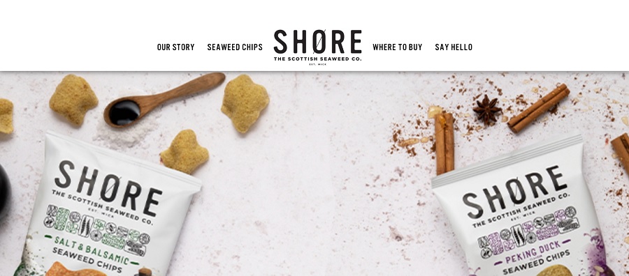
Shore’s logo is a simple wordmark but has the added interest of a diagonal line through the letter O. This sets the wordmark apart and embraces the simplicity of the snack. The font is a sans serif, which adds a modern look. The thick strokes add power to the look.
Bright, Earthy Color Palette
When you think of seaweed, you may think of an almost black green. This website’s use of light colors is refreshing. Note the white, off-white and fresh green hues. Green color palettes allow users to understand the commitment to sustainability and give a nod to the health benefits of eating seaweed.

Trust Factors
If you’ve not heard of the Shore brand before today, the list of accolades adds authority to the website and shows they’re a company others trust. They showcase awards they’ve won. Then, creatively above the awards in a twinning of the round emblems, the website designer added the benefits of Shore chips, showing it is 100% plant-based, a good source of fiber, free of MSB and under 120 calories.
Beautiful Images
The visuals on your site can make or break your design. The photographs on the Shore website are bright and showcase the products. For example, the sweet sriracha flavor chips have red peppers and red seasonings spilling out of the top of the bag to grab attention. The high-level, commercial food photography draws the user in and makes them want to learn more about the snack.
The designer also made the images large. They take up a significant portion of each website page, speaking so loudly that words aren’t necessary.
Mobile Responsiveness
Approximately 85% of Americans own a smartphone and use it frequently. The chances that someone accesses your website via a mobile device are high. Ensuring a site responds to smaller screens is no longer an option in 2025–it’s a necessity. Shore meets this need. The simple hamburger menu places everything at the user’s fingertips.
Clear Information
You can build the most beautiful site ever, but it isn’t worth much if it doesn’t meet user needs. Shore does an excellent job covering everything someone needs to know before buying these seaweed chips. One of our favorite spots on the site is the Where to Buy page, so you can figure out how to get your hands on this delicious snack.
Navigation
With just four navigational tabs, the site embraces a minimalistic vibe. The limited options highlight the calls to action of “Buy Online Here,” “Say Hello,” and “Find Your Nearest Store.” Limiting the number of CTAs and ensuring they are strong encourages users to click on the links and take action.
What We Would Do Different
We loved the website for Shore the Scottish Seaweed Co. It has a fresh, fun vibe and that minimalistic look that never goes out of style. The navigation is to the point, which enhances the overall minimalistic effect.
Although we love the simplicity, the site feels a tad blah without a blog or articles on the seaweed snacks. We’d love to see more information about the founders, what the company is involved in and other details about the brand. A blog also provides ongoing content to post on social media, bringing organic traffic to a website. Content is far from dead, so taking the time to add some posts would enhance the UX of this site.


Leave a Comment