


In This Article
Similar to the monochromatic style, the analogous color scheme uses neighbor colors on the wheel in any shade variation. The strikingly bold look gives your website a modern edge. Most designers stick to two or three hues for this look, making some of the most beautiful analogous color schemes.
Keep in mind, however, how important contrast is in your designs. Variations allow certain elements to stand out and make the text easier to read. If the colors in your project palette don’t vary enough, make adjustments in the hue until you hit the right amount of variation. Remember, analogous colors appear in nature, so stick to natural-looking combinations.
You can use one color as the primary option and add the other two as accents, use all three shades equally or use two and have a third for a pop to grab user attention.
One of the best ways to learn how to use analogous color schemes in your designs is to study the work of other web designers. Here are some excellent examples to instruct and inspire you. We used Canva’s Color Palette Generator to grab HEX codes for you.
Why Does Analogous Color Scheme Work?
Choosing the right set of colors is essential to ensuring a memorable website design. Colors can impact 90% of first impressions of users.
An analogous color scheme is an excellent way to add variation to your website without making it visually overwhelming. It may be confusing initially, but as mentioned before, nature is the best place to look for examples.
For example, the hues of autumn leaves, from red to orange, or a peacock feather’s blue-green palette. In a broader sense, the sky’s blue tones or the ombre of the sunrise or the sunset is also part of the analogous color scheme. These are neighboring colors on the wheel and complement each other well. Because they mirror nature, human eyes perceive these schemes as more pleasing and attractive than other schemes.
Do you recall Mastercard’s orange, red and yellow logo? Or perhaps BP’s green and yellow logo or Pepsi’s cool blue and red logo accentuated with white? These are analogous color palettes. Many of these logos are recognized worldwide, even without the brand’s name in the logo.
These colors provide an equilibrium to the design, ensuring a unified look and further contributing to brand recognition.
In addition, these palettes also increase the chance for customers to engage with the brand because they evoke emotions that match the brand. For example, a website that sells eco-friendly products may have hues of blue and green — colors of the Earth — enabling users to understand the brand’s vision to save the planet. It ties the brand’s message cohesively, leading to better comprehension and loyalty toward the products.
Because these palettes are made from colors beside each other on the wheel, using them together gives a smoother transition than the vibrant tetradic palettes or the high-contrast complementary color scheme. This further promotes a visually balanced and satisfying user experience.
One of the best ways to figure out how to use analogous color schemes in your designs is by studying the work of other web designers. Here are some excellent examples to instruct and inspire you. We used Canva’s Color Palette Generator to grab HEX codes for you.
1. Blue and Green
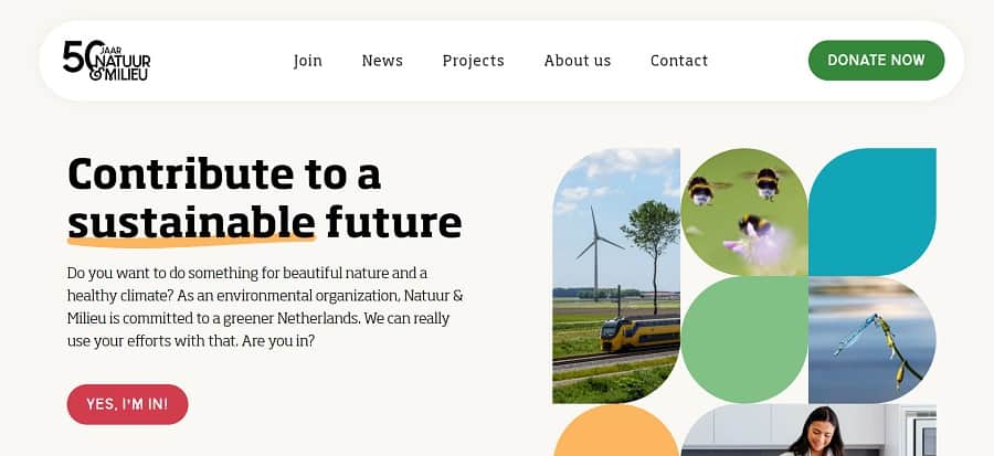
Natuur & Milieu utilizes a blue and green color scheme. Note how it chose muted colors and a neutral background so the text still contrasts nicely with the webpage and remains readable. As you move down the page, the design morphs into different shades of blue and green and even has a slight gradient effect. These shades live next to each other on the color wheel. It’s gone deeper into the circle and chosen lighter hues in the pastel family. You can do something similar with bolder blues and greens.
Both blue and green shades have a wide range. You can choose lime green or dark forest green, sky or aqua. A blue and green theme can be soothing or jarring, depending on the contrast between the hues.
You don’t want to copy the HEX codes exactly for your designs. However, examine shades on the color wheel and come up with your combinations from these analogous color scheme examples. You can also utilize one color in a design you like and add a second hue of your own choosing. Plug it into the wizard and see what pops up. Keep tweaking until you get the look you love.
2. Purple, Blue and Pink
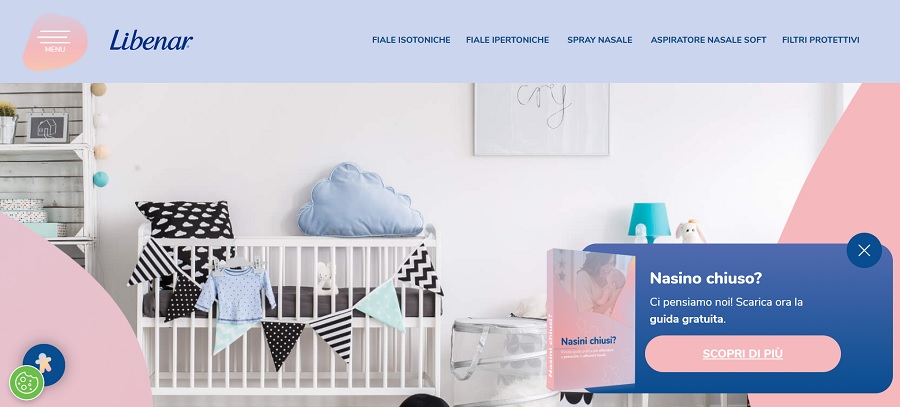
Libenar uses a soft combination of purple, blue and pink, perfect for a site selling baby products. Pink is on the lightest side of the red portion of the color wheel. It’s placed next to the purples and then blues, making the selection an analogous color scheme. Note how it uses darker purple for the text and lighter shades for the background and accents.
Note the use of secondary colors in various hues. There’s a touch of blue and gray. The color palette generator didn’t pick up the pink hues on the actual page, so you’ll want to play around with soft pinks alongside colors such as scorpion. Grays look really good with pink and purple.
3. Pink and Blue

If you’re looking for a great color scheme idea for your next project, consider this visually pleasing combination. You could use many different shades of pink and blue for design. The mesh of medium blue and deep pink on the Lobster site works particularly well for grabbing attention. The other colors on the page are quite muted in comparison. Although pushing the analogous color scheme definition a bit, the colors are still close enough on the wheel to qualify.

Again, use the above hex codes as a starting point for your design. You might choose a lighter or brighter pink. The blue is a very soft blue. You could go bold, neon or anything in between.
4. Brown and Green

Campesino creates a muted brown and green analogous color scheme for its website. The colors add a hint of nature and work particularly well for food and beverage websites. It also sprinkles in some blues, which reside next to the greens. Using three colors keeps everything in the same design style while creating more interest.
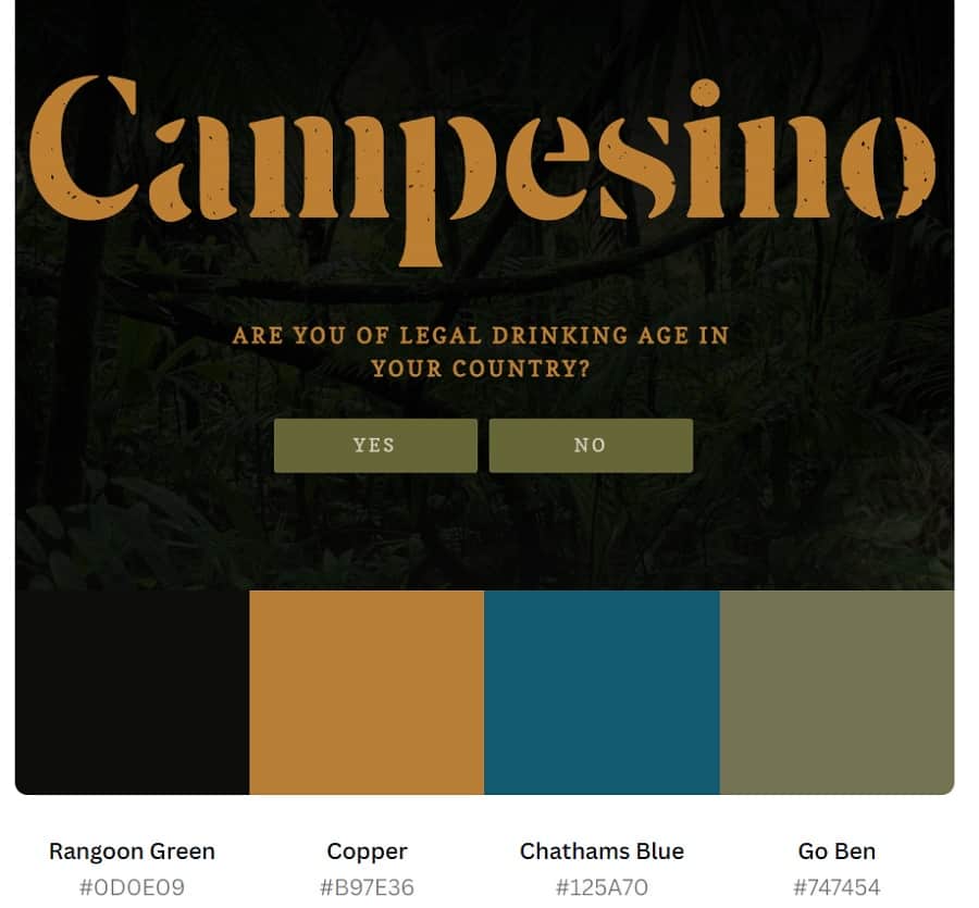
Note how the site uses two different greens, one almost olive and the other so dark it almost looks like charcoal. The designer then chose copper for the brown on the page. The contrast between the colors and placing different hues next to one another on the color wheel gives the design a unique look. The user sticks around to see where the aesthetics might go and becomes engaged.
5. Orange and Red

Brain Bakery has a gorgeous red and orange analogous color scheme. The site also pulls in some blue-green, which offers a nice analogous contrast. It utilizes a bright orange resting right on the edge of the red color spectrum. The other colors are fairly neutral except for a pop of contrasting blue further down the page.

Note how the site uses an orange with a hint of red and adds a gradient effect. This makes the site bold and modern without distracting the user with a busy background. We also love the color Eden—Hex #OF454A. This deep greenish-blue also gives the entire design a beautiful analogous look without distracting from the content on the page.
6. Yellow and Orange

A Short Journey uses yellow throughout its site, often falling back to an analogous color scheme that includes orange. At times, they add a splash of blue for contrast. The site pairs pastels with bold colors for visual interest.

It’s kind of interesting how the site’s design highlights pale yellow and orange, but then the generator pulls orange, blue and brown. Because the shade of orange is quite natural looking, it is likely the hex code generator sees it as an earthy brown, sort of like terra cotta.
7. Purple and Blue
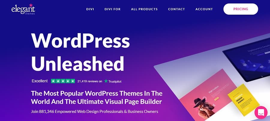
Elegant Themes utilizes a gradient with purple and blue. By using darker, vivid hues, it grabs the user’s attention immediately. As you scroll down the page, the background becomes more subtle and a grid pattern with images emerges. The background is white, adding a strong contrast between the analogous color scheme and the rest of the webpage.

As with some other sites, the generator doesn’t pick up that the deep blue is almost a purple hue. It does pick up different shades of blue, an eggplant-like color, and soft pink. Use any of these hues as a starting point to create your own blue and purple analogous color palette.
8. Green and Yellow
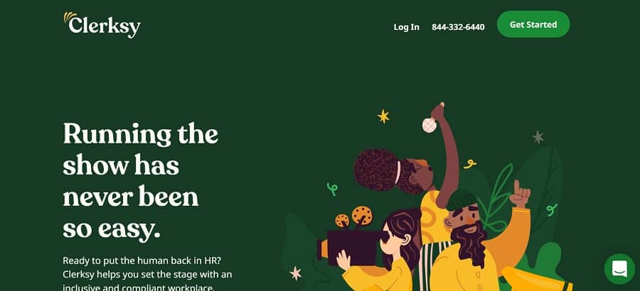
Clerksy uses yellows and greens to grab attention. The yellow, green and orange analogous color scheme creates a bold look for this site. Note the bright and modern looking hues rather than a milder light color or even a deeper shade. Although the website’s background color palette focuses on yellow and orange, note how the logo is two shades of green.

Note how the color palette includes three shades of green and a muted yellow. Although there are also oranges and white on the page, these four hex codes give you a good place to start with your own green and yellow palette.
9. Yellow, Purple and Blue

FontShop uses a blue and yellow color palette. Then, it pulls in a heather purple with the images it uses on the page, which creates a fresh and interesting look. This type of color scheme works particularly well for gardening centers, spring promotions and wedding-related businesses.

The color palette generator pulls up purple, blue and yellow for this site. The hues are all pretty bright and eye-catching. You can play around with different depths of color to find the right analogous palette for your page.
10. Purple, Blue and Red

Rightcar offers a simulator to show the safety ratings of different types of vehicles. Most of its color scheme is blue, making the site almost monochromatic. As you scroll, you’ll see some spots of red appear, showing vulnerable points on an image of a crash dummy. The pops of red create an analogous look and add interest to the illustration.
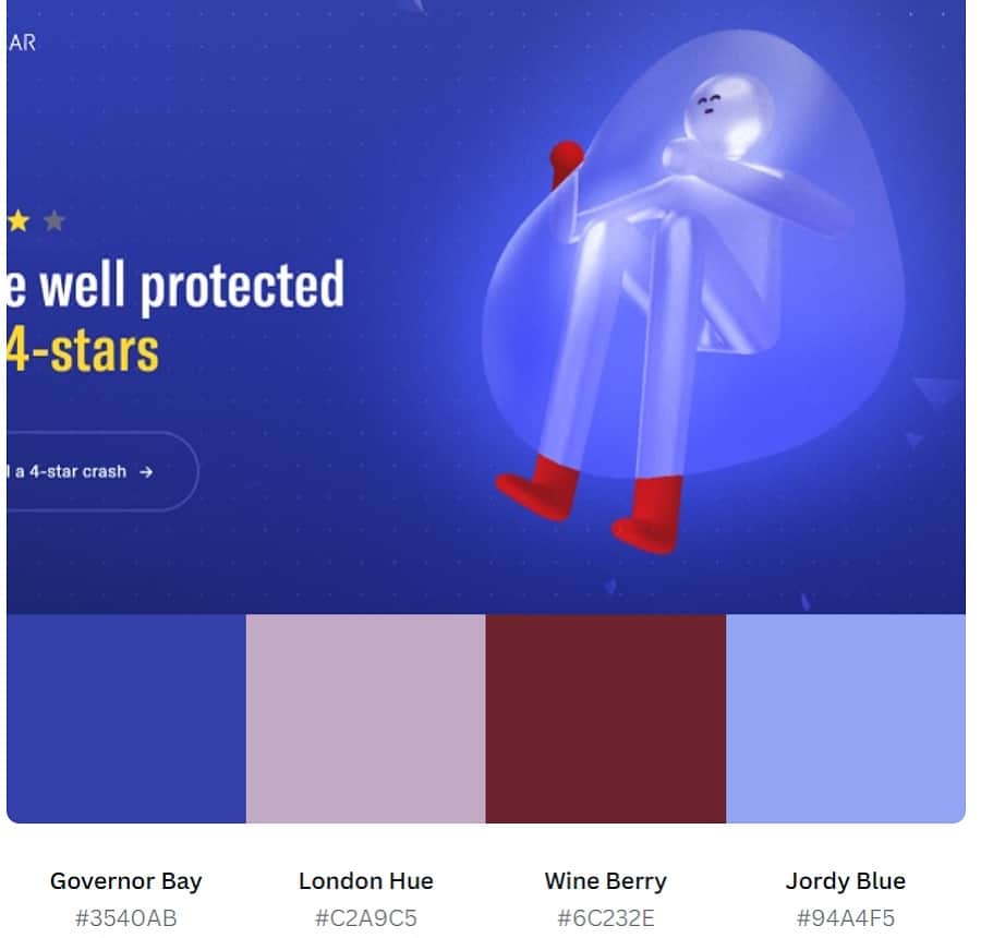
Look at the beautiful hues and how they look side-by-side. We’re in love with the purple London Hue next to Wine Berry. The colors create a beautiful, engaging design.
11. Blue and Red
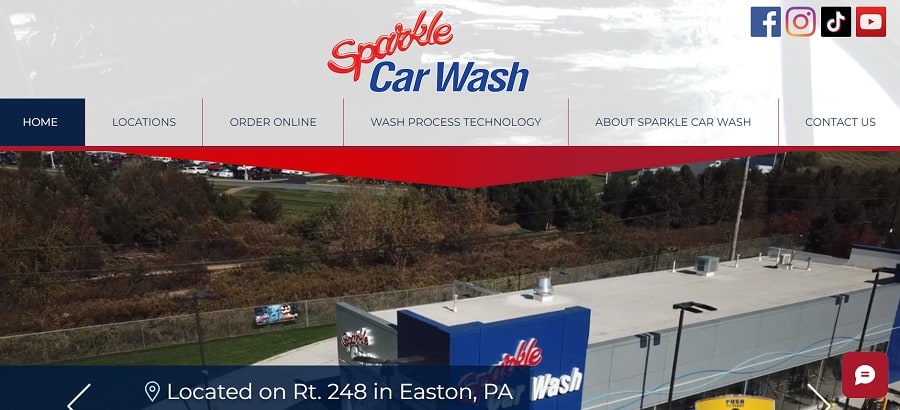
Sparkle Car Wash utilizes a red and blue color scheme with a deep violet in the image of its place of business. Scroll down the page to see different shades of blue and red via the pictures and highlights. Purple, blue and red can give your design a more authoritative look. You’ll see deep blues and reds on some financial institution websites.

We were a bit surprised at the colors the palette generator pulled. It’s likely due to the large images on the page. If you look at the header, the main colors are red, white and blue. However, the palette wizard says blue, gray, pink and a deep purple.
12. Earthy Blue and Green

Wild Souls Wildlife Rescue and Rehab uses softer blues and greens to grab attention. The colors remind one of nature, which is in perfect keeping with a wildlife rescue organization. Note the pops of yellow to add to the analogous color scheme.
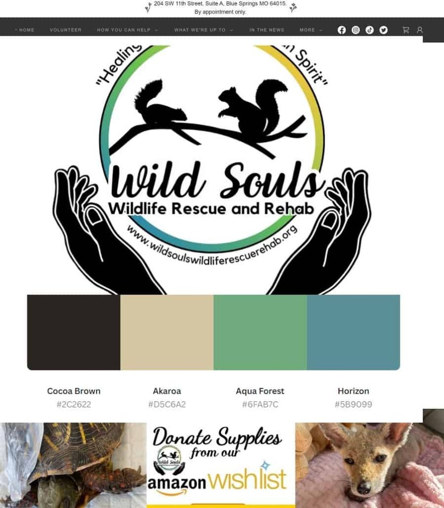
The palette generator pulled the soft green and blue, named Aqua Forest and Horizon, but it pulled a tan instead of the pop of yellow you see on the site. Be aware that a generator that pulls colors from an image might occasionally miss a hue.
13. Bright Blues and Purple

Netrix grabs several shades of blue and a bright pop of purple for a gorgeous analogous color scheme that pulls the user in. Note how the CTA button has a gradient that starts with a bright blue and moves into deeper blue and then a pop of purple on the right edge.
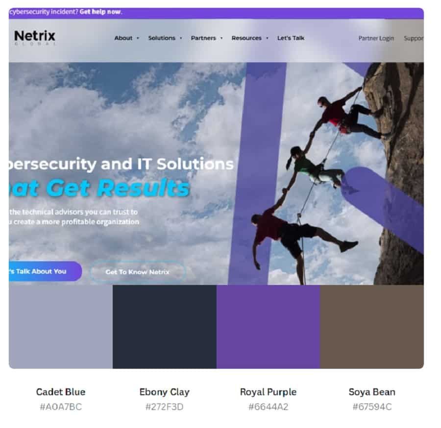
We adore this beautiful royal purple with Hex #6644A2. The palette generator picked up the soft Cadet Blue (#A0A7BC) but failed to grab the brighter blue hues on the CTA and text. Keep in mind you can add accent colors or vary the shade of each color you’re using in a scheme.
14. Yellow to Orange
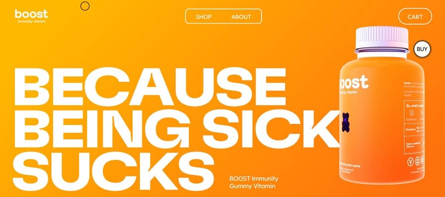
When it comes to analogous color schemes, you’ll see color combinations repeated, but the hues of those choices vary. Boost uses yellow and orange into a red-orange, but they keep the colors quite vivid. Other examples may go to almost peach or pale yellow, but Boost shows the vibrancy of their product by leaving the pop there. Even though it isn’t analogous, we love the little pop of the purple gummy bear to show off their product and grab interest.

The color generator grabbed the gorgeous orange that dominates the theme and named it “West Side.” To utilize this color in a design, code #FA970F. Although the system also picks up the cream color, it fails to capture the subtle variations in orange to yellow you see on your screen.
To repeat a look similar to the one on the Boost website, start with the vivid orange and utilize a gradient with a bright yellow. We recommend something like #F8D210 for a retro look or #F9F940 for a modern, neon edge.
15. Orange, Yellow and Green

It isn’t easy to find a website design with the colors orange, yellow and green. While they do sit next to one another on the color wheel, they don’t have the punch of, say, red and purple. We like the effect of this color combination for Our Breathing Planet because it gives a sense of nature.
Consider the way things are organized in the natural world. Green grass gives way to yellowed fields with pops of orange day lilies scattered about. The design for this site follows the ratio of green to yellow to orange you might see driving down the road in a rural community.
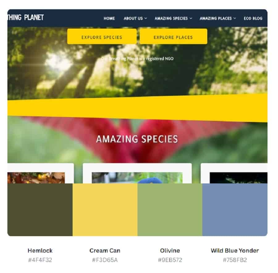
You can see the yellows and greens in the above palette. While the generator didn’t grab the vivid colors of birds, it is a very small part of the equation. When creating your own color palette, you can use orange as an accent and have a very close approximation to the colors in nature.
The Perfect Analogous Color Schemes
Figuring out what look is best for your project requires combining your brand color scheme and your goals. Feel free to work with different shades until you find a combination with an excellent aesthetic. Adding analogous designs to your repertoire gives you more choices to get a fresh, cutting-edge look.


Leave a Comment