


Social media started as a simple idea of sharing people’s faces or funny video clips online and exploded into today’s multiple platforms with varied media types. In the beginning, social media logos were as simple as the site designs. One could argue in the early days of “social media” things were simple. There were newsgroups and forums where people shared information back and forth.
However, they were a far cry from the more advanced platforms of today. Experts predict approximately 3.43 billion people will use social media by 2023. One thing we can be certain of is that new social media platforms will emerge. A few will disappear into the same obscurity of MySpace. Others will change their logos and revamp their overall look yet again.
Designers can learn a lot about the rapidly changing internet trends by studying the shifts in social media logos over the years. We’ll look at seven popular platforms and how their social media logos changed.
1. Facebook
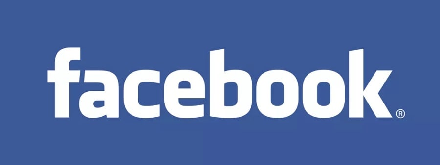
Facebook was initially called Facemash and featured a red box with white letters. The name was then changed to The Facebook and finally just Facebook. The original Facebook social media logo was a rectangular box with white letters with a Klavika-looking font. Mark Zuckerberg hired Mike Buzzard to design the logo in 2005.
The choice of a blue background was due to Zuckerberg’s form of color blindness called deuteranopia. He can see blue, but other colors look gray.

They kept the same logo for about ten years and then altered it in 2015 ever so subtly by using a more rounded a and adding a stem to the letter b. The colors and rest of the logo remain the same.
They also turn to a simple “f” for their website and use it with many of their assets. The letter and colors are instantly recognizable as belonging to the brand. They have precise rules for how people can use their social media logos.
2. Twitter

In 2005, the podcasting company Odeo conducted a brainstorming event. A team member named Jack Dorsey had the idea for a text service where people could send a message to a linked group. Someone in the group suggested “Twttr.” The original logo reflects the trends of the time and the original concept, which quickly turned into the complete word “Twitter” by 2005 to 2006.
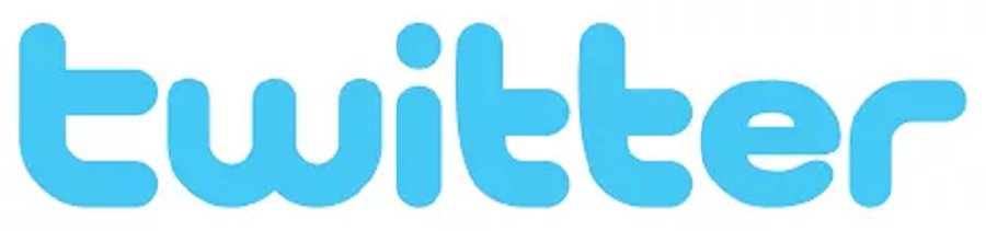
You can see the similarities with the chunky, short, lower-case letters used in the “twtta” logo and the first Twitter logo. As people began to call the messages “tweets,” the idea of a bird came into being. By 2010, the Twitter logo featured a bird added to the end of the text.
Eventually, the logo just became the bird, signifying tweets. The logo above is the one Twitter currently uses. Even the shade of blue changed slightly from the more aqua shade in the beginning.
3. Instagram
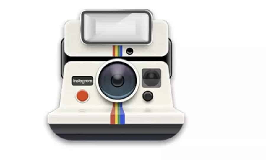
One of the more recent social media logos would be Instagram, but they still have had some changes since the company’s inception. In the beginning, a retro-looking camera was the icon. The word “Instagram” was in small letters on the face of the camera.
The social media platform is image-based, so it makes sense to have a camera for the logo, but it wasn’t proprietary to the brand. The app hit smartphones everywhere in 2010. Adding unique filters and embracing hashtags, the brand snowballed and today has well over a billion users globally.
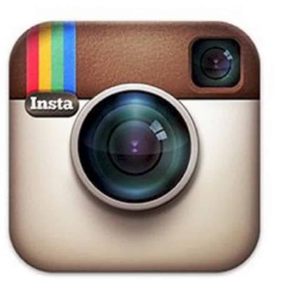
The logo changed slightly shortly after the brand launched, becoming more square. They also added a rainbow and the word “Insta” to the upper right corner.
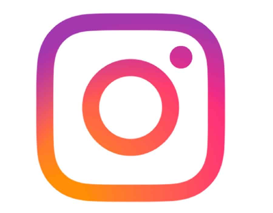
In 2016, they had a dramatic social media logo remake and took the outline of a camera lens on a smartphone and gave it a gradient background with white lines and no letters. The color gradient using blue, purple, red and orange is unique among social media platforms and stands out for users.
4. YouTube
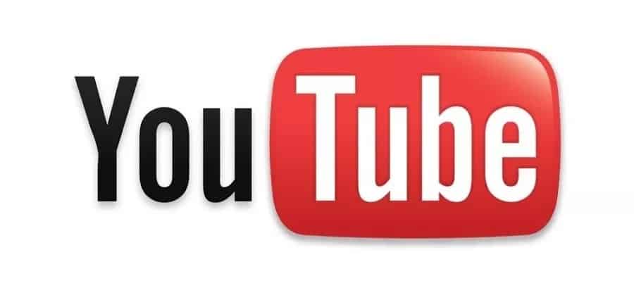
The original YouTube logo appeared in 2005 and was a simple rendering of a “tube” for watching around the portion of the word. The “You” was capitalized and in black, and “Tube” was in white on a gradient rectangle.
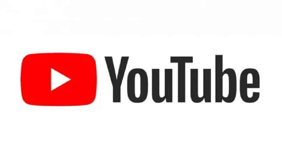
As technology advanced and television screens became flatter, YouTube also adapted to the change by adding a play button to the left. They wrote the entire word “YouTube” in black text. The company has used just the play button on occasion and made minor adjustments along the way, but the logo remains the same.
5. Pinterest
When you design social media logos that reflect your brand, you don’t have to change their look frequently. Pinterest is another player without many adjustments over the years. They still use the same red “P” and font they started with.
The original logo in 2010 featured the name in a red script font. They encouraged people to “pin” different images. To “pin,” the user clicks on a red circle with the letter “P”. The logo resembles the red pin on a board to mark the spot.
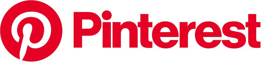
In 2017, Pinterest conducted a redesign but left the red “P” icon as it was. They only revamped the letter mark for the rest of the word and giving it a more business-like sans-serif look.
6. SnapChat
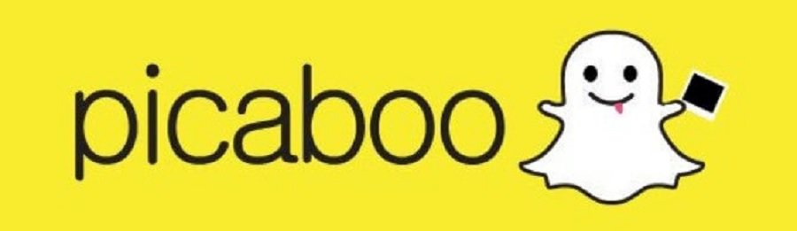
Originally, Snapchat was dubbed “Picaboo” for the disappearing images. There are many reasons why they chose the ghost logo, including ghost images and that “Pic a Boo” means ghost in Spanish. Snapchat founder Evan Spiegel also named the ghost with a nod of respect to rapper Ghostface Killah. Spiegel loves rap and even tries his hand at it. From 2011 to 2013, the logo with the little sheet ghost icon was what Snapchat stuck with.
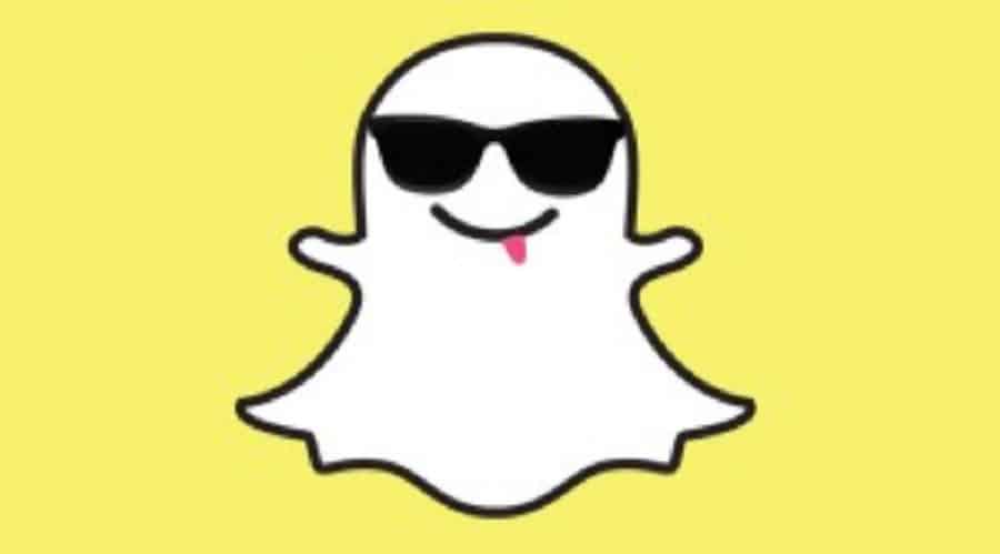
By 2013, the ghost began appearing as a faceless outline of the character. The common PR story is that the ghost symbolizes each user and thus has no face but yours. However, one of Picaboo’s designers filed a copyright lawsuit around this time, which may be the main reason for the sudden logo change.
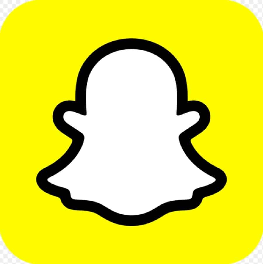
In 2019, the company changed the logo ever-so-slightly to darken and thicken the outline around the ghost. Users complained about the change, but Snapchat has left the icon with a slightly thicker border, and users seem to have simmered down.
7. LinkedIn

LinkedIn went live online in 2003 with a simple logo with the word “Linked” in black sans-serif text and the word “in” as white letters inside a blue box. The changes to this logo over the years have been relatively minor, meaning the original social media logo design had a ton of substance and suited the platform almost perfectly.
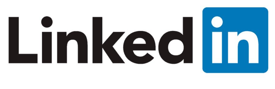
At the eight-year mark, the company redesigned the logo slightly by spacing the letters out the tiniest bit and revamping the letter “E” to narrow the bottom and give it a bit more curve. The change coincided with their IPO registration with the NY Stock Exchange.
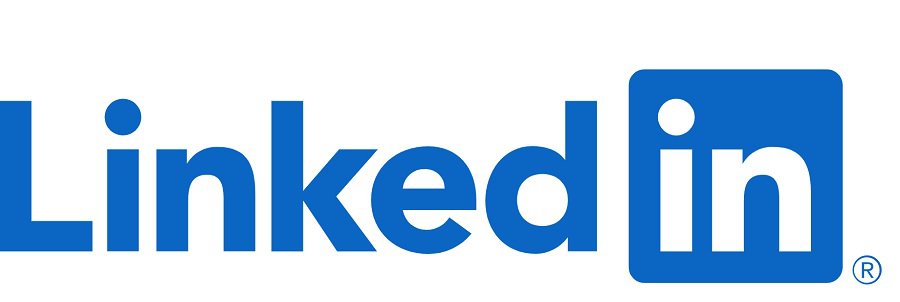
In 2019, the company underwent a second logo redesign. Although the logo is still very similar to the original, the changes are significant for the current logo. The letters changed from black to blue, and the color palette became closer to Microsoft’s, the company that bought them out in 2017. The first portion of the logo is blue on a white background, and the second part is white on a blue background, creating a monochrome effect but still providing consistency.
Learn from Social Media Logos
Social media logos offer an excellent opportunity for designers to see how a brand image shifts over time. Most of the examples above have fairly subtle changes. You can still recognize the brand from the original logo to the current one.
Some rebrands may require a more drastic change. However, if you design a usable logo that fits the brand from day one, the changes needed over the decades will be subtle to reflect changing technology and design trends. Learn from the best and come up with your own inspiring logos that stand the test of time.
Leave a Comment