


In This Article
The phrase “triadic colors” indicates a palette with three different hues. Traditionally, triadic schemes have one main color and two others serving more as an accent than dominant options. You can also add in white or black and not count that as part of the trio but for balance and aesthetic appeal.
All three of the colors are evenly separated around the color wheel. Some examples of triadic colors include:
- Red, yellow and blue
- Purple, green and orange
- Maroon, orange-red and lime green
The colors can be light or bold and skewed slightly to either side. You’ll find a lot of flexibility with a triadic color palette.
Designers often use a color wizard to create a triadic palette. You’ll also be given some other options for analogous, complementary, monochromatic and tetradic. A color palette generator saves you time and helps you see combinations you otherwise might not have thought of.
One of the best ways to figure out how to utilize triadic colors in your designs is by looking at what others have done. We’ll talk about the things to be aware of as you embrace this method and include a few examples of some of our favorite triadic websites.
1. Consider Current Logo and Color Palette
If you’ve been in business for a while, you likely already have a brand style. What color is your logo and does it serve well as part of a triadic color scheme? Not every design method works well for every business.
Triadic colors tend toward the brighter side, so if you run a business with more traditional clientele, you may want to opt for monochromatic or some other style.
You can also do a three-color triangle and use muted and extremely light or dark hues for two of the colors and then tap into a bright, vivid hue for the final part of the trio.
If your current logo simply doesn’t cut it, you can always rebrand and create a brand new color palette for your brand. Whatever route you go, select options that aren’t too trendy. You want a logo and color palette you can use for years and solidify your brand image with.
2. Choose Your Dominant Color
The most crucial decision with triadic colors is picking the main color for your design. The other two colors serve as accents and will be used far less frequently than your primary one.
The dominant shade is going to leave an impression about your brand. It’s smart to consider color psychology and what each hue means to the user. Keep in mind that the emotional impact of colors vary from person to person. You’ll also need to fully understand your buyer personas to choose the best one possible for good user experience (UX).
For example, most people like the color blue, so if you choose blue as your primary color you’ll please the most people. However, you also need an option that doesn’t create eye strain, particularly if people spend significant time on your site.

On DSCL, the Japanese-based designer Yoshiro Murakami uses some bright colors to pull the user in. In this design, yellow is the dominant color and blue and red are used as accents. The finished look is quite bold. You can tone down a triadic color scheme by adding some neutral colors into the mix and reducing the placement of secondary colors.
We like how DSCL has a deeper blue that serves almost as a neutral since the yellow and red are so bright. The effect is modern and attention-grabbing.
3. Study Competitors
The last thing you want is for users to think you’re copying your competition. Spend a little time studying their designs and color palettes so you can make sure you meet industry standards but in a unique way.
The banking industry often uses blue because it signals trust. However, the shade you choose can help you stand out from other companies in your industry.
If you choose the same dominant color as a competitor, users might also confuse your two brands. It would be better to adjust the shades slightly so your triadic colors do not match anyone else’s.
Ask yourself if the other brand tapped into the power of color psychology when selecting their palette. Perhaps you can stand out from the competition by selecting wisely.
4. Play With Saturation and Hue
Triadic colors sometimes seem harsh, especially to users who are online for many hours a day looking at different material. You can tone things down by playing around with the colors a bit. Go from a vivid blue to a soft, subdued blue jean color. Take a yellow to a pale pastel glow. With a bit of creativity, you’ll still have a triadic color scheme but the boldness will reduce and leave you with a highly accessible design users love.
You may wish to conduct some A/B testing to figure out which shades your target audience responds best to. A slight adjustment on the color scale can have big impact. Try variations until you find the one with the best response rate.

SEMRush utilizes a triadic color scheme. Purple is the strongest hue on the page, filling the background above the fold. Shapes in a lighter purple and green reside on the top and bottom corners. The call to action (CTA) is in a bright orange that grabs user attention. The entire effect generates excitement.
The bright pops of color showcase the modern abilities of the product. The design uses pops of color to pull the eye where the designer wants it to go, naturally going from the top to the CTA to the bottom left in an F-pattern.
5. Test Your Design
If you aren’t sure whether a triadic color scheme is right for you, you can create a single landing page and test it with your core audience. Send them to differing versions and see which creates the best conversions. Ask for feedback on the design.
Your current customers are often your best gauge of how well a design might perform with new buyers. Use split testing and choose the one that your audience prefers. The most beautiful design won’t help you if it doesn’t entice people to make a purchase.
Send out a survey and ask what their favorite colors are. What hues do they associate with your brand? Would they like to see anything else? While a designer’s eyes should always be the final decision point for any change, getting input from users goes a long way toward creating a valuable resource for their needs.
6. Consider Color Warmth or Coolness
Most designers understand there’s a time and a place for both warm and cool colors. Using the same types of colors together creates a mood for your website. If you want people to feel welcomed, warm colors might be the best option. On the other hand, cool ones can make them feel calm and reassured.
Think about the purpose of your website and which emotions you most want to elicit from users to decide which range of shades work best for your design.
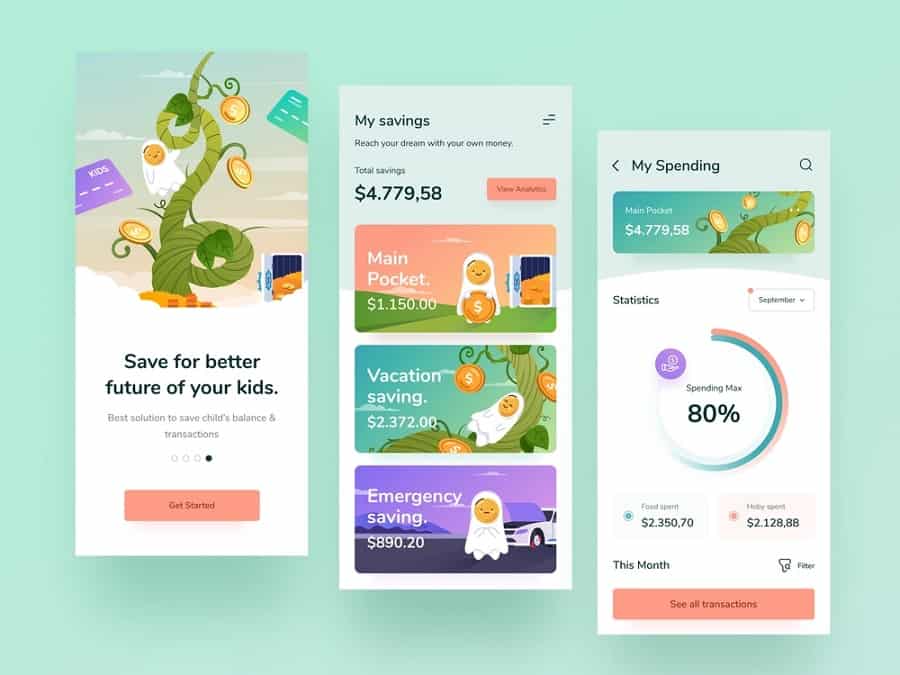
We loved this Dribbble design of a Digital Bank for Kids with its soft pastels. The more muted hues show how you can play around with triadic colors to find the best combination. This particular design works in purple, green and orange but also includes quite a bit of neutral white for extra white space and a softer feel to the design that is better suited to youngsters.
7. Adjust Saturation and Brightness
Another way you can play around with the color values and come up with a unique triadic color design is by moving the lever on saturation and brightness. Use a bit of transparency and overlap elements to show how the colors mesh together.
Add white to any color to come up with something softer and easier on the eyes. Decide what you want for your background. An extremely soft blue that is almost white might serve as an excellent backdrop for a pop of vivid purple.
You could then add yellow and choose a soft buttercream or a earthy mustard tone. Try different variations until you find the one that screams the brand’s personality.
8. Create Visual Balance
Triadic color schemes can be jarring on the human eye. It’s crucial to use your unique design skills and eye for what looks good to come up with a combination that is aesthetically pleasing. Much of finding the right color palette involves trial and error.
Create a color triangle and then step back from the computer and view it from a distance. Make sure nothing is too harsh. People are online for hours on end in the twenty-first century. Eye strain is a problem. Avoid colors that create a stimulus overload. Soften them just enough to create a visual balance people enjoy.

Strategic Materials Inc goes with an earthy green as their primary color. They then pull in the other two colors in the triangle by choosing images with blue and yellow. Everything else is neutral in color. The result is a vibrant site that grabs user attention and keeps it.
Should You Use Triadic Colors in Your Next Design?
While you can create almost any effect you want with a triadic color scheme and it passes the rule of thumb about three colors or less, only you will know if the method works for your project. Other techniques work well, too, so it’s just a matter of playing around and seeing whether a trio of split colors is right for your business.


Leave a Comment