


Website footers do not always get the attention they deserve, but they do influence how people traverse your site and what they do next. A well-thought-out footer can orient visitors, build trust, and support your goals without being an afterthought.
Whether you are a business owner, marketer, or designer, viewing the footer as a purposeful part of the experience may make your entire site feel more intentional. With that in mind, it is worth it to take a closer look at what separates a basic footer from one that truly works.
A footer design for a website often acts like a safety net for visitors who reach the bottom of a page without finding what they need. But instead of just more room for links, it gives users another chance to navigate and act before leaving your site. When a footer is built properly, it improves usability and conversions.
Footers serve as a backup for visitors who did not find what they were looking for in the main navigation. When users reach the end of a site, they automatically glance to the footer for a second pathway, as a backup navigation area, rather than scrolling back to the top. Links like services, contact pages or significant resources make it easy to continue browsing instead of abandoning the site.
Trust and Credibility Signal
Visitors generally look for key trust factors in the footer. You can reassure users that your site is reputable and transparent by including a privacy policy, terms of use, geographic details and social media links. Even something as simple as a plainly visible contact link might make your site feel more trustworthy.
Conversion Opportunities
The footer also provides one last opportunity to inspire action without disrupting the browsing experience. It makes sense to include a newsletter signup, a contact button, or a secondary CTA here, since it is exactly where people are deciding what to do next. Thoughtful placement turns the footer into an effective engagement point rather than empty space.
A strong website footer brings together the details visitors expect to find when they reach the bottom of a page. Think of it as a compact hub that supports navigation and keeps your brand accessible without overwhelming the layout. While every site’s needs are different, most effective footers include a mix of the following essentials:
- Contact information: Include your business address, phone number or email so visitors know how to reach you without searching elsewhere. Even a simple contact link can make your site feel more trustworthy.
- Navigation links: Add a streamlined set of links to important pages such as services, blog content, FAQs or support resources. This works like a simplified sitemap and helps visitors continue exploring instead of leaving the site.
- Legal and copyright details: Privacy policies, terms of service and copyright notices are expected in the footer and signal professionalism. They also help your site meet compliance requirements in many regions.
- Social media icons: Link to active social platforms where visitors can follow updates. Keeping these icons available but unobtrusive helps maintain a clean layout.
- Call to action: A newsletter signup form or simple contact prompt gives visitors one more opportunity to engage before they exit the page. This placement feels natural because it appears after they have finished scanning the content.
- Company branding: Reinforce your identity with your logo and a short pathway to an “About” page. These elements help visitors quickly confirm who you are and what your organization does.
- Trust signals (optional but recommended): Security badges, certifications, awards or affiliations can strengthen confidence, especially for e-commerce or service-based sites.
With the essential elements in place, the next step is to apply design best practices to keep your footer organized and aligned with the rest of your website experience.
1. Prioritize Visual Hierarchy
A clear visual hierarchy helps visitors quickly understand what matters most when they reach the bottom of your page. Since research shows users can form an impression of a website’s visual design in as little as 50 milliseconds, the way links are placed in your footer directly affects whether people notice key information.
Using headings to organize link sections, increasing space between groups, and giving priority items slightly more visual weight can make the footer easier to scan without making it feel crowded. When hierarchy is handled well, the footer feels like a natural extension of the page.
2. Design for Mobile First
Designing your footer with mobile users in mind helps ensure it stays usable on smaller screens where space is limited, and navigation needs to stay simple. Research shows that 97% of adults under 50 now own a smartphone, making a mobile-friendly design an expectation.
Stacking links vertically, increasing tap-target spacing, and limiting the number of columns can make your footer easier to scan and interact with on phones. A mobile-first approach also encourages a cleaner organization overall, which improves usability across every screen size.
3. Maintain Brand Consistency
Your footer should feel like a natural extension of the rest of your website. Keeping colors, typography, logo usage and tone consistent helps reinforce your brand identity and makes the experience feel more intentional. Even small details like matching button styles or using the same accent color for links can strengthen recognition and trust as visitors move through the page.
4. Avoid Treating It as a Dumping Ground
It can be tempting to place every leftover link in the footer, but overcrowding this space often makes it harder for visitors to find what they need. UX research from the Baymard Institute shows that 67% of mobile sites still struggle with navigation performance, which highlights how easily overloaded link areas can reduce usability instead of improving it.
Instead of treating the footer like storage for extra pages, focus on including only the most helpful navigation paths, essential policies and key engagement opportunities. A more selective approach keeps the footer easier to scan and supports a smoother browsing experience overall.
A fat footer can be a smart choice when your site has a larger content structure. Therefore, it can benefit from extra navigation support at the bottom of the page. Instead of relying on a single row of links, this expanded layout lets you organize resources into clearly labeled sections, making it easier for visitors to explore related pages without returning to the main menu. The key is to stay intentional about grouping links so the layout still feels structured.
Looking at real-world examples can make these best practices easier to picture in action. The following site footers show how design choices come together to support usability and visual appeal.
Stripe
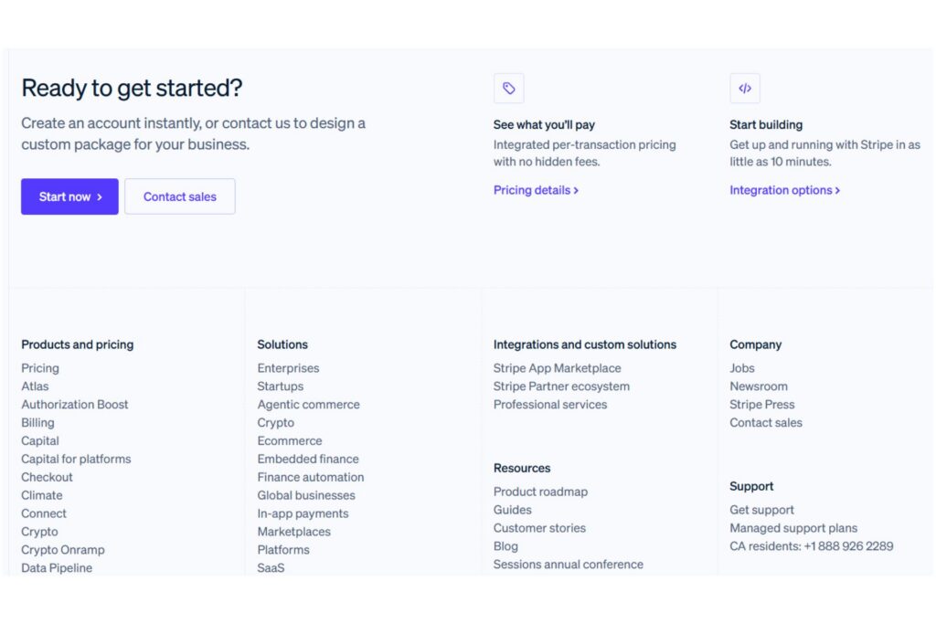
The footer on Stripe’s website is effective because it combines a strong call to action with a well-structured fat footer layout that supports deeper exploration. The “Ready to Get Started?” section gives visitors a clear next step before they even reach the navigation links, while the grouped columns below organize products, solutions, resources and more into easy-to-scan categories.
Patagonia
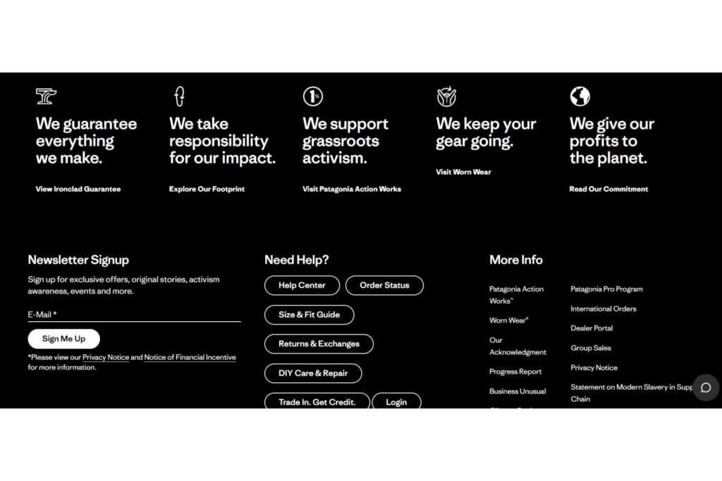
The footer on Patagonia’s website stands out for reinforcing the brand’s mission while still supporting navigation. The bold statements across the top highlight Patagonia’s environmental commitments, turning the footer into a storytelling space. At the same time, the layout includes helpful support resources, a newsletter signup, and policy links, making it easy for visitors to take action or find assistance.
The New York Times
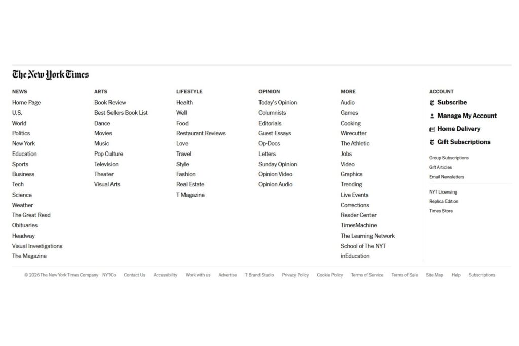
The footer on The New York Times website is a strong example of a well-executed fat footer that supports large-scale content navigation. Because the site covers many sections, the footer organizes links into clearly labeled categories, making it easier for readers to explore topics without returning to the main menu.
A well-designed website footer supports navigation, reinforces trust and gives visitors a clear next step without cluttering your layout. By organizing essential components, you can turn the footer into a natural extension of your site. Even small improvements in this space can make your website feel more complete and easier to explore.


Leave a Comment