


Whether you’ve gone to art school or picked up the skills needed to be a designer elsewhere, you’ve likely heard of the Rule of Thirds. Used most frequently in photography, the guideline gives creators a way to balance the composition and draw the viewer’s attention to a central element in an image.
Take your canvas and draw three equally spaced horizontal lines and three similar vertical lines either mentally or with actual lines you can remove later. The Rule of Thirds gives you a grid on your workspace. Experienced artists mentally visualize the markers and have no need to actually break up the page.
When you’re trying to come up with a focal point for your design, it’s essential to move it out of the center boxes unless you are trying intentionally to break the rule and have a valid reason for doing so.
History of the Rule of Thirds
John Thomas Smith wrote down an explanation of the Rule of Thirds in 1797, but artists had used it before that time. Although the rule helps artists, it is also made to be broken. The famous photographer Ansel Adams once said the rules of photographic composition were irrelevant. He is known for taking amazing photos and not worrying about the “rules.”
Although, knowing the basics of design, photography and art allows you to also understand on a deeper level when it’s a good idea to throw the standards out and go your own way.
How Using the Rule of Thirds Improves Your Design
Even though you might not use the Rule of Thirds 100% of the time, there are some interesting ways it improves your designs as a graphic artist.
Find Your Balance
Asymmetrical designs are popular right now, but a good design has a balance to it with plenty of white space and a natural ability to draw the viewer’s attention to key elements. The Rule of Thirds grid ensures you put things in a location balancing the page. You might locate your CTA in the lower right of a webpage, but you will make sure it spans part of two blocks instead of sitting off-balance in the bottom far right corner.

Source: https://hillsmade.com
Hills makes high-end accessories for Tesla vehicles. Their website design places the focus on one of their products by placing it in the left middle grid. The rest of the screen is filled with the background of a vehicle interior and sky. This puts the attention on the item they’re trying to sell.
Create Movement
Do you want to give the appearance of action in a design? Place your subject on one side in two of the grids and face them toward the other. This draws the eye from one side to the other to see if there is anything of interest.
One example of how to utilize this method with the Rule of Thirds would be creating an ad with a woman in the left lower two grids and facing her toward the right side. The user’s eye would naturally drift right and down. You could then add a call to action (CTA) on the lower right.
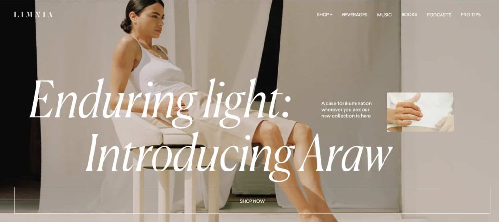
Source: https://araw.limnia.com
Limnia utilizes the Rule of Thirds. They add an image of a model stretched out across three of the grids moving downward. They leave white space around for a look drawing the eye across the clothing the model wears and to the large CTA button reading “Shop Now.”
Highlight Important Elements
One of the best parts of using this design method is you’ll see clearly how best to highlight certain items. For example, if you want to draw attention to a new product, you know you’ll need some negative space and the item. However, you don’t just want a big blank page of white space and only a single small image or text on the page.
Use the Rule of Thirds to fill in the space but also layer elements on top that send the message you want or elicit an emotion in the viewer.

Source: https://www.capannasuites.com/it
Capanna Suites adds an image filling a majority of the screen, but they place the subjects in a small portion of the canvas. In this particular design, the photographer used the method to place the subjects in a small portion of the overall image without making them overwhelm the setting. However, the web design also utilizes a grid to place elements such as the logo, menu and CTAs.
Know Where Users Look First
When users land on a web page, their eye goes in a particular pattern. Scientists conducted eye-tracking studies to figure out how we view webpages, and most people look in a Z pattern, running our view across the top first and thin zig-zagging down.
So, the most viewed area is the upper left corner above the fold. Then, the upper right corner. Next, the user will jump down and look at the lower left corner and finally the lower right corner. Understanding this pattern allows you to place vital information first. Websites tend to place the logo in the upper left for branding purposes. Every page the user lands on will have the company name and logo and reinforce recognition.
When to Break the Rules
One of the reasons designers learn rules such as the Rule of Thirds is so they know when and how to break them. If you are in the middle of a website design and you see the typical layout isn’t working, think about a different placement and how it might still be aesthetically pleasing to users.
Always focus on the usability of the site over any other element. You can create a beautiful design and find a highly functional one. Now that you understand the Rule of Thirds a little better, you’ll be able to easily apply it to your design work.


Leave a Comment