


In the modern digital marketing landscape, most brands rely on bright, harsh neons to grab the attention of scrollers. This strategy can often backfire, leading to digital fatigue. With screen time at and all-time-high, consumers now look for visual relief. This is where earth tones have real potential, signaling maturity and authenticity that artificial colors can’t replicate in professional settings.
For brands looking to stand out in the highly saturated, digitized market, colors are a strategic asset as much as an aesthetic. By using colors found in nature, you can effectively communicate stability and substance, qualities any consumer would want in a brand.
The Psychological Pull of Grounded Colors
Even as marketing trends continue to rapidly evolve, color remains a key driver of brand equity. While flashy colors prioritize getting that initial click, earth tones generally do a better job of building brand identity and establishing a presence. When a person sees deep brown or muted greens, their brand naturally associates it with safety and durability.

Brown and Umbers serve as a strong anchor. They conjure a sense of reliability derived from wood and soil. These are great for small businesses, as they suggest they are established and resilient, which helps reduce some of the startup anxiety new ventures experience.
Alternatively, greens and olives imply calmness. The serenity people often associate with nature is strategically used in these palates, providing a digital exhale that lowers stress. It invites the user to linger on your page a little longer rather than rushing to exit.
Grays and orchres provide more professional balance. Grays offer modern sophistication, and ochre creates a degree of heritage. Together, these tones prevent a brand from appearing too clinical. They suggest a business that values both human craftsmanship and precision.
10 Earth Tone Color Palettes for a Natural Design
These tone color palettes create a grounded design for any brand looking to build positive associations.
1. The Overgrown Garden
This palette creates an immersion reminiscent of an untouched woodland. The deep greens suggest resilience and time-testedness. It’s perfectly suited for wellness brands and outdoor equipment companies that want to emphasize a connection to the wilderness.

HEX Codes:
- #2D3A27 – Deep Moss
- #4B5D43 – Fern
- #A1887F – Bark
2. High Desert
This combination feels adventurous and balanced at the same time. Terracotta provides a sense of energy, while sage feels like a cooling agent to keep the visual identity from feeling too overwhelming. It works for travel agencies seeking a spirited yet organic vibe that conveys the feelings and tones of adventure.

HEX Codes:
- #E07A5F – Terracotta
- #F2CC8F – Sand
- #81B29A – Sage
3. Coastal Mist
Desaturated greens and stone-heavy neutrals create a spacious and quiet air that removes a lot of visual noise. It projects maritime tranquility without relying on cliches like ocean blues. It is ideal for high-end skincare brands or interior design firms seeking to convey sophistication and minimalism.

HEX Codes:
- #6B705C – Olive
- #A5A58D – Stone
- #DDBEA9 – Shell
4. Ancient Stone
These tones are intentionally moody, aiming to leverage the cooler side of the earth spectrum and create perceptions of being premium and established. The addition of muted mauve provides a layer of heritage that standard grays lack. This suggests structural elegance and strength, being a strategic fit for architecture firms or boutique brands.
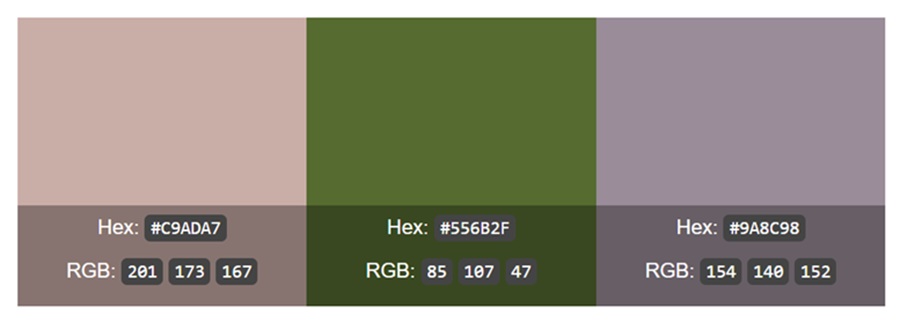
HEX Codes:
- #556B2F – Slate
- #9A8C98 – Muted Mauve
- #C9ADA7 – Dusty Rose
5. Olive Grove

This is the definitive organic palette so prominent in the colors of Mediterranean agriculture. It depicts health, longevity, quality and the simplicity of life, accentuated by the high-contrast relationship between deep greens and raw linens. This vibe is the gold standard for organic food producers or eco-friendly products that want to signal purity.

Hex Codes:
- #556B2F – Dark Olive
- #BDB76B – Khaki
- #F5F5DC – Beige
6. Canyon Clay
This represents the more artisanal and “human” qualities certain tones can bring. Rich and tactile, these tones have a physical weight to them that reminds users of raw materials like pottery or sun-dried brick. It is a fantastic choice for pottery studios and small bakeries where the maker’s story is a big part of the product’s value.

Hex Codes:
- #8D4925 – Raw Sienna
- #C28E73 – Clay
- #E9C46A – Ochre
7. Stormy Peak
This palette draws on the cooler side of nature, such as mountain shadows and rainclouds. It invokes modernity and technical stability, making it a safe choice for tech startups. It allows these brands to appear grounded while maintaining some sleekness that modern users expect.

Hex Codes:
- #2B2D42 – Night Sky
- #8D99AE – Cool Gray
- #EDF2F4 – Cloud
8. Dune Path
For brands that want to build a visual environment that feels protective and gentle, such as maternity brands or bedding companies, this palette is a strong choice. It is warm, inviting and soft, creating a strong sense of comfort by stripping away high-contrast edges.

Hex Codes:
- #CB997E – Rose Gold Dust
- #DDBEA9 – Pale Sand
- #FFE8D6 – Cream
9. Deep Moss and Copper
The inclusion of a copper-like red-brown adds a necessary spark of energy to deep greens. The vibe here is old-world luxury that’s built on tradition rather than flashiness. It is uniquely suitable for luxury spirits or traditional grooming products that want to look wealthy and classy.

Hex Code:
- #1B4332 – Evergreen
- #94D2BD – Minty Earth
- #BC4749 – Copper
10. Autumn Hearth
This palette is comforting and rich, great for creating nostalgia through warm and wooden tones or weathered golds. It builds an atmosphere that feels community-centred, like a well-worn but beloved library. It is perfect for local cafes and hospitality brands aiming to create a cozy environment for customers.

Hex Code:
- #582F0E – Cocoa
- #7f4f24 – Leather
- #A68A64 – Gold Leaf
Being Aware of Accessibility Guidelines
At the end of the day, accessibility is the highest form of trust. It allows all users to interact with your website’s content, ensuring that it stays comprehensible to people with disabilities. Because earth tones are often muted, they can sometimes fail Web Content Accessibility Guidelines for contrast. Sage green text on a tan background might look aesthetically pleasing, but it must be readable for all users. Always test your pairings to ensure that key texts and buttons are legible.
Strategic Ways to Apply Earth Tones
To effectively use earth tones in brand identity, a strong visual hierarchy is key. The secret is to ensure a thoughtful mix of light and dark shades, avoiding overreliance on mid-tones that could muddy your design. This creates much-needed contrast.
For website UI/UX, use light neutrals like soft cream or pale sand as a background color. Then use your darkest umber or slate for the body text. This brings a strong pop while retaining the earthiness of the chosen palette.
In terms of social media, earth tones benefit strongly from texture. Adding a little graininess creates a matte texture that feels like linen. This subtle detail makes the page look human and homey.
Grounding Your Brand For Growth
Selecting an earth-tone palette depicts a dedication to authenticity and comfort. The right combination depends on your business goals and the brand you want the world to receive. The big lesson here is that when you ground your brand in the real world, customers feel the difference.


Leave a Comment