

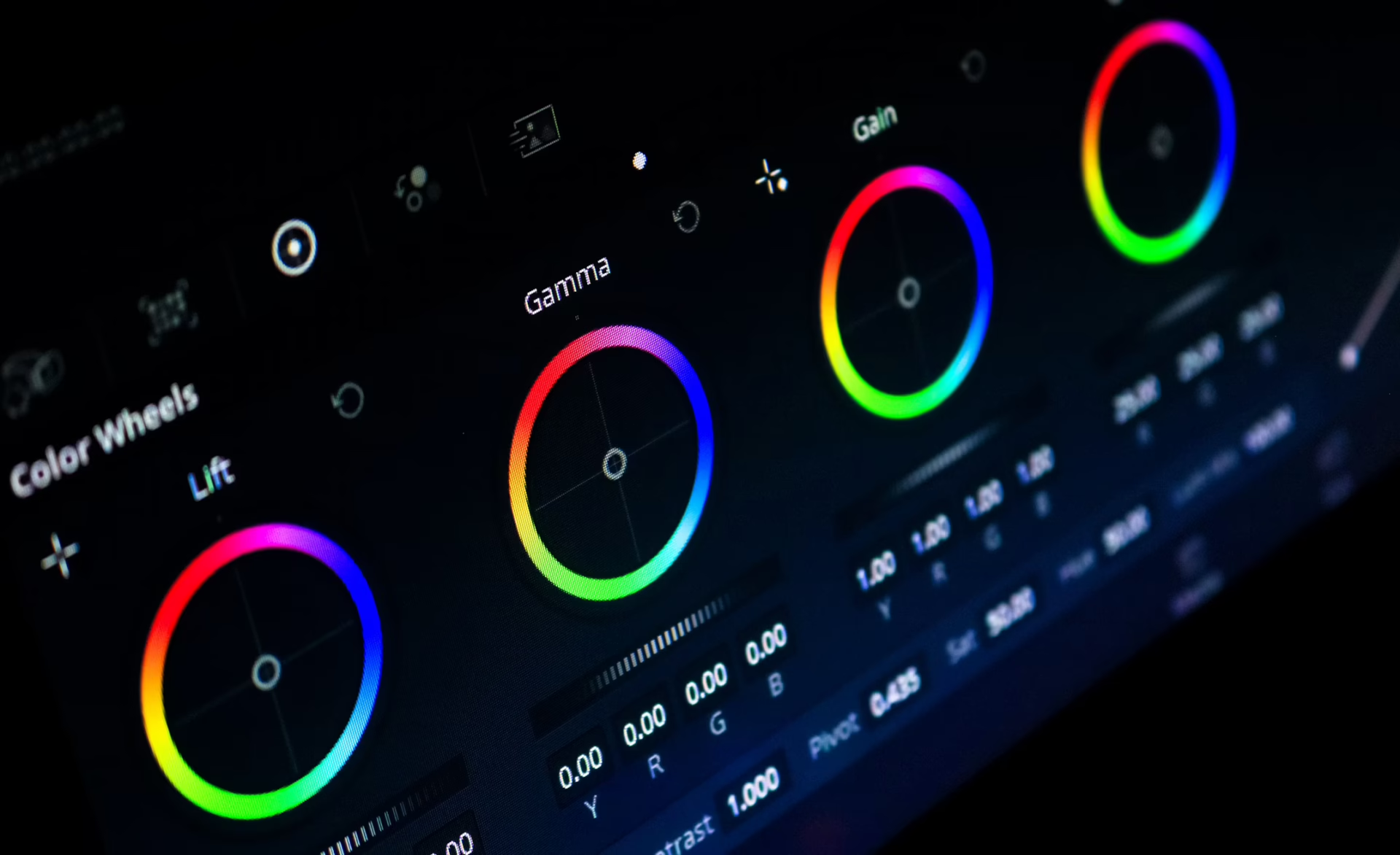


Brand consistency influences how customers perceive a business. When colors vary across websites and social media posts, marketing materials can feel disconnected and less professional.
Understanding color grading vs color correction helps businesses solve that issue. Color correction ensures the accuracy and consistency of visual assets, while color grading adds mood and personality. Together, they help marketers and business owners create a recognizable brand that builds trust and leaves a lasting impression.
Why Inconsistent Brand Colors Damage Trust
Visual consistency is a business asset.
Research shows that 79% of consumers are more loyal to brands with consistent communication across channels. Consistent branding, which includes color usage, supports both loyalty and trust.
Color carries significant weight because people process visuals faster than text. Buyers may overlook subtle differences between a website banner and a social media post, but they quickly notice when a brand feels disjointed.
Global companies such as Coca-Cola and Apple maintain highly recognizable visual identities across advertisements, websites, packaging, and social content. Their consistency makes them instantly identifiable.
Smaller businesses can achieve similar results. A unified visual identity signals professionalism and reliability, regardless of marketing budget.
Color Correction: The Technical Foundation
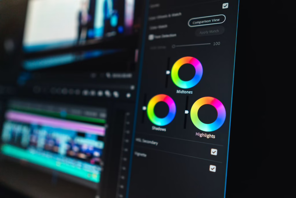
Color correction makes images and videos appear accurate and natural. As the name suggests, it “corrects” colors to a neutral baseline. Think of it as quality control for visual content. The process fixes technical issues and creates a canvas before any creative edits occur.
Without correction, footage may appear too dark, overly warm, or inconsistent with other marketing assets.
Establishing a Neutral Baseline
Color correction usually addresses:
- White balance
- Exposure
- Contrast
- Saturation
- Highlights and shadows
- Color balance
A product photographed under office lighting may develop a cool tint. Color correction removes that cast so customers can see the product’s true appearance. Video footage captured throughout the day can shift in color or brightness as sunlight changes. Correcting those differences produces a cleaner and more professional result.
This step gives marketing teams a dependable starting point for every campaign.
Matching Visuals Across Channels
Color correction becomes especially valuable when businesses manage multiple channels.
One campaign may include product photography, video testimonials, social media graphics, website banners, and paid advertisements. Every asset should present the same foundational look.
If a company’s signature blue appears differently across platforms, customers may receive mixed visual cues. Color correction keeps brand colors accurate before designers apply any stylistic enhancements. Corrected assets create a reliable foundation for future campaigns, especially for firms with established brand guidelines.
Common Color Correction Mistakes
Even experienced marketers make avoidable mistakes during the color correction process. These include:
- Relying too much on automatic settings: While modern editing tools can produce acceptable results, they often interpret lighting conditions differently from one file to the next.
- Overcorrecting footage: Increasing exposure or saturation too aggressively can make products appear unrealistic and create inconsistencies across campaigns. Teams should pay attention to the screens they use when editing, as colors may look different between monitors.
- Frequently switching editing styles: Establishing a standard process helps ensure all creative assets maintain a consistent appearance over time.
Color Grading: The Strategic and Creative Layer
Color grading shapes how audiences feel about a brand. Applied after correction, grading sets an image’s mood and emotional impact. It bothers less with accuracy, allowing marketers to focus on whether the image or video supports the brand’s identity.
Evoking Emotion and Setting a Mood
Color influences perception. For example, warm tones communicate energy and warmth, which can feel welcoming. Cooler palettes often feel more modern and sophisticated. Muted colors support minimalist aesthetics, while saturated visuals create a sense of excitement and movement.
Warm, natural tones help wellness and lifestyle brands feel approachable, while cooler blues help cybersecurity companies reinforce trust and stability. Brands make these choices intentionally because emotional associations influence purchasing decisions.
Building a Recognizable Brand Aesthetic
Many companies use a signature visual style across videos and advertisements. Customers may not identify the exact grade used in a campaign, but they remember the feeling associated with it. That familiarity strengthens brand recognition over time.
Lifestyle brands often favor warm highlights and softer contrast. Tech companies frequently use cooler tones and cleaner, minimalist imagery. Outdoor brands tend to emphasize earth colors and deeper shadows.
Understanding color grading vs color correction helps businesses create a visual identity that supports their overall marketing goals.
When to Use Different Grades
While consistency is important, brands can still adapt their grades and maintain a recognizable visual identity.
For example, holiday campaigns often benefit from warmer tones that create a sense of comfort and celebration. Product launches may use brighter colors and stronger contrast to generate excitement, while corporate videos typically use clean and neutral grades that reinforce professionalism and credibility.
Brands can treat color grading as a flexible extension of their visual identity, instead of relying on a one-size-fits-all formula.
How Color Choices Shape Customer Perception
Color theory directly influences how people perceive brands. Different colors often communicate different ideas and have established broader social meanings. For example:
- Blue: Trust, security, calmness, and professionalism
- Red: Energy, urgency, passion, and excitement
- Green: Growth, health, harmony, and nature
- Black: Power, elegance, sophistication, and luxury
- Yellow: Optimism, creativity, joy, and spontaneity
Aside from relying on basic color associations, marketers should also consider factors like gender and nationality that may affect color perceptions. Every color choice should reinforce the values a company wants customers to remember.
A Practical Workflow for Stronger Brand Visuals

A repeatable process can help small businesses maintain visual alignment across marketing campaigns, even without an in-house production team.
Always Correct Before Grading
Professional editors follow a predictable sequence. They start by correcting exposure and white balance, then match assets across campaigns and brand colors.
Once those technical adjustments are complete, they apply a creative grade before exporting content for each platform. Applying a creative color grade to poorly exposed footage only makes existing issues more visible.
Teams that adopt this basic workflow produce cleaner and more cohesive marketing materials.
Essential Tools for Marketers and Designers
Modern editing software has made color management more accessible to businesses of all sizes. Popular options include:
- Canva
- Adobe Photoshop
- DaVinci Resolve
- Adobe Premiere Pro
- CapCut
Most platforms include controls for exposure, temperature, saturation, and contrast, making it easier for nonspecialists to apply basic correction and grading techniques.
Teams can also document preferred platforms and settings in their brand guidelines. Shared standards help ensure that employees, agencies, and freelancers produce consistent creative assets.
Unifying a Brand’s Visual Language
Color correction and color grading play distinct roles in shaping brand visuals. One establishes accuracy, while the other creates emotion and reinforces identity.
Businesses that apply both consistently produce stronger marketing assets across their various channels. Reviewing existing content for color inconsistencies is a simple first step toward building a more recognizable and trustworthy brand.
Brand consistency influences how customers perceive a business. When colors vary across websites and social media posts, marketing materials can feel disconnected and less professional.
Understanding color grading vs color correction helps businesses solve that issue. Color correction ensures the accuracy and consistency of visual assets, while color grading adds mood and personality. Together, they help marketers and business owners create a recognizable brand that builds trust and leaves a lasting impression.
Why Inconsistent Brand Colors Damage Trust
Visual consistency is a business asset.
Research shows that 79% of consumers are more loyal to brands with consistent communication across channels. Consistent branding, which includes color usage, supports both loyalty and trust.
Color carries significant weight because people process visuals faster than text. Buyers may overlook subtle differences between a website banner and a social media post, but they quickly notice when a brand feels disjointed.
Global companies such as Coca-Cola and Apple maintain highly recognizable visual identities across advertisements, websites, packaging, and social content. Their consistency makes them instantly identifiable.
Smaller businesses can achieve similar results. A unified visual identity signals professionalism and reliability, regardless of marketing budget.
Color Correction: The Technical Foundation
Color correction makes images and videos appear accurate and natural. As the name suggests, it “corrects” colors to a neutral baseline. Think of it as quality control for visual content. The process fixes technical issues and creates a canvas before any creative edits occur.
Without correction, footage may appear too dark, overly warm, or inconsistent with other marketing assets.
Establishing a Neutral Baseline
Color correction usually addresses:
- White balance
- Exposure
- Contrast
- Saturation
- Highlights and shadows
- Color balance
A product photographed under office lighting may develop a cool tint. Color correction removes that cast so customers can see the product’s true appearance. Video footage captured throughout the day can shift in color or brightness as sunlight changes. Correcting those differences produces a cleaner and more professional result.
This step gives marketing teams a dependable starting point for every campaign.
Matching Visuals Across Channels
Color correction becomes especially valuable when businesses manage multiple channels.
One campaign may include product photography, video testimonials, social media graphics, website banners, and paid advertisements. Every asset should present the same foundational look.
If a company’s signature blue appears differently across platforms, customers may receive mixed visual cues. Color correction keeps brand colors accurate before designers apply any stylistic enhancements. Corrected assets create a reliable foundation for future campaigns, especially for firms with established brand guidelines.
Common Color Correction Mistakes
Even experienced marketers make avoidable mistakes during the color correction process. These include:
- Relying too much on automatic settings: While modern editing tools can produce acceptable results, they often interpret lighting conditions differently from one file to the next.
- Overcorrecting footage: Increasing exposure or saturation too aggressively can make products appear unrealistic and create inconsistencies across campaigns. Teams should pay attention to the screens they use when editing, as colors may look different between monitors.
- Frequently switching editing styles: Establishing a standard process helps ensure all creative assets maintain a consistent appearance over time.
Color Grading: The Strategic and Creative Layer
Color grading shapes how audiences feel about a brand. Applied after correction, grading sets an image’s mood and emotional impact. It bothers less with accuracy, allowing marketers to focus on whether the image or video supports the brand’s identity.
Evoking Emotion and Setting a Mood
Color influences perception. For example, warm tones communicate energy and warmth, which can feel welcoming. Cooler palettes often feel more modern and sophisticated. Muted colors support minimalist aesthetics, while saturated visuals create a sense of excitement and movement.
Warm, natural tones help wellness and lifestyle brands feel approachable, while cooler blues help cybersecurity companies reinforce trust and stability. Brands make these choices intentionally because emotional associations influence purchasing decisions.
Building a Recognizable Brand Aesthetic
Many companies use a signature visual style across videos and advertisements. Customers may not identify the exact grade used in a campaign, but they remember the feeling associated with it. That familiarity strengthens brand recognition over time.
Lifestyle brands often favor warm highlights and softer contrast. Tech companies frequently use cooler tones and cleaner, minimalist imagery. Outdoor brands tend to emphasize earth colors and deeper shadows.
Understanding color grading vs color correction helps businesses create a visual identity that supports their overall marketing goals.
When to Use Different Grades
While consistency is important, brands can still adapt their grades and maintain a recognizable visual identity.
For example, holiday campaigns often benefit from warmer tones that create a sense of comfort and celebration. Product launches may use brighter colors and stronger contrast to generate excitement, while corporate videos typically use clean and neutral grades that reinforce professionalism and credibility.
Brands can treat color grading as a flexible extension of their visual identity, instead of relying on a one-size-fits-all formula.
How Color Choices Shape Customer Perception
Color theory directly influences how people perceive brands. Different colors often communicate different ideas and have established broader social meanings. For example:
- Blue: Trust, security, calmness, and professionalism
- Red: Energy, urgency, passion, and excitement
- Green: Growth, health, harmony, and nature
- Black: Power, elegance, sophistication, and luxury
- Yellow: Optimism, creativity, joy, and spontaneity
Aside from relying on basic color associations, marketers should also consider factors like gender and nationality that may affect color perceptions. Every color choice should reinforce the values a company wants customers to remember.
A Practical Workflow for Stronger Brand Visuals
A repeatable process can help small businesses maintain visual alignment across marketing campaigns, even without an in-house production team.
Always Correct Before Grading
Professional editors follow a predictable sequence. They start by correcting exposure and white balance, then match assets across campaigns and brand colors.
Once those technical adjustments are complete, they apply a creative grade before exporting content for each platform. Applying a creative color grade to poorly exposed footage only makes existing issues more visible.
Teams that adopt this basic workflow produce cleaner and more cohesive marketing materials.
Essential Tools for Marketers and Designers
Modern editing software has made color management more accessible to businesses of all sizes. Popular options include:
- Canva
- Adobe Photoshop
- DaVinci Resolve
- Adobe Premiere Pro
- CapCut
Most platforms include controls for exposure, temperature, saturation, and contrast, making it easier for nonspecialists to apply basic correction and grading techniques.
Teams can also document preferred platforms and settings in their brand guidelines. Shared standards help ensure that employees, agencies, and freelancers produce consistent creative assets.
Unifying a Brand’s Visual Language
Color correction and color grading play distinct roles in shaping brand visuals. One establishes accuracy, while the other creates emotion and reinforces identity.
Businesses that apply both consistently produce stronger marketing assets across their various channels. Reviewing existing content for color inconsistencies is a simple first step toward building a more recognizable and trustworthy brand.


Leave a Comment