
You’re likely familiar with the concept of warm colors. However, you may not know their meaning or how to incorporate them into your designs. Using these colors can make designs more inviting and accessible to viewers.
By understanding the meaning of warm colors, you can evoke certain emotions that appeal to your business’s audience. First, it helps to understand the psychology behind colors in a design.
Understanding the Psychology of Colors in Design
A color is a powerful tool for conveying emotion and meaning. However, colors in graphic design can be subjective. For example, black can symbolize power, exclusivity and elegance. On the other hand, it can remind the person of something unpleasant.
When using colors in a design, it’s important to remember the meaning associated with each hue. You can use color to convey feelings, moods or messages. When you incorporate certain colors, you must be strategic in choosing them. That way, you send the right message and appeal to them in a positive way.
Yet once you understand the meaning behind warm colors — you can use them most appropriately and effectively in your designs.
What Is the Meaning of Warm Colors?
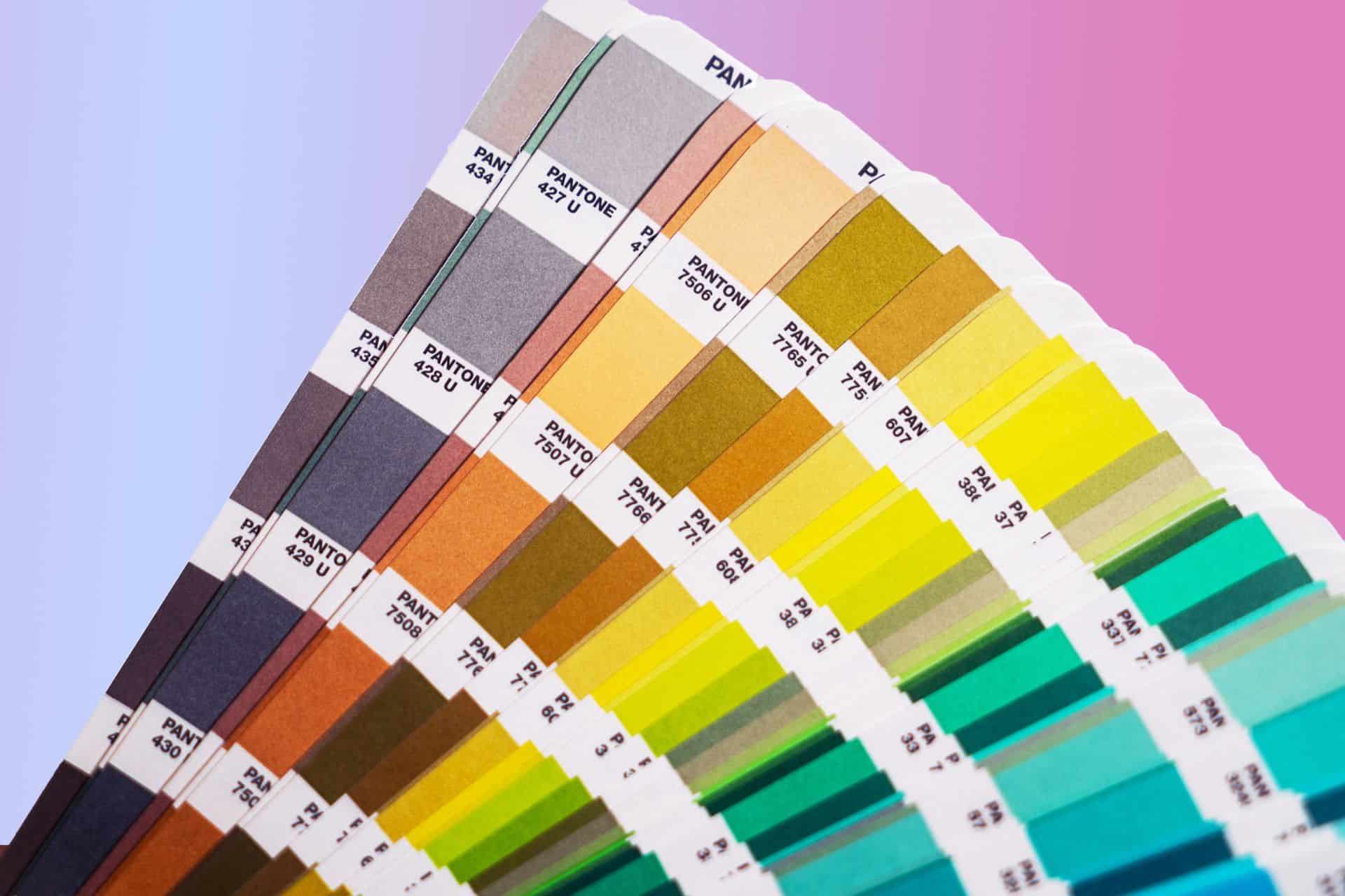
Warm colors are those that fall within the red or yellow portion of the color spectrum. They are associated with feelings of warmth and energy, and you can use them to make a design more welcoming.
These hues tend to have higher saturation than their cool counterparts, making them feel more energetic and vibrant. As such, many businesses use them for marketing purposes. That way, they can make their product or service come across as lively and fun-loving.
Red
Red is one of the most visible colors of all. It can be helpful when using it for CTA buttons and headlines. Red works well with other colors, including green, blue, orange and yellow, on social media posts or advertisements since they stand out well.
The use of red conveys urgency and alerts for people to pay attention to what you have to say. It also helps to know that it can stimulate appetite. That’s why many restaurants, like McDonald’s, use it to promote their food products.
Orange
Orange is one of the warmest colors you can use in graphic design. It is a color that conveys energy and excitement, so it makes sense for businesses to use it to promote urgency.
This color is also associated with the color of the sun. Therefore, it represents feelings of warmth and happiness — which is perfect if you want to create an inviting atmosphere for your audience.
Yellow
Yellow is associated with joy, happiness and optimism. It’s also great for drawing attention to something. For example, you can use it as an accent or highlight parts of your website or graphic design project.
This means if you want people to notice a particular element of your design — like an image or logo — then using yellow will help.
Common Variations of Warm Colors
Warm colors come in many variations, including monochromatic, complementary and analogous. All of these variations you will find on the color wheel, and can be similar or opposite. Below is an overview of each variation.
Monochromatic Warm Colors
Monochromatic colors are of similar shade, tone and value. When warm colors are monochromatic, they tend to create a sense of balance and harmony. For example, if you used a red color scheme — this would give you a feeling of warmth and comfort. That’s because red may be associated with fire, which people tend to associate with warmness.
Complementary Colors With Warm Colors
Complementary colors are opposites on the color wheel — meaning they’re furthest from each other than on the color wheel. When you pair complementary colors to warm colors, they create high contrast in a design to create visually interesting effects.
For example, orange and blue make for a bold combination of complementary colors — one that’s sure to grab your attention.
Analogous Warm Colors
Analogous warm colors are next to each other on the color wheel. For example, you might use shades of red, orange and yellow-red in your design. Analogous colors tend to be harmonious because they sit close together on the color wheel — meaning there’s less contrast. Using these colors can be a good choice for establishing a sense of order and unity in your designs.
You can use analogous colors that share common tones, such as oranges and yellows. One way this works is by creating visual tension with one complementary color — contrasting two similar hues or tones will make visual interest without overpowering either one’s function within the design.
How To Use Warm Colors in Graphic Design
Now that you know the meaning behind warm colors, here’s how to use them in your projects.
1. Attract Attention
When choosing your focal point, you want to treat it as the most important part of your design by attracting your viewer’s attention. To make the focal point eye-catching, you can incorporate warm colors in this area.
2. Create Contrast
You can use warm colors to create contrast. Doing so will enhance visual interest. For instance, if you have a cool color palette, you can use a warm color to instill difference.
3. Keep Relative Color Temperatures in Mind
Analogous colors always affect the appearance of their neighboring colors. When choosing a warm tone, you can have more options beyond reds, oranges and yellows. A violet-blue can be on the warmer side in your design and include properties associated with warm tones.
Therefore, being mindful of relative color temperatures allows you to mix and match the perfect color palette.
4. Use Color Psychology to Your Advantage
Since warm colors tend to evoke positive and happy feelings, you can do this to enhance the illustration behind each element of your design. For example, if you wanted to create a happy graphic, you could use warm shades in your fonts to liven up the design.
5. Limit Your Color Palette
Limiting your color palette can accentuate a mood or the reaction you’re trying to create. Otherwise, too many colors can create a mix of confusion and prevent the viewer from receiving the message you’re trying to send.
As you can see, there are many ways to use warm colors in your designs. Yet, the more you understand their effects, the more meaningful your design will be. Therefore, it’s always good to experiment with variations and color combinations.
Creating multiple options allows you to see what works best for you.
Use Warm Colors to Make Your Design More Appealing
Remember, warm colors convey energy, urgency and passion. Incorporating the warmer side of the color wheel gives you a bold and vibrant look in your designs.
They can also allow your viewers to feel warmth, trust and belonging. For instance, suppose you wanted your design to look friendly and inviting. If that is the case, light or mid-tone warm colors that are not overpowering — like pastels — will be soothing on the eyes.
Make the Most of Your Designs With Warm Colors
The use of warm colors is an important aspect of graphic design. They allow you to create a more compelling layout. The next time you’re working on your next project, consider your color selection.
You have various ways to use warm colors in your designs.

Leave a Comment