
Over the years, trends in design have come and gone. As printing technologies improved and full-color printing became more affordable, we saw a rise in full-color photography and smoothly blended gradients – sometimes just tacked on because they were possible. These behaviors were mirrored on the web – remember the Flash-heavy days a decade ago when broadband Internet was just becoming widespread, and designers seemed determined to add as much load time as possible to a web site? Or how about the skeuomorphic design craze, sparked by Apple and favoring drop shadows, carefully recreated textures and characteristics of real objects?
The latest trend is flat design, and it’s not only flourishing on the screen. It’s also transferring to the real world, where pamphlets, business cards, book covers and more are exhibiting elements of flat design. Designers and developers favor flat design because the elements are simpler and easier to make work across multiple environments. When we think of “modern” style for printed materials, book covers and even physical objects or architecture, we think of smooth lines, solid blocks of color and bright tones… basically all the things that are also true of “flat” design.
Read on to learn more about flat design and what impact it’s having on print design and beyond.
What is Flat Design?
Flat design came into vogue in part of a response to the trend of skeuomorphic design, which attempts to emulate real-life features with exaggerated characteristics. Imagine the dashboard in your car. It’s not real leather, but there’s an artificial texture that’s been added to try to make it look like leather. That’s skeuomorphic design.
The biggest proponent of skeuomorphic design has long been Apple, which uses it in the iPhone, iPad and Mac computers. Perhaps as a counter to this, and certainly to set themselves apart from what Apple embraced for so long before iOS 7 was released, Microsoft became one of the first companies to embrace flat design.
It eschewed the rounded edges and addition of real-life elements to apps, as found in so many Apple design elements. Instead, Microsoft embraced open spaces, hard edges, bright colors and the two-dimensional illustrations that put the “flat” in flat design.
Here are some things you will find in flat design:
- Minimalist approach – Instead of featuring many elements all begging for your attention, flat design pares these down to the basics and give a lot of breathing room.
- Bright colors – While it’s not a hard and fast rule, many flat designs take advantage of their simplicity to introduce a rainbow of colors.
- Simple images – Instead of complicated graphics or photographs, flat design is more likely to feature simple images created with basic shapes and just a few colors.
- Straightforward ideas – In a flat design, it is very clear what the piece is trying to communicate. You don’t need to search to understand.
- A focus on typography – With a simpler layout, designers are more able to focus on rendering beautiful letterforms and combining two or more fonts in interesting ways.
- Buttons or icons – Flat design is more likely to include graphics reminiscent of icons – the more simply the designer can convey the point, the better.
- Large images – There are less images in flat design, but when a photograph or visual is used, it will be treated as a very important element.
Here are some things that you will not find in flat design:
- Muted tones – There are exceptions, but typically flat design isn’t subtle.
- Overuse of weighty gradients – Gradients bring to mind the shading and dimension of real-world objects. However, brighter, more abstract gradients are still sometimes used.
- Real-life objects wrought into realistic digital forms – Called skeuomorphism, the digital rendering of realistic objects goes against the simple principles of flat design.
- Drop shadows – You won’t find smooth shadows in a flat design, but you might find blocky shadows with sharp edges, or long shadows, typically at an angle.
- Bevels – Beveled edges are intended to give dimension to objects. Instead you’ll see sharp and clean edges.
- Artificial textures – For the most part, flat design works with bold blocks of solid color instead of employing textures like paper, fabric, or woodgrain. These types of patterns are meant to digitally recreate something in the real world. Abstract textures can sometimes still fly, though.
Why Flat Design Works
So, why choose flat design over other approaches? There are a number of reasons why this trend is gaining acceptance both on- and offline. Here are some of the advantages of using flat design:
It Embraces Minimalism
Users aren’t distracted by decorative, but ultimately meaningless, design elements. If skeuomorphism is about details – lots of them – flat design is about simplicity. For example, the on button embraces texture, pattern, shadow, and reflection. The off button has the only elements it needs to be an off button: the word “off,” and a shape to press. That’s all. It’s easy and makes sense from a distance.
Everything Serves a Purpose
It’s easier to illustrate big ideas when you’re not worrying about where to add a drop shadow. Take the older and newer Safari icons for example:
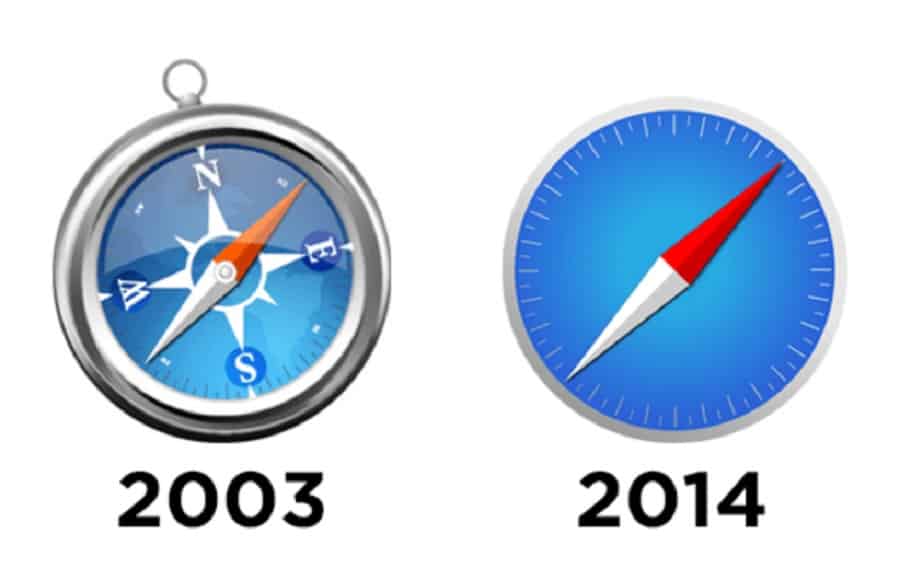
The old design was skeuomorphic to the core. It represented a compass, from the shiny chrome border to the explicitly labeled cardinal directions to the tiny swing tag at the top, where one could imagine hooking it to a lanyard. That’s a lot of detail for an icon – and at a tiny size, it’s almost impossible to make out the shapes of North and South America in the background.
The newer icon still features a subtle gradient, but instead of existing to represent a plane of glass, it just adds intrigue to the icon. Pared down to the dial and tics on the outside, it’s still clearly a compass. But more importantly, it’s easy to make out at any size and simple enough to understand at a glance.
It Puts the Emphasis on Content
Without all the extra bells and whistles, the ideas behind a product come across much more clearly with flat design. It’s a simple on/off button, not a realistic button rendered in light and shadow. It’s an icon that instantly means “Safari,” not a physical compass sitting on your dock. It is what it is, and nothing more.
Flat design can work offline just as well. In particular, typography principles of flat design translate nicely to printed materials, such as folders, brochures or business cards. The most important thing to remember is the emphasis on simple design. Remember that every piece makes a bigger difference when working with simple elements. Ensure your font isn’t at odds with your other imagery, and that your color scheme works.
Flat Design Trends in Print
With an understanding of the ideas and implementation of flat design, it’s time to explore how this trend plays out in the real world. You’ve probably noticed the almost cartoon-like print ads from some brands.
Type-Only Design
Business cards have long used the type-only approach. However, this is beginning to catch on in other areas, too, such as promotional postcards, posters and even book covers. The minimalist approach catches the eye because the words are the message. White space is often utilized with those words to make them stand out. For instance, a large word may appear at the top of the poster. This will open the middle with a small print at the bottom to convey the necessary contact information or call to action. Above is an excellent example of type-only design from a law firm outlining its forms of assistance, featured on Inspired Mag.
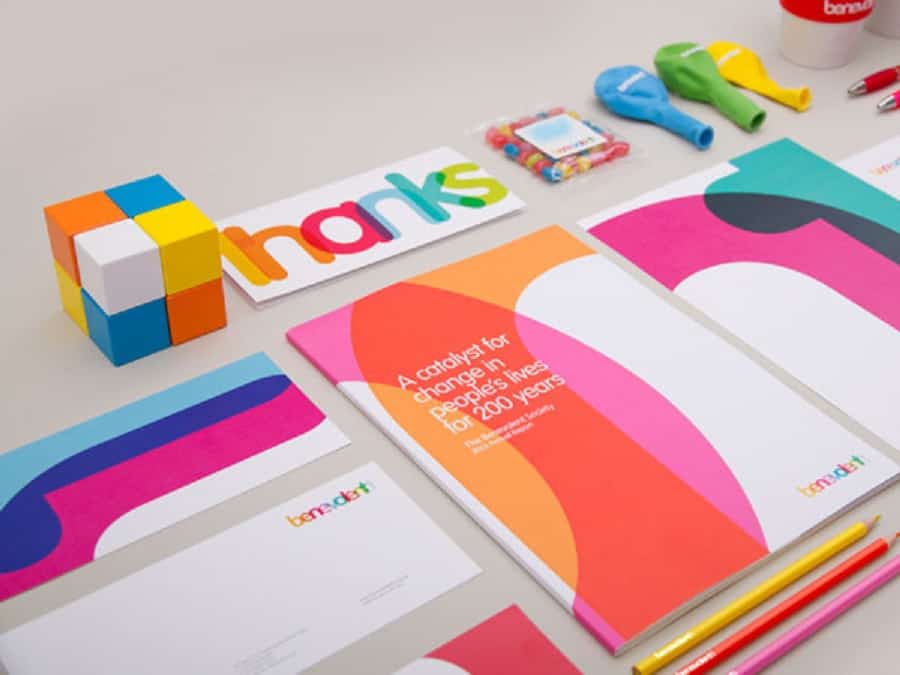
But type-only design doesn’t have to exist only in black and white. It can have a degree of abstraction, too. Check out the marketing materials Designworks created for Benevolent Society, a charity in New Zealand, below. All of the bright overlapping forms are actually letters that make up the word “thanks.”
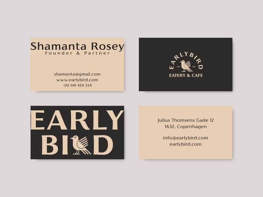
Below are a few more examples of flat design typographic business cards:

Straightforward Style
Flat design means emphasizing two-dimensional illustration. Without the traditional three-dimensional effects such as bevel and textures, familiar designs can take on a whole new look. For instance, the below group of postcards featuring reimagined superheroes is a great example of flat design’s straightforward approach.

Consistent Branding
Many companies like the idea of consistency in their products. They may like the flat design concept for their website and want to echo it in their offline materials. This could comprise report folders, business cards or pamphlets. You might also pay special attention to the selected colors because you’ll want consistency across all platforms.

The Wall Street Journal is a good example. Elements of their online design carry over to the printed newspaper and vice versa.
Reduction of Clutter
These days we’re in a constant state of information overload. From our mobile phones to tablets to laptops, it seems we’re always being inundated by information. Flat design is a remedy to that, so it is no surprise it’s adopted offline, too. This is to counterbalance the clutter of words and information we find online. You can find that in book covers, posters or even T-shirts.
Flat design is here to stay. Whether online or offline, it’s a great way to emphasize ideas and content in a way that stays in style.


Leave a Comment