


Most brands understand the importance of an effective logo, but stopping at one design — however good it may be — is a mistake. In today’s omnichannel world, branding must adapt to fit various applications. Responsive logo design is the answer.
What Is Responsive Logo Design?
Responsive logo design is the practice of adapting your logo to fit a wider range of audiences. The most straightforward example is simplifying it so it remains legible on a smaller screen, but it can involve far more than just shrinking the dimensions.
Consider how over 54% of all internet traffic today comes from mobile devices. Responsive design would cater to that audience by creating simpler alternate branding that’s still recognizable as your company emblem but easier to see on a phone screen. However, you wouldn’t replace your original design entirely — rather, you show the full version on desktop or in-person branding but use the compact one for mobile.
Some organizations embrace responsive design by creating two versions of their logo. Others end up with five or more alternates. These differences also apply to more than just different devices. You can vary logos between specific products, market niches and even times of year.
Benefits of Responsive Logo Design
The primary benefit of responsive logo design is that it enables better omnichannel marketing. U.S. households have over 10 connected devices on average, at least six of which have a screen. Businesses need to ensure a consistent experience across all these platforms, but each one presents different dimensions and UX concerns.
A long, word-heavy logo may work well on a TV screen but less so on a laptop. Similarly, a square, minimalist design looks great on mobile but may leave too much empty space on a billboard. Responsive logos match the needs of each situation while preserving the core of your design.
Responsive design is also a helpful way to cater to different markets. You can use a busier, more professional-looking version for your corporate communications but a brighter, simpler alternative for B2C purposes. Alternatively, you could adjust your logo slightly between product categories based on the market niche that would be most interested in each.
5 Examples of Responsive Logos
It’s easier to understand this concept when you see it in practice. With that in mind, here are five famous examples of responsive logo design.
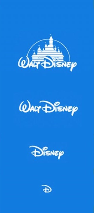
1. Disney
Source: https://creativecomp.com/wp-content/uploads/2021/04/Logo-Variation-examples-scaled.jpeg
The Walt Disney Company is an excellent example. The original logo features the brand’s full name, Cinderella’s castle and an arc representing a shooting star. It’s a great design that encompasses a lot of what the company tries to embody, but it’s busy. So, Disney simplifies it in several ways.
One version removes the castle so the company name can fit in a format without as much vertical space. Another removes the “Walt” from the branding entirely to shorten it further. The final version is only the first letter, but it’s still recognizable because of the iconic font.
Each increasingly simplified design sacrifices some iconography but holds onto the most recognizable aspects. Between these four, Disney can easily brand products of all sizes or adjust ads to fit any screen.
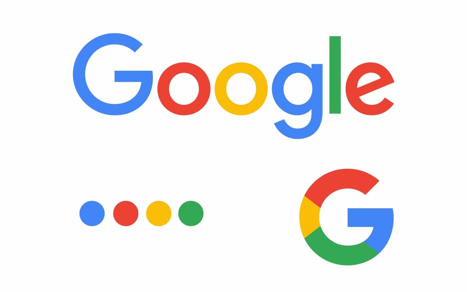
2. Google
Source: https://fabrikbrands.com/branding-matters/branding/introducing-responsive-logos/
Another of the most popular logos of all time, Google, takes a different approach. Instead of a cascading series of designs, the company sticks to two or three. While this leaves less room for hyper-niche marketing, it fits the brand’s most prominent needs — fitting computer and phone screens.
As a tech company, Google will mostly interact with users on a screen, so it doesn’t need as much variation. A landscape-friendly version and a more compact square icon are sufficient, although the company also has another simplified landscape design to fit where verticality is limited.
Google’s use of color is also worth noting. Instead of purely removing elements, each redesign centers around displaying the brand’s iconic color scheme in different ways.
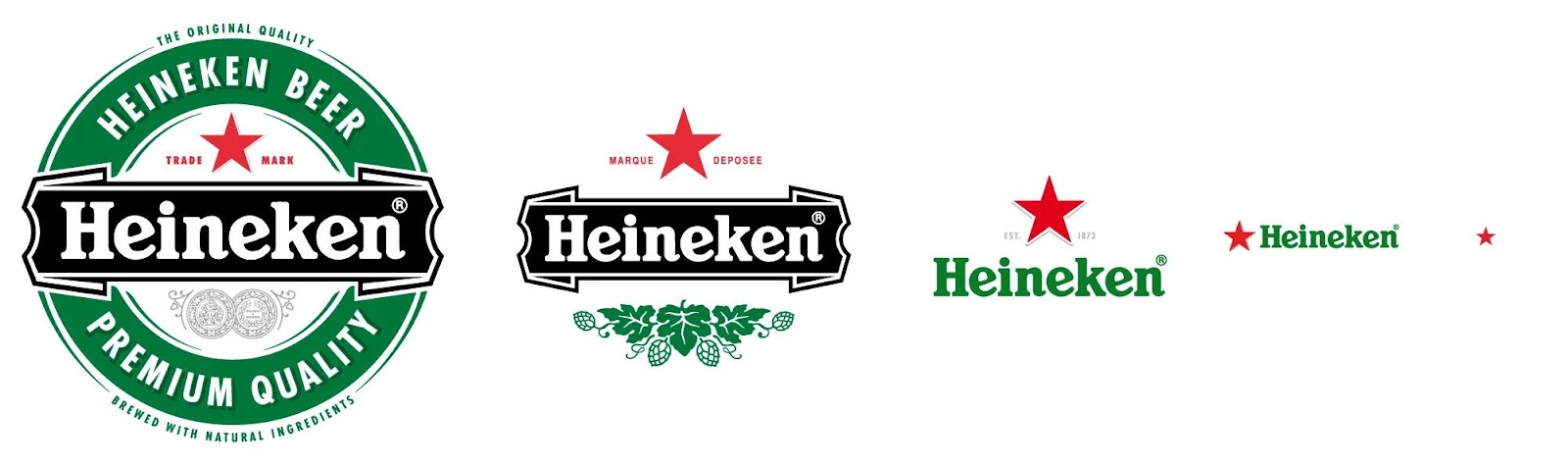
3. Heineken
Source: https://www.adozeneggs.co.uk/insights/what-is-a-responsive-logo/
Food and beverage companies employ responsive logo design often, as various packages have different size and shape constraints. Heineken is a great example of this in action, as they have fairly dramatic differences between each design.
While sizes, shapes, orientations and elements vary between each, every redesign reflects consistent branding. The ones that have text all use the same font, even if the words use different colors. Those colors, while varied, also still employ the same overall palate.
The biggest takeaway here is that Heineken has zeroed in on the most recognizable part of their image — the red star. That is the one element that is present in each design.
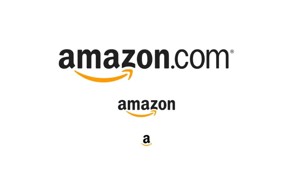
4. Amazon
Source: https://inkbotdesign.com/responsive-logo-design/
Whereas Heineken’s responsive logo design showcases extreme versatility, Amazon’s favors simplicity. Like Disney, it drops part of its name in the first variation, acknowledging that its domain is recognizable even without the “.com.” It then shortens it again to a single “a” but keeps an important element — the arrow.
Amazon’s arrow logo has a hidden meaning in that it points from A to Z, emphasizing how the e-commerce giant has everything. It also works as a smile or an arrow to suggest shipping speeds. Whatever the case, it’s a critical part of the design, so Amazon keeps it in every variation.
Keeping the arrow is also important because, unlike Google, Amazon does not have an immediately recognizable color scheme. Its font is likewise not a standout, so it needs the arrow for brand recognition.
5. Walmart
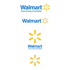
Source: https://www.designerpeople.com/blog/logo/responsive-logo-design-digital-branding/
Walmart is a similar case. The asterisk is the most easily recognizable part of the full logo, so all variations keep that element, with the simplest featuring only that and nothing else.
Designers should also note how Walmart moves their text around for different logos. In some, the asterisk comes after the name, but in another, it sits above it. While this change may seem small, it’s an easy way to rework a design to fit somewhere as a square rather than a rectangle.
The square logo has all the same elements as the full landscape one but serves a different need. It can appear as the icon for a mobile app or in the corner of a website, whereas the landscape one is better suited for large screens or billboards.
How to Design a Responsive Logo
As a designer, you can learn a lot about responsive logos from these examples. The first step in employing it yourself is to recognize which elements of your current branding are your most recognizable. Do you have stand-out colors or a unique font? Does your logo include a noticeable icon? Identify these factors before doing anything else.
Once you know the most recognizable parts of your brand, you can build alternate logos around this. Experiment with different layouts, shortened text and sizes, but keep those key elements you identified earlier in each one.
It may also help to identify which niches or applications warrant a redesigned logo. Determine the different needs of each and compare these to your current design to see if and how it may need to change to suit varying situations.
After designing a few variations, it’s best to test them. Present them to colleagues and customers to get feedback on how recognizable the simplified elements are. Testing how well each design fits its intended use case is a good idea, too.
Use Responsive Design to Take Your Logo Further
Responsive logo design often goes unnoticed by customers, and that’s a good thing. Your design variations should ensure your branding is recognizable across all applications, and when it is, the differences likely won’t stand out. While clients may not realize it, they will know when a design doesn’t work in a situation, so start designing your alternate logos today.

Leave a Comment