


Is your website mobile-friendly? Nowadays, smartphones have become part of our everyday lives. You may even find it strange for anyone to leave their house without a mobile phone.
If you go anywhere, seeing people stare at their phones is normal.
The fact is that website owners need a mobile version of their website. Mobile web traffic has officially surpassed desktop — and it accounts for 54.4% of website traffic worldwide. In addition, a mobile-friendly site can drive your search engine rankings significantly.
Here are tips on how to make a mobile version of your website.
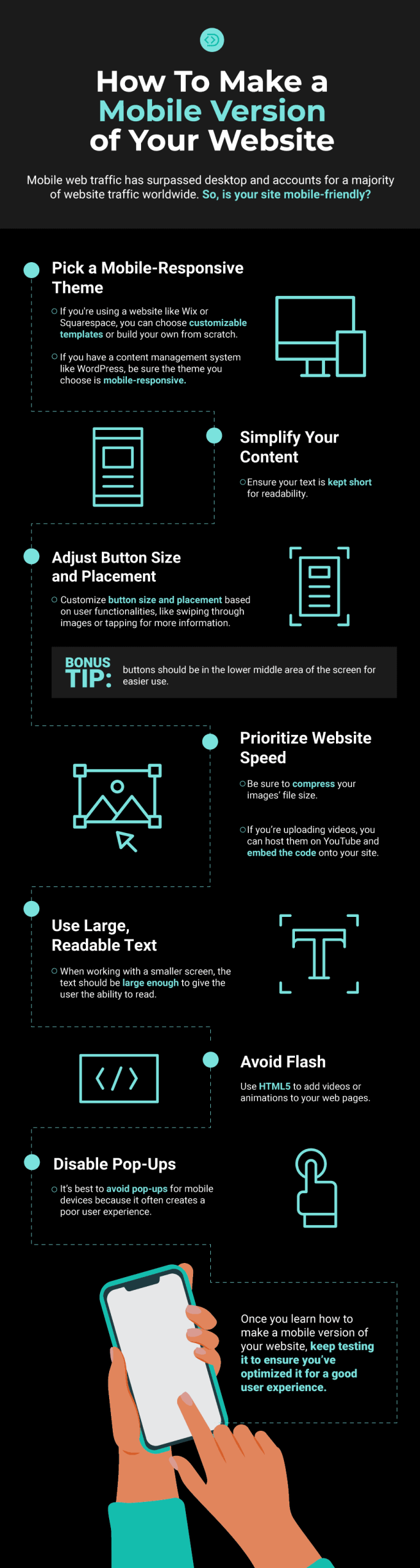
How To Make a Mobile Version of Your Website
1. Pick a Mobile-Responsive Theme
Choosing a mobile-responsive theme is your most vital step because a responsive design will easily adapt to the screen’s size. So if you’re using a website like Wix or Squarespace, you can choose customizable templates or build your own from scratch.
If you have a content management system like WordPress, be sure the theme you choose is mobile-responsive. You can use WordPress’s library to search ‘responsive theme’ and find what you need.
[sc name=”newsletter”][/sc]
2. Simplify Your Content
Your content is the next important step to making a mobile version of your website.
Take your homepage into account, for example. The main goal of your homepage should be more prominent than your desktop version. This might seem pushier — but mobile users don’t want to spend time searching for a function.
Therefore, it makes sense to encourage users to get to the end goal.
In addition to simplifying your content, ensure your text is kept short for readability. And if you have long-filling forms, keep it less distracting by asking for essential information only.
3. Adjust Button Size and Placement
Button size and placement matter because users navigate mobile websites differently. Think of the way you use your phone. Chances are, you use your thumbs to swipe and tap for more information.
However, if your buttons aren’t large enough or are in the screen’s wrong spaces, you might want to make new adjustments to create a better user experience.
For instance, buttons should be in the lower middle area of the screen for easier use.
4. Prioritize Website Speed
Website speed plays a crucial part in your search engine rankings. If it takes a few seconds to load your site, your visitors may back out and move on to something else. That’s why it’s important to consider your mobile site speed.
A few factors that affect your site’s speed are images, videos and CSS. Be sure to compress your images’ file size. And if you’re uploading videos, you can host them on YouTube and embed the code onto your site.
In addition, it’s best to keep your design simple. It will cut down on loading time and also make navigation easier.
5. Use Large, Readable Text
When working with a smaller screen, the text should be large enough to give the user the ability to read.
The font size recommendation is generally 16px for desktop monitors. Suppose you choose this size for your website. You’ll need to test how it looks with the mobile version. You may need to increase the size if you find it somewhat small.
In addition, a font that’s on-brand and simple across all platforms is best for readability purposes. It also helps to space out text with line breaks and images. Or, you can bold or italicize individual lines of text to keep them from merging into each other.
6. Avoid Flash
While Adobe Flash used to be popular, this is no longer the case. It is especially true for mobile devices since they don’t support Flash.
Flash is often for animations. However, it’s best to avoid it altogether. Instead, you can use HTML5 to add videos or animations to your web pages.
Doing so will keep your content the same across all devices and significantly boost your mobile site loading speed.
7. Disable Pop-Ups
When carefully used on a desktop site, pop-ups can work effectively. You can collect leads, email subscribers or attract more visitors to register for an online event. However, it’s best to avoid pop-ups for mobile devices because it often creates a poor user experience.
Mobile devices give you smaller screens. Therefore, a pop-up can hide the content entirely.
If you need to use pop-ups, do so responsibly to avoid user frustration and search engine ranking penalties from Google. For example, pop-ups should not cover the entire screen. They should be small enough to allow users to back out.
Make Your Website Mobile-Friendly
You can see that a mobile version requires various tweaking compared to the desktop. While you need to keep up with many tasks when making a mobile version of your site, be sure to create a checklist. That way, you know what you need to accomplish next.
Once you learn how to make a mobile version of your website, keep testing it to ensure you’ve optimized it for a good user experience.


Leave a Comment