

A premium salon needs more than a memorable name to capture attention. Its visual identity should communicate the level of luxury clients can expect before they ever walk through the door. The right salon logo design creates a good first impression and helps the business appeal to its ideal clientele.
What Makes a Logo Feel Luxurious? The Core Principles
Luxury logo design often relies on restraint. Every element should feel intentional, from the typeface to the amount of space surrounding it. The following principles help a salon create an identity that feels refined without becoming overly ornate.
Simplicity and Clarity
High-end logos rarely try to communicate too much at once. A clean wordmark or a simple emblem can appear more confident because it does not need extra decoration to attract attention. Chanel is a classic example, using a straightforward interlocking monogram that remains instantly recognizable.
Timelessness Over Trends
Trendy fonts or visual effects may look fresh now, but they can quickly make a brand feel dated. A luxury salon logo should remain relevant as the business grows. Classic typography and a balanced layout often have more staying power than design choices tied to a passing aesthetic.
Exclusivity and Uniqueness
A premium logo should feel as though it were made specifically for the salon. Generic icons and premade templates can make the brand blend in with nearby competitors. Custom lettering or an original symbol can give the design a more exclusive feel while helping clients remember it.
Color Psychology
Color shapes how people interpret a brand before they read its name. Black can suggest elegance and authority, while white space creates a sense of calm. Sophisticated neutral shades can also support a softer salon aesthetic. Whatever the palette may be, it should represent the atmosphere and experience that clients can expect.
Key Styles for Luxury Salon Logos
Different logo styles create different impressions. The best choice depends on the salon’s services and the atmosphere it wants clients to experience.
1. Minimalist and Modern

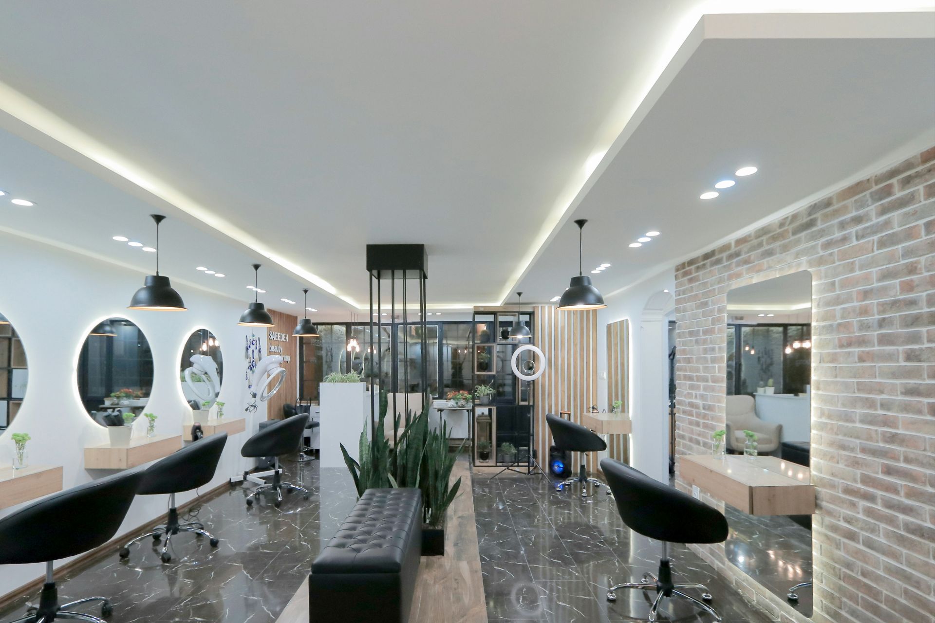
A minimalist logo uses clean lines and generous negative space to create a refined look. Sans-serif fonts work especially well for this style because they feel crisp and contemporary. The design might feature the salon’s name alongside a simple line illustration or an understated geometric symbol.
This approach suits salons with sleek interiors or a modern service model. Beauty brand The Ordinary built a powerful identity by emphasizing text and a clean aesthetic, proving that a design does not need unnecessary “fluff” to convey quality.
2. Classic and Elegant

Classic salon logos often feature serif fonts that evoke tradition and a sense of established quality. A carefully crafted wordmark can stand on its own, while a monogram made from the salon’s initials adds a personalized touch. Fine lines and subtle flourishes can make the design feel graceful without becoming too ornate.
This style is a strong fit for established salons or businesses that want to create a timeless identity. It can also complement a salon offering premium services in an elegant setting. Keep decorative details to a minimum so the logo remains legible when it appears on appointment cards or product labels.
3. Art Deco and Glamorous

Art Deco design brings a sense of vintage glamour to a luxury salon logo. Geometric shapes and symmetrical patterns are common features of this style. Metallic accents in gold or silver can add richness, while rose gold creates a softer effect.
This direction works well for salons inspired by the elegance of the 1920s or those that offer a more dramatic client experience. Consider framing the business name with a geometric border or pairing it with a fan-shaped emblem. The finished design should feel clean rather than overly busy, so leave enough space around each element.
4. Boho and Organic

A boho logo feels relaxed and artistic, making it ideal for salons that focus on natural beauty. Hand-drawn elements can give the design a more personal quality. Botanical illustrations also reinforce the connection to nature, especially when paired with an earthy color palette.
This style works particularly well for eco-conscious salons or businesses offering holistic beauty services. Soft lettering can create an approachable mood, while a simple leaf or floral illustration adds character. Avoid packing too many natural motifs into one design. One distinct image will make the logo easier to recognize and reproduce.
How to Bring Your Logo to Life
A strong salon logo begins with a clear plan. Following a thoughtful process helps you communicate your vision and avoid costly revisions later.
Step 1: Create a Creative Brief
A creative brief gives the designer a clear direction before the work begins. Start by describing your salon’s core values and the type of clients you hope to attract. You should also explain how you want people to feel when they encounter the brand.
For example, a modern luxury salon may want its logo to feel polished and exclusive, while a wellness-focused business might prefer a calmer appearance. Include examples of logos you like, but explain which specific elements appeal to you.
Step 2: Find the Right Designer
You can work with a freelance designer or hire a design agency. Freelancers may offer a more personal and affordable experience, which can suit a smaller salon. Agencies often provide broader branding support and may be helpful if you also need signage or a complete visual identity.
Review each designer’s portfolio to see whether they have experience with your preferred style. Look beyond attractive samples and pay attention to how well their previous work reflects each client’s personality.
3. Review and Refine the Design
When the first concepts arrive, consider how well each one supports the creative brief. Give specific feedback instead of simply saying you dislike an option. Explain which details feel off and what you would like the design to communicate instead.
Before approving the final logo, view it in several sizes and against light or dark backgrounds. It should remain clear wherever clients encounter your salon.
Common Salon Logo Mistakes to Avoid
Before finalizing your salon logo, watch for a few common mistakes that could weaken its appearance or limit its effectiveness.
Being Too Literal
Scissors and hairbrushes may clearly signal what a salon does, but these symbols are often overused. Relying on them can make a luxury brand look generic or difficult to distinguish from competitors. A more abstract mark or custom wordmark can communicate beauty without stating it so directly.
Prioritizing Trends Over Timelessness
A trendy font or effect may feel current when the logo launches, but it can quickly become dated. Frequent redesigns also make it harder for clients to recognize the salon. Choose design elements that reflect the brand’s personality and can still feel relevant in five to 10 years from now.
Not Testing for Versatility
A detailed logo may look beautiful on a large sign, yet lose its impact at a smaller size. Test the design in black and white as well as in full color. It should remain clear as a social media profile image and translate well when embroidered on a robe.
Your Logo Is Just the Beginning
A premium salon logo needs to be straightforward, distinctive and genuine to the brand. Once you choose a design you love, utilize it everywhere, including your website and social media. You can also get the advice of a trademark professional who can help you secure your unique design. With a strong foundation, a strong logo may help support a recognizable brand for the years to come.

Leave a Comment