
Many designers want to grab attention with the flashiest colors, most noticeable images, and huge, attention-grabbing text. That approach can work, but it may also be more appropriate to prioritize a minimalist look. Here are 11 examples of minimalist ads that prove how to achieve more with less.
1. The Ordinary
Source: https://www.designrush.com/news/the-ordinary-breaks-the-norms-of-skincare-advertising
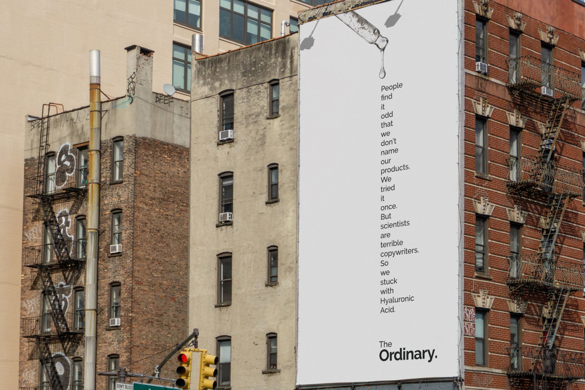
So much of the beauty and personal care industry centers on creating routines for one’s skin, hair, and sleep that will ultimately turn heads when the person goes out in public. However, The Ordinary is a beauty brand that has gained attention for how it emphasizes text in ads rather than gorgeous models without a hair out of place.
Notice how the top part of the ad features a serum, and the orientation of the words makes them appear as if they are also dripping out of the bottle.
That smart decision encourages people to start from the top and work their way down until they read this entire minimalist ad.
The ad’s humorous take also emphasizes the perception that this is a science-backed brand, which could encourage interested parties to choose it over the options that seemingly have more fluff than substance. The easy-to-read black text against the white background facilitates reading the content at a glance.
2. Disney+

A minimalist ad run during the Super Bowl can get noticed, too, as the above YouTube clip and screen capture indicate. Here, Disney+ asserts its strength as a streaming company by debuting an advertisement featuring famous lines from various shows and movies on the platform. Although the final frame features the company’s branding, that is the lone obvious sign of it.
The accompanying music is also soothing and well-paced to match the rhythm of the words as they come up on the screen. Indeed, famous dialogue can sometimes make a movie, turning it into an enduring crowd-pleaser. This ad strips away everything unnecessary and urges viewers to recall everything they love about their favorite films. Then, it invites them to bring all those joyful moments into their homes by becoming streaming subscribers.
3. BMW
Source: https://www.demilked.com/30-clever-minimalist-print-ads
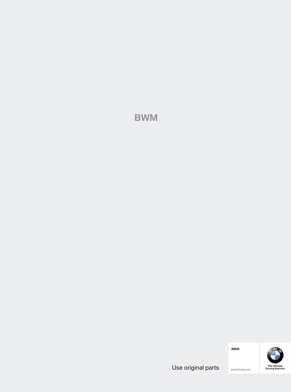
Something is not quite right about the order of the letters in this minimalist ad. The error cleverly reminds people to always use original parts when working on their BMWs. Many other options look nearly identical to the genuine ones, but they may not undergo the stringent testing that original equipment manufacturers require.
This advertisement also offers an excellent example of audience segmentation. Such efforts make it maximally relevant to those who see it. For example, BMW’s marketing team likely aimed it at BMW owners who like to spend time on DIY work, and not people who always take their BMWs to auto shops.
4. McDonald’s

Sometimes, going with a minimalist ad encourages designers to think more creatively about getting attention without relying on all the usual means. Such is the case with this memorable McDonald’s ad, which simultaneously celebrates Halloween while making people feel hungry,
The upside-down box of fries still has two left, each carefully positioned to mimic fangs, complete with a dab of ketchup on one, giving the appearance of blood. The curved shape of the fry box is also similar to the look of a wide-open mouth, with just about half of the famous Golden Arches logo on it. That one pairs nicely with the one in the bottom-right corner, reminding people of the company behind this minimalist ad without going over the top.
5. LA Bicycle
Source: https://www.adsoftheworld.com/campaigns/folding-bike-0b73c4d5-4510-4064-8501-c91f1b1f3f51
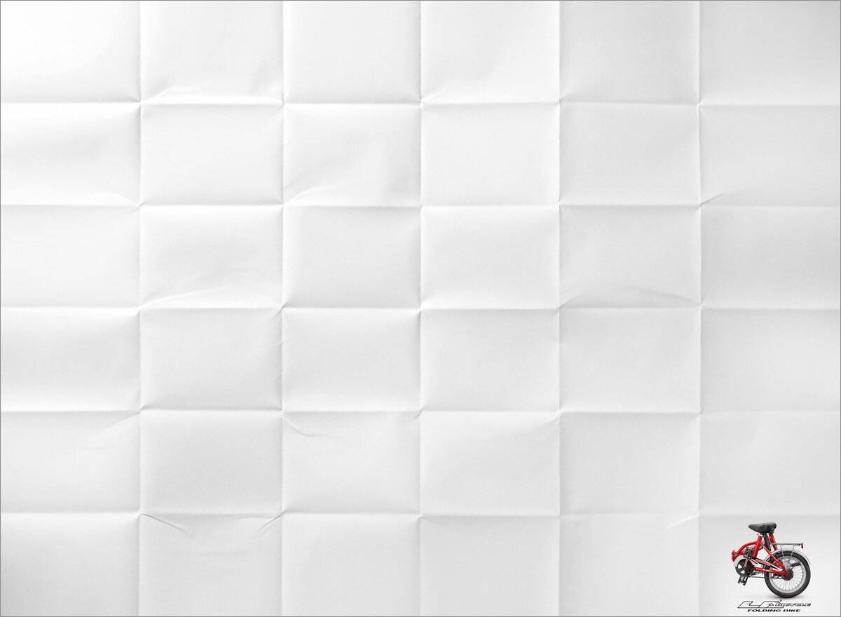
At first glance, people might think this ad is a misprint because it nearly appears as a blank page. However, the repeated markings suggest that someone folded the material several times, such as to fit it in their pocket. The resultant grid-like look creates numerous small squares with a bigger purpose. Indeed, inside the one on the last row in the bottom right sits a folded bike.
People know they cannot actually fit it in their pocket, but the bicycle still gets noticed because the graphic shows how small these products fold down, making them ideal for use on crowded trains during morning commutes.
The company’s logo is not immediately noticeable because the bike is on top of it. However, those interested enough to learn more will look closer to get the necessary details. This minimalist ad is creative enough to stick in people’s memories —hopefully coming to the surface again once some of them realize it’s time to buy a folding bike.
6. Oral-B

Source: https://www.demilked.com/30-clever-minimalist-print-ads/
Most people don’t consider flossing their teeth among their favorite activities, but this minimalist ad reminds them why they should. The narrow strip in the middle couples with the unspooled dental floss in the bottom right corner. The words to the left of the container emphasize how this floss is an effective way to address the consumable remnants that may linger between the teeth after meals.
The ad’s narrow vertical line also looks like someone peering out of a cracked door, such as a child trying to prevent going to bed on time when their parent calls them. Most people can remember doing the same when younger, so this ad may cause them to smile and reminisce.
7. The Black & Blaze Coffee Roasting Company
Source: https://fabnews.live/black-blaze-attempts-to-turn-you-on-with-new-ads/
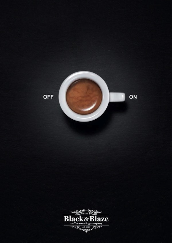
Control knobs are some of the most familiar parts of everyday life. Most people use them so often, they hardly think about it. This coffee roaster wants the cup o’ joe to fit into life just as smoothly. The centerpiece of this minimalist ad is a coffee mug oriented to look like something a person should turn to activate an appliance.
This became a theme in a series of ads run for this campaign. All have the coffee cup’s handle pointing to the “on” or “maximum” position. That decision reminds people that they should look no further than this hot beverage to get energized during an afternoon slump or to start their days.
8. Pepsi

Source: https://adsspot.me/media/prints/pepsi-light-straw-13a357200b83
Notice the dualistic nature of this minimalist ad. First, it looks like a woman posed with her arms overhead, as if appearing to dive into a pool. But then, it becomes clear that the shape of her body and the stripe of her outfit combine to look like a flexible drink straw.
It also makes sense that this slender figure appears in an ad for Pepsi Light, which some countries offered as a lower-calorie beverage. The image is a creative way to market a drink to people who are likely trying to manage their caloric intake. The orb of light surrounding the woman also strengthens brand recognition by connecting to the product name, showing that this ad’s design team thought of all the minor but important details.
9. KitKat
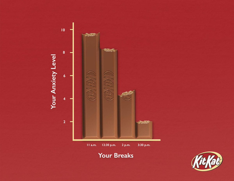
Taking a break is an ongoing theme of this beloved chocolate treat, and this minimalist ad features a corporate slant to emphasize it. The reddish background is the same hue as the candy bar’s packaging, making it more recognizable.
Then, the main part of the ad resembles a chart like those found in corporate meeting rooms worldwide. A closer look at the data reveals a humorous message that likely has significant validity: The more breaks a person has — and the more KitKat they eat — the less anxious they’ll feel. It doesn’t hurt that a KitKat’s shape is easy to stash into a desk drawer and pull out as needed.
10. Scotch-Brite
Source: https://mindrone.wordpress.com/tag/creative-minimalist-ads/
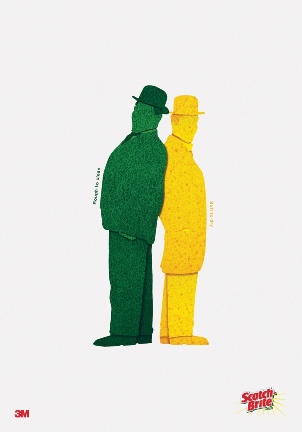
Many people have distinctive yellow and green Scotch-Brite sponges in their kitchens, but they may overlook the purposes of these items’ dual textures. This minimalist ad doubles as a brief set of instructions for effective use. People should use the rougher, green side to scrub dishes clean and the softer, yellow side to soak up excess water before placing things on drying racks.
The ad’s duality continues in the bottom part of the page, showing the 3M and Scotch-Brite logos to encourage brand recognition the next time someone goes shopping and needs more cleaning supplies. This advertisement proves that a piece can have plenty of meaningful content without overwhelming those who see it.
11. STIHL
Source: https://www.joelapompe.net/2024/02/27/autumn-leaves-that-looks-like-lips/
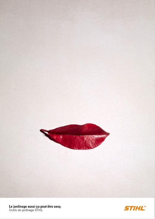
Here’s another example of how things are not as they seem in this minimalist ad. The text reads: “Gardening can be sexy too. STIHL Gardening Tools.” And although the main part of the image initially looks like slightly curved red lips, it is actually a reddish leaf.
Viewing these elements together causes a person to realize that, if they have the right tools, even mundane tasks, such as cleaning up leaves, can become more enjoyable. The contrast between the light-colored background and the leaf’s hue makes the ad instantly noticeable, even if someone is merely flipping through a magazine. People should also appreciate the creativity that highlights how the things they come across while in their gardens can remind them of things they see in other parts of life.
Making Massive Impacts With Minimalist Ads
This minimalist ads collection proves that designers do not have to pull out all the stops to get noticed in an increasingly crowded media landscape where many consumers have short attention spans. Instead, people can find meaningful ways to catch and keep attention while encouraging viewers to learn more about brands and products.


Leave a Comment