

This month, we knew we wanted an Asian company to feature for our Designerly awards. With websites around the globe and so many different industries, it is crucial that we narrow the options or we could wind up in limbo for days trying to find a winner. Skydea was our final choice for this month’s Designerly Award.
How Winners Get Chosen
Skydea also falls into the advertising agency sphere, coming up against large agencies in Chicago, New York, London and other popular locations. Once we’ve narrowed down the category, we sometimes narrow down by geographic region, as we did with this one. IBISWorld estimates that advertising agencies bring in $447.7 billion in global revenue in 2025.
Most agencies also offer graphic design and web design services, to ensure their clients have a full digital presence. Selecting a winner is complex. This category is one where you expect the company to have a stellar website to showcase its abilities. The final choice came down to some specific preferences by our Designerly staff and the interactivity of the site chosen.
Winner: Skydea
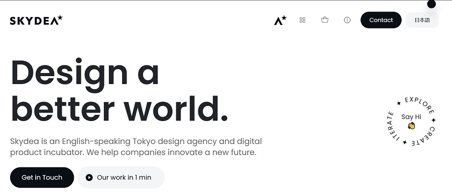
The company describes itself as helping companies to “innovate a new future” and is an English-speaking design agency and digital-product incubator based in Tokyo, Japan, often referred to as Skydea, Inc., or Skydea for short. No one knows the exact year of its founding, but the copyright dates on the company’s website are “2018-2025”, which indicates that it has existed since at least 2018.
Skydea is involved in strategy, branding, user interface/user experience, web development and front-end experience. It has a bilingual English and Japanese portfolio, and has worked for numerous start-ups and global brands. It excels in promoting companies where cultural differences between Japan and the West were an issue.
Why We Chose Skydea as Our Winner
Skydea quickly became the clear winner out of the websites we visited. While all were worthy, it stood out for a variety of reasons.
Page Speed
The site loads before you can blink. Since many experts recommend mobile sites load in under three seconds, the rapid loading time on a smartphone made this site stand out. In staff tests, the site loaded in one second,including the animated button at the top of the page.
Minimalistic Color Palette
The design uses black and white with plenty of negative space. A tiny splash of yellow for the hand icon and a few photographs add some color for interest. By sticking with such a neutral color scheme, the site has excellent contrast for readability and puts the focus on the work they’ve done for clients.
On the desktop version of the site, the navigation rests along the top right and is limited to four tabs – one of which is home – and a contact button. Users can shift between English and Japanese by clicking on the symbols to the far right.
The desktop website also has a round black dot as the cursor to add some visual interest. The mobile version loses the dot and keeps only the footer links for navigation. It does add a CTA button for “Get in Touch” under the first section.
Since 94% of consumers say they want easy navigation, this site checks off all the right boxes.
Examples
While most advertising agencies offer at least a portfolio, we loved the way Skydea laid their examples out for potential clients. You can either scroll down on the home page to see examples or click on the “Work” button. Each client is highlighted with a big, beautiful image. When you click on it, you find out more about the company and the scope of work Skydea completed for them. You can also click on a link to go directly to their website.
Images
The number of photos are limited to only the ones attached to the client work, which makes them stand out even more. Everything in uniform and the same size and general appearance, which gives the design a consistency that makes the company stand out as trustworthy.
Interactive Features
The fun black dot bounces around the screen as you move your mouse, adding visual interest and keeping users on the page longer than they’d otherwise be there.
Skydea uses their footer area to showcase a couple of awards they’ve won–Top Web Design Company for Tokyo and Japan. They also have two columns of services they offer, such as branding, graphic design, marketing landing pages and website development. The bottom includes their privacy policy and address along with a copyright notice.
Unique Value Proposition (UVP)
When all other things are equal, Designerly staff will turn to a site’s UVP to see how well it aligns with the brand mission and if the company stands out from others in their niche. One thing we loved about Skydea was the “Incubator” section of the site. When the agency is low on client work, they put their skills to use developing products and finding solutions to people’s pain points. It is a unique spin and draws site visitors in.
What We Would Do Different
Skydea is a beautifully designed website. You can learn a lot by studying the layout, minimalism and interactivity of the site. If we were going to change anything, we’d probably add a more detailed About section. When you’re trying to reach new clients, they need a reason to trust you. By showcasing who you are as a business owner, you can tell a story that resonates with them.


Leave a Comment